Established in London in 1852 and named after Prince Albert and Queen Victoria, the V&A Museum is the world’s largest decorative arts, applied arts, and design museum.
The V&A’s 2005/6 annual report is unusual in how the designers approach type and photography.
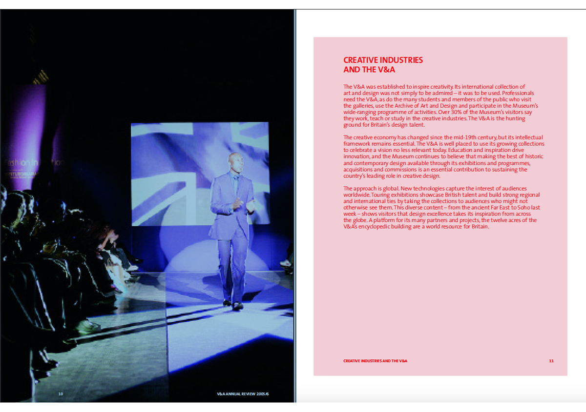
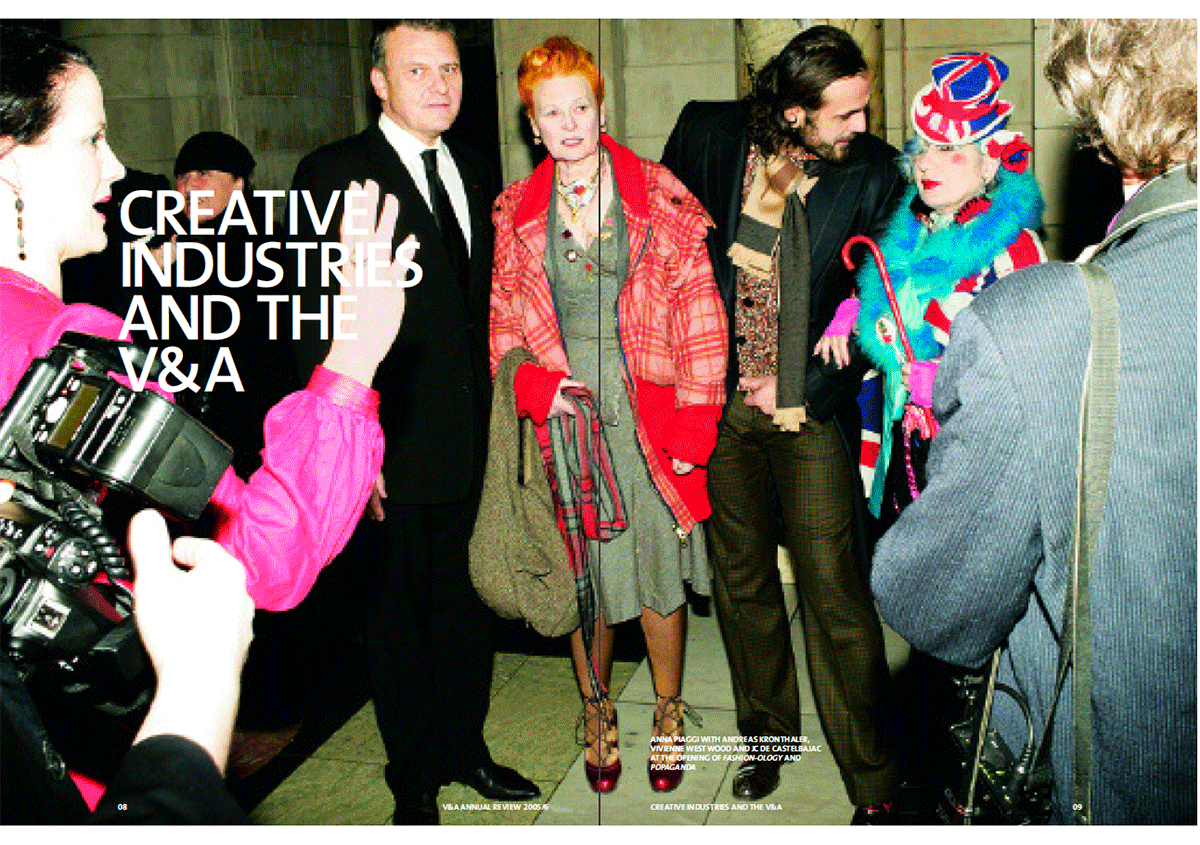
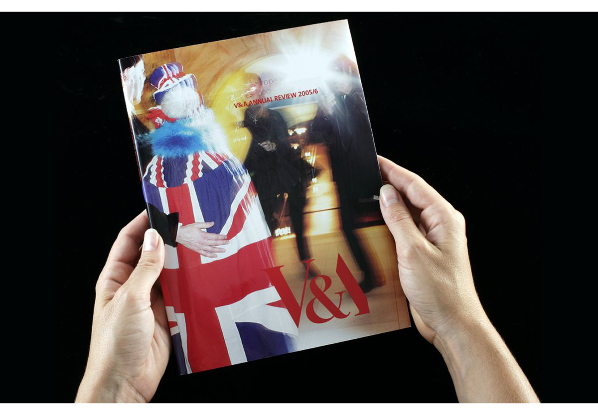
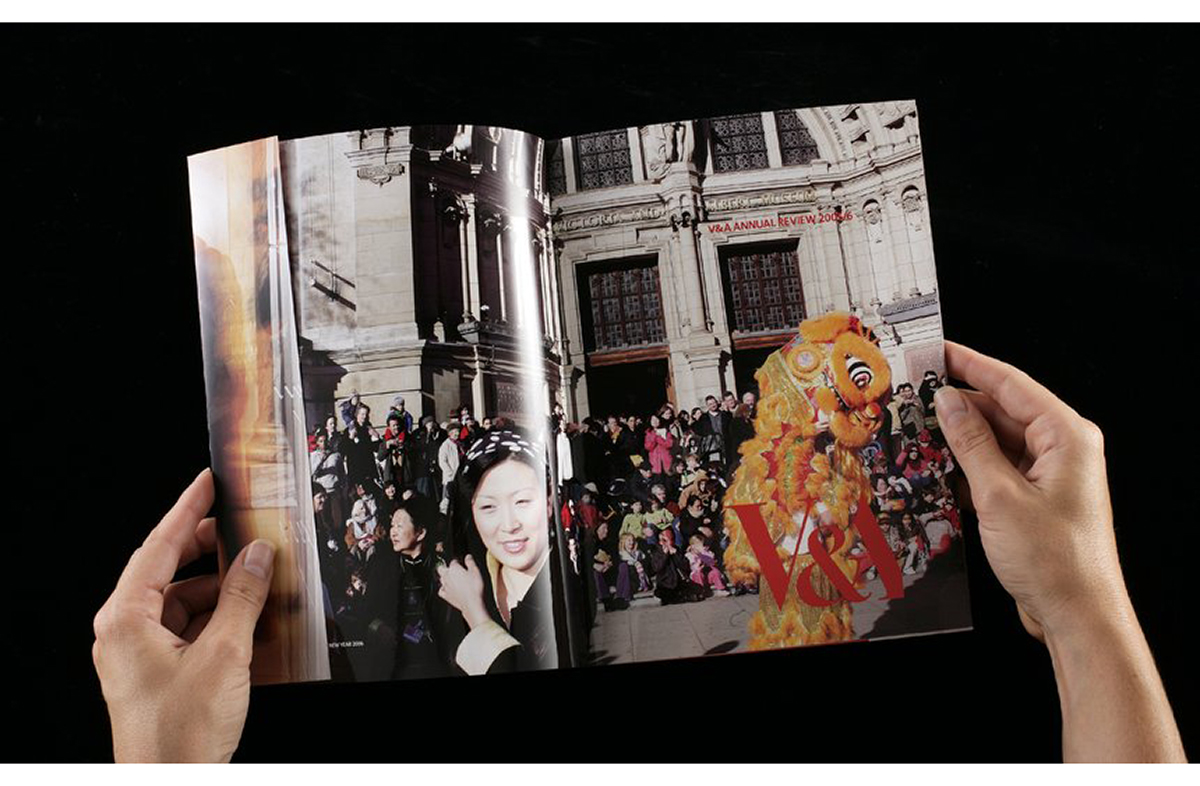
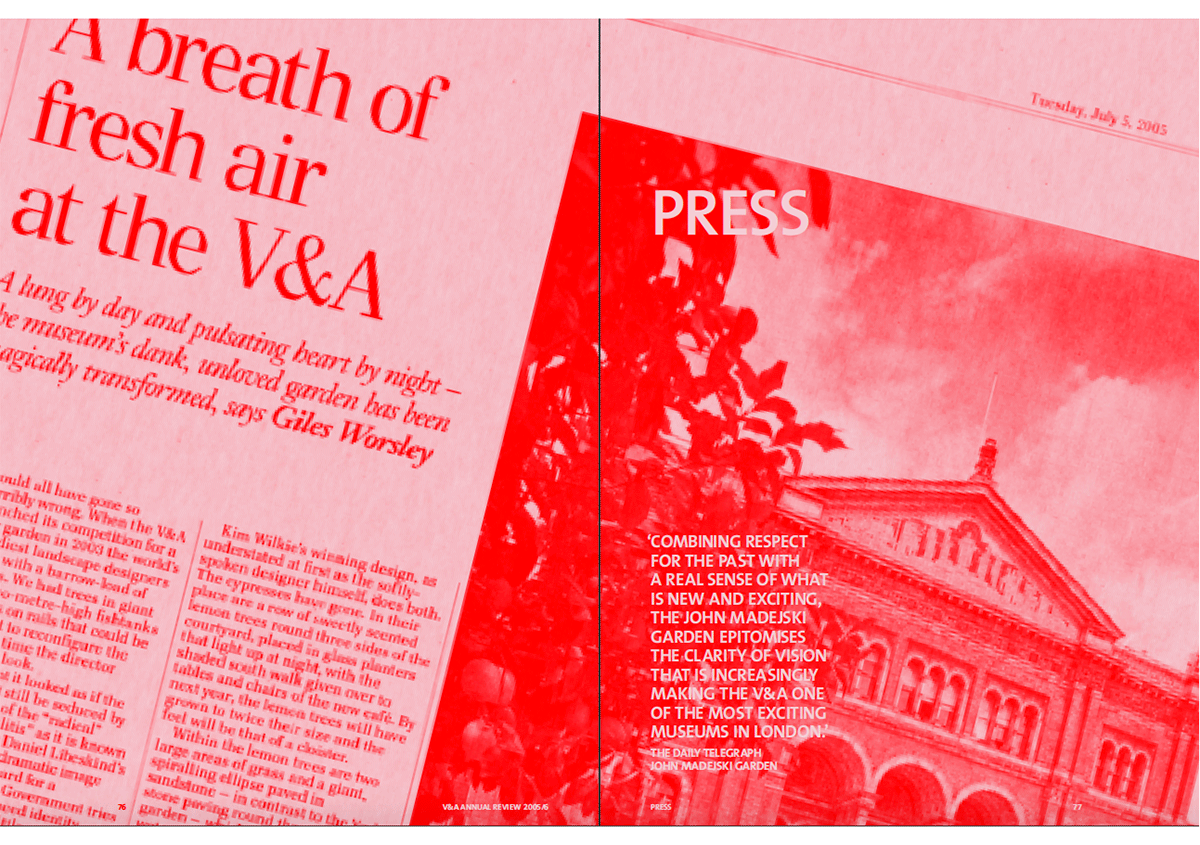
The designers present body text using a red spot ink. Making use of a tone of this ink, they create a pale pink background to the text. Sections titles and captions appearing on photographs appear in white—the only white text in the report.
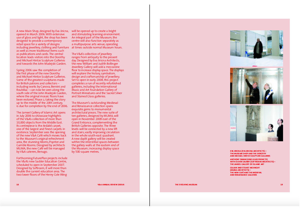
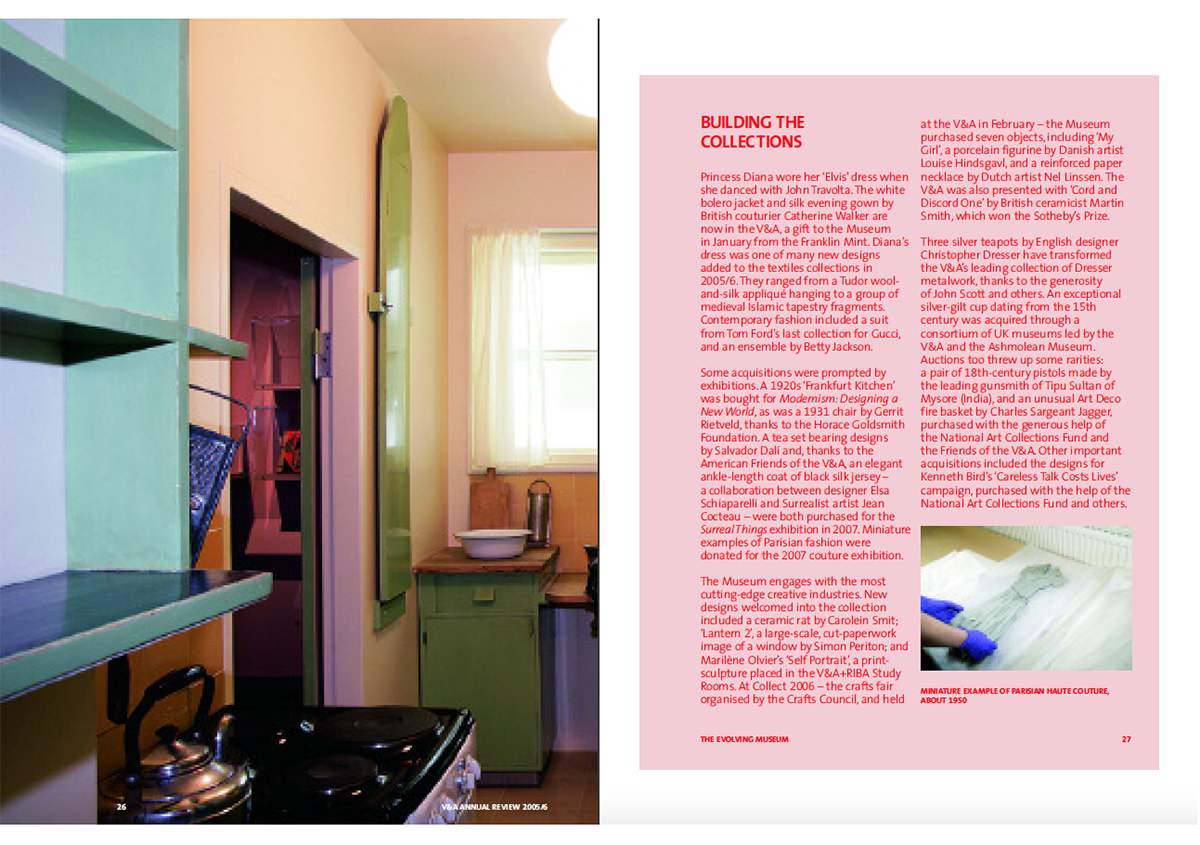
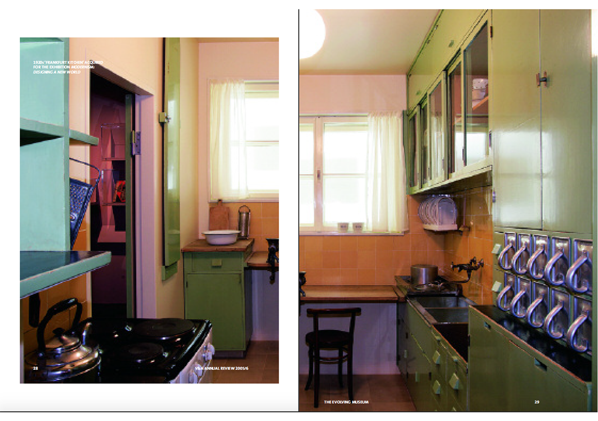
This is a bold choice for a publication. Most designers shy away from coloured body text because the reader’s eye is so trained to read black text. Here, the red works well because most text blocks are contained to a page, or at most, two. The red and pink combination is also used towards the end of the report as treatments for press clippings and the financial section, thereby subverting expectations.
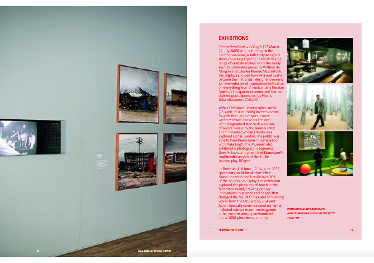
One impact of the use of red is that the whites in photographs stand out sharply. This is not often the case because photographs usually appear on white pages. And this report has a huge number of large images, so the effect is pronounced.
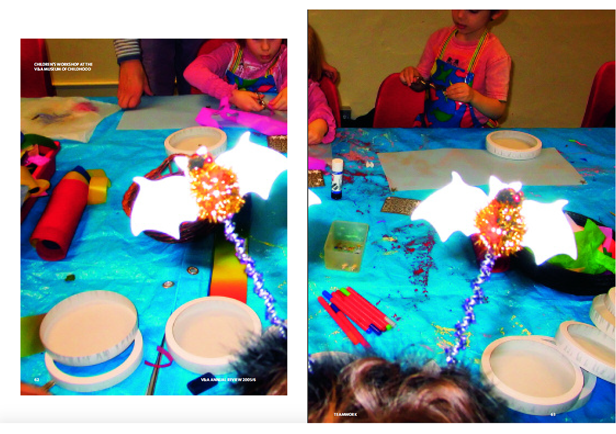
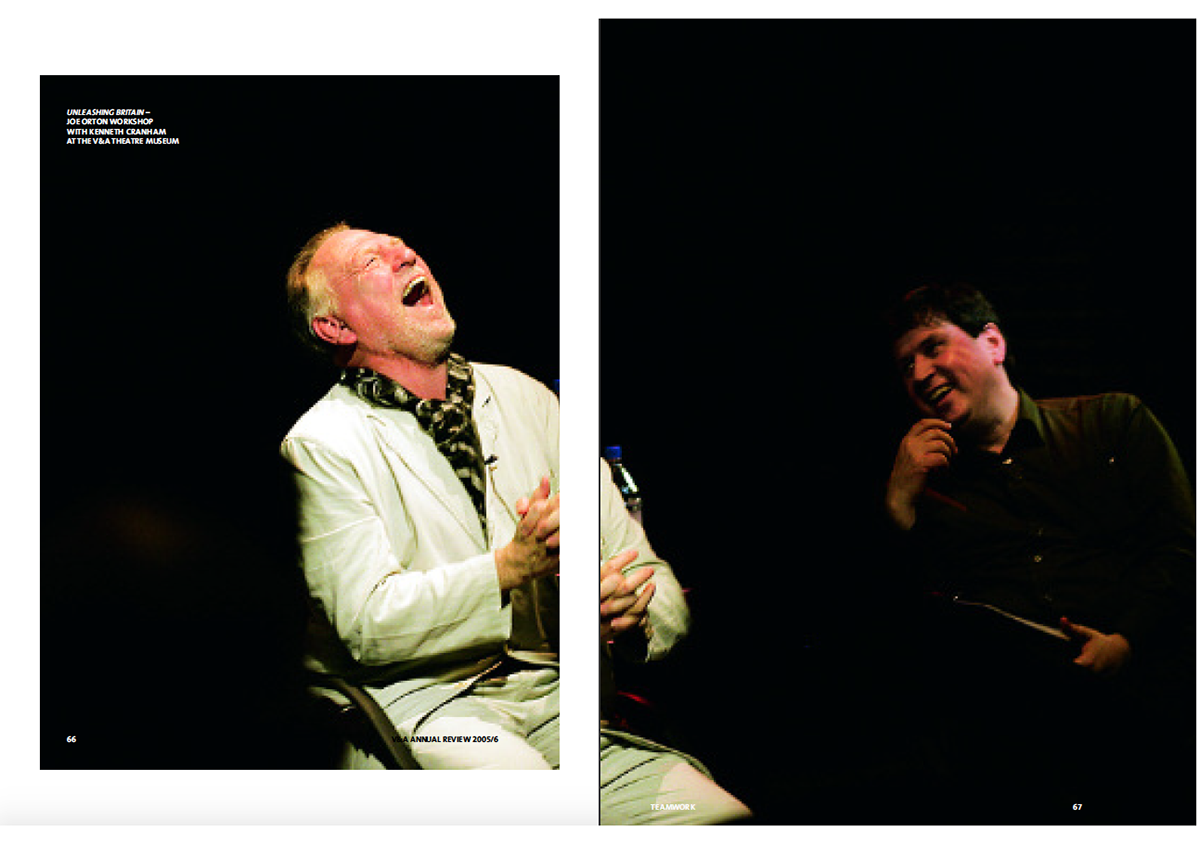

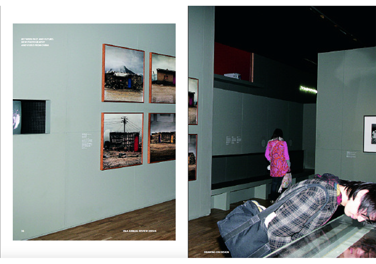
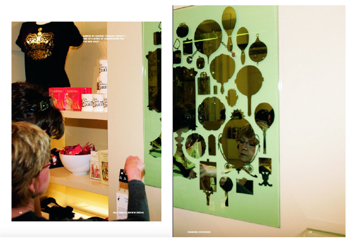
This is also an interesting choice since very few of the images are posed, studio pictures with controlled lighting. The majority of the images (photographed by Davy Jones) are reportage pictures of shows and objects from shows.
The use of the red spot ink in the type treatment and the style of photography create a spur-of-the-moment vibrancy to this report.
Back![]()
![]()