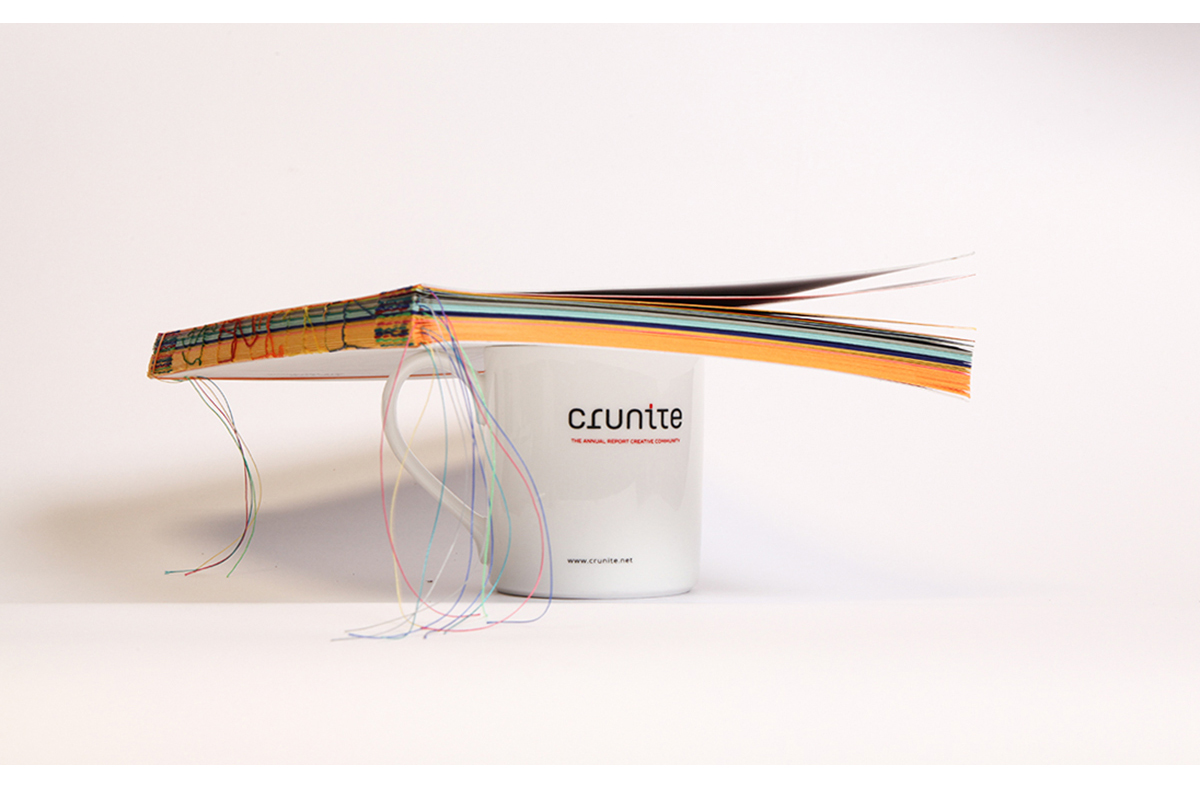
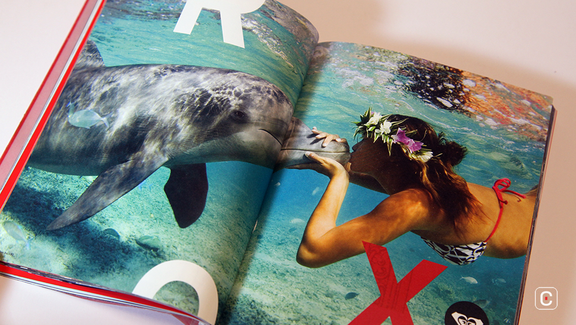
Just as Quiksilver the brand cut its own path, so does the report. This small (7-inch-tall) report throws convention to the wind and presents itself as a captioned book of photography.
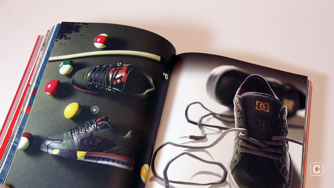
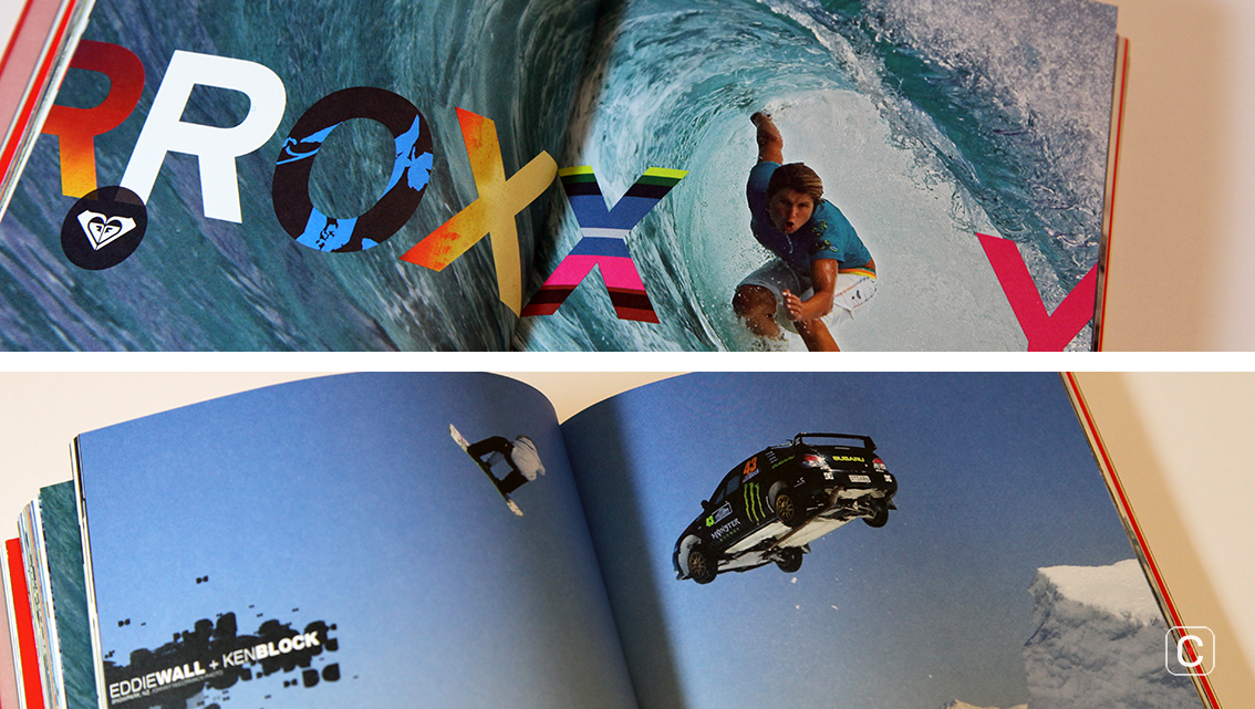
The type treatments vary – the content written for the report makes use of unaffected sans serifs, while the inclusion of advertisements adds a plethora of energetic typefaces and weathering effects, more usually associated with the brand. Given the number of typefaces used in the advertisements, it shouldn’t work, but it does.
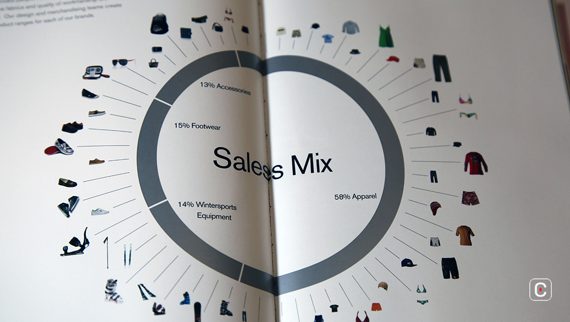
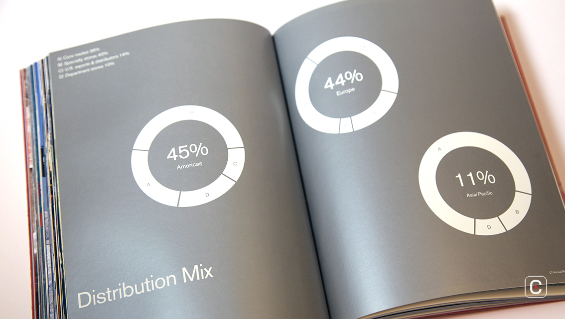
In terms of the rhythm of the book, again, disregarding convention has worked well for Quiksilver – in most annual reports the ratio of text to image is heavily in favour of text.

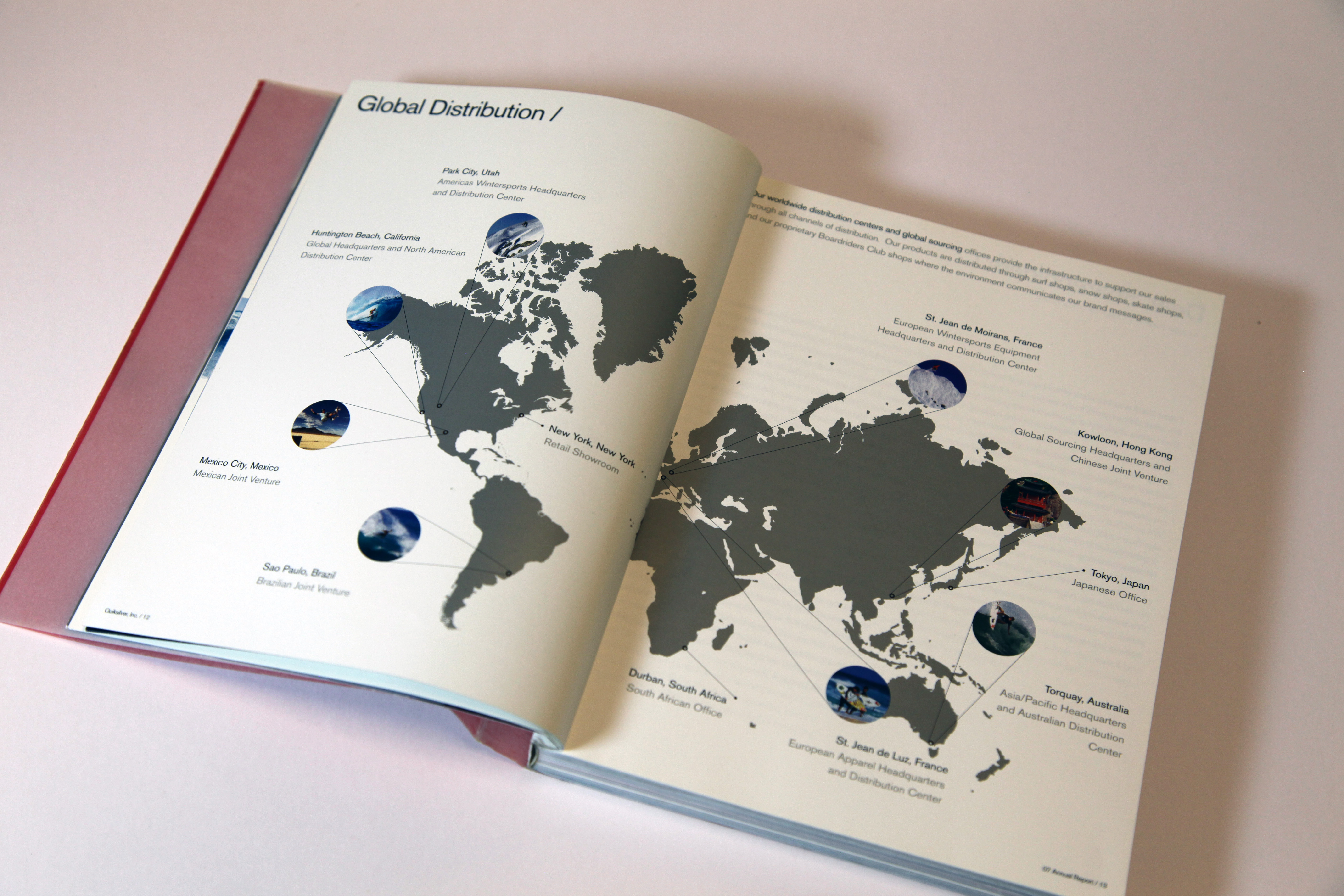
The restrained use of silver ink on the infographics draws the eye and provides a palette cleanser from the brightly coloured imagery to tell the story of a brand that never followed the herd.
Back![]()
![]()