
Fresenius is an European healthcare company with headquarters in Germany. Amongst the many healthcare-related services the company provides, it is known as being a pioneer in the provision of dialysis technologies to patients afflicted with chronic kidney disease.
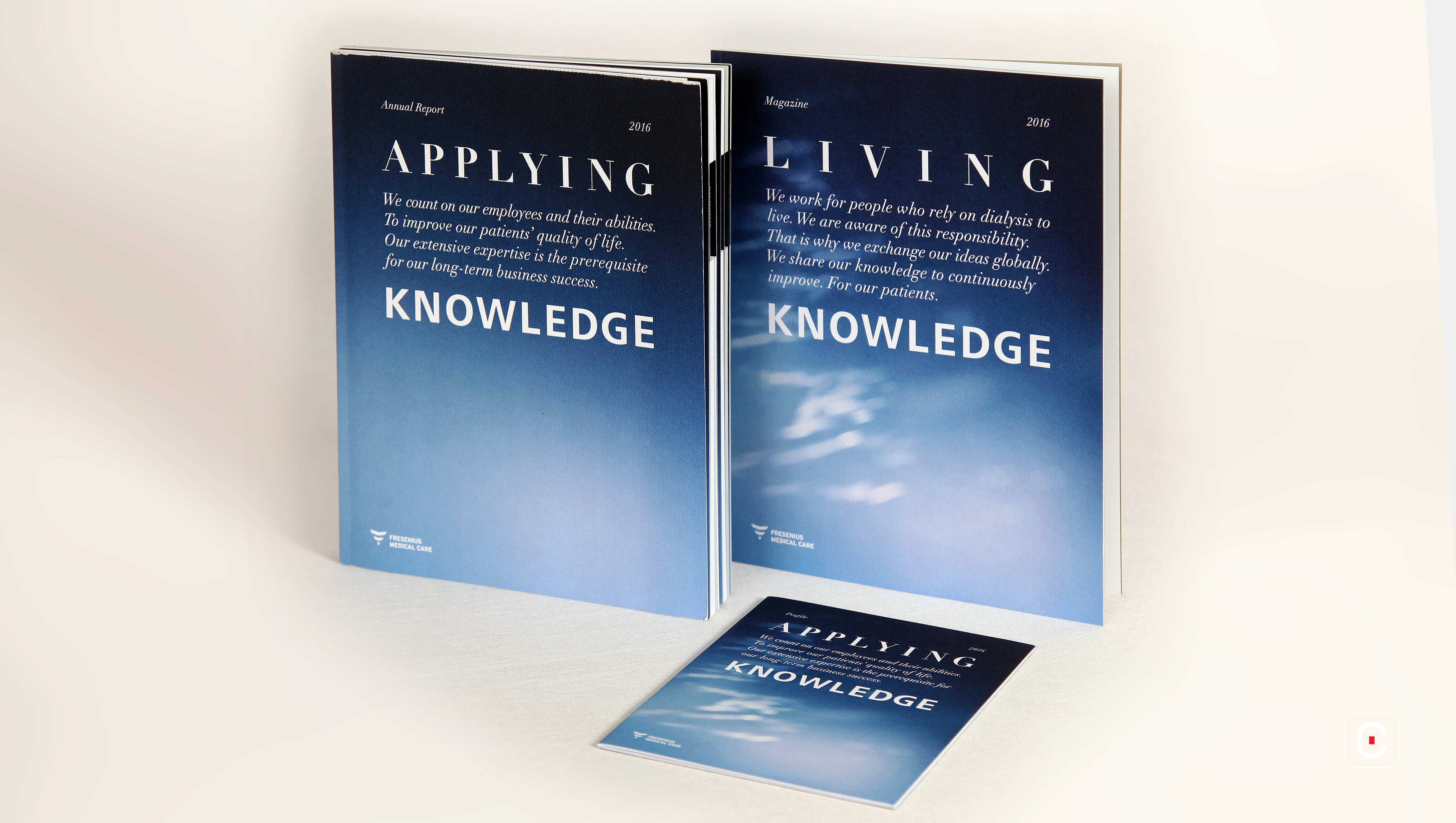
The 2016 Annual Report of this organisation is a compact publication that reflects the company’s spirit and the gravity of its work. The report consists of three parts- a financial report, a magazine and a quick read section containing profiles.
The report’s colour scheme is of black, blue and white. Gradient shades of blue are used on both the cover pages and the chapter front covers. Text is black when the background is white, and inverse when the background is coloured. The financials at the end of the report deport from this norm by using a greyish-blue background.
Interestingly, the report uses a mix of serif and sans-serif fonts throughout. The title of the report itself; ‘Applying Knowledge’, sees ‘Applying’ being written in a serif font and ‘Knowledge’ being set apart in sans-serif. Figures are printed in sans-serif. The report also employs an erratic mix of boldface and italics, and there appears to be no set rule as to which is used where. This has an adverse impact on the readability and navigation of the report.
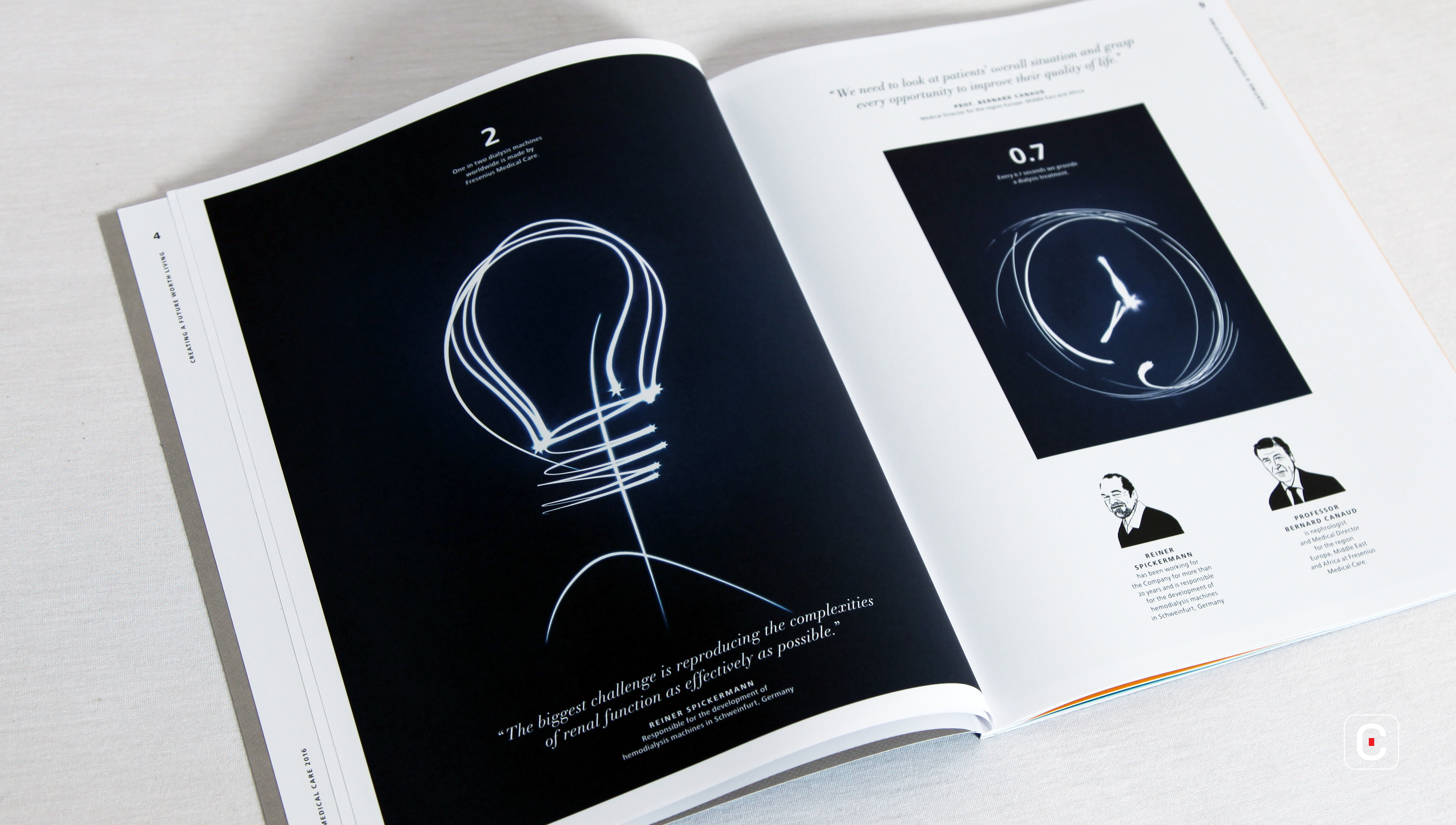
Important messages are also laid out using word collage, which takes the form of printed animations.

Conveying alternating imagery of X-rays and the trails left behind by sparklers, these simple graphics depict basic figures, such as a tick mark or a dollar sign. These few images are also the most eye-catching of the report, as they break up the monotony of the text.
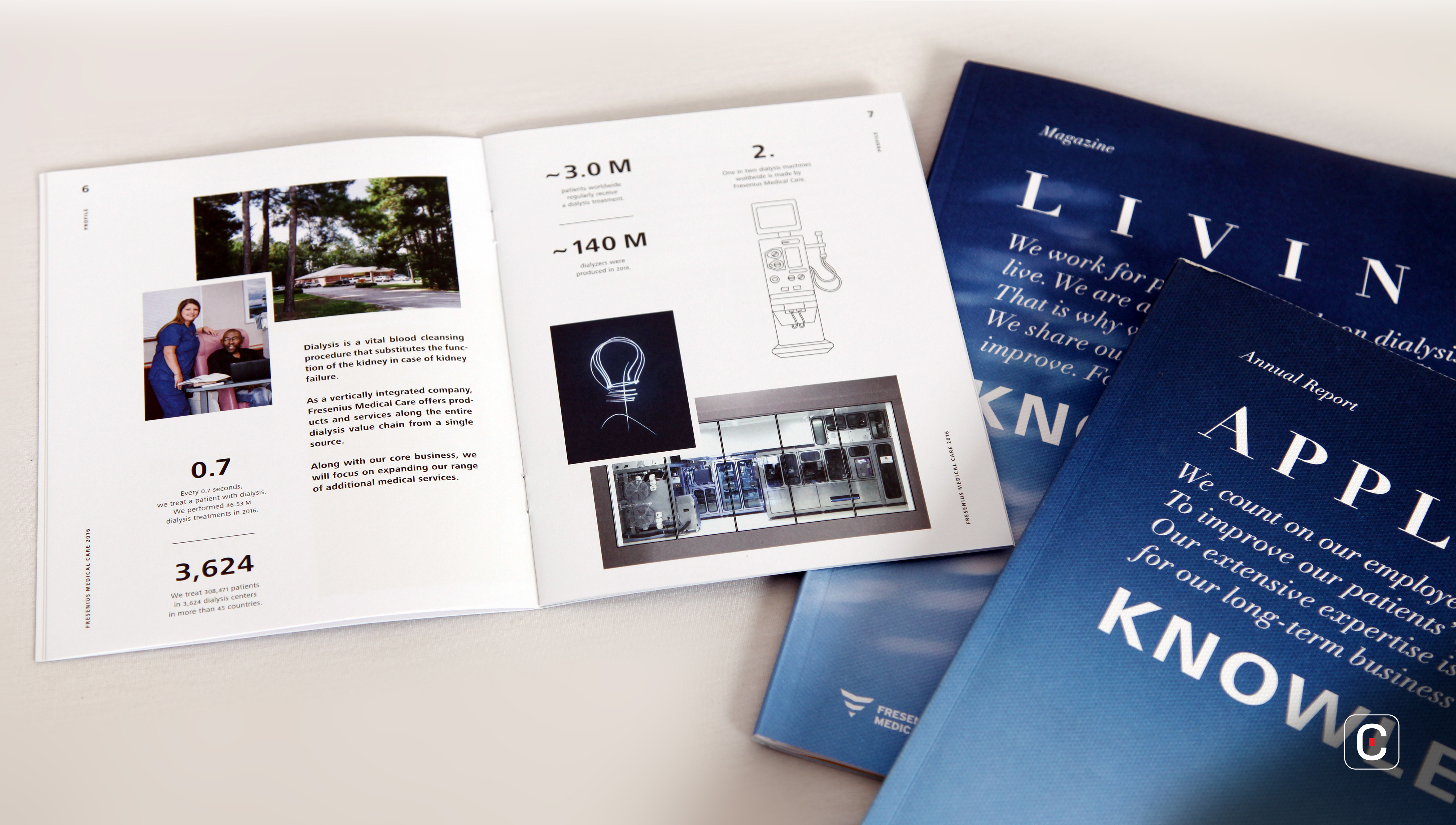
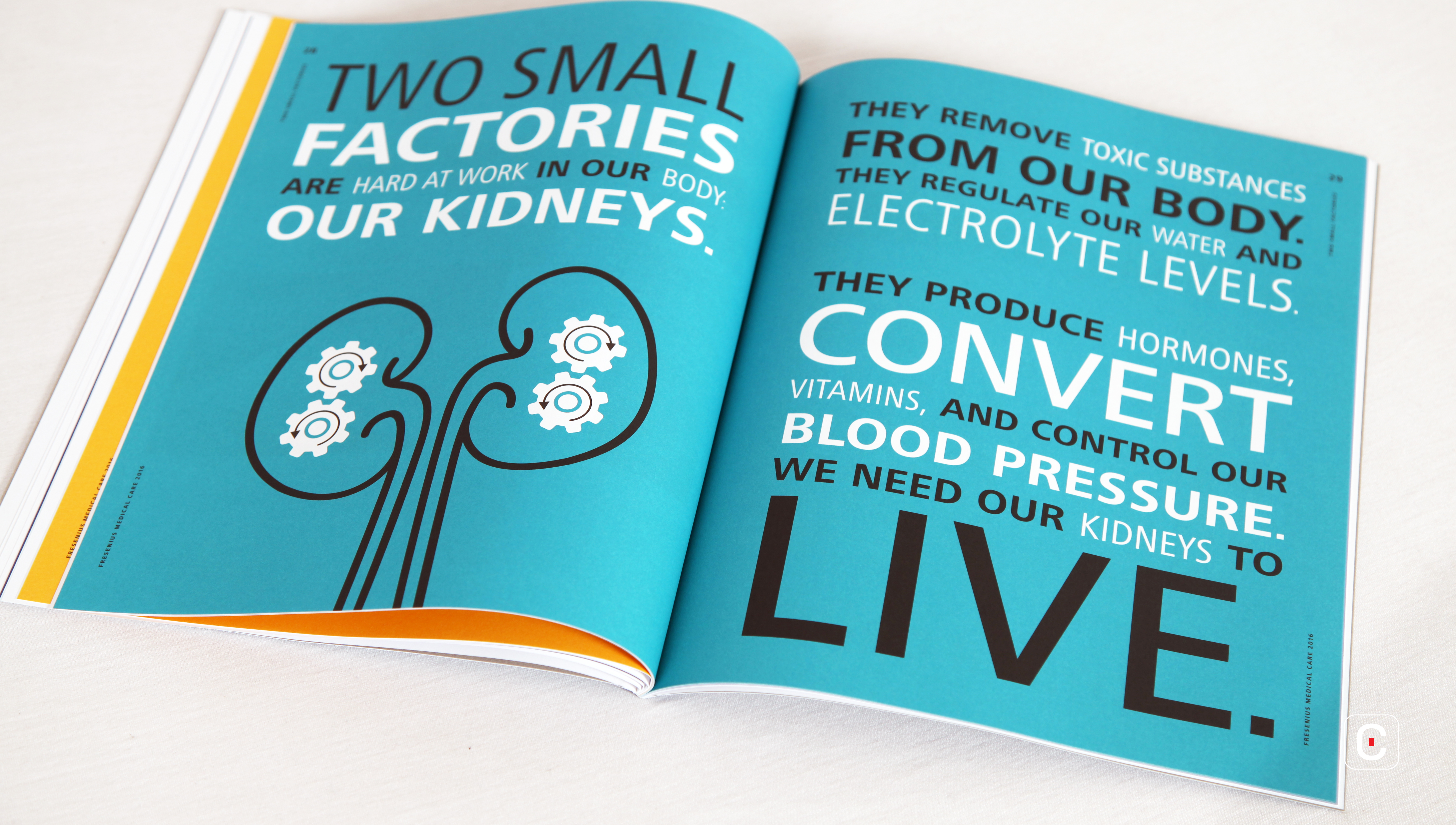
Infographics are few in prominence; and where present, are executed in simple lines. The most noteworthy include a world map of the company’s operations; and interestingly, in the report’s glossary at the end, two figures which demonstrate aspects of kidney dialysis. Charts blend seamlessly into the text in their use of black and blue.
The report uses a simple, unadorned style of writing that emphasises substance over style. However, the chairman’s address employs loftier language as it talks about the company’s achievements and its future goals. The message is written in the first person, to further a personal touch. The rest of the report employs a mix of first and third person in its reporting.
Another distinguishing feature is the presence of a glossary at the end, which provides useful explanations on the scientific and medical terminology that appear throughout the publication.
The printed report uses FSC-certified paper and is further designated as being carbon-neutral.
Overall, the report appears to showcase a lack of consistency in most aspects, from the colour scheme to typography and writing. The company may have produced a simple publication true to its aims, but it certainly is not a memorable one.
Back![]()
![]()


