
The Visio Corporation was an American firm the specialized in diagramming and technical drawing software. It made products for Windows95 and was eventually incorporated into Microsoft. Their 1997 report is heavily influenced by the design of Windows95 and is a joy to look at, given how different the typography and visual layouts of the 21st Century are, from the heyday of Windows95.
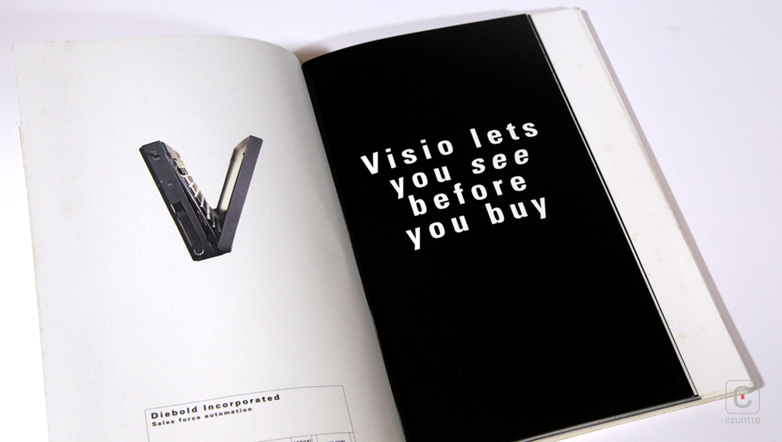
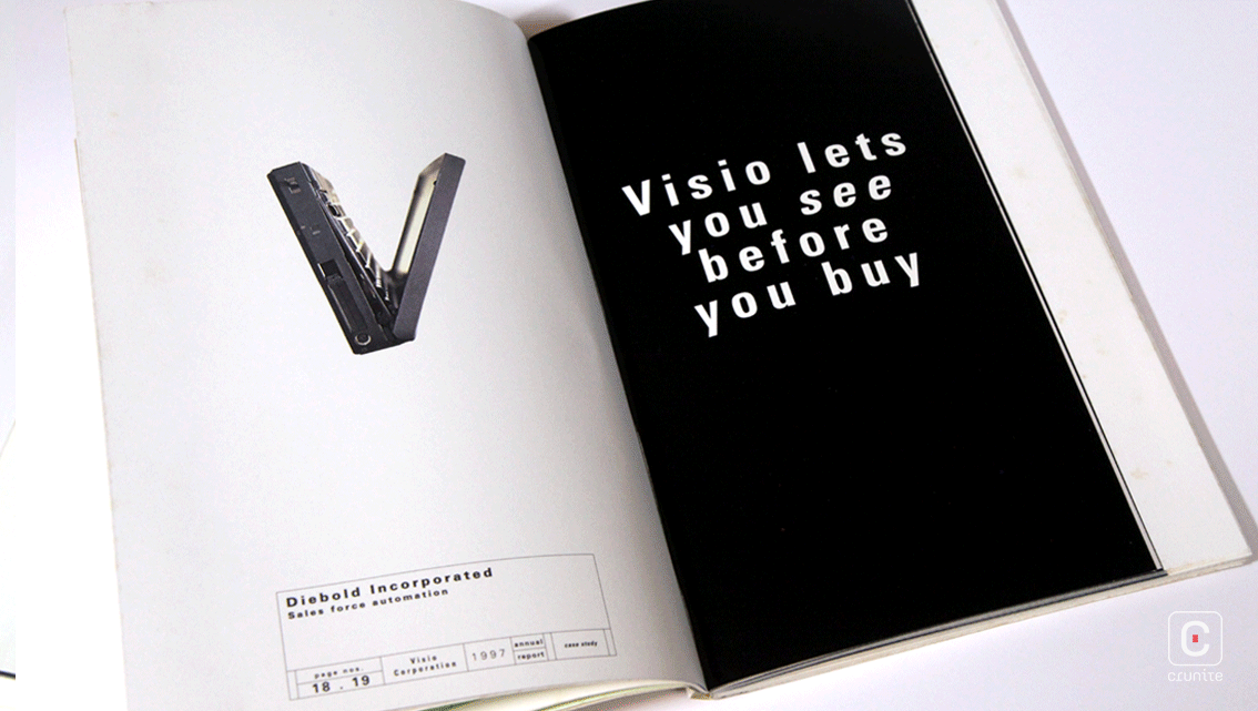
Navigating these pages is tricky but visually rewarding given the approach to photography – a mix of saturated, grainy images, glossy environmental portraits of engineers and iconic objects from the era – a boxy computer monitor, a mouse, an dial-up modem cable.
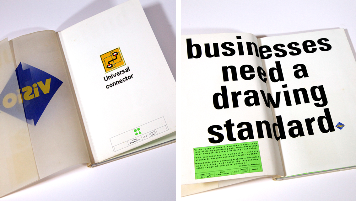
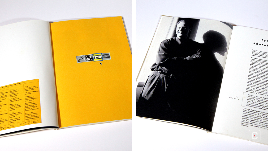
Type treatments echo the heavy, thick, liberally kerned sans serifs of the 90s – a little hard on the eye, especially when there is a lot of text on the page. The report makes use of a single typeface in multiple weights but given how heavy the typeface is, the distinctions are subtle. Important text is encased in the dialogue boxes Windows was known for, but also riffs on the design of Apple computers.
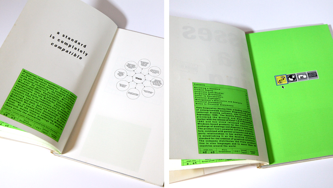
Colour is used sparingly – sometimes to highlight important text (a near-fluorescent green and orange) and at other times, in richer colours (deep blue and purple) to mark a new section. The palette isn’t entirely coherent but has its own charm.
This idea of drawing/diagramming is carried though into the portraits section by linking each image and therefore making the section do double duty –showing us who runs the firms and also their relationships to one another – it’s a clever use of space. The thin line which forms the bounding boxes in use through out the report carry through into the financial section and while this is coherent with the rest of the design, it does squash the financials together a little.
The Visio report is a thing of its time – true to the esthetics of the day and though a little jarring to read now, it is a good report to study and learn from.
![]()
![]()


