
Pearson is an enormous, multinational publishing group that includes such giants as Penguin Publishing, The Financial Times and Pearson Education (the largest education company in the world). With such a vast impact on the world, you may well expect their annual report to aim for size and pomp. The 2002 Pearson report goes in entirely the other direction.
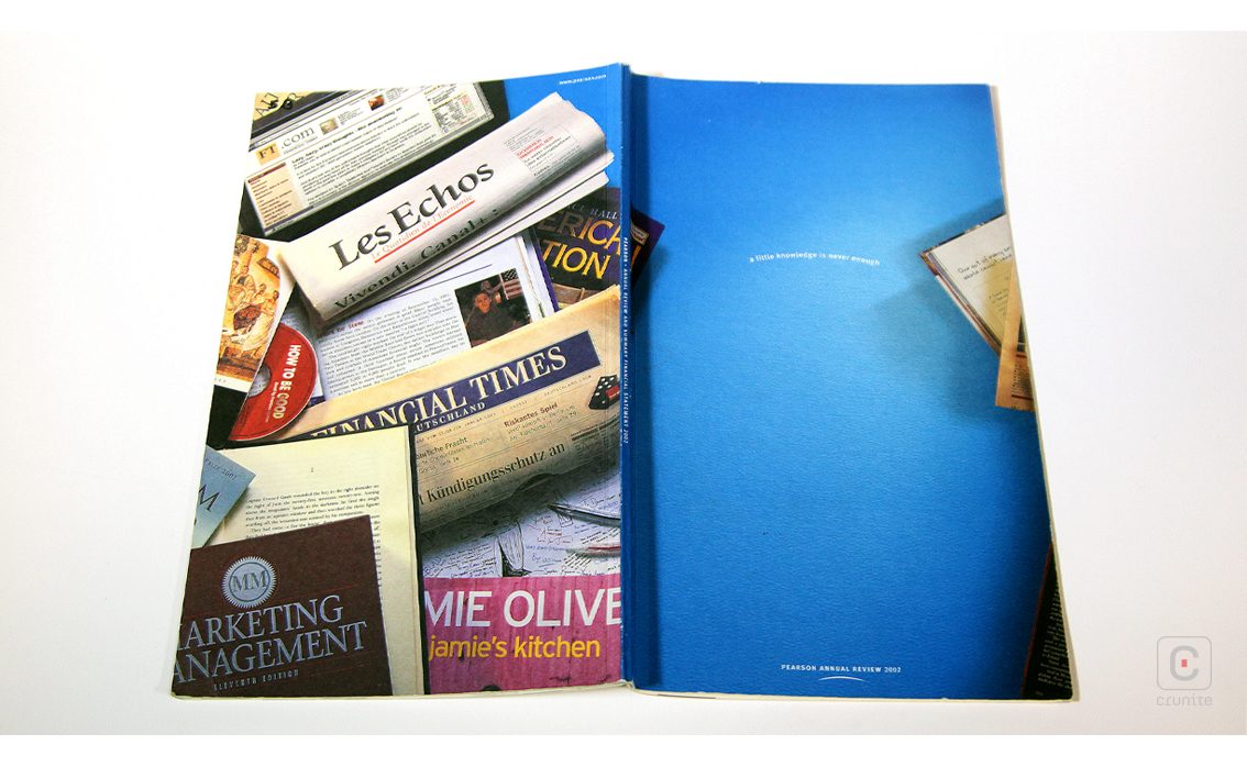
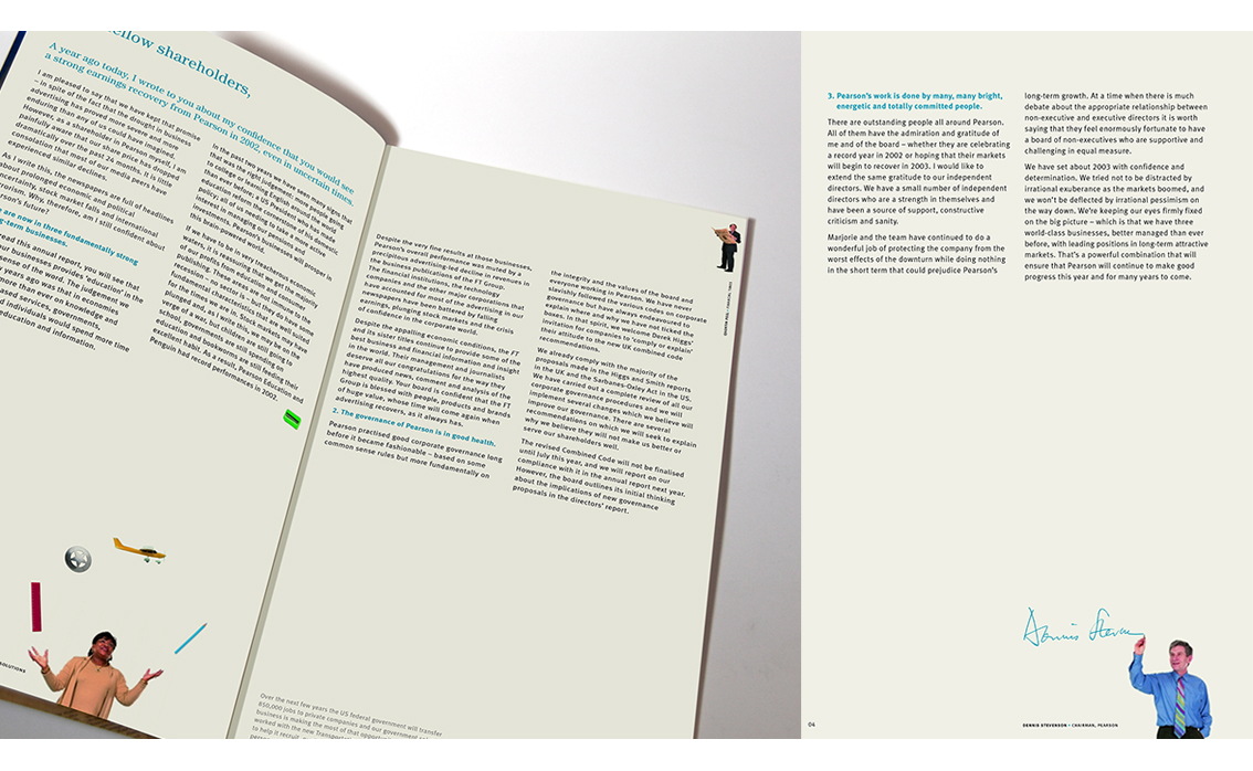
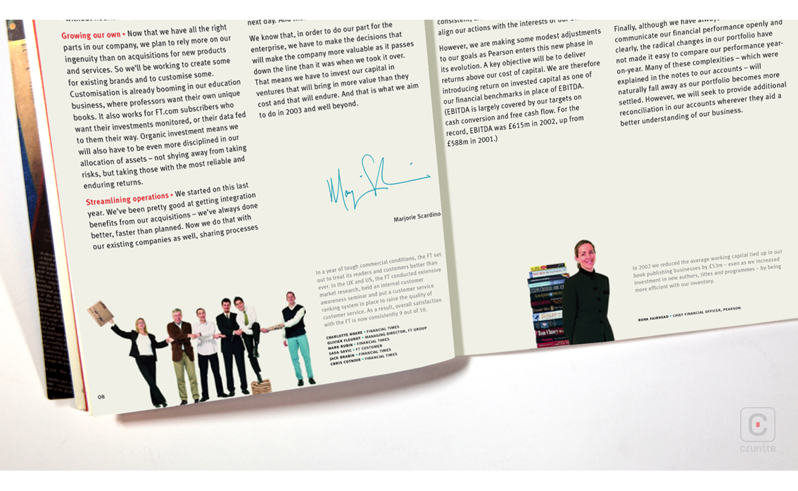
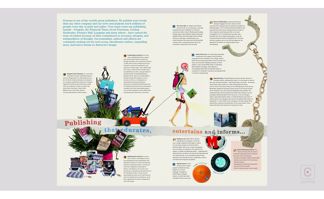
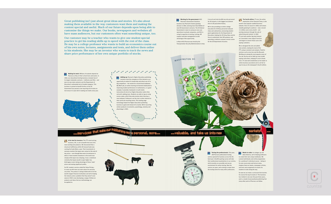
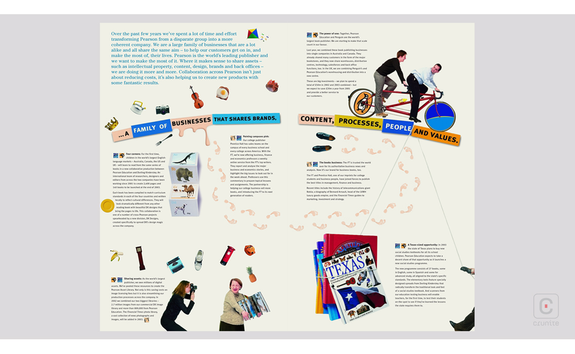
This report is a slim volume both in number of pages and page dimensions. It is an easy book to hold and read. Very little speaks overtly to the scale of the company and it is a refreshing change. This idea of underplaying its scale takes the form of a kind of visual humility. The portraits of staff are an excellent case in point – tiny pictures of jolly people walk, run or pose within the giant ‘frame’ of the page. It’s such an unusual approach it encourages the reader to peer at the images and then ‘zoom out’ again to read the text, constantly engaging with the book.
Type treatments reflect this idea as well – lengthy captions are set in quite small type, encouraging the reader to physically move the book closer to engage with the content. In its way it this report does convey an idea of scale, cleverly hinting at just how large an entity Pearson is.
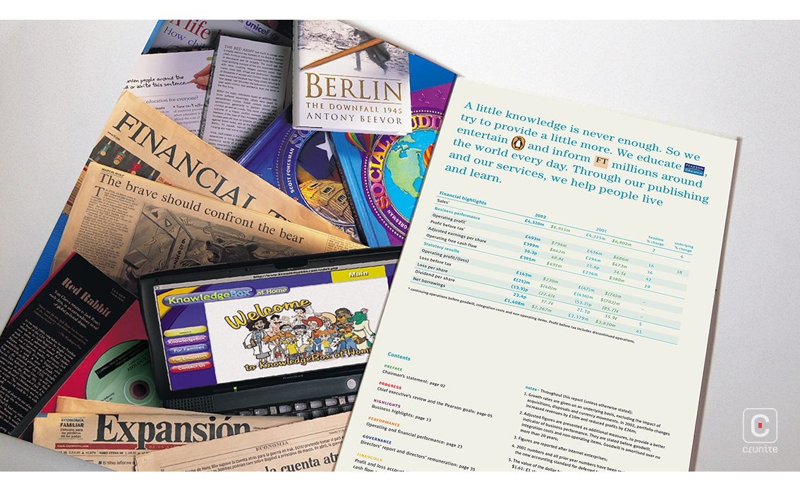
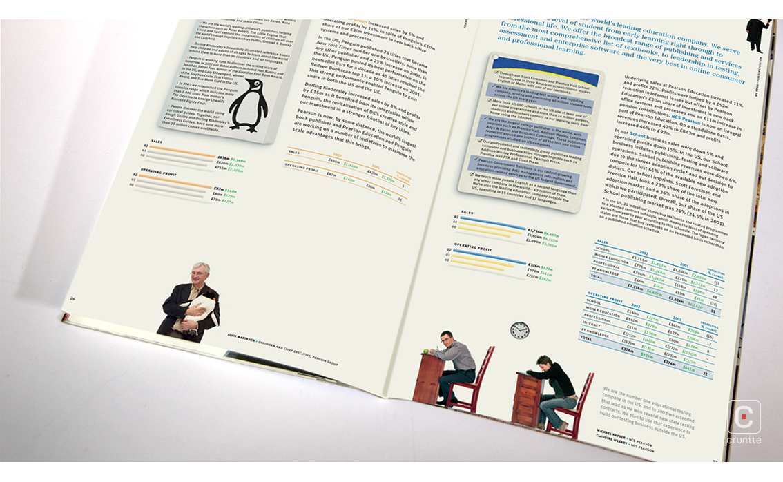
Navigation is made easy via the use of solid colour on section-opening pages. These fields of colour also providing a calming interval between pages packed with tiny people and multiple small images. The financials are compact and easy to navigate. The tiny people show up here as well, making for a seamless transition between thematic pages and financial information. An unusual approach and one that works well.
Back
![]()
![]()


