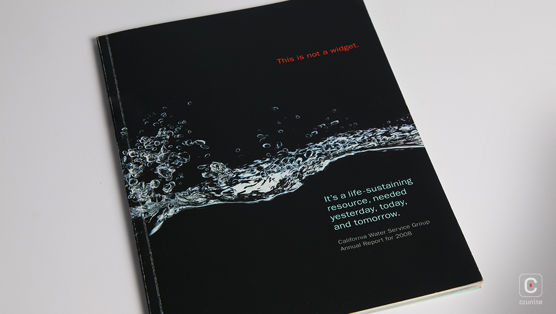
The California Water Service Group’s Annual Report of 2008 is well written and has a simple, effective design. The cover shows a splash of water in midair against a black background, accompanied by the company’s mission, subtly brought out by the cover text.
The history of the company is described textually and visually over a series of double-page spreads, accompanied by a double-sided, extendable flap.
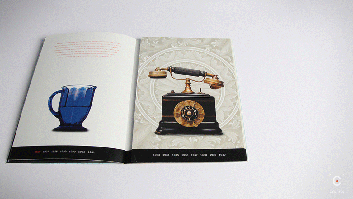
It is interesting to note that the great depression (1933-40) is not covered in the text although the it is referred to – in retrospect – under the years 1941-1948.
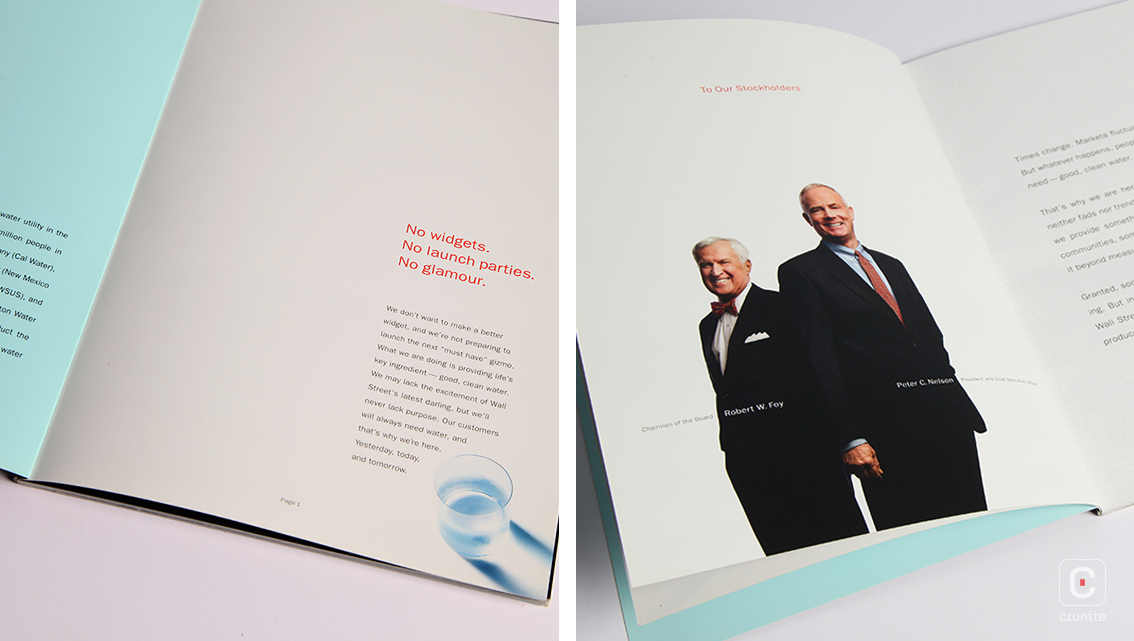
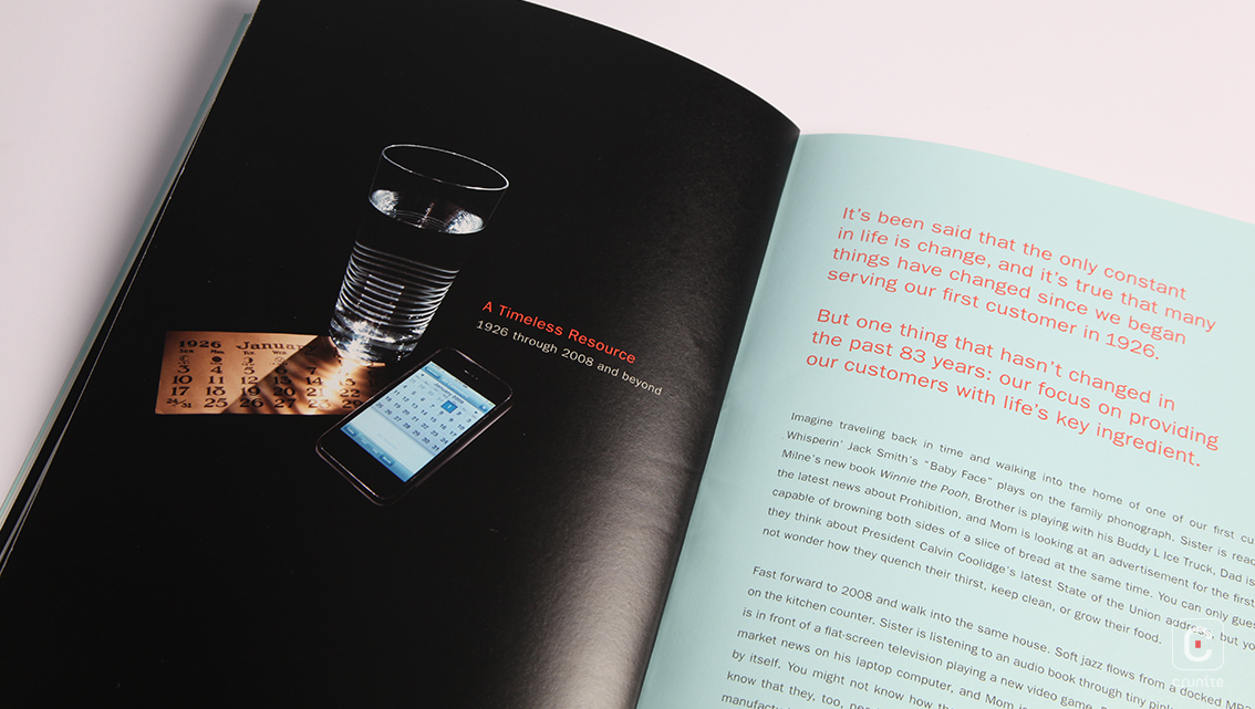
The report features a notable flash-forward to the present: one page carries a description of one aspect of the company’s operations –customer service, for instance. This is accompanied by a thematic image –a service man’s helmet or a coin– while the other pages carry photographs of technical aspects of operations and a short description, providing information about CWSG’s employees.
Overall, the report seems to successfully bring out its theme, providing a sense of class and timelessness to an element as familiar as water.
![]()
![]()