
Dottikon is a Swiss company that makes complex chemicals for the pharmaceutical, biotechnology and chemical industries. They specialize in hazardous chemical reactions.
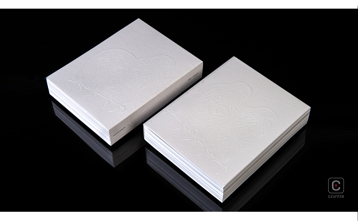
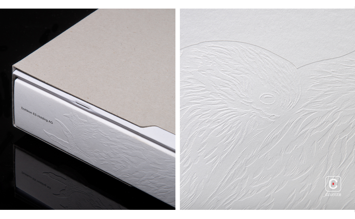
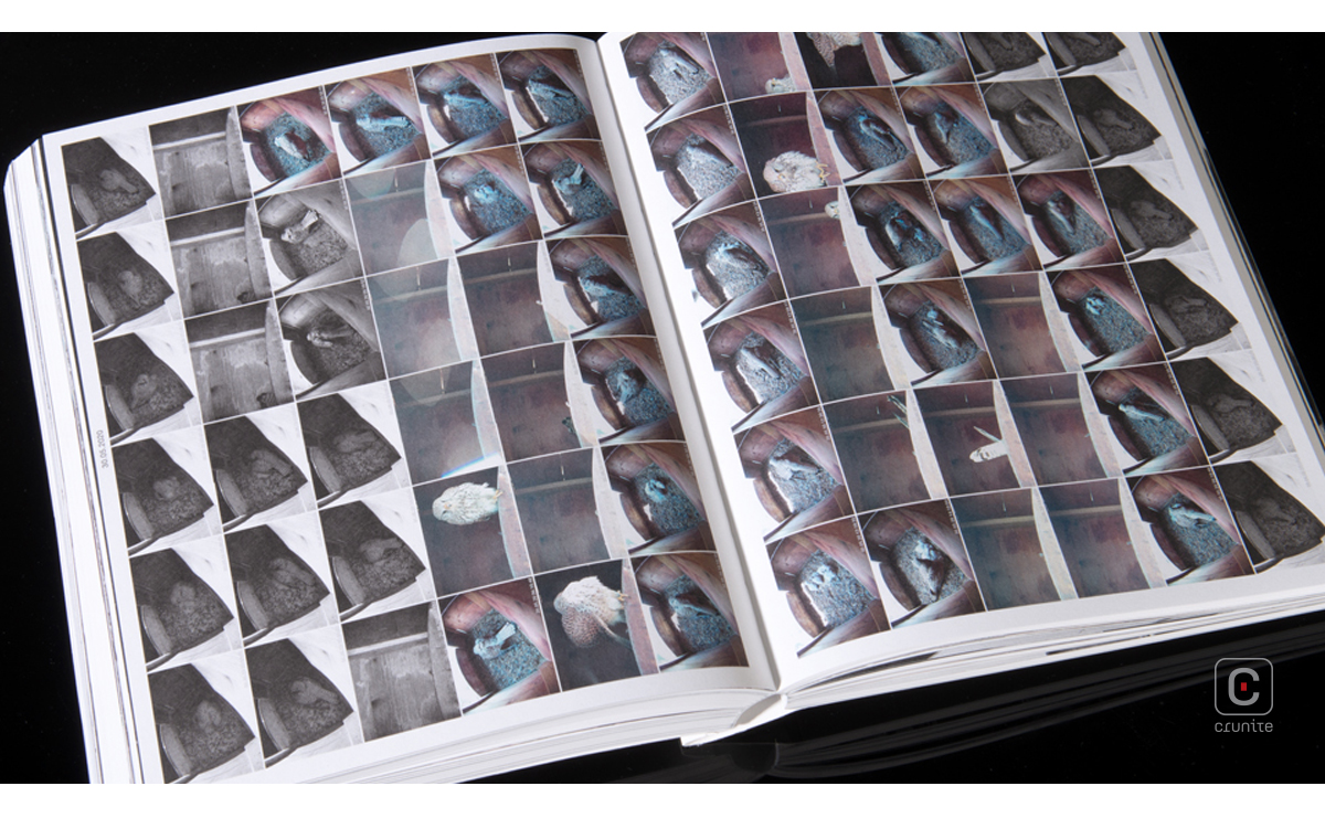
Presented as two books in a simple slipcase with a delicate blind deboss, the 2020 report is a brilliant expression of controlled contrast. One book, the report proper, is slim enough to be saddle stitched. The other, a book of photography, is enormous in comparison.
The two books have aspects in common. They follow some rules of scale, in order to fit the slipcase. They echo treatments of negative space, typography and, to some extent, grid. There are similarities also in voice — different people write the two books, but the writers share a sensibility.
Within these constraints, the two books are vastly different. One is rich in information, the other is sparse; one makes for leisurely reading, the other is fast; one is still, the other is life and movement.
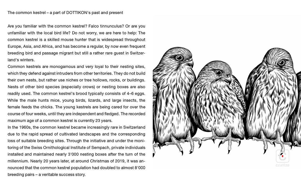
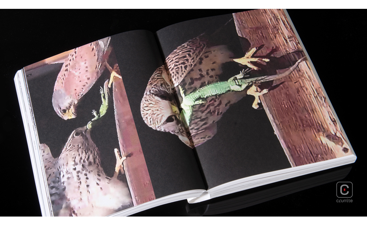
The photography book has a friendly, frank, one-page explanation of the idea behind its making. In of itself, it is a surprising and excellent idea: In 2011, Fredy Rüttimann, the Head of Training (Production) and self-confessed bird-lover resurrects an old Swiss Scheme of maintaining breeding boxes for the common Kestrel (Falco tinnunculus).
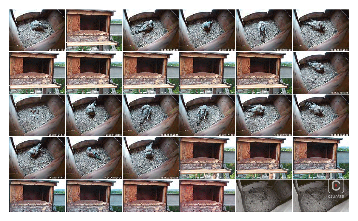
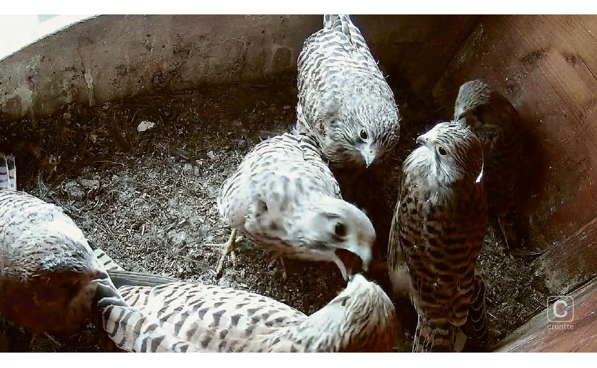
He has cameras monitoring the kestrels and has these connected to a live stream anyone in the company can access. Still images from this documentary of the lives of common kestrels are then chosen to form the entirety of the photography book. Rüttimann’s introduction is enthusiastic and authentic, perfectly preparing the reader the wonderful images to follow.
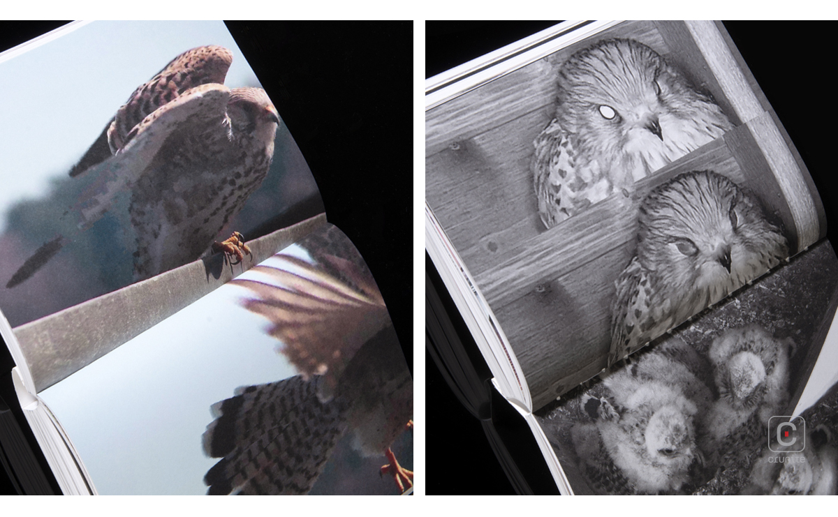
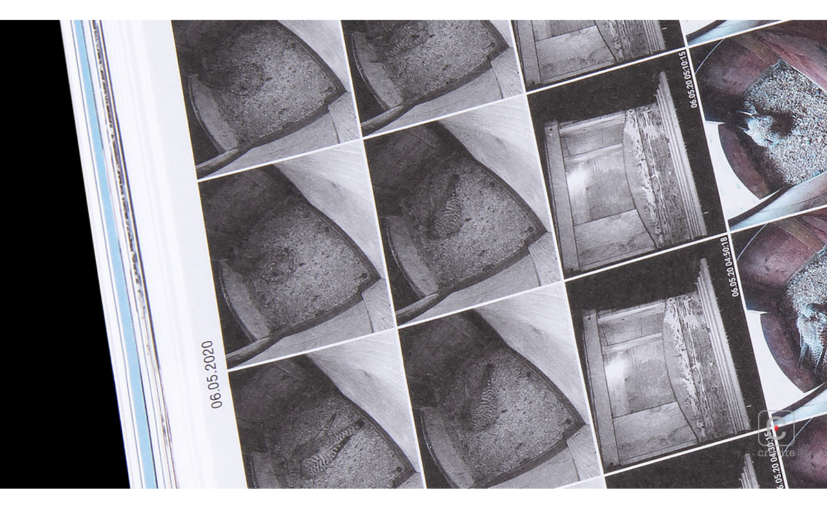
What follows is followed by years of camera footage, frames arranged in neat rows, like film negatives, with white space to ease the eye between sequences. The generous image selection means a reader can experience something of the thrill of seeing a young Common Kestrel grow, compete, breed and raise their offspring.
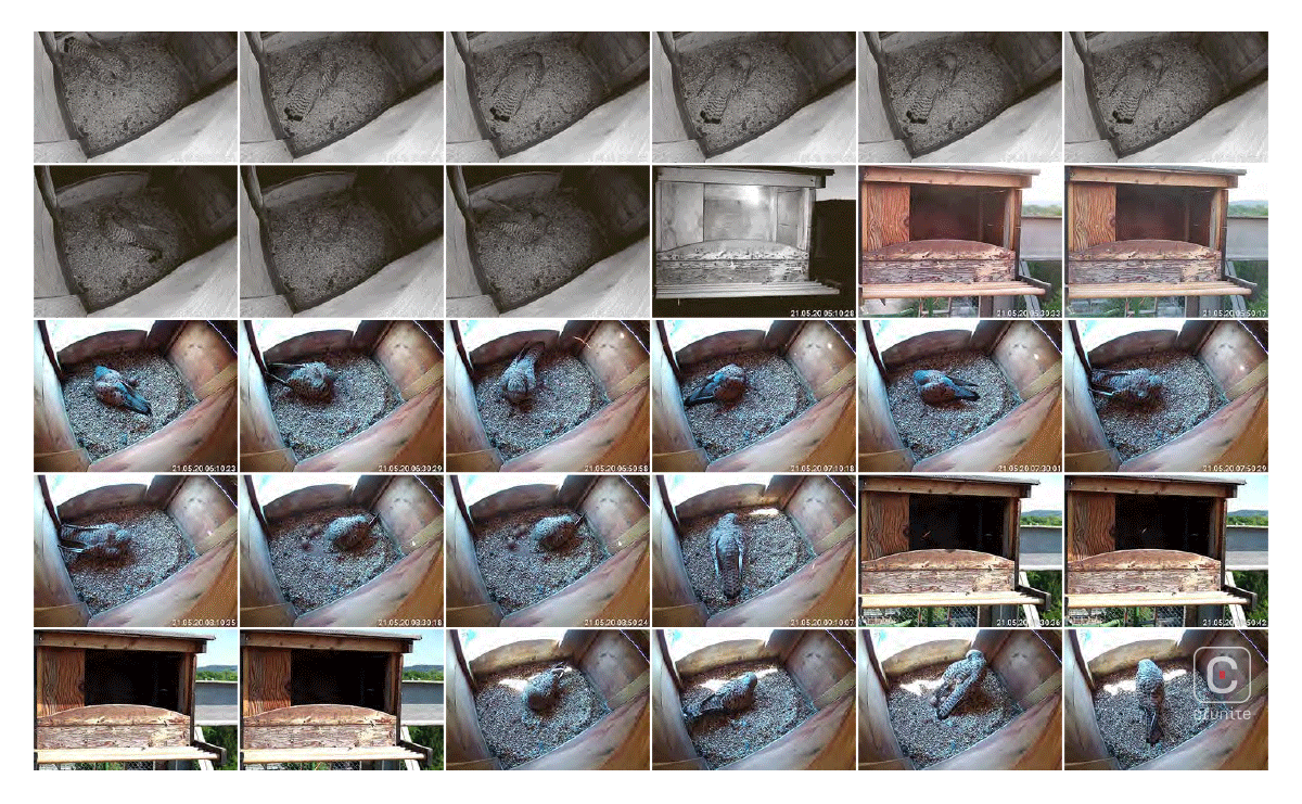
This book is hugely information-rich. The video generated was unlikely intended for print at all, let alone as magnified images (some of which are applied as full or double-page spreads). The stills images carry digital grain, motion is often blurred, colours bleed. And these seeming defects only work to enhance the experience of seeing the lives of these birds. It’s an inspired design choice.
The annual report proper is a simple, efficient thing. It features a two-colour palette, plenty of negative space and an unassuming type treatment. The text blocks are force justified but the hyphenation is thorough and the reading experience isn’t hindered. The design of this book is, in a way, politely directing the reader back to the photography book – not that it needs the help. Dottikon has developed an excellent approach to presenting an annual report – one that is worth studying and celebrating.
![]()
![]()


