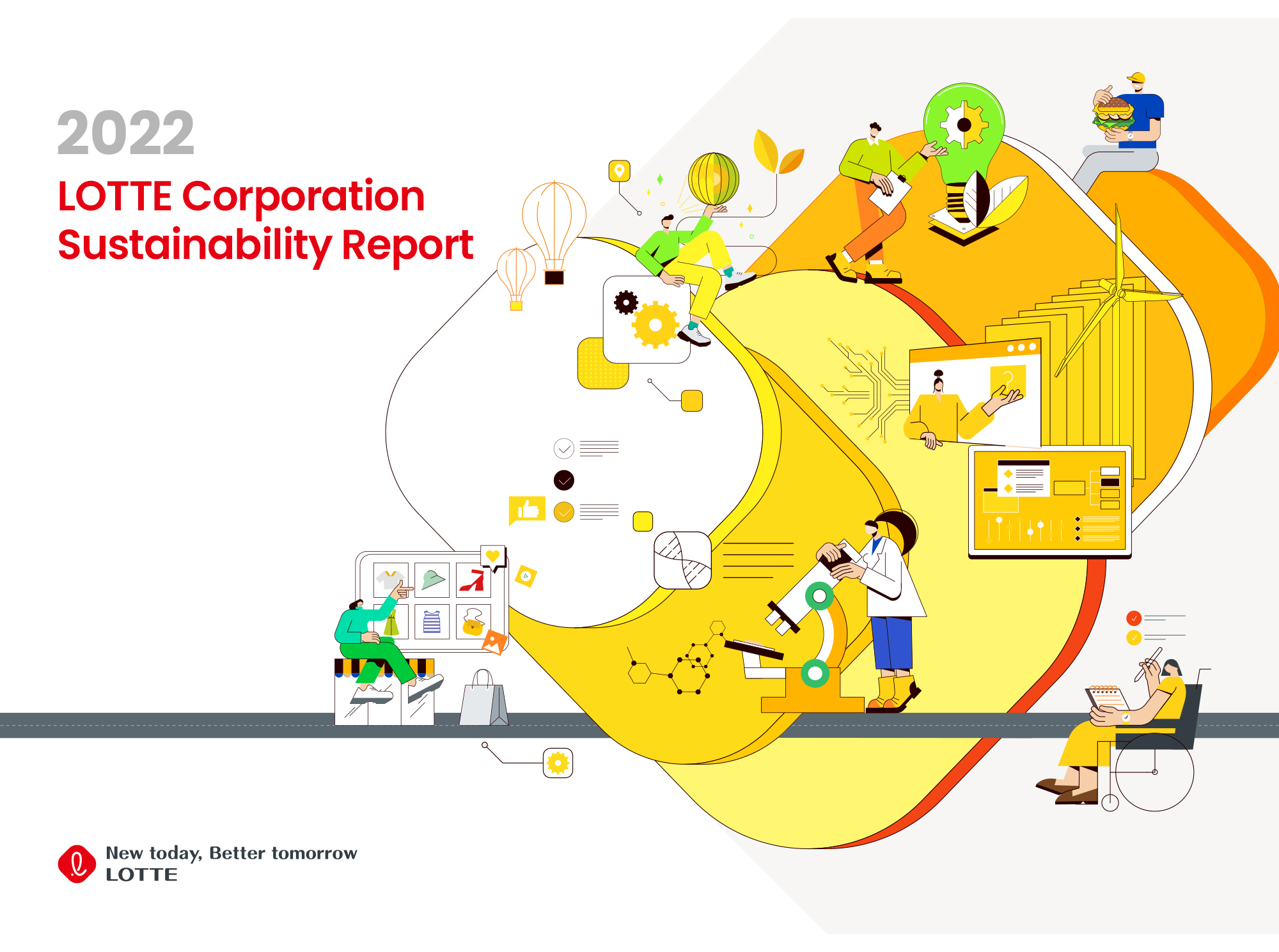
Grupo Bimbo is an award-winning, multinational, Mexican food company formed in 1945. Their 2021 annual report is a fine example of using simple tools to create a sense of warmth and vibrance.
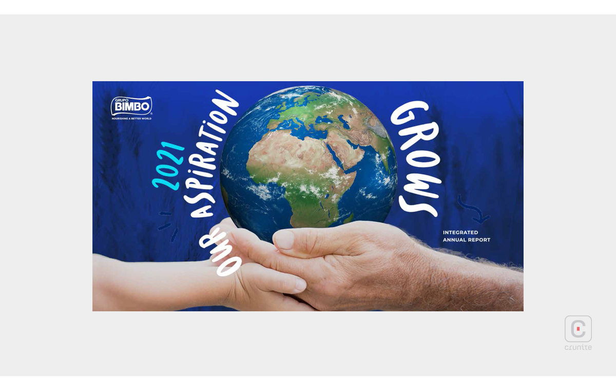
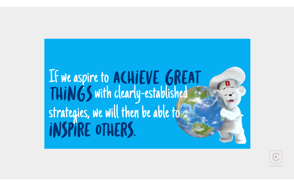
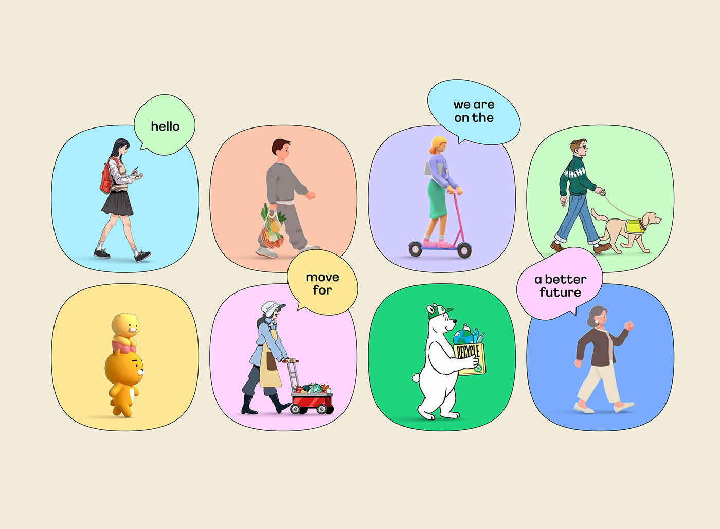
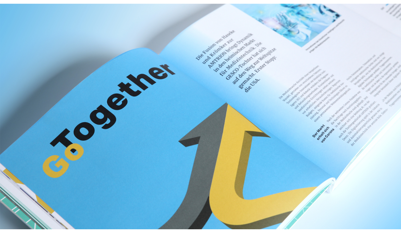
The report relies on a loose, narrow, sans serif typeface with a hand-drawn feel for its titles and infographics. This typeface interacts closely with the visual elements on a page – wrapping around photographs, or superimposed over images. This is carefully done, to create a sense of closeness, even friendliness.
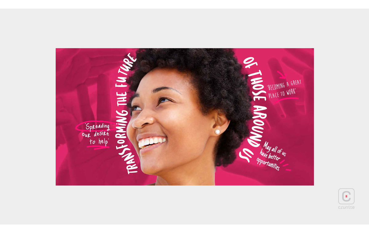
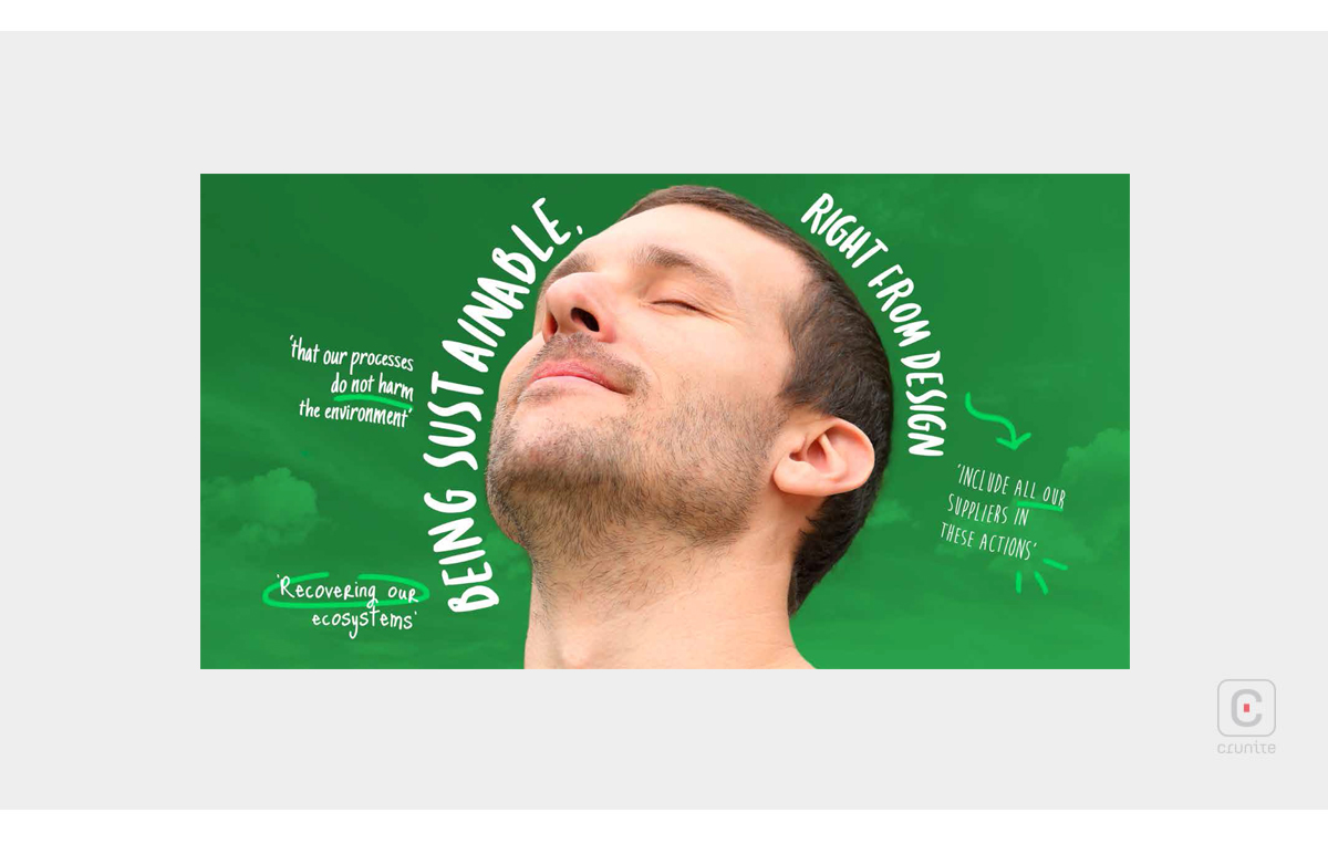
The colour palette, though wide, is chosen for its energy and warmth and reflects the work of a food company, suggesting a hand-made quality to the food. Complementary tonal variants of each colour reinforce the energy of an individual colour.
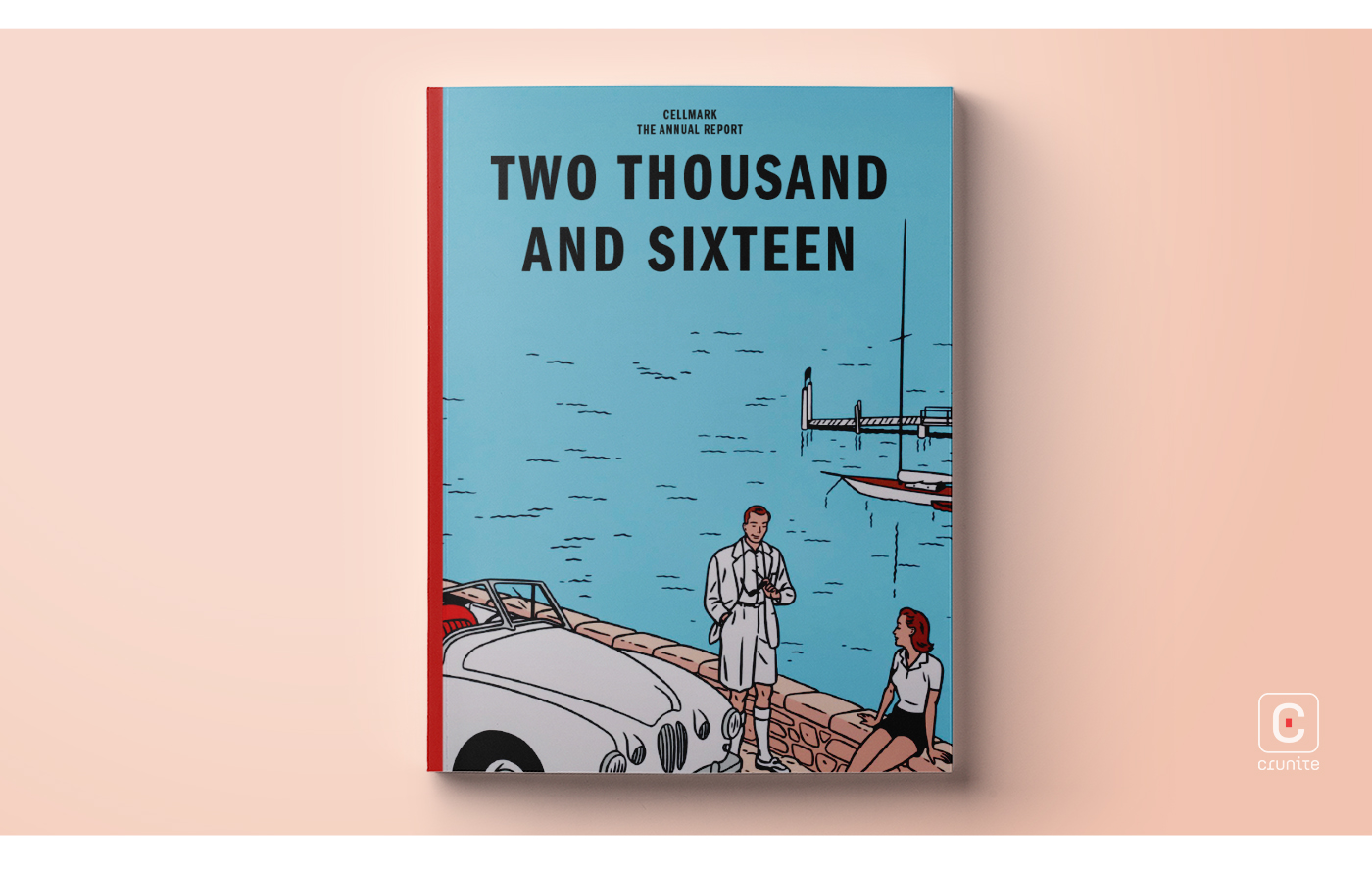
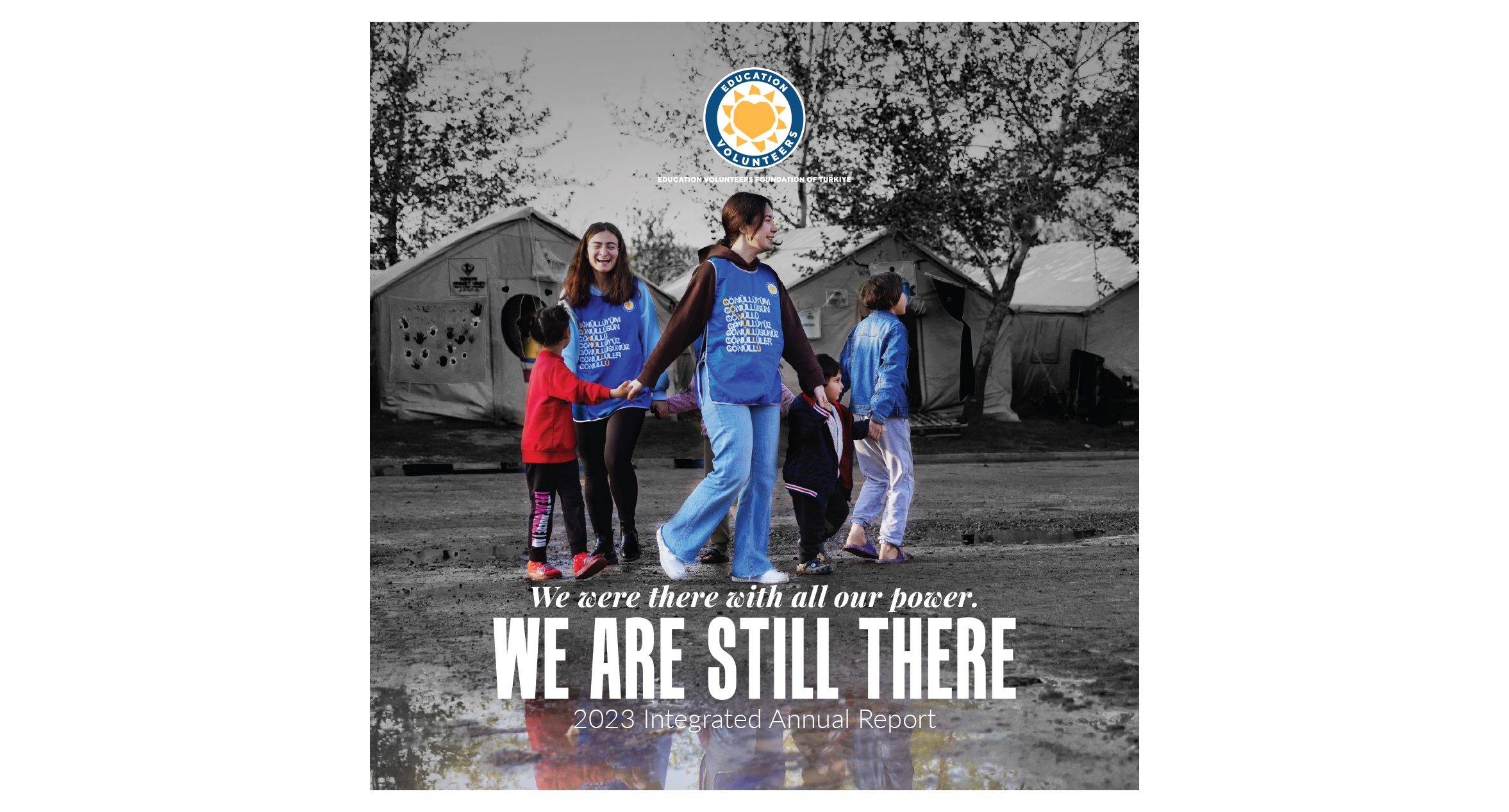
For the most part, portraits and food photography are incorporated with backgrounds cropped out, while some photographs are used with a colour overlay, filling the entire page. These techniques help create depth, as each design element interacts with others in a logical way, creating plausible fore-, mid-, and backgrounds.
Images and text boxes are stylised to gently echo the pointed corners of the company’s logo – a nice touch that does not draw undue attention to itself. The unusually narrow and wide page dimensions of the report also echo the shape of the logo.
In the often staid world of annual report design, the warm, energetic Grupo Bimbo report is a welcome change.
![]()
![]()