
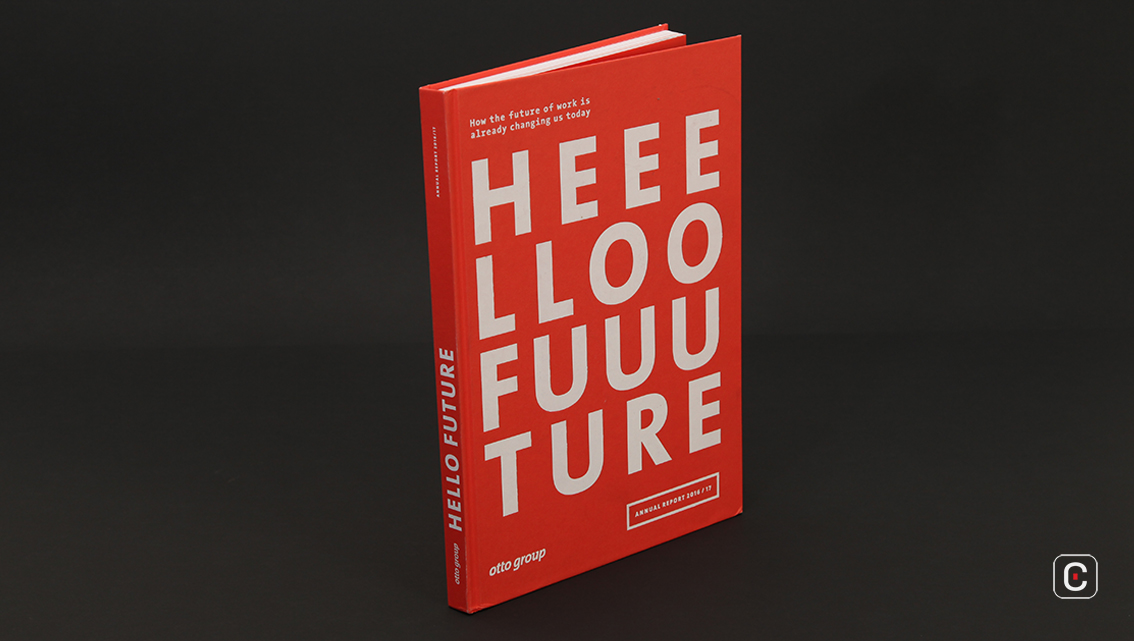
One of the world’s largest online retailers, The Otto Group makes a bold (pun intended) statement on the cover of their 2017 annual report – “HEEELLO FUUUTURE”. It may be also read as a ‘Hurrah!’ attesting to the ingenuity with which this Report is designed.
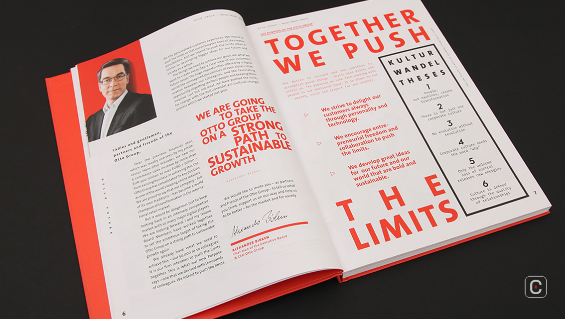
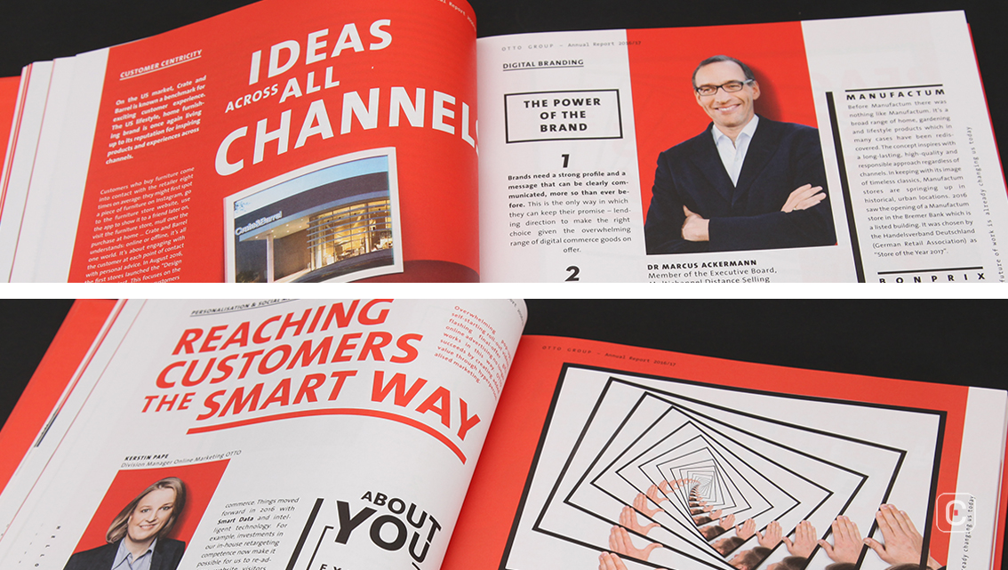
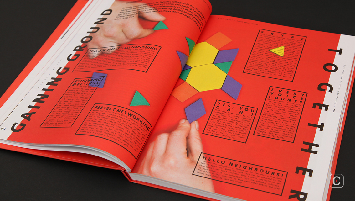
One of the most striking visual features of the report is its typography. Various typefaces and innovative word clouds are used consistently. Speech bubbles, text boxes, open paths, and others are also used and contribute to the pleasing visual effect. Though pages are packed with content covering almost 90% of the space in the Report, they do not feel cluttered owing to a careful calibration and kerning of text and other graphic elements.
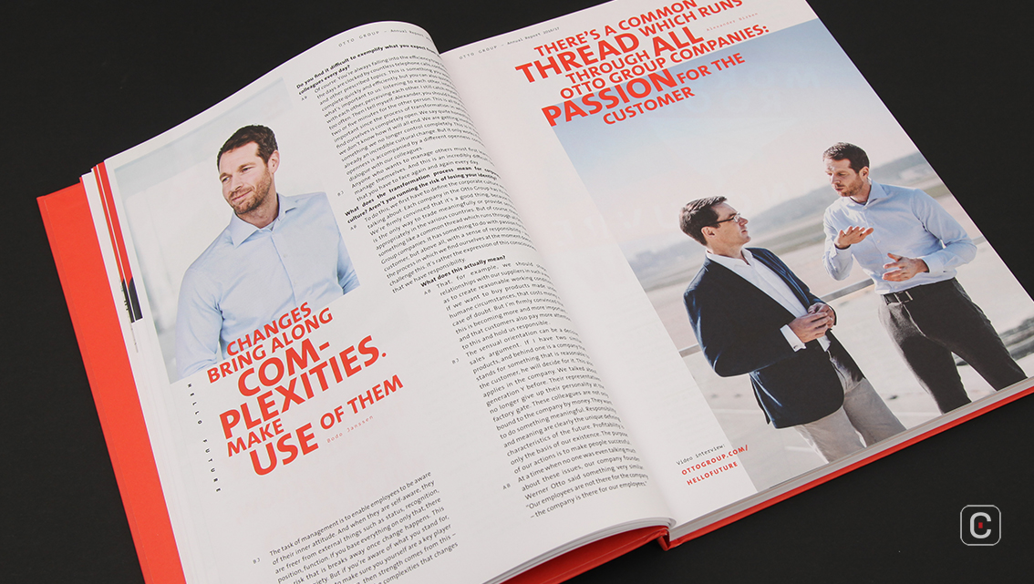
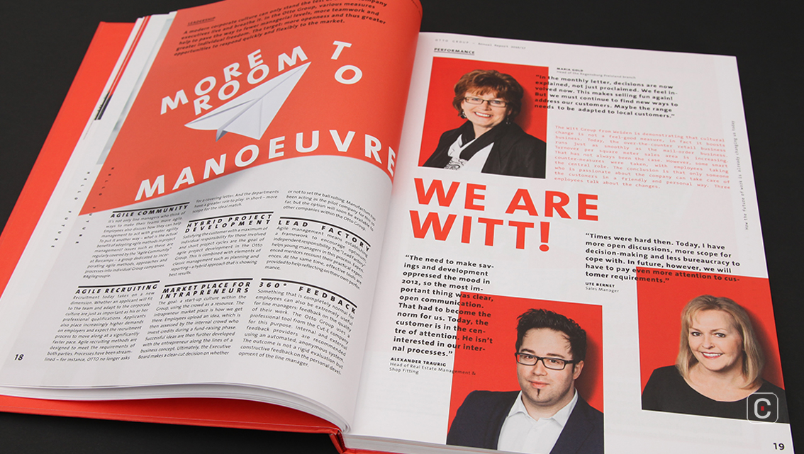
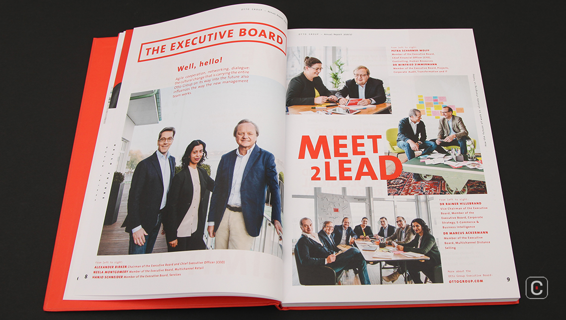
The photography is a novel aspect of the report. Panoramic pictures of Hamburg’s alluring sights including Flughafen Hamburg (airport), Elbphilharmonie (concert hall), Speicherstadt (harbour) contribute in signifying Otto Group’s roots in Hamburg. Candid, natural portraits of members of the Executive Board and Corporate Management in informal settings are quite refreshing.
There is however, a lack of captivating infographics as well as a dearth of iconography in the report. As a whole, the report is text heavy but the mix of typographic styles employed throughout ensures visual stimulation.
Overall, the report is vivid, engaging and pronounced in its communication, thus making it a publication which could no doubt be dubbed a page-turner.
Back![]()
![]()


