
This report speaks fast, in a confident voice. It is ambitious in its use of materials and colour – perfect for a multinational sportswear design company.
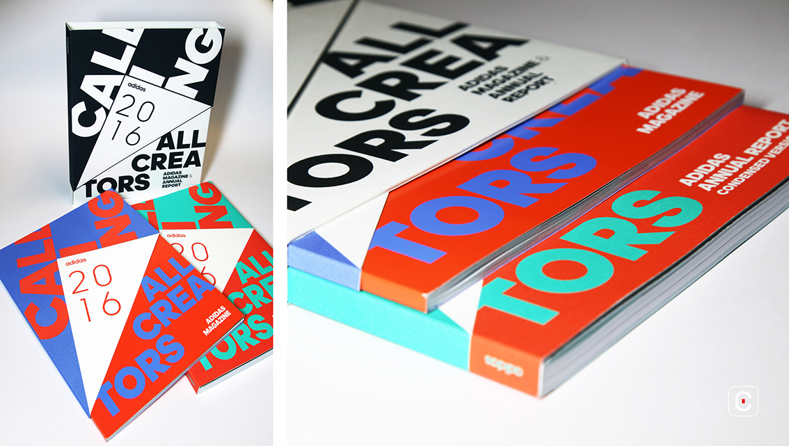
The 2016 report from Adidas includes a magazine and annual report bound in an unusual slipcase that opens like a gatefold, the diagonally cut flaps held in place by concealed magnets. However, neither top nor bottom is enclosed, allowing to the contents to slip out if held upright, which seems unintentional: a bold design choice that may have benefitted from more testing at the design phase.
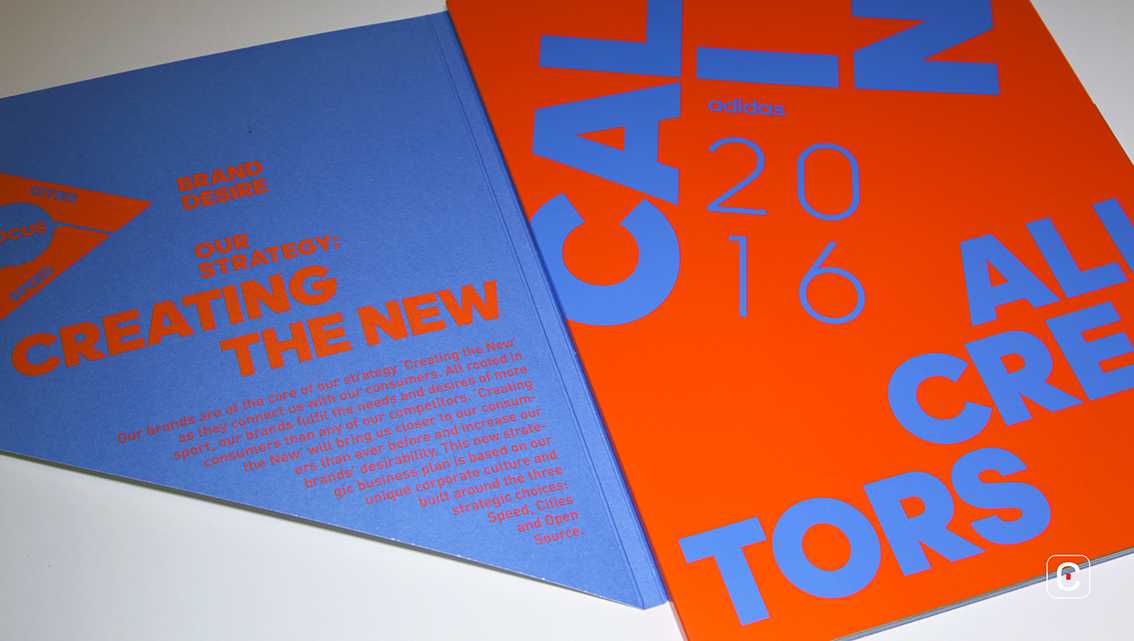
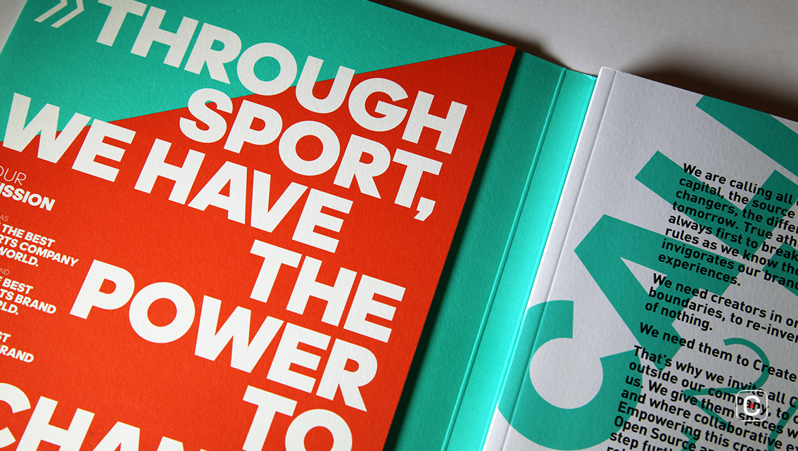
The beautiful, stark black and white slipcase opens to reveal a burst of colour. High contrast complementary colours in vibrating red/blue and red/green suggest speed and motion but makes text set in these colours a challenge to read. The use of colour and dynamic alignment of textual elements works together to suggest a creative restlessness – a useful approach for a sportswear brand. It is unclear though, whether the distressed effect visible in some areas of black print is intentional. Inconsistent use suggests it may not be, but instead an artefact of printing solid colour on uncoated stock.
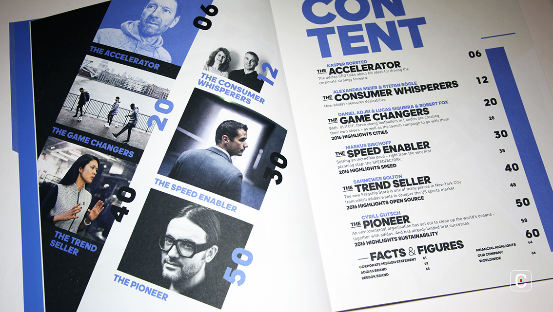
Both publications make use of a loose, floating grid, allowing extreme flexibility in the placement of text and image. The lack of consistency this engenders works only sometimes, to suggest the fast-paced world of sports. In other places it can disrupt the reading experience as the reader attempts to navigate the text. However, the use of die cut tabs to mark each section of the report is excellent for easy navigation and are a pleasure to use.
![]()
![]()


