
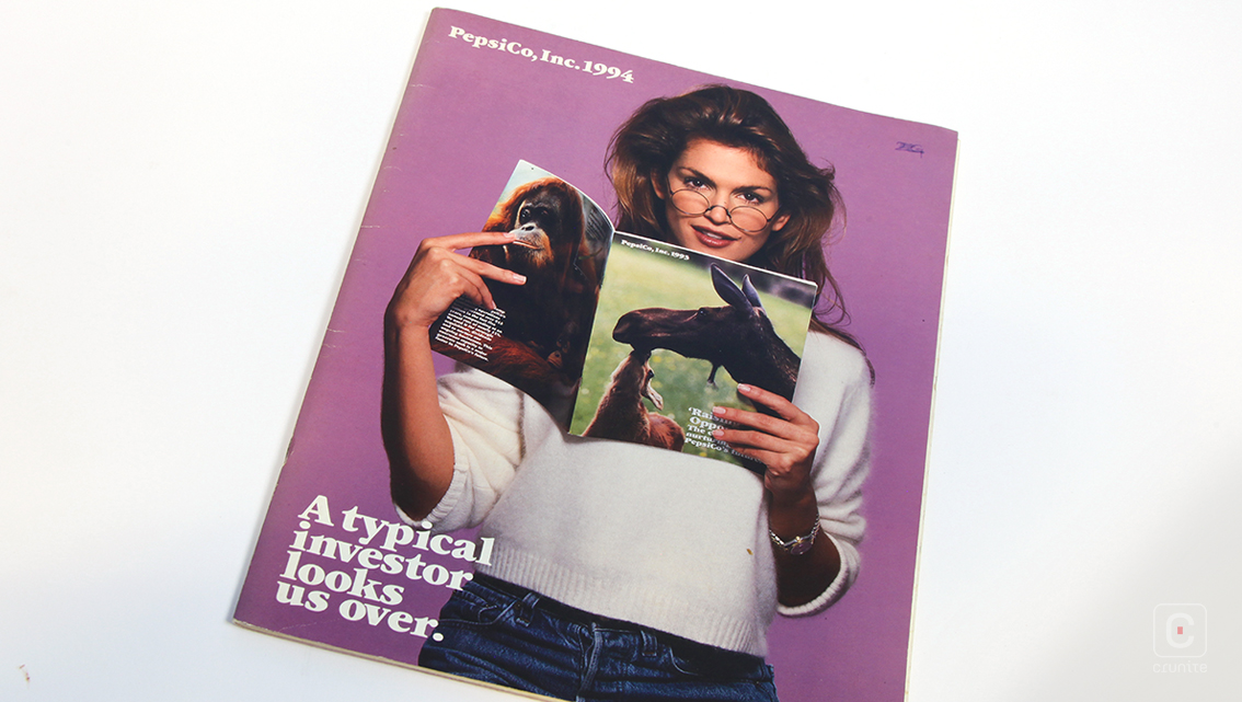
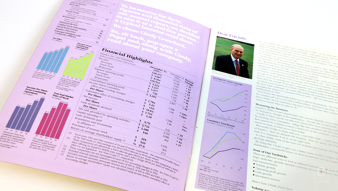
In the 90s, if you put Cindy Crawford on a magazine, people were going to buy it. It was a sure bet and one Pepsi Co. capitalises on in the design of their annual report from 1994.

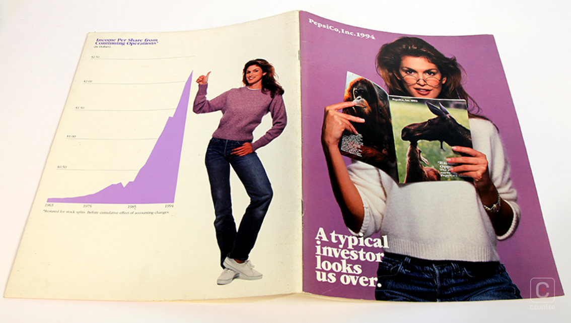
In the charming way of the 90s, the palette is pastels used to excess (and so much mauve!), tightly set sans serif text and title text rotated through 90 degrees.
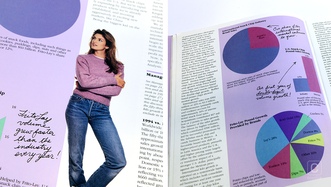
Most pages use an asymmetric four-column grid, the fourth column always the thinnest and set at the outer edges of the page. This allows for Pepsi Co. to showcase their range of products, photographed, with backgrounds cropped out and the images placed at a jaunty angle. Garish though it may seem, this is far more effective than simply listing out the names. Given how popular its products are in American culture –Pizza Hut, 7Up, Mountain Dew, Doritos etc.– these visual elements work immediately and efficiently.
It’s an odd effect and used nowhere else in the report – as if, after the report were printed, someone made additional notes. The 90s was a boundlessly enthusiastic era of publications design and this report is certainly a representative sampling.
![]()
![]()


