
Podravka is a Croatian company that has been making and selling food products since the 1930s. It began with fruit but currently produces and sells everything from tinned fish to baby food.
While popular in Europe, the company was unfamiliar to the rest of the world until 2009, when the Croatian Deputy Prime Minister resigned after being implicated in a mismanagement scandal that involved his time at the company.

The design of Podravka’s 2005 report is notable for three reasons – photography, page design, and the fact that the soon-to-be disgraced Deputy Prime Minister was on the board at the time.
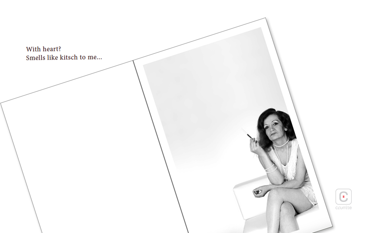
The report is titled “An excerpt from eternal debate about the heart” and it opens with three stark, monochrome portraits, with each sitter musing about the word ‘heart’ and what it means to them. These pages feature a vastly generous use of negative space – a design choice that is effectively used here, and throughout the rest of the report.
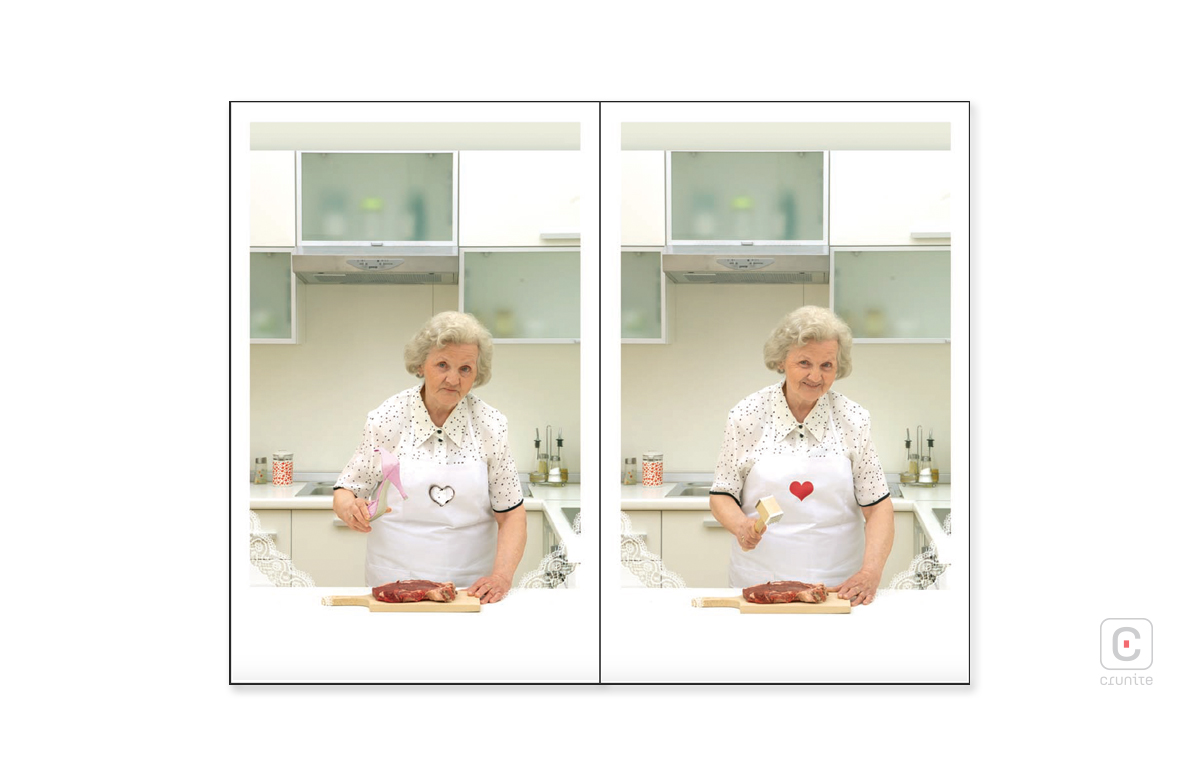
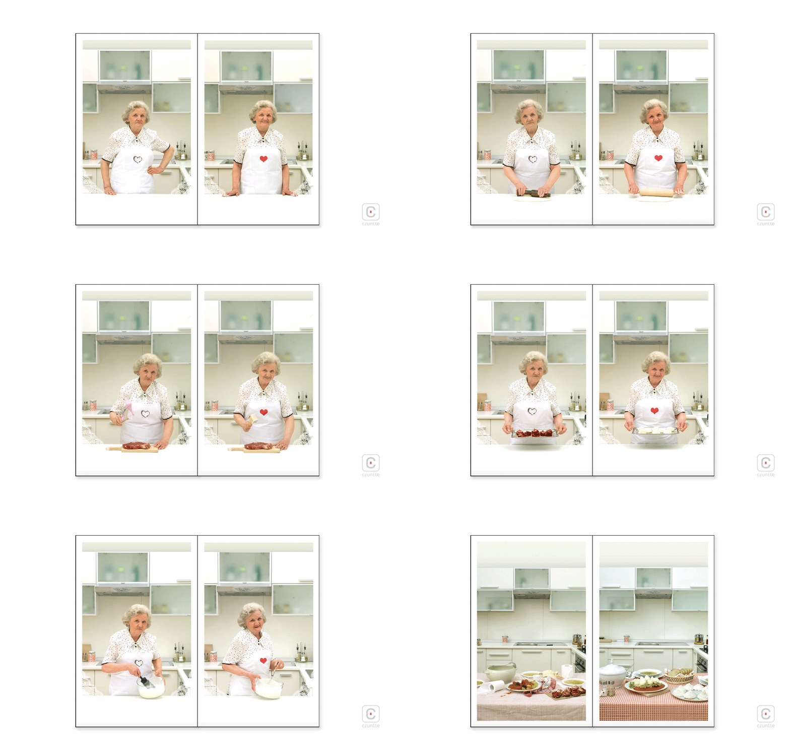
Following the monochrome portraits are a series of diptychs in colour. Each set features the same actor in the role of a grandmother preparing food. The image on the left shows her ‘cooking without heart,’ while the image on the right features her ‘cooking with heart’. The images are amusing – in one of them, grim faced, she uses a high-heeled shoe to tenderise meat. The images also establish a heart motif that is used in the report, sometimes in innovative ways – especially in the photographs of common kitchen implements, later in the report.
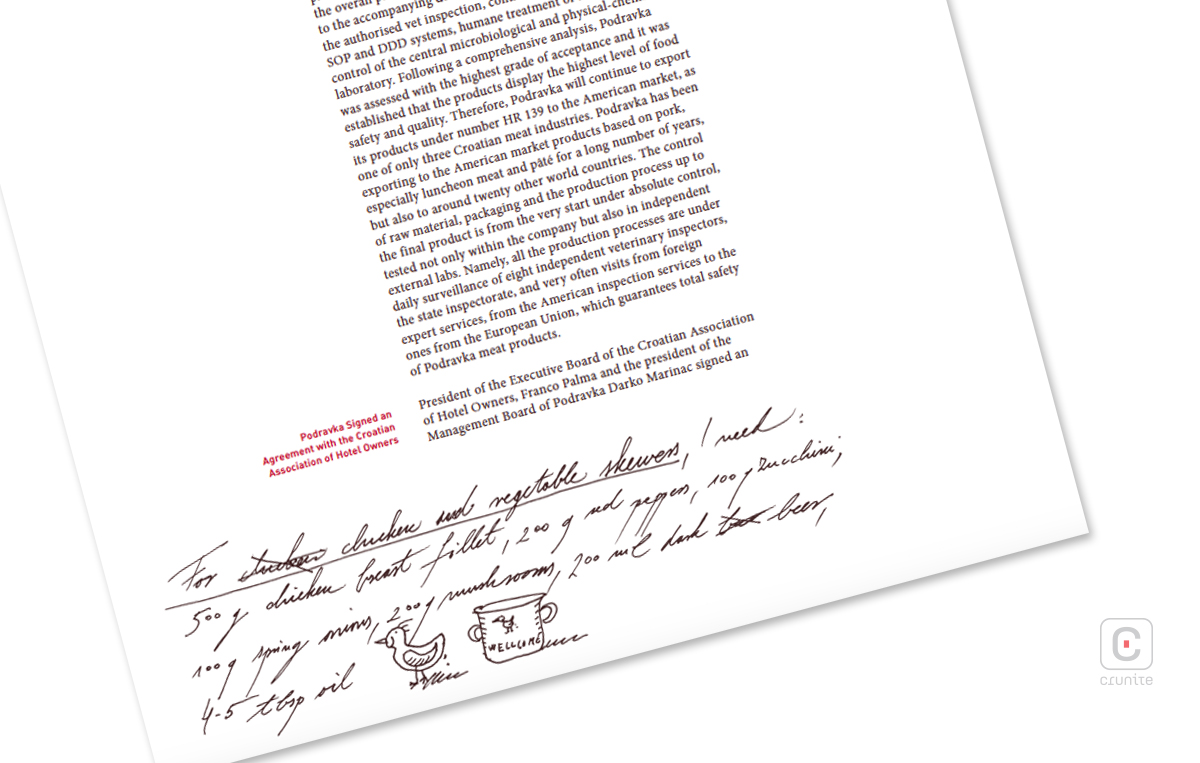
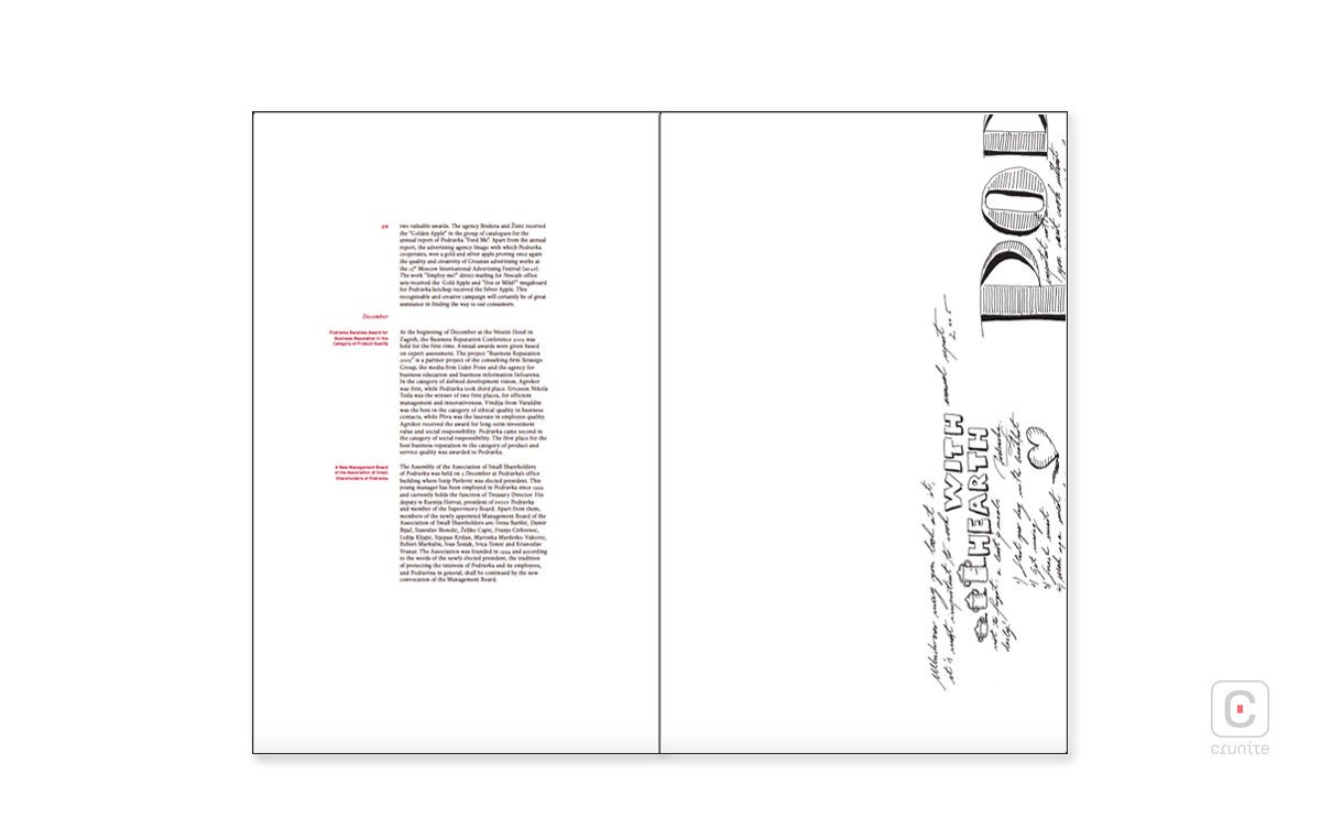
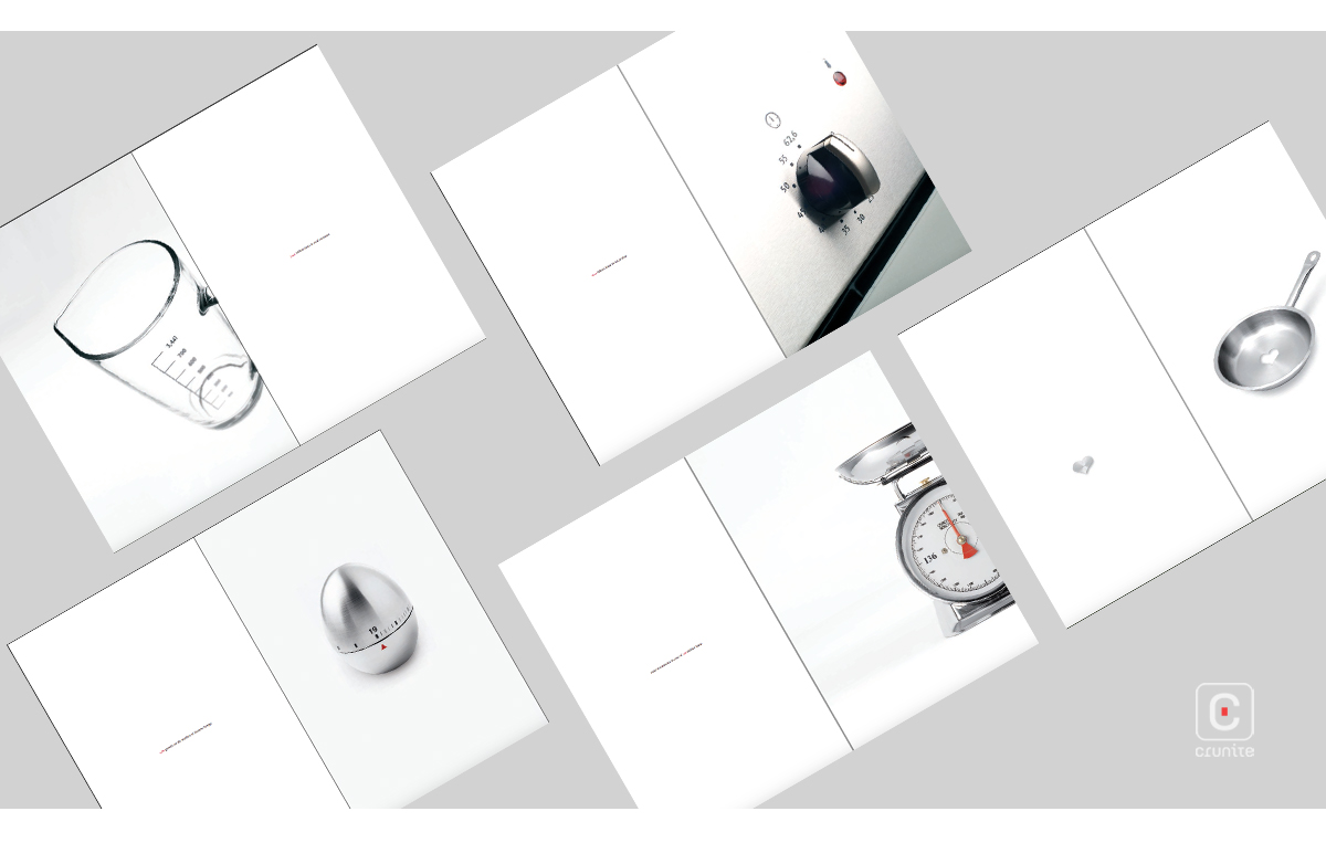
The page grids use negative space, column width and a 2-colour palette so cleverly, the entire text is set in one size without navigation suffering very much at all.
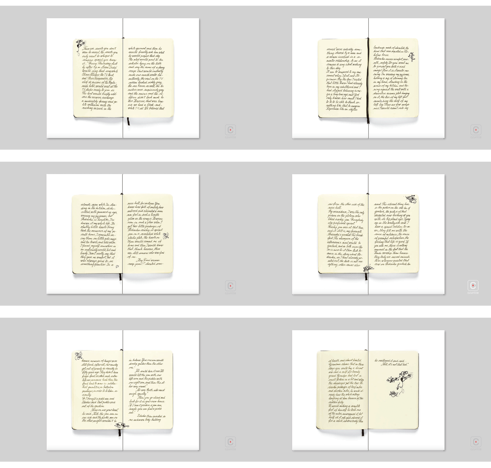
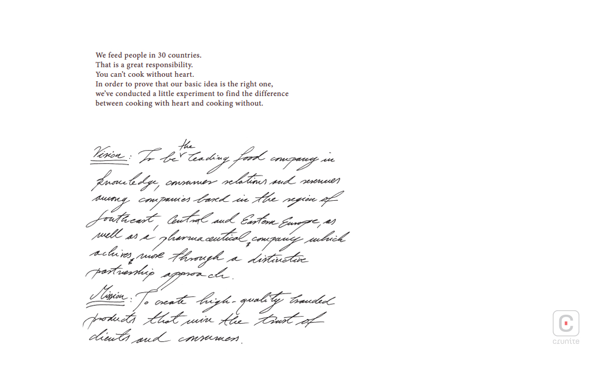
On the digital version of the report, the page orientation switches to horizontal, making the financials simple to read – an excellent design decision. These are followed by photographs of a small, 72-page handwritten ‘journal’. The journal is a sophisticated use of copyrighting to highlight the products, services and ethos of the company, while also being visually engaging.
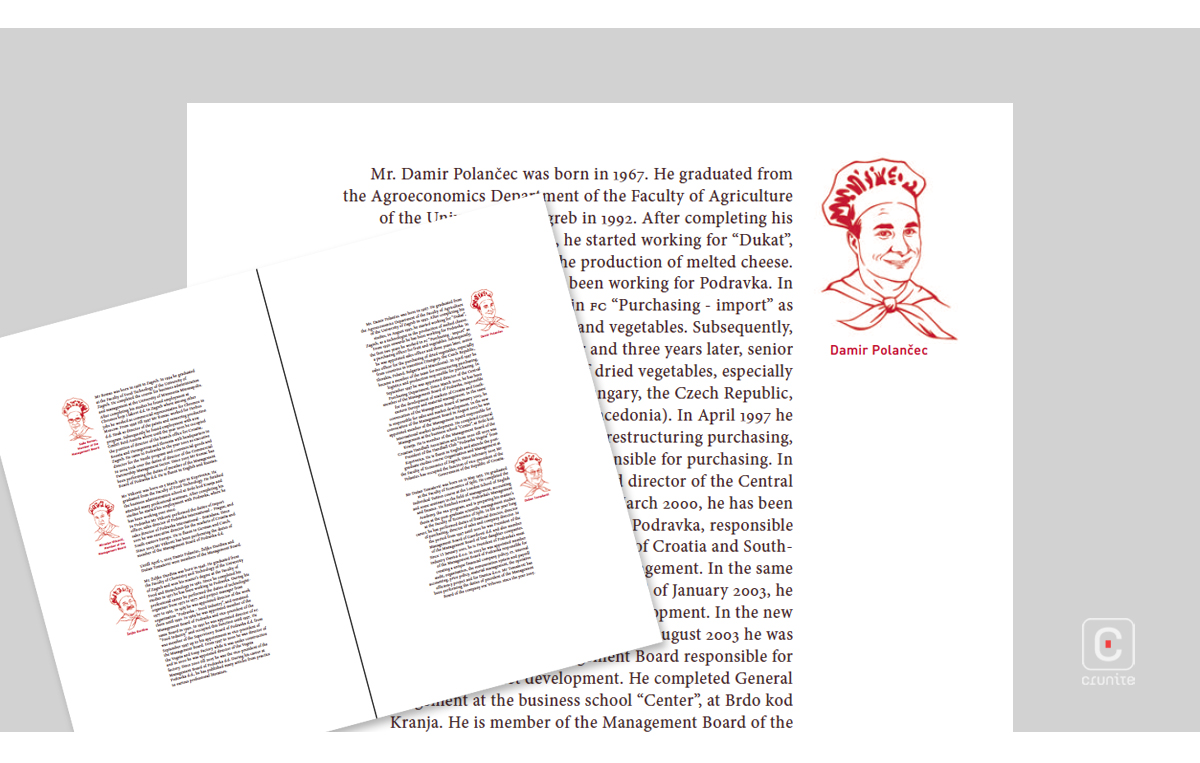
The report ends with portraits of the senior staff in chef’s hats, drawn in the same rich red line used in typesetting. They include, of course, one of the man who would bring the country and company into such disrepute, c.2009. It’s a strange legacy for the report to carry. Doubly so because it is a fine piece of publication design.
Back
