
Part of the second largest private bank in Turkey, Garanti Pensions operates across Europe, offering pensions and life insurance.
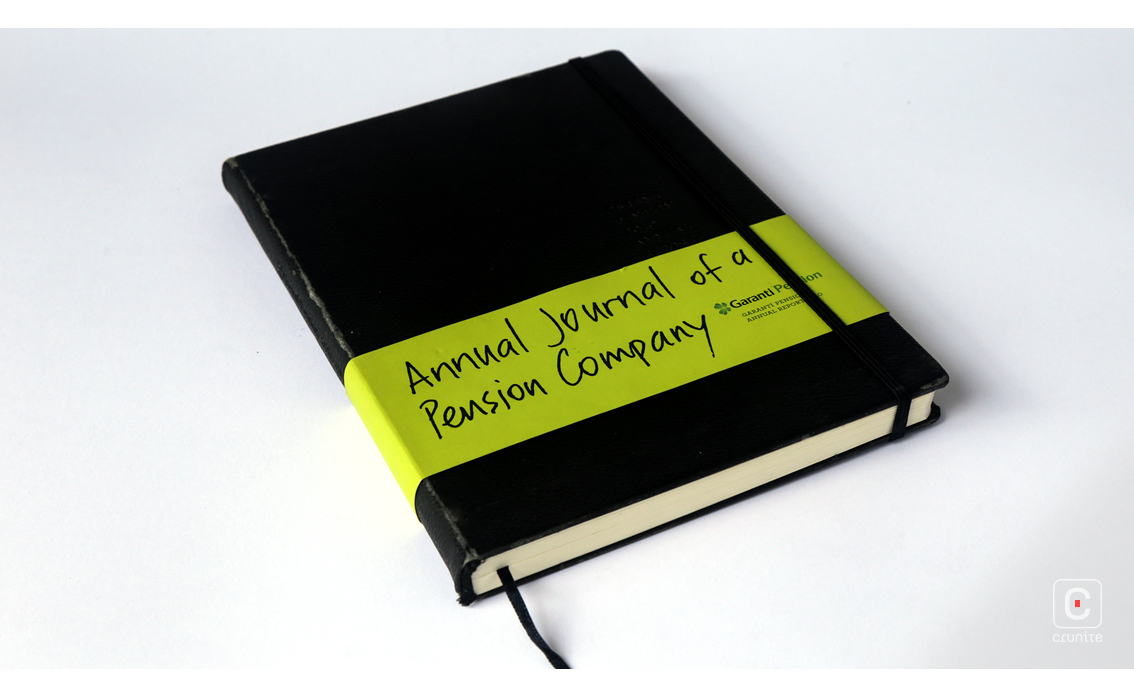
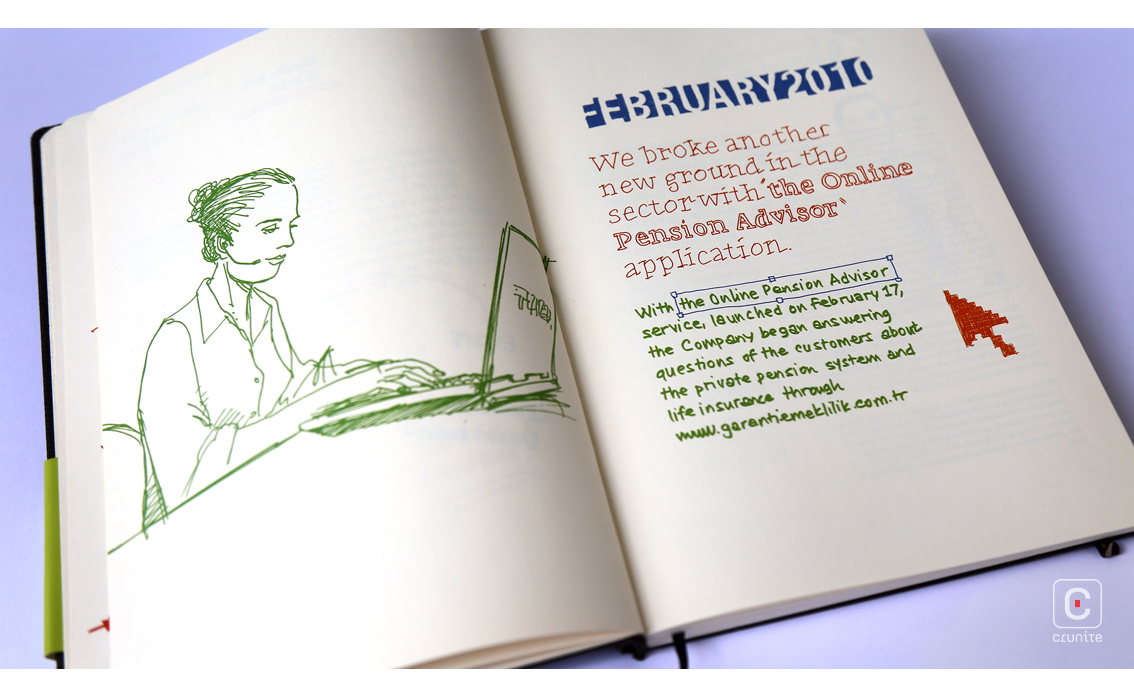
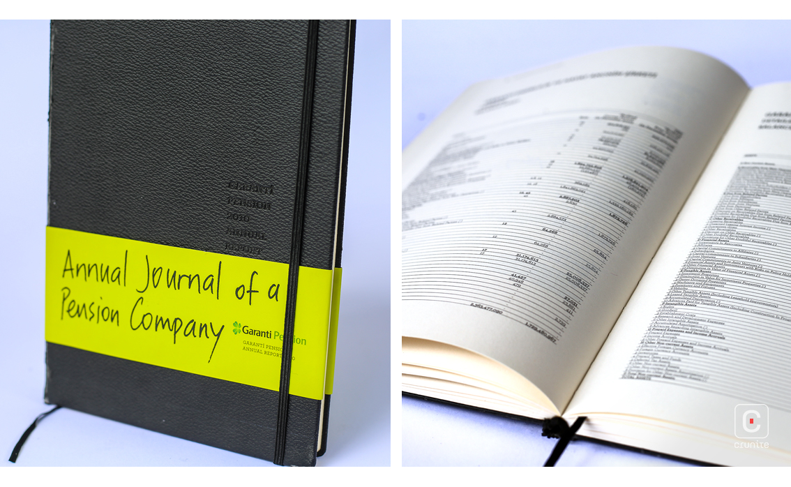
Their 2010 report is called ‘Annual Journal of a Pension Company’ and the design leans hard into the idea of a journal. Designed to mimic a Moleskin notebook it features curved corners, cream paper and a woven ribbon bookmark.
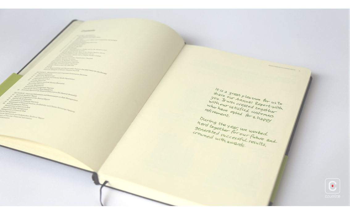
It departs from the Moleskin esthetic with a bright green belly band and small, debossed type on the faux leather cover. One disappointing note is that 11 years after publication, the faux leather cover is flaking off. Given that the design was only meant to last one year, this may be forgivable. The report is a good size and easy to handle while reading.
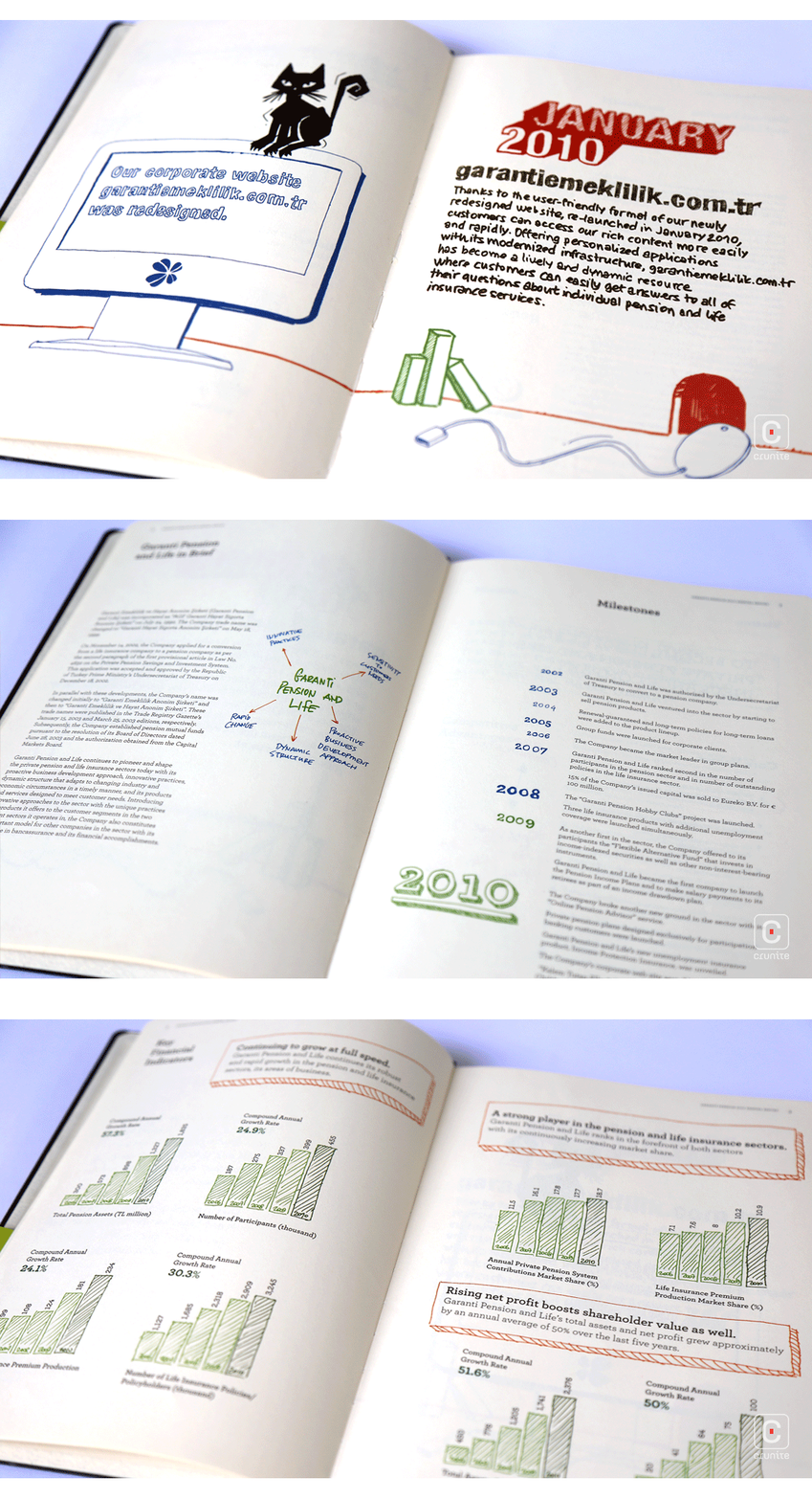
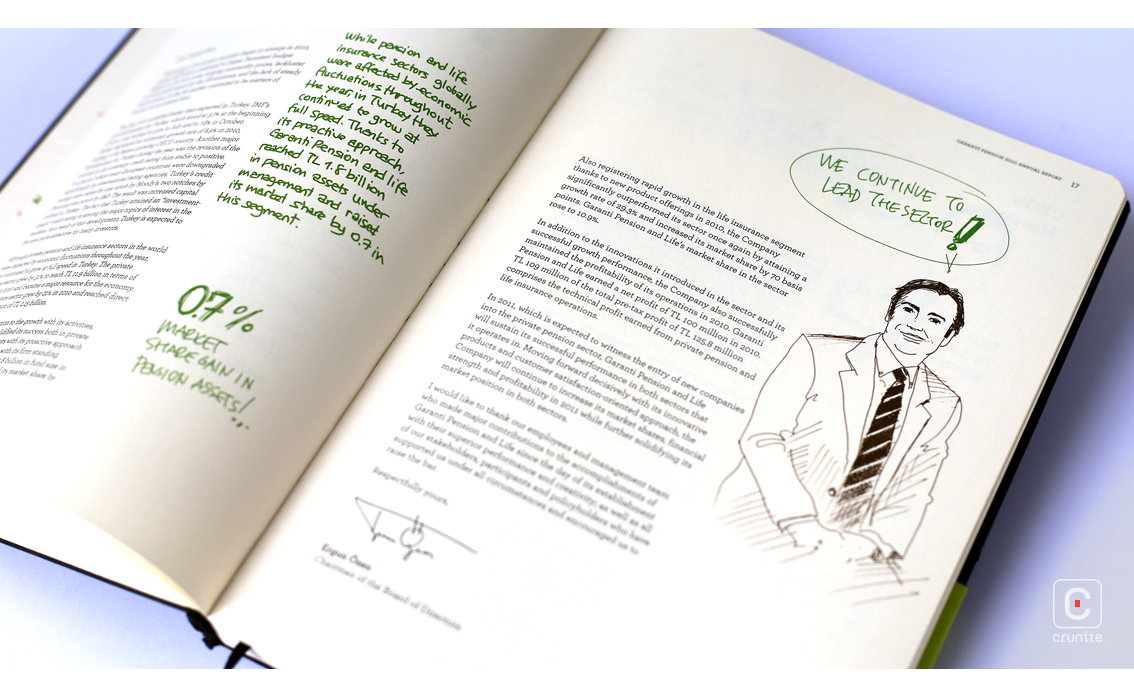
Body text is typeset in a light, modern serif in a range of weights. The various weight are deployed effectively to guide the reader through the hierarchies of information on any given page.
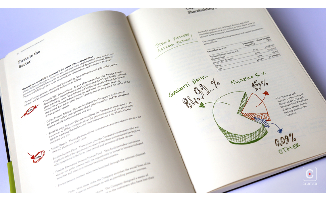
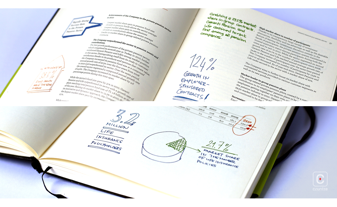
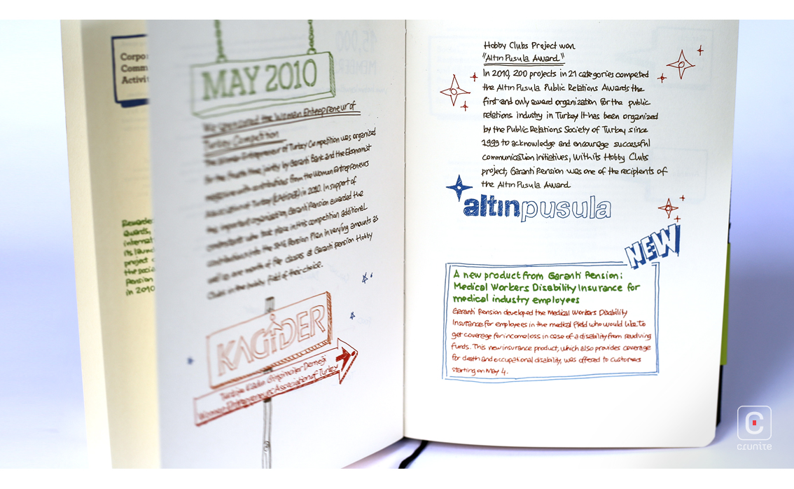
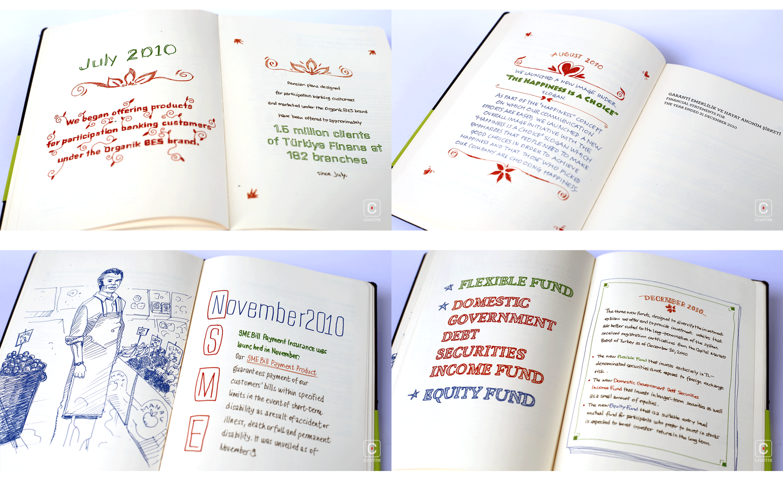
Accompanying the typeset body text are ‘hand-drawn’ annotations and infographics. There is a good use of colour to direct the eye and the annotations are presented in two or three different ‘hands’, suggesting a company that values collaborative effort. Thin line weights, a generous use of white space and sensitive page composition further help the report feel uncluttered.
The financial section shows varying type sizes in the tables and this inconsistency sullies an otherwise neat report. Aside from this issue and the flaking cover material, the book is section sewn with a curved spine – it opens flat and the book-block construction is sturdy, giving a satisfying heft to this report.
Back

