
Baden-Württemberg Stiftung is a state-level foundation in Germany that provides for and supports community projects and existing charities in Baden-Württemberg with a focus on education, society and culture.
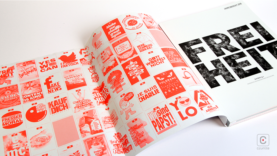

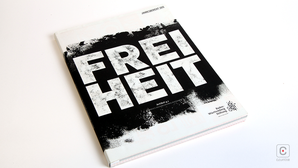
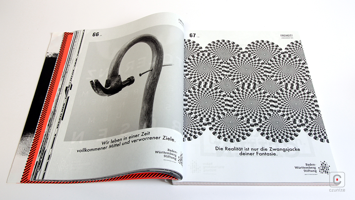
While all this sounds very serious and bureaucratic, the designers have opted for a 2-colour aesthetic of black and fluorescent orange that is almost punk in its sensibilities – chaotic and joyful, the visual elements of the report celebrate an active, modern community of distinct individuals working together to build a better future.
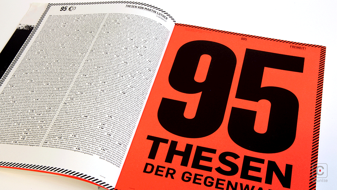
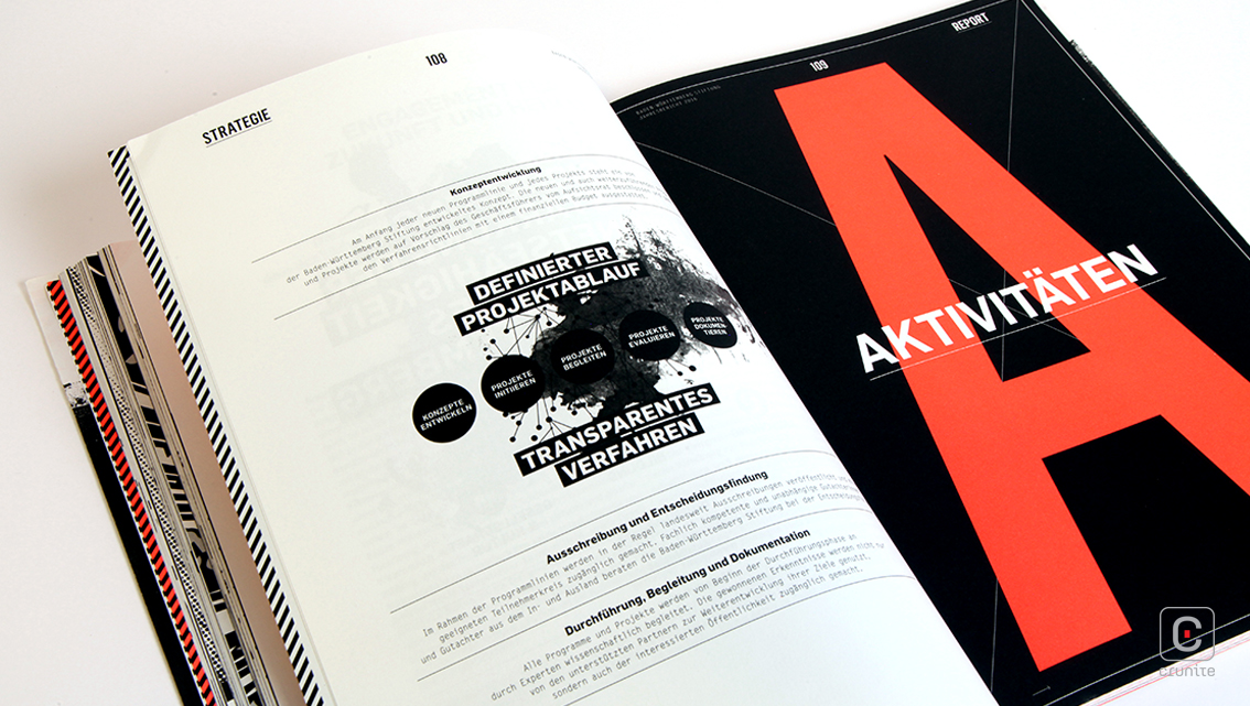
The 2-colour palette helps restrain some of these exuberant design elements from overwhelming the reader and the report uses the fluorescent orange very effectively to guide the eye through the content (and is used to beautiful effect on the reverse of the dust jacket).
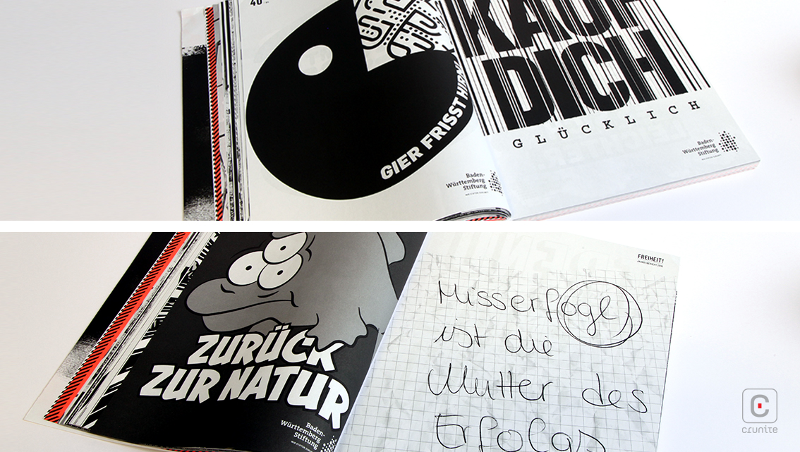
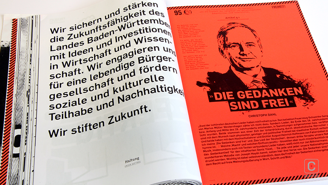
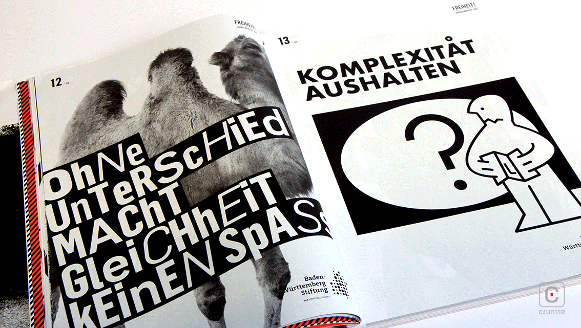
Corporate portraits are a combination of photographs and illustrations with senior staff portrayed in single colour, illustrated headshots drawn in ink that suggests a rapid painting style. This report manages to make wildly disparate illustration styles and densely packed text work seamlessly through the clever application of colour – all suggesting the different groups and communities in Baden building and a vibrant, thriving state together.
![]()
![]()


