
With a vision to build a modern financial enterprise, the Industrial and Commercial Bank of China offers a glimpse into how they use the bank’s performance to achieve their goals. Lead by design, their Corporate Social Responsibility Annual Report 2017 presents in-depth information through a minimalist design with simple, visually-pleasing infographics and illustrations. The cover sports no photography, but rather a modern multi-coloured line illustration against a white background with the title written in a light sans-serif font. The contents page flaunts simple iconography in addition to the illustrations.
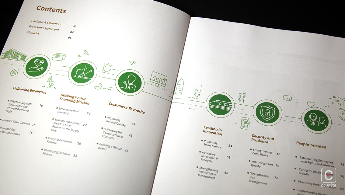
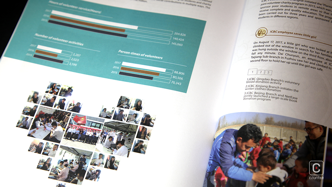
The report is divided into six sections to accommodate the expansive information that includes quotations, facts, figures, and financial accounts and records. Underlying this is a constant structure: heading, subheading and summarization. Most of the italicized headings and subheadings have introductory paragraphs to help readers grasp the essence of the information to follow. To further simplify the information and make the content more interesting, graphs in many formats are employed, in addition to creative infographics.
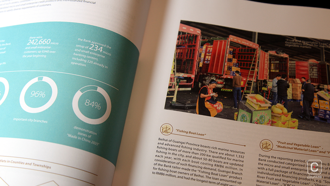
The report’s photography is kept to a minimal so as not to interfere with its illustrative design layout. Portraits exclusively showcase the bank’s Chairman and President and exclude the Board of Directors. The randomly dispersed photographs, ranging from images of employees at work to bank buildings to financial projects carried out by the bank, are of no constant size, shape or style. Holding about two pictures per page, photography in this account is used merely to fill in gaps.
Quirky details included in the report further amplify the fun design; the Chairperson and Presidents signatures, colour panel and line illustration on section pages, footer + page number combo, the inclusion of a credit card image and the substitution of sharp edges with round corners. The occasional use of iconography next to headings, ample white breathing space and colour boxed information chunks helps simplify the information further, making the content more reader-friendly.
![]()
![]()


