
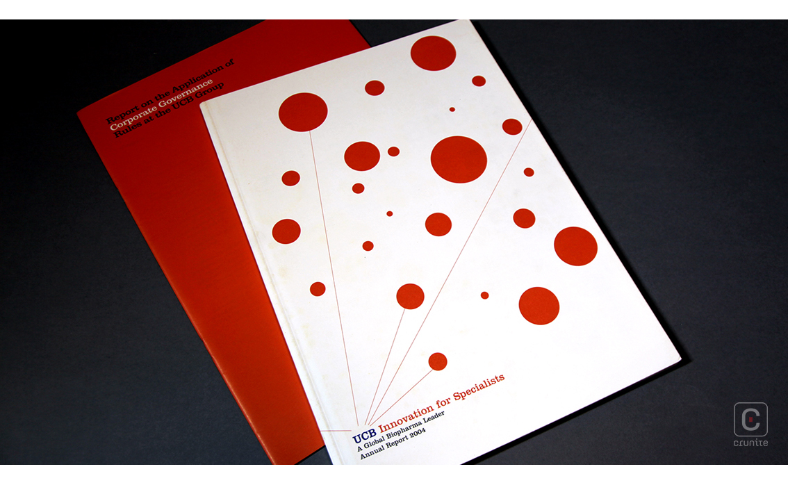
Inspired by patients, driven by science; the global biopharmaceutical company, UCB, focused on the study of immunology and neurology, strives to treat people living with severe diseases. Their 2004 annual report stays true to their maxim with its minimalistic design, clean appearance and inviting, friendly layout. Featuring a white cover with red polka dots and thin lines resembling a stylistic molecule, the report gets right to the point with a creatively direct title in a small, serifed font that continues throughout the report.
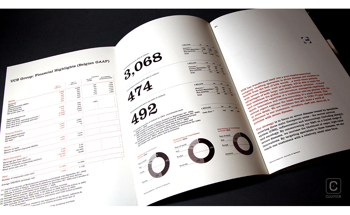
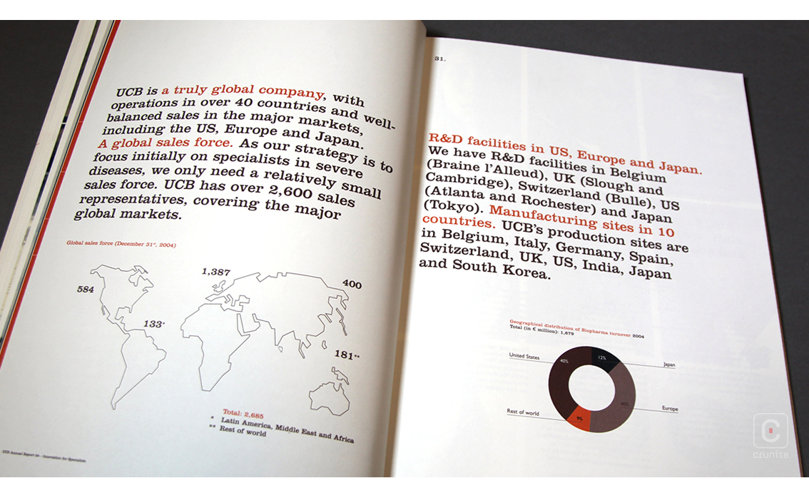
Wasting no time, the reports jacket contains a summary of UCB’s goals and what they have achieved in the past year; an inspirational overlook of the company and its noble cause. The large bold numbers and pie charts amongst the neat square paragraphs and small black and red text create the perfect contrast between the corporate and convivial sides of this company. This consistent layout breaks its monotony by subtle increases in font size, weight, number of columns and font colour. The lack of gaps between paragraphs is made up for by the vast amount of white space that surrounds the well-written content.
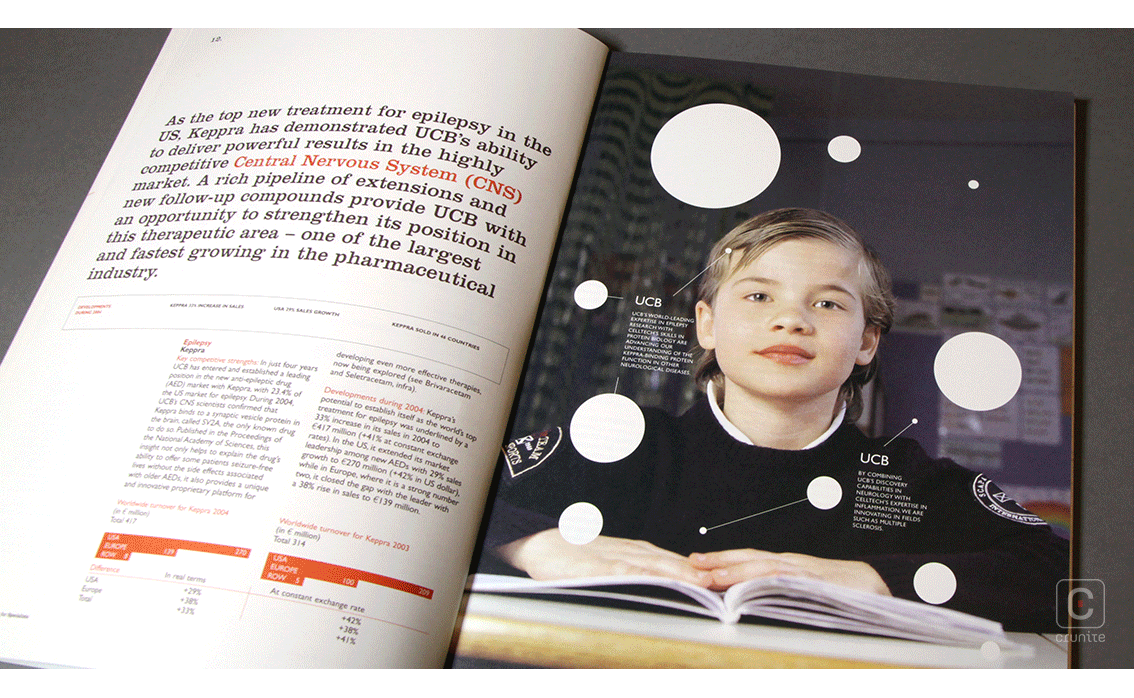
Split into various smaller sections, this standard sized, slim report uses a simplistic layout of a section summary in bold text and a full-page full bleed photograph of the people and moments that inspire UCB’s success. These dulled images add little pops of colour that perfectly complement the reports triple colour theme of black, white and red.
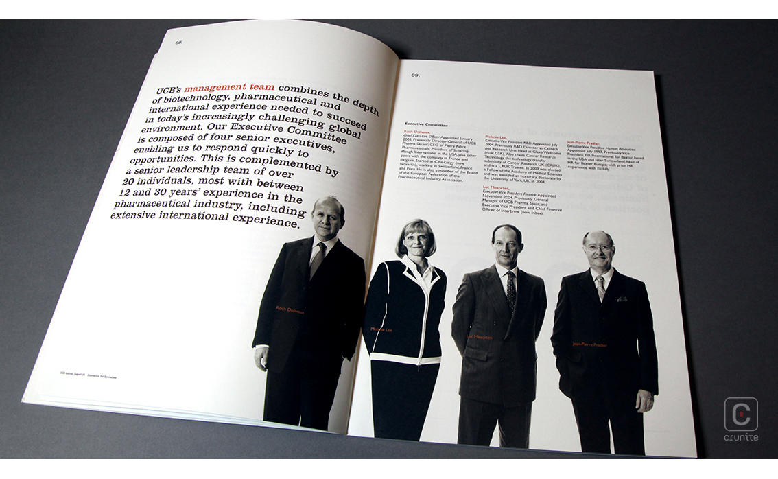
The corporate profiles of black and white photographs are, however, incorporated in the account in three different styles; full-page image, figure cut-outs and framed portraits, adding to the overall corporate aesthetic of the report.
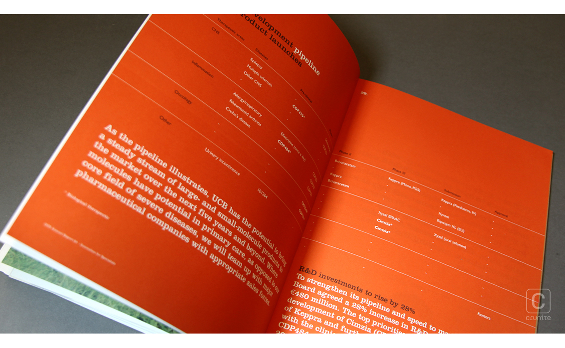
Carefully compiled for readers to pleasantly stumble upon little surprises, the account features red double pages with white text, a negative of the layout that beautifully ties in with the other quirky accents of the report. The emphasized headings, red bursts of text and avoidance of unnecessary imagery cluttering up the page completes the design, making this report a fun, easy read for anyone. The Belgium company thus engages its readers on an inspirational level, strengthening our belief in their mission.
![]()
![]()


