
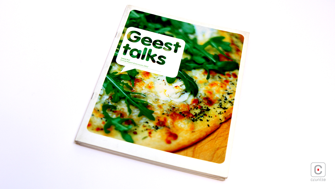
Let’s talk design with Geest PLC’s delicious looking Annual Report & Accounts 2002. Enticing their readers right from the front cover, UK’s leading producer and distributor of fresh chilled foods uses a close up image of one of their own tasty treats combined with a playful round-edged font within a white speech bubble giving us a quirky report named “Geest Talks.”
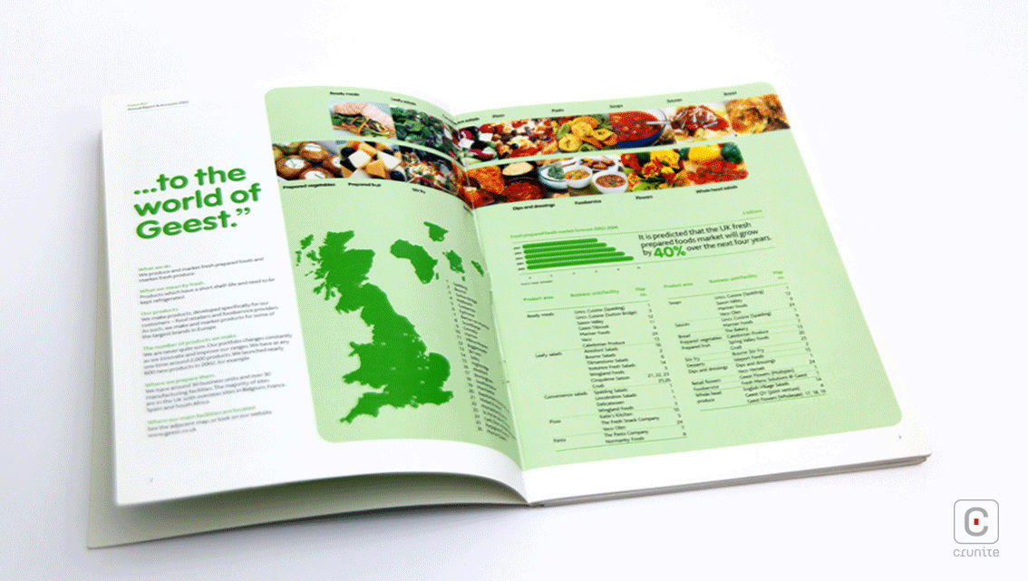
Enclosed by the border is an unusual text layout of two columns of neat square paragraphs with an extreme right alignment giving room for a third column where required and ample white breathing space for readers to absorb the well written content. The comprehensive summarized information is split into two sections by the unique binding of the report to give us a 360° view of the company, its vision, target and goals, and a financial overview of extensive audited accounts. As a result the Chairman’s address is found towards the centre of the account rather than conventionally at the beginning. Subdivided into more sections, the report adopts the colour scheme of a spring harvest of bell peppers and uses shades of each colour in various graphs within the report. Catering for mere perusal, the report even includes colourful boxes of the more important facts, figures and quotes along with rhetorical questions as headings giving the account a FAQ look and feel.
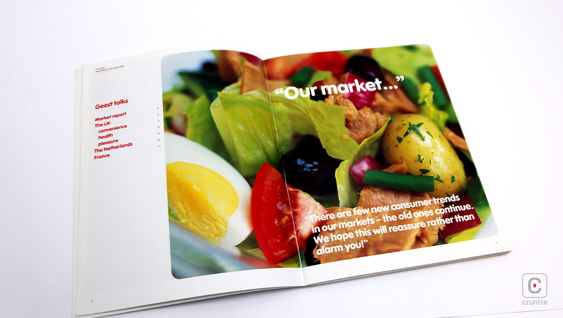
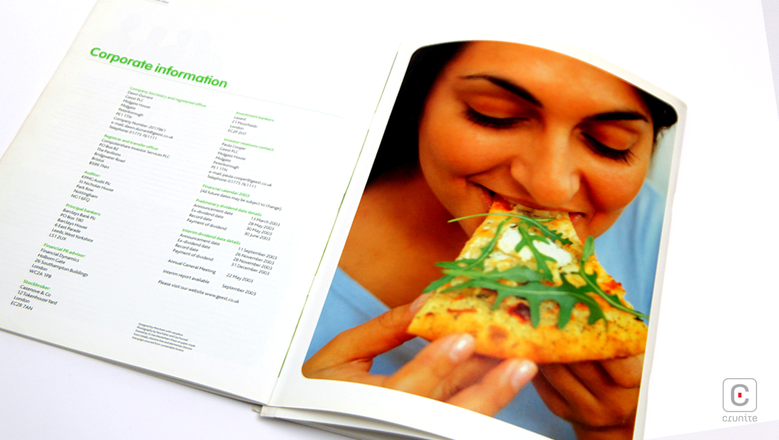
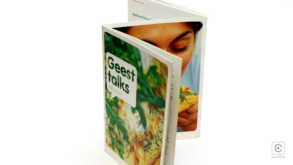
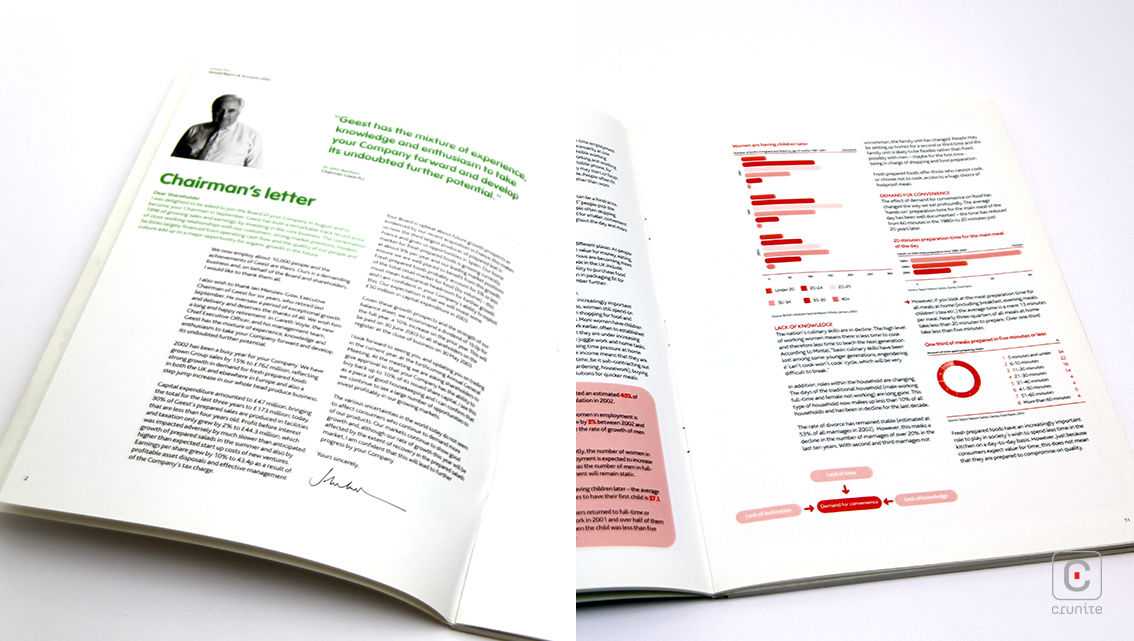
Lightly scattered throughout the report are mouth-watering close up shots of tasty treats that fill up entire pages and even spread across two adjoining sheets. While prominence has been given to flavourful photography, images do not clutter up the account but simply break the monotony and overwhelm of context and reinforces information. Small black and white portrait cut-outs appear occasionally of important corporate figures however prominence is kept on the cook book style pictures.
The thin line under headers and main headings, signatures of corporate personnel, consistent round edges and minimalistic easy-on-the-eyes design tie it all together and perfectly garnish this beautifully compiled report.
![]()
![]()


