
Like a stream of consciousness the data in the Alexandria Real Estate Equities, Inc. 2006 Annual Report flows continuously uninterrupted by conventional page turning. Unconventionally, the report is constructed of one piece of paper folded accordion style; review on one side, financial data on the other. It’s a simple, elegant idea often used for brochures but rarely adopted for annual reports.
When the report was published over a decade ago it was available in two different covers both incorporating tactile features. On one version debossed type sinks into a silver cover while blind debossed type makes an impression on the back cover. On the other version engraved metal adorns the front cover and acrylic on the back cover.
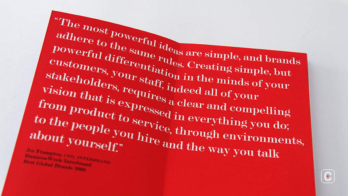
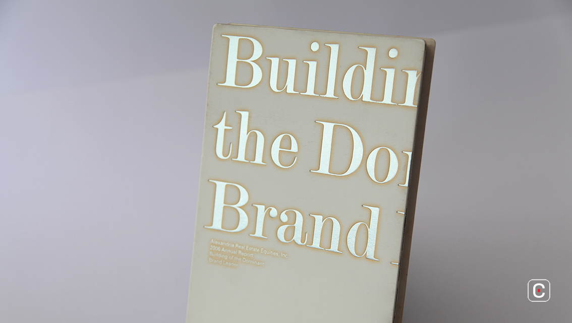
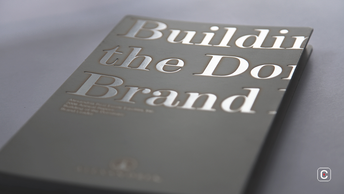
The report’s simple, metaphoric title ‘Building of the Dominant Brand Leader’ conjures myriad meanings; the company’s infrastructure investment in the company, physical assets, the success of the client tenants, the importance of brand and client synergy, and possibly it’s a reference to all of these. Despite the company being fundamentally a landlord, it is at pains throughout the report to position itself as partnering with its clients. Simplicity and brand differentiation are key notes too and are highlighted in the quote by Interbrand’s CEO at the time, Jez Frampton taken from the ‘Best Global Brands 2006’ a Business Week and Interbrand publication – an influential benchmark study.
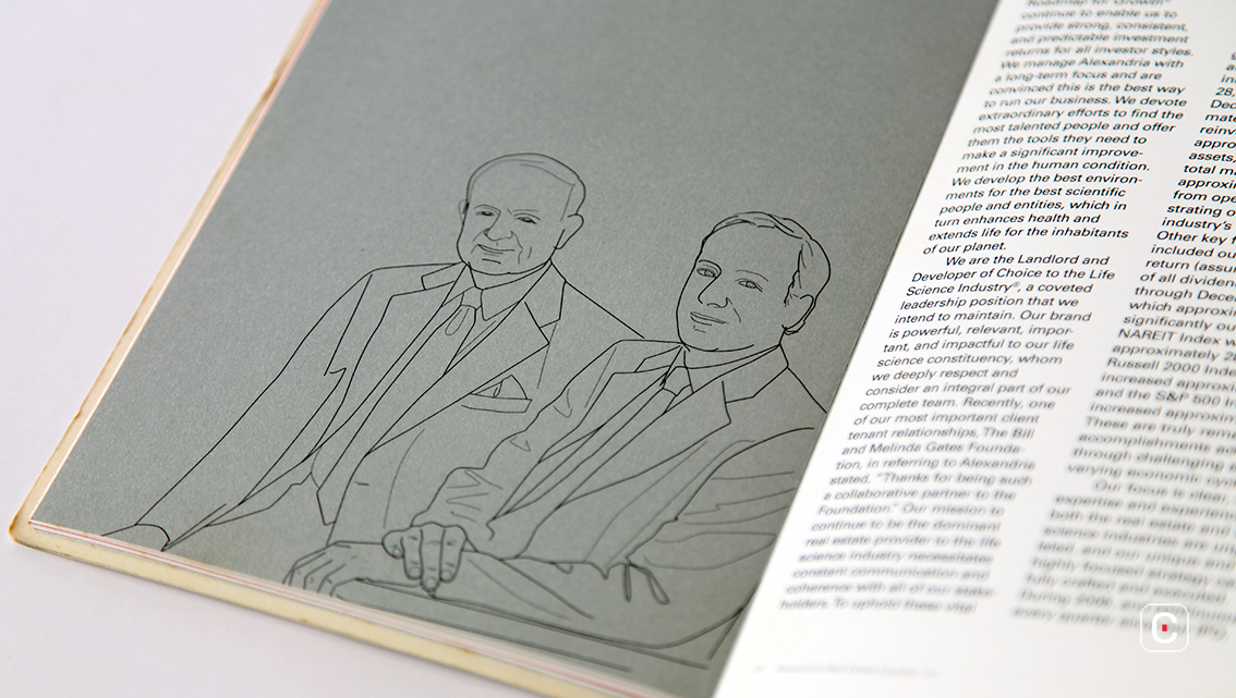
Against a backdrop of solid grey the pure and simple contour drawings of Jerry M. Sudarsky, Chairman of the Board, and Joel S. Marcus, Chief Executive Officer are recognisable from their outlines alone. The photographs in the ‘Knowledge of the Customer’ section are quite basic but in keeping with the simplistic style. The same beige tone used for the background enhances the uniformity.
Turning to the report’s typography, Bodoni and Universe have been used. This is a popular choice in reports. Generally, annual reports require less complicated type combinations often because they themselves are complicated and long. The choice of Bodoni and Universe in this report enhances the hierarchy between heading, subheading and body copy. Printing Bodoni on the solid backgrounds prevents its elegant design from suffering readability issues due to its hairline strokes and fine serifs, the small projection at the end of each letter stroke.
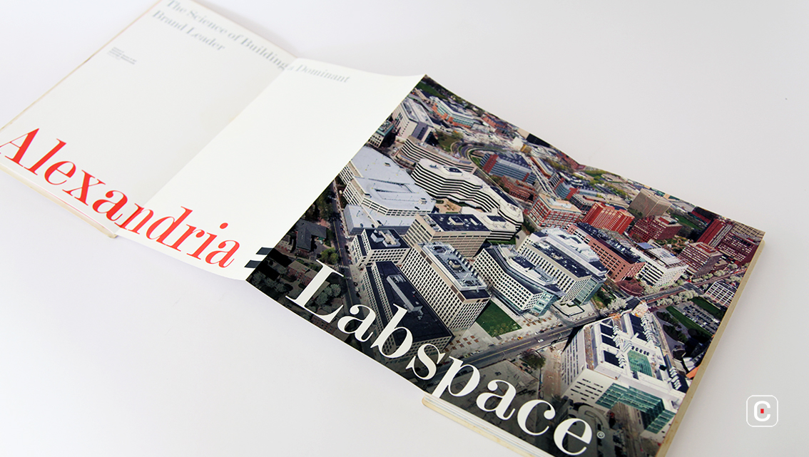
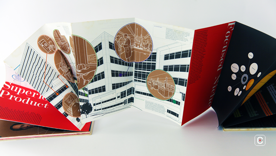
From page 13 onwards illustrations and images are produced in the style of architectural drawings to highlight the company’s message that it doesn’t just lease space but plays an integral role in helping its tenants, thereby partnering with them to inspire productivity, efficiency, creativity and success.
The infographic that stretches across pages 16, 17 and 18 is visually appealing and turns potentially boring content into something that is fun to read. Not only that, it clearly illustrates how the company is successful in its niche market of providing space for lease to the life science and technology industries.
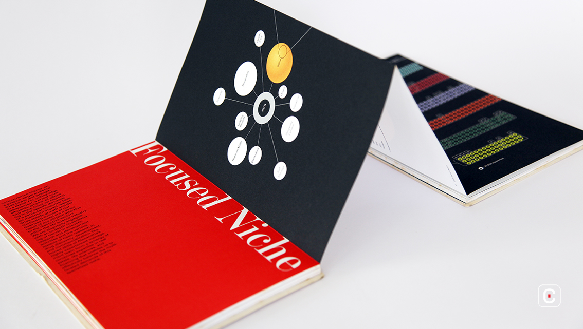
The company operates in the USA and Canada but has its sights set on global reach as the science and technology illustrations allude to in the infographic that stretches across pages 19, 20 and 21.
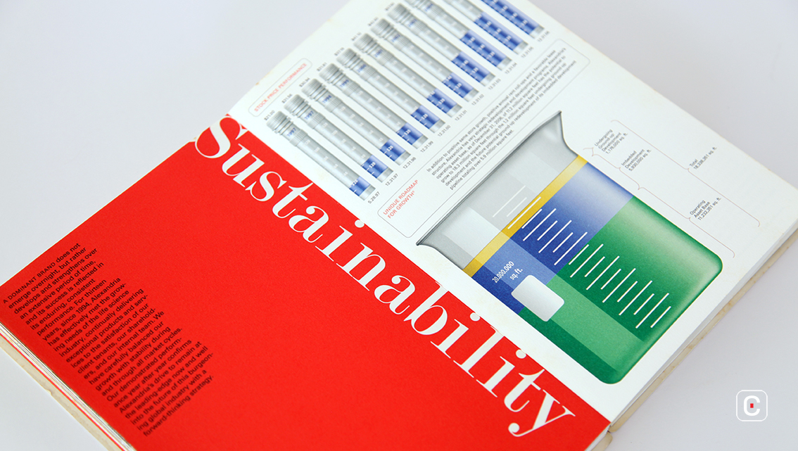
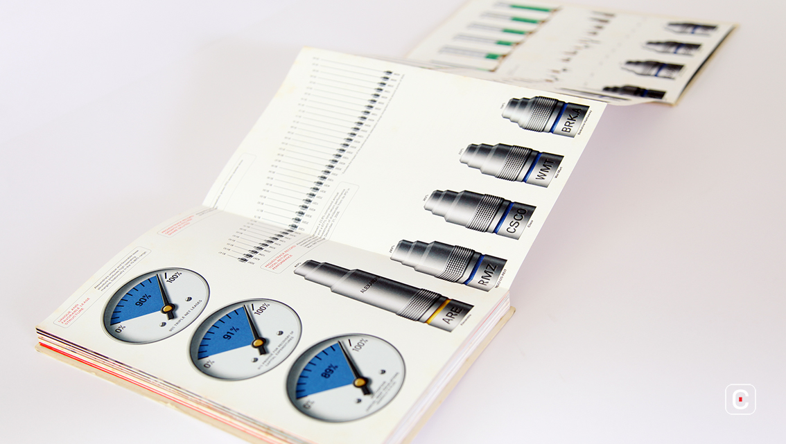
The section on Sustainability at the end of the report deals with the company’s ability to endure and grow. Bar charts in the shape of laboratory equipment illustrate financial data imaginatively and succinctly.
![]()
![]()


