
Metro AG is a German firm of wholesalers. They are the fourth largest cash-and-carry retailers in the world. Their 2017 annual report (the condensed version) is a study in using colour and print well. The report is slightly larger than A4 and the use of thin paper stock for the financials means this 84-page report feels as easy to pick up and read as a magazine.
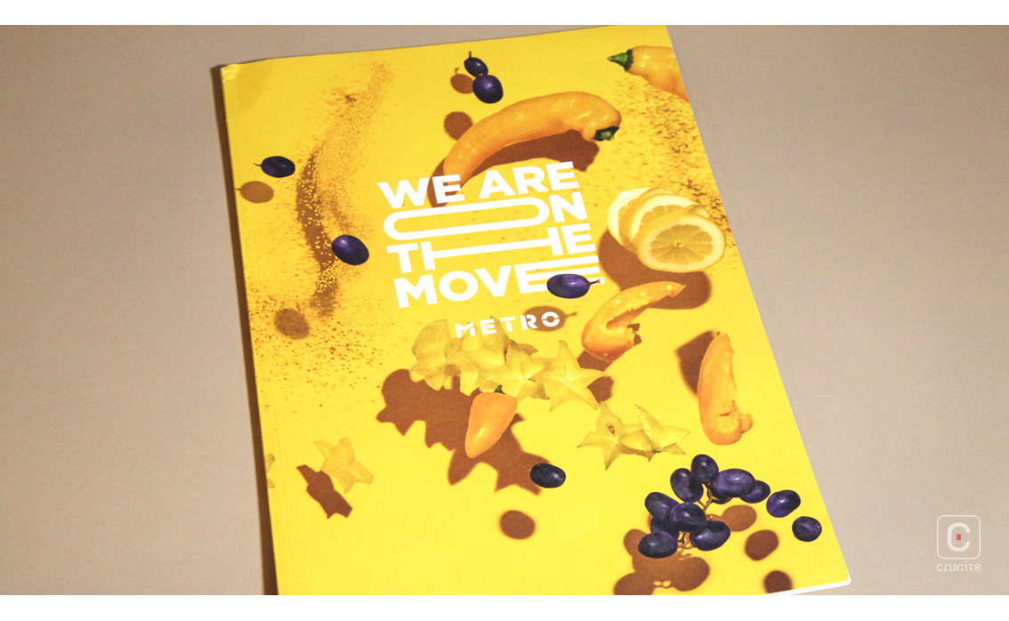
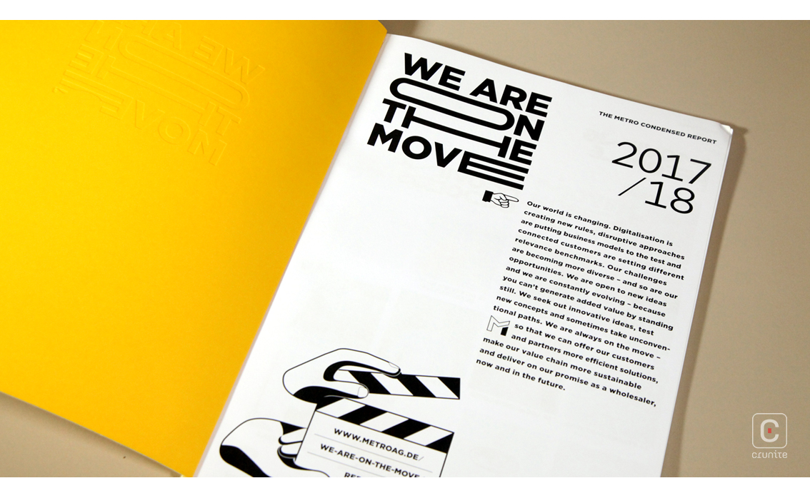
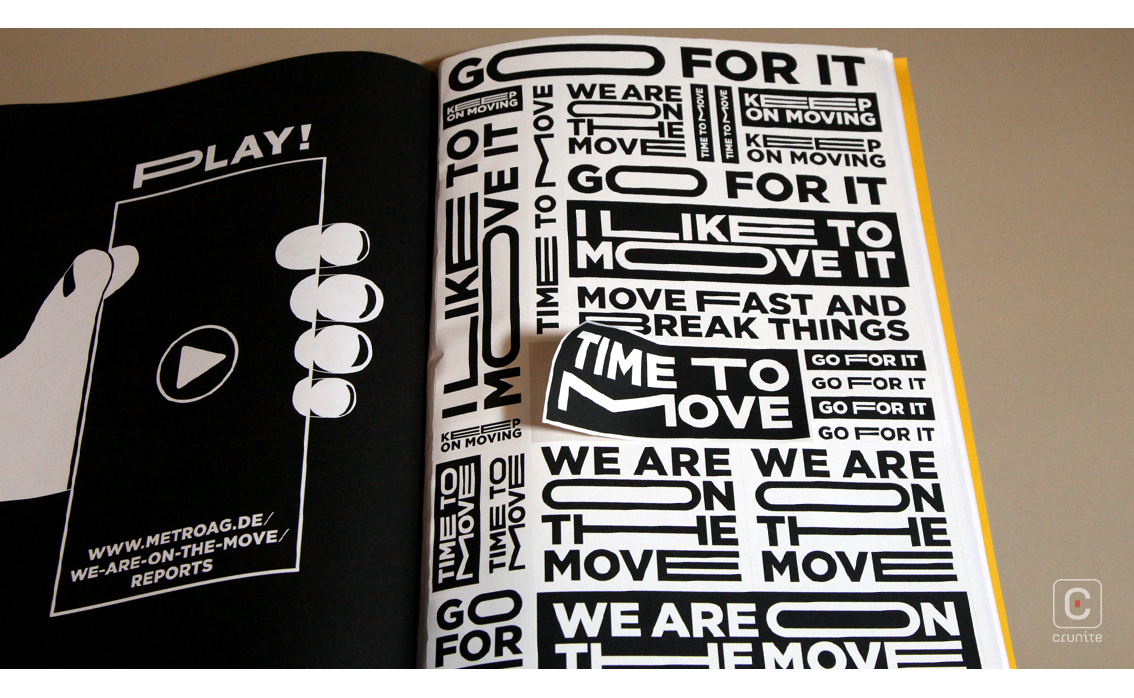
Titled ‘We Are On The Move’, you might expect the report to make full use photography to suggest this movement. Aside from the cover and a few places in the report where photography does convey the idea of speed, Metro AG uses typographic treatments instead.
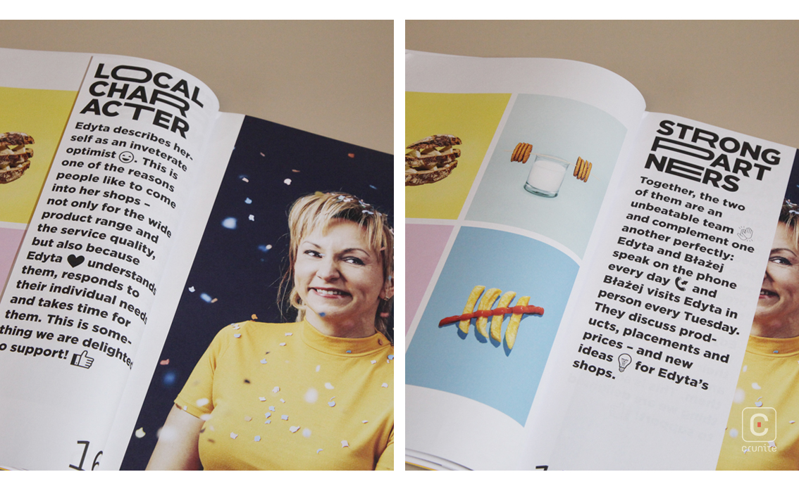
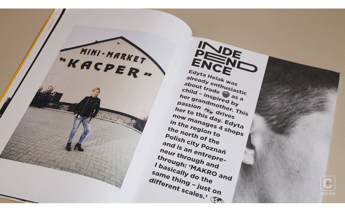
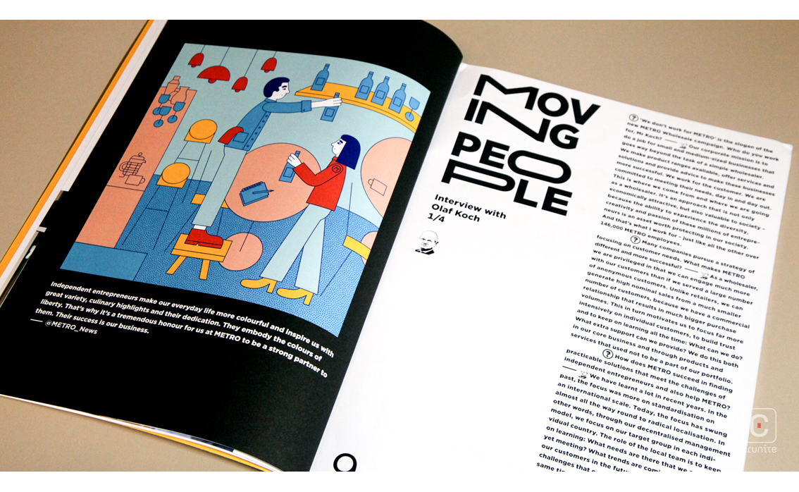
This typographic technique allows the portraits to work at a different speed. Most are carefully composed images that speak of calm. The space allowed for photography as a design element is worth noting. In the thematic section of the report, text is tightly regulated and presented mostly in half-page tip-ins, so as to give the images priority. This makes for an engaging reading experience.
The report includes a page of stickers emblazoned with the title of the report and motivational phrases as part of a game accessible online, which is a puzzling addition given how well the report works without this gimmick.
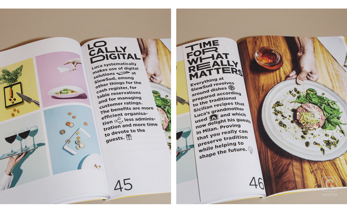
Flat blocks of colour are vibrant, photographs are pin-sharp and colour gradations are subtle. This suggests a sensible amount of time spent on print – something very few annual reports do properly and the results speak for themselves.
![]()
![]()


