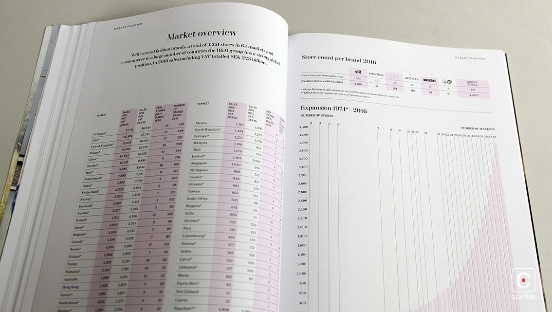
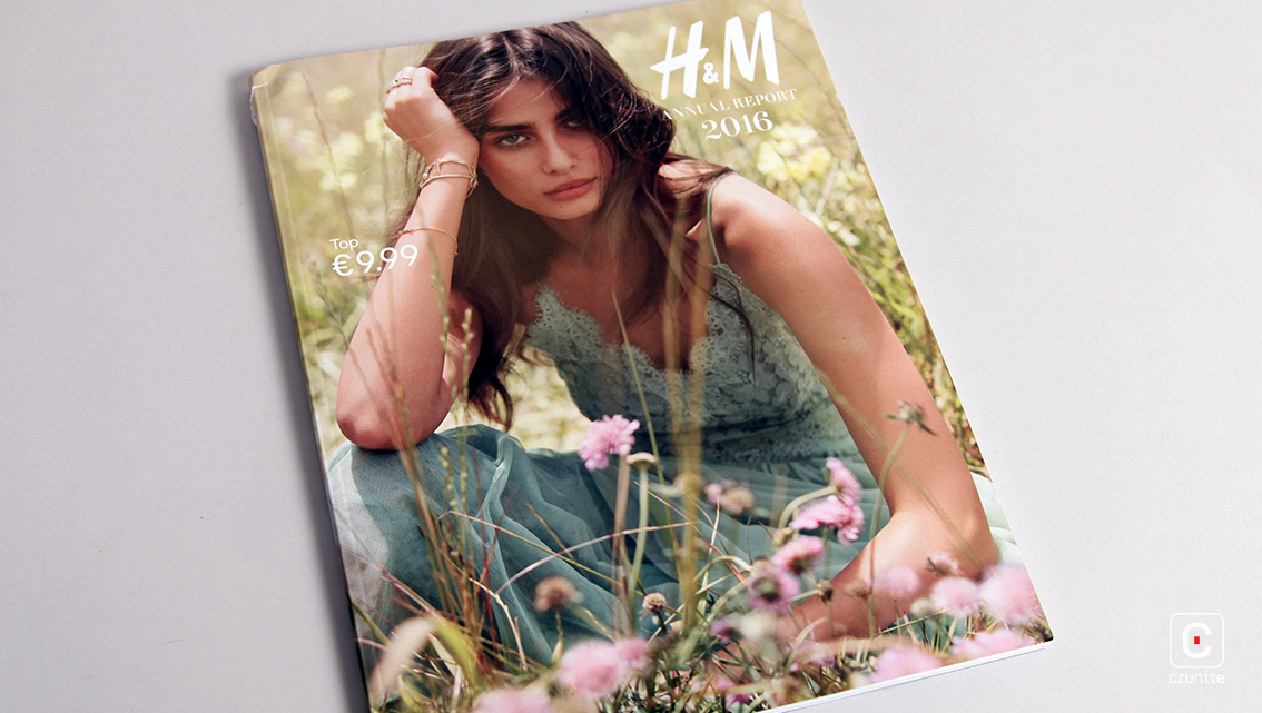
Adopting the façade of a fashion magazine, the 2016 H&M Annual Report takes its readers on a journey of fashion and expansion. The non-traditional size, magazine format and fashion photography is sure to attract trend-conscious investors. In the vein of popular fashion magazines, the cover features a reputed model (Taylor Hill) modelling H&M clothing with the price in the top left corner. The first seven pages of the report are solely dedicated to full-page images of models representing each brand of H&M.
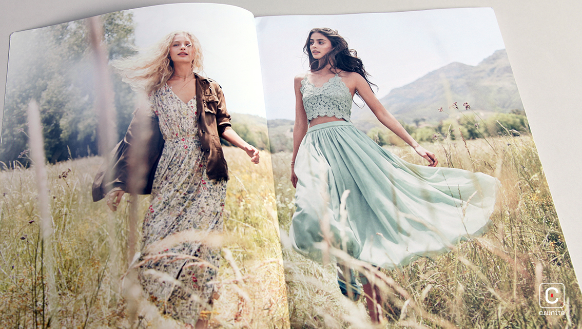
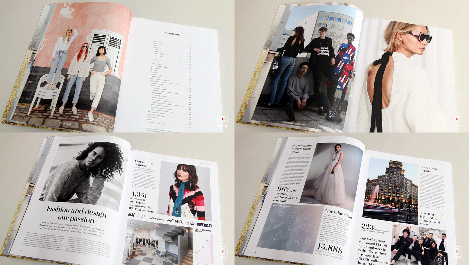
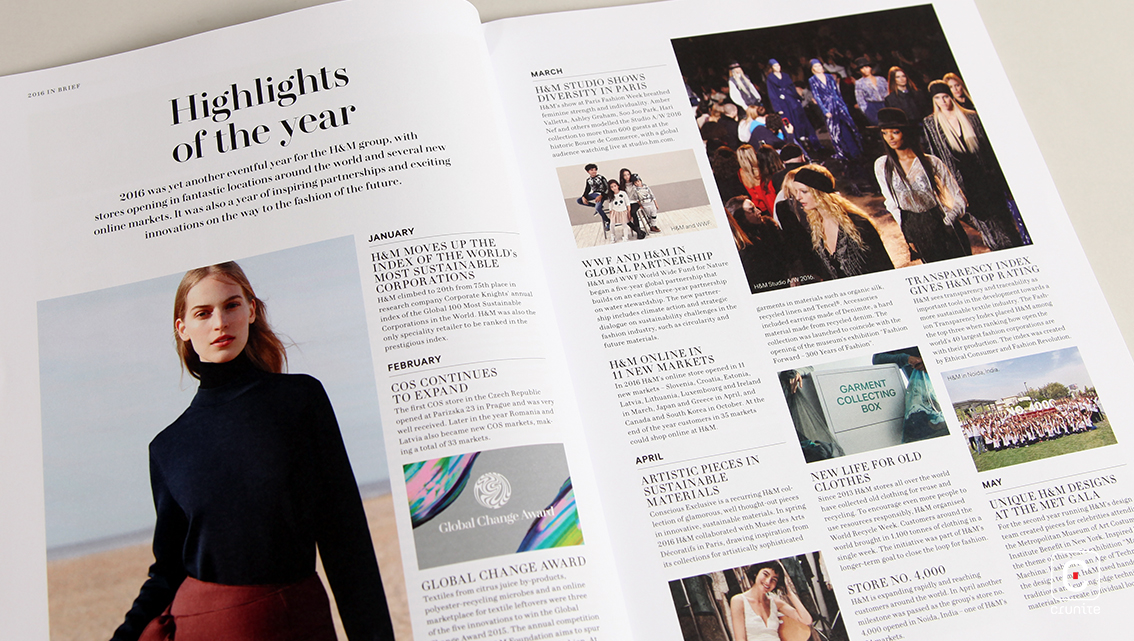
The images used here advertise each brand’s products while simultaneously strengthening the content on each page. These pictures range from landscapes to portraits with sober colours that complement the design while sporting monochrome, uncluttered backgrounds to bring out the main subject of it. To introduce H&M’s brands, the report uses a collage of six square images, one representing each brand, with overlaid brand logos, bringing out the young playfulness of the line. On the other hand, the Board of Directors take up two full connecting pages and pose formally for a black and white portrait, giving this report the right touch of seriousness as well.
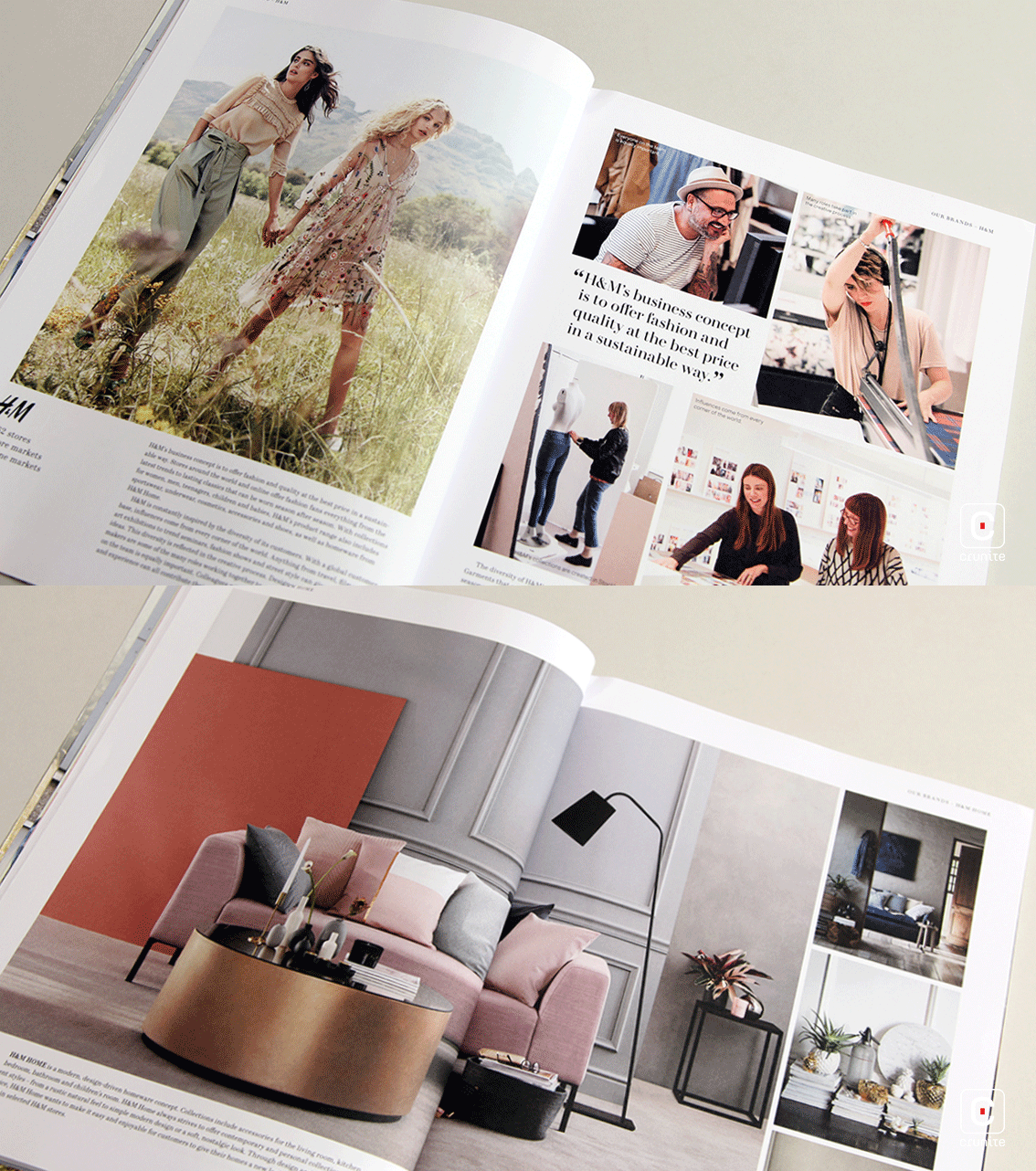
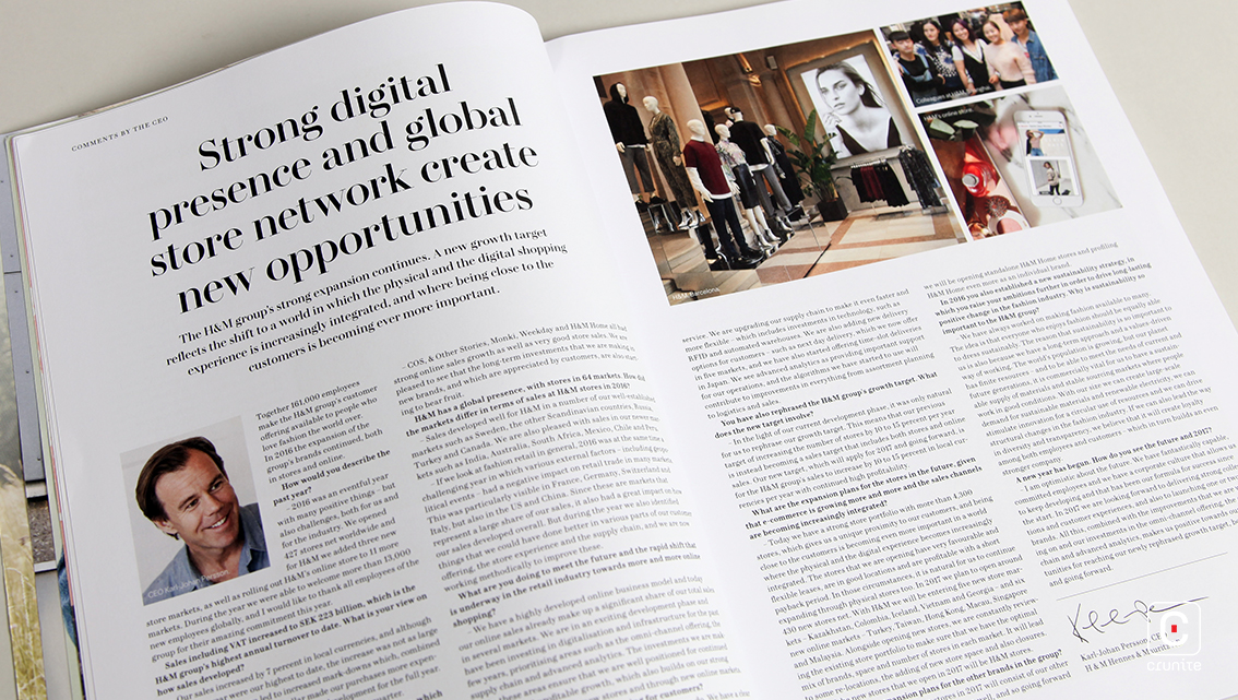
The smart, black, serif typeface used in this assembly of photographs conveys thorough but summarized content. Neat, justified columns give the report a newspaper style format and promotes a smooth flow of information, making it easier to read.
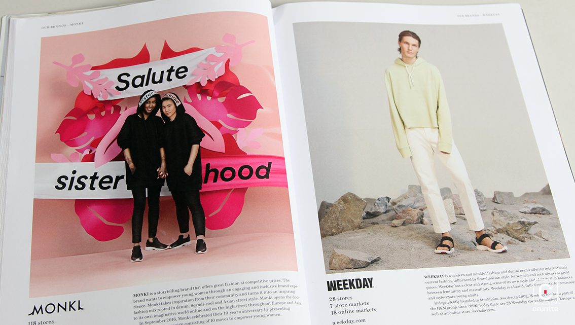
Another unique feature of this account is the structure of each section, comprising of a heading in large, bold, uppercase text followed by a subparagraph in medium, bold, uppercase text. This short subparagraph summarizes the in-depth content of that entire section, making it convenient for readers to simply pick and choose the parts they want to read.
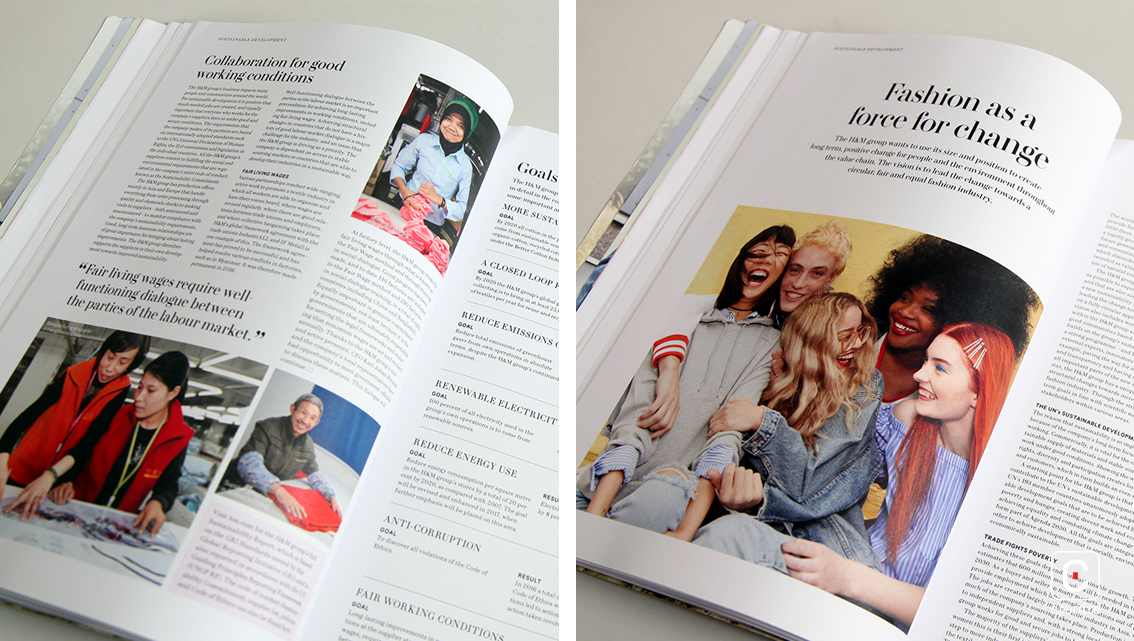
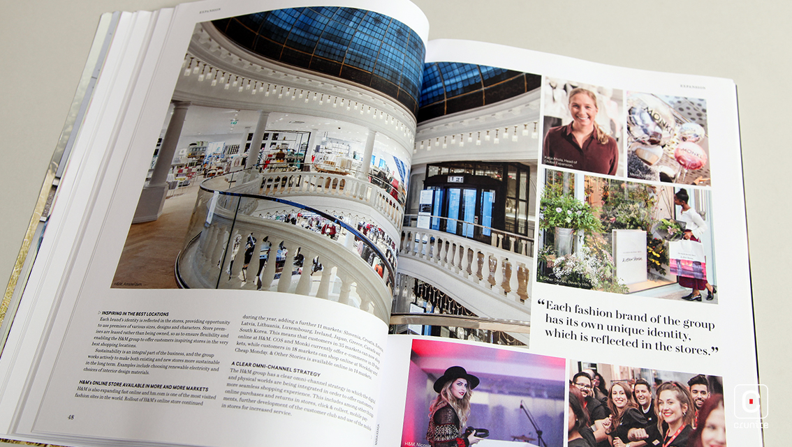
No bright colours or extravagant typography are seen and keeping with this modest format, the report also uses text-only headers to simplify navigation. All in all, the H&M Annual Report for 2016 derives elegance and sophistication out of a simple and basic format much like their simple yet fashionable array of products, while still managing to convey comprehensive content and keep their readers interested.
