
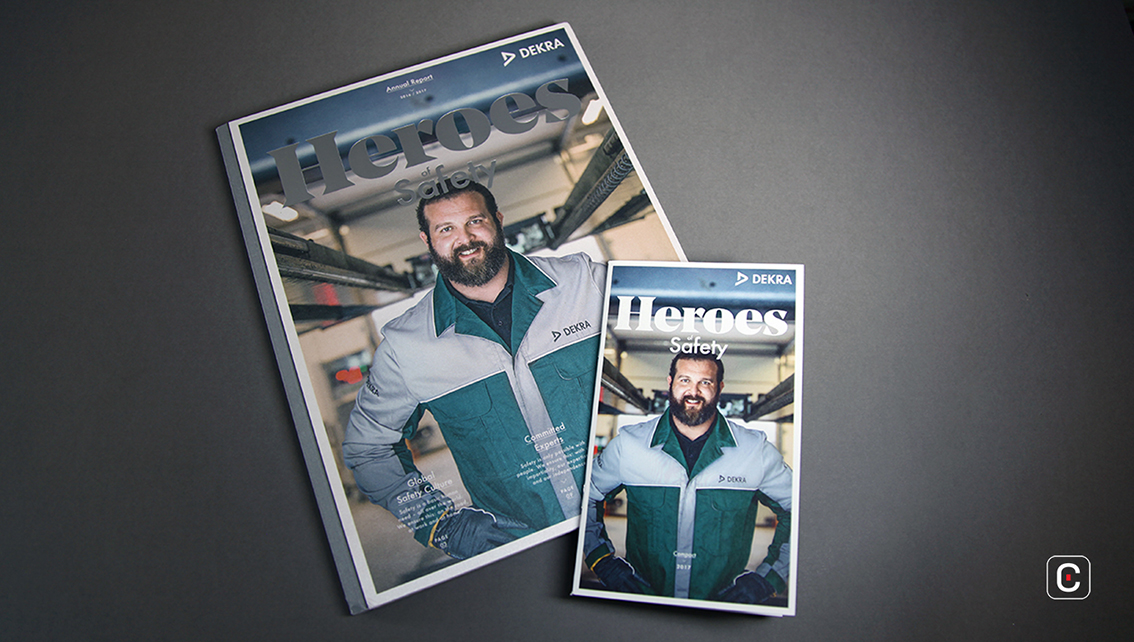
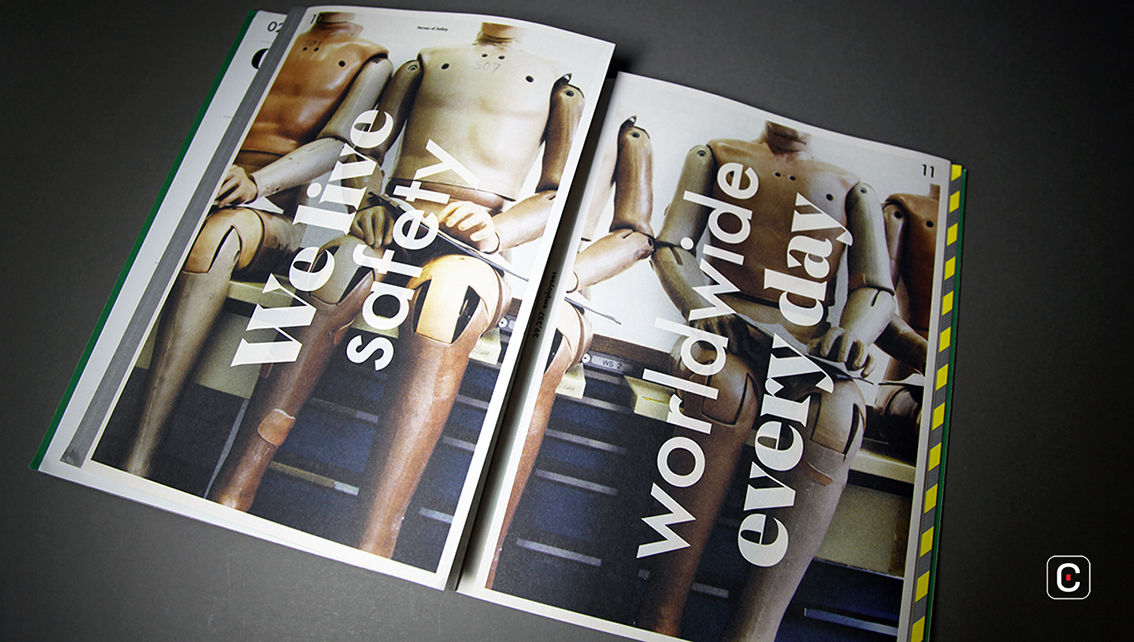
Dekra is a German vehicle testing, inspecting and certification company so it’s no accident that the message of their 2016 Annual Report is safety. The safety message is driven home throughout the report which is formatted in the style of a magazine. This choice of magazine format is especially noticeable on the front cover; a central, musthead title ‘Heroes’ spreads across the top, ‘of Safety’ appears immediately below while much further down attention grabbing items together with relevant page number encourage readers to take a peak inside. The word ‘Heroes’ is a direct nod to the company’s employees and an acknowledgement of the work they do. Their smiling faces appear on almost all the pages of the report and their opinions on safety are presented in a clear and easy-to-understand language in the ‘Management Team’ section.
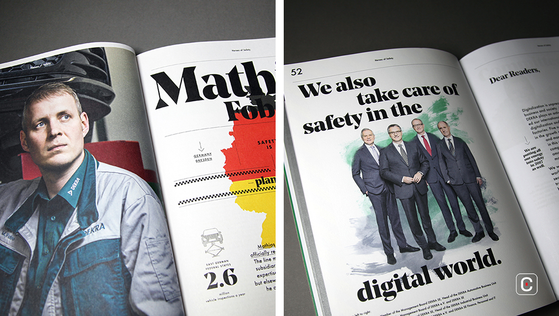
The ‘Company Report’ section looks at the safety in the digital world and discusses the way digitalization is changing business and society. The portraits in this section and also in the ‘Responsibility for safety’ section tie subtly into the concept of digitalization. The photographs have been digitized to create a pastel palette of grey and teal watercolour portraits. The treatment lends a warmth to the otherwise stark grey suit images of the management board so often seen in annual reports.
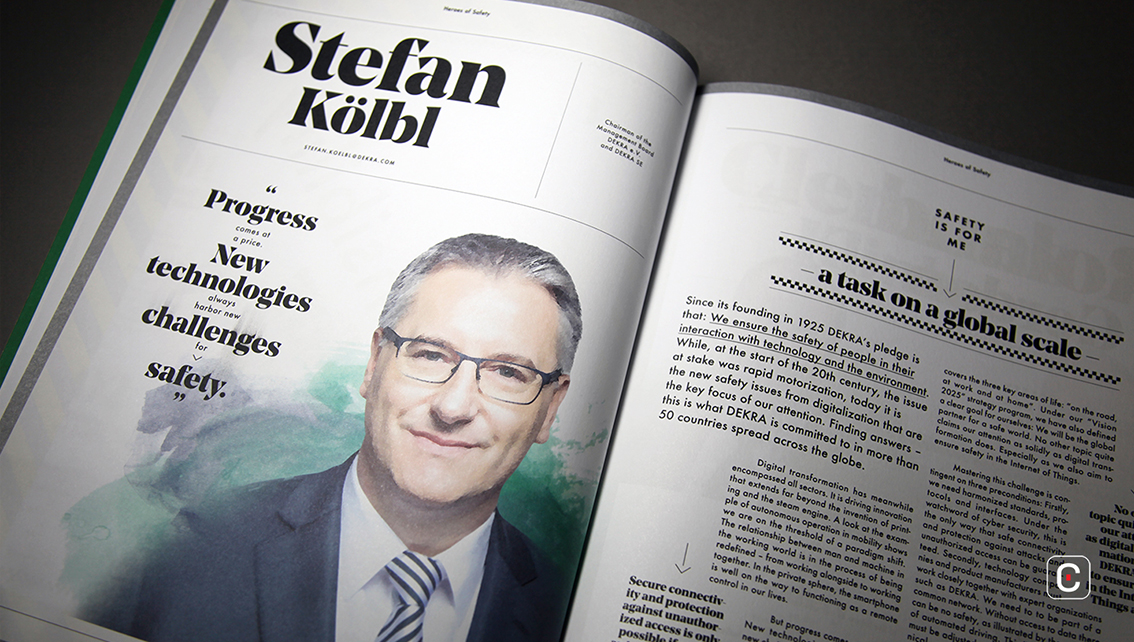
The effect is not overused. Elsewhere traditional style photographs integrate exciting colours and contrast well with the subtle watercolour affect.
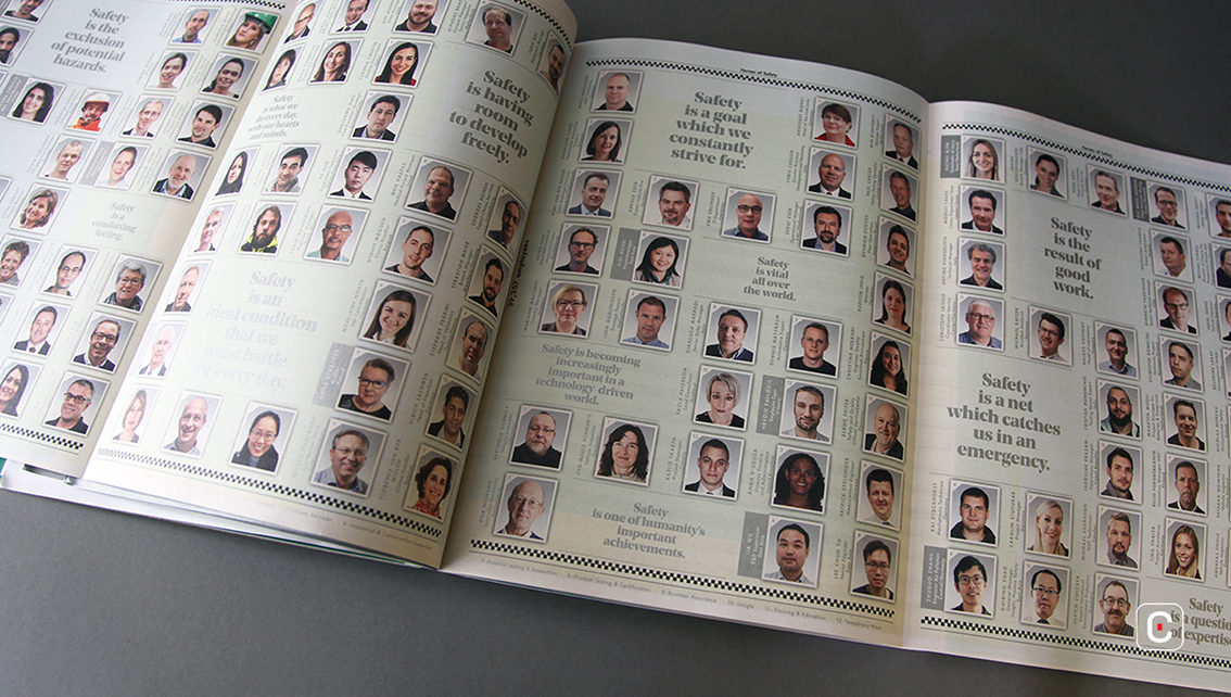
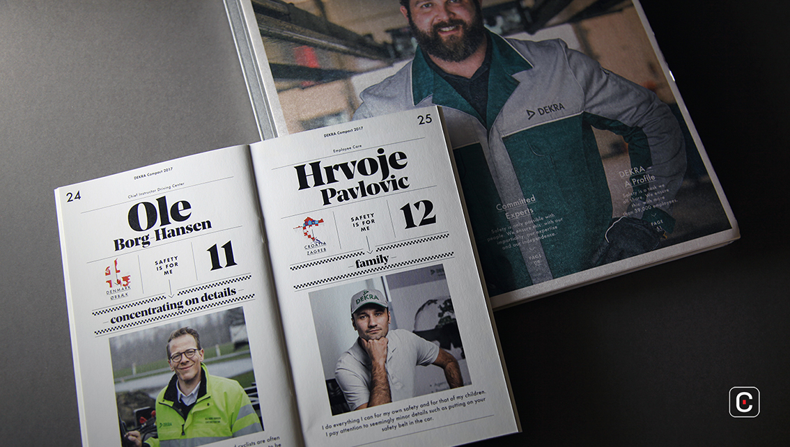
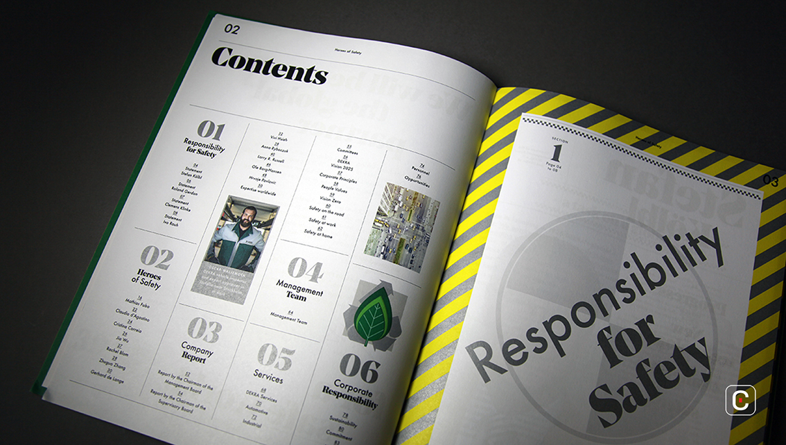
A quick glance through the report gives the impression of a document that is rather busy. Many of the pages are multifaceted; double-page spreads of photographs play background to chunks of solid text with hanging subheadings and pull out fact snippets. This is interrupted occasionally by a double-page sharp, detailed photograph that presents an opportunity to relax and take in the view before moving on to the next visually busy page. In the ‘Heroes of Safety’ section, which focuses on employees and the countries in which they work, a country map of the employee’s work location provides quick visual information. Safety related symbols are motiffed throughout the report. In the ‘Company Report’ section, the infographics use an edging and style reminiscent of ancient maps. Whilst the company is not ancient, it has been around since 1925, perhaps the map designs hint at its longevity.
The names of the management board and the company’s employees in a large bold seriffed typeface of various sizes act as section titles, for example in the ‘Management Team’ section where an email address subheading is also included. A much smaller clean san serif typeface is used for the general copy and more detailed information such as management board’s contact details and profile and the body text.
Back![]()
![]()


