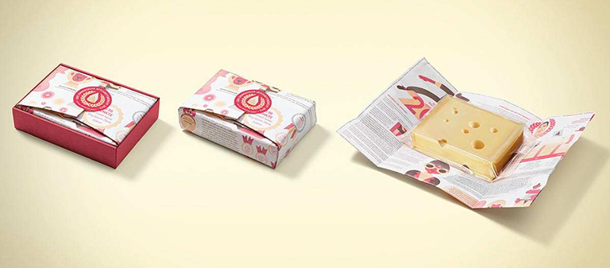
Swiss cheese giant, Emmentaler, produced their 2014 annual report on a single side of waxed cheese paper. Leo Burnett Switzerland’s design of the annual report pushes the boundaries of the form and succeeds in an unexpected way.
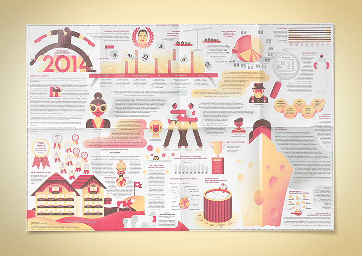
Curiously, for a company that prides itself on its nationality, the Emmentaler report eschews most of the tenets of the Swiss Style (International Typographic Style). Absent are the typically rigid grid; there is no use of photography; ragged-right text appears but inconsistently; and while asymmetry is relied on, it is often distracting. The only consistently applied element of the Swiss Style is sans serif typography.

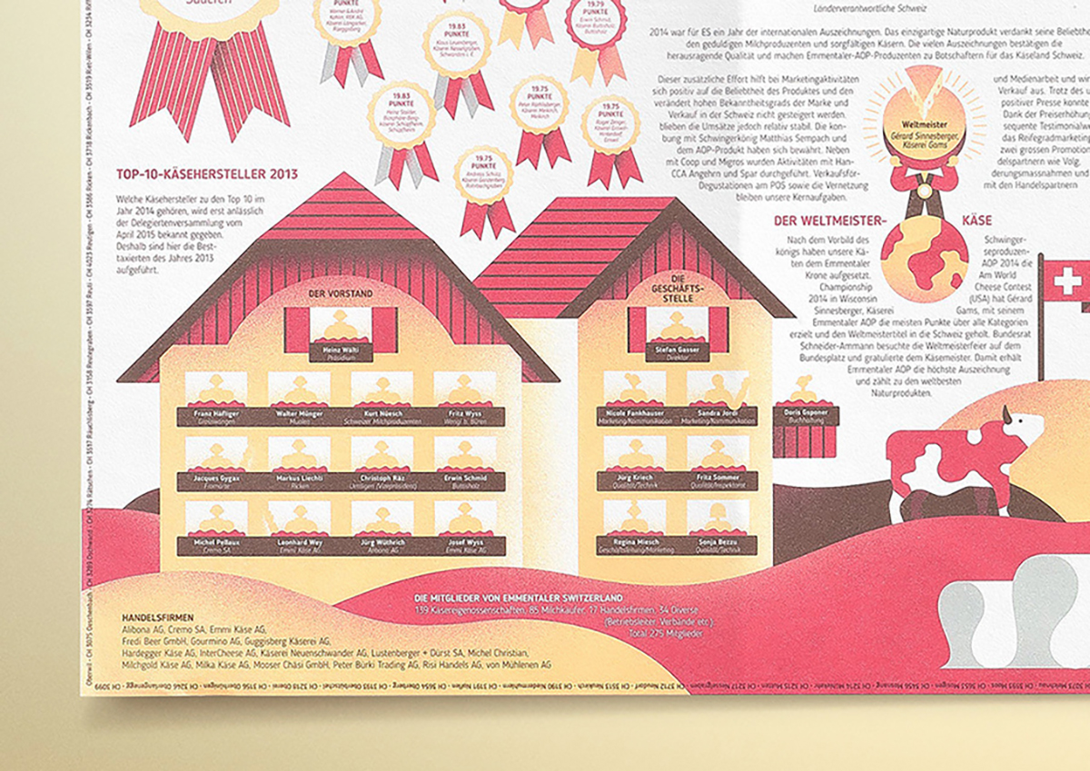
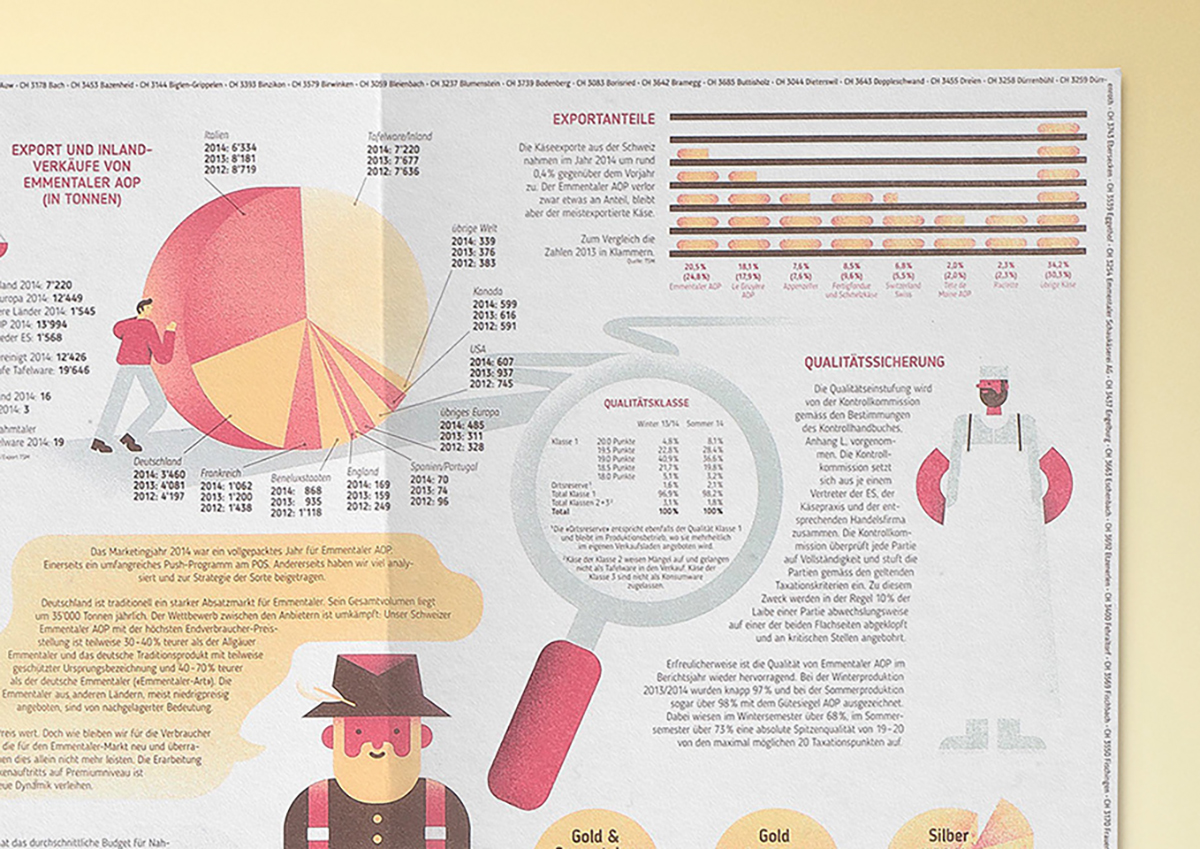
And yet, the report works. The reason it works is a further surprise – use of colour and illustration – two design elements not usually part of the core of the Swiss Style. Here, the delicate 3-colour palette and soft illustrations do wonders to elevate the design – they soothe the eye, amidst the chaos of the densely packed text.
This report is worth studying, not because of how close it comes to failure, but for what aspects make it a success, and how they are applied. Experimental reports like this are risky to pitch and hard to sell. The sheer bravado on display here is worth celebrating. And unless you’re lactose-intolerant, this report, wrapped around a block of Emmentaler cheese, must surely rank as one of the nicest annual reports to receive.
See our Emmentaler 2020 report review: https://www.crunite.net/fine-cheeses-emmentaler-aop-2020/
Images: ©Emmentaler
Back![]()
![]()