
At only 68 pages, the Andritz Annual Report 2016 presents a year’s worth of information in a concise, easy-to-read, comprehensive booklet. Furthermore, the compact publication manages to include not only statistics but also pitches its products to the reader to boot. Thumb through the report and it’s clear from the design that just over half the publication is a magazine-style review of the company followed by a quick glance at the financial year.
The report, based around the theme of safety – the title plays on the idea of complete coverage ‘from A to Z’ using the ‘Andritz’ name – is engaging and visually appealing.
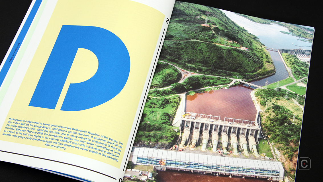
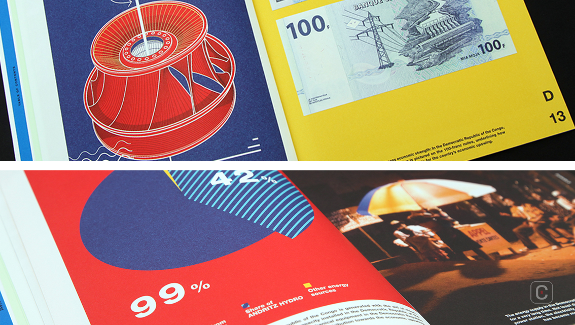
Soaring over page 11 the reader gets a bird’s eye view of a dam on the Congo River.
The mood switches to a journalistic feel on page 15 as the camera captures the cultural atmosphere of a community at ground level before rocketing into space on page 17 for a satellite image of the Earth.
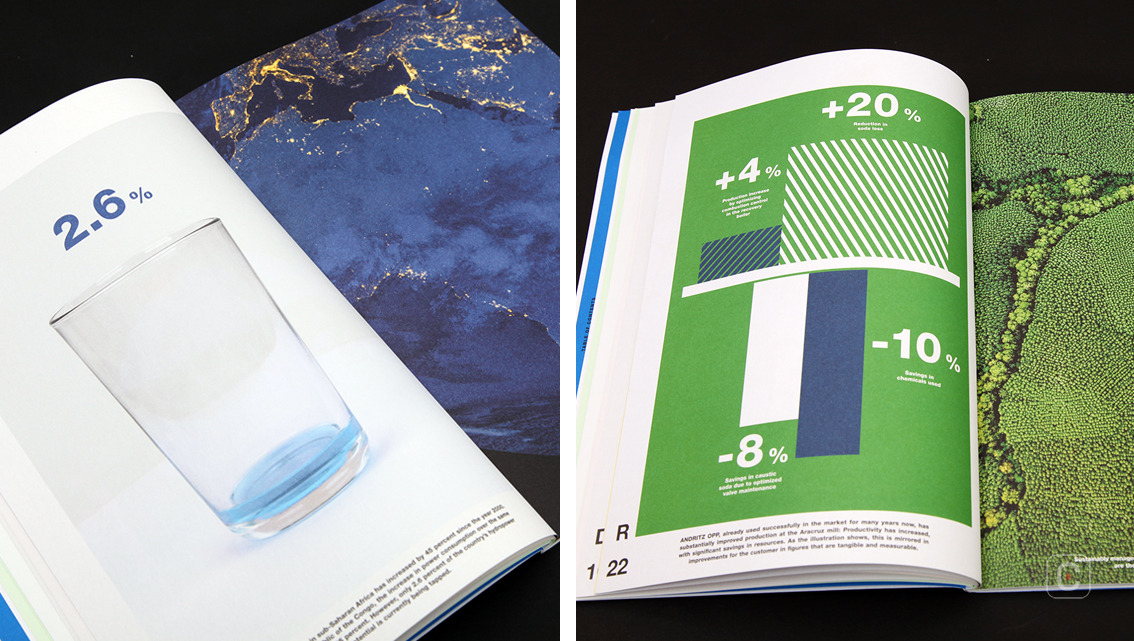
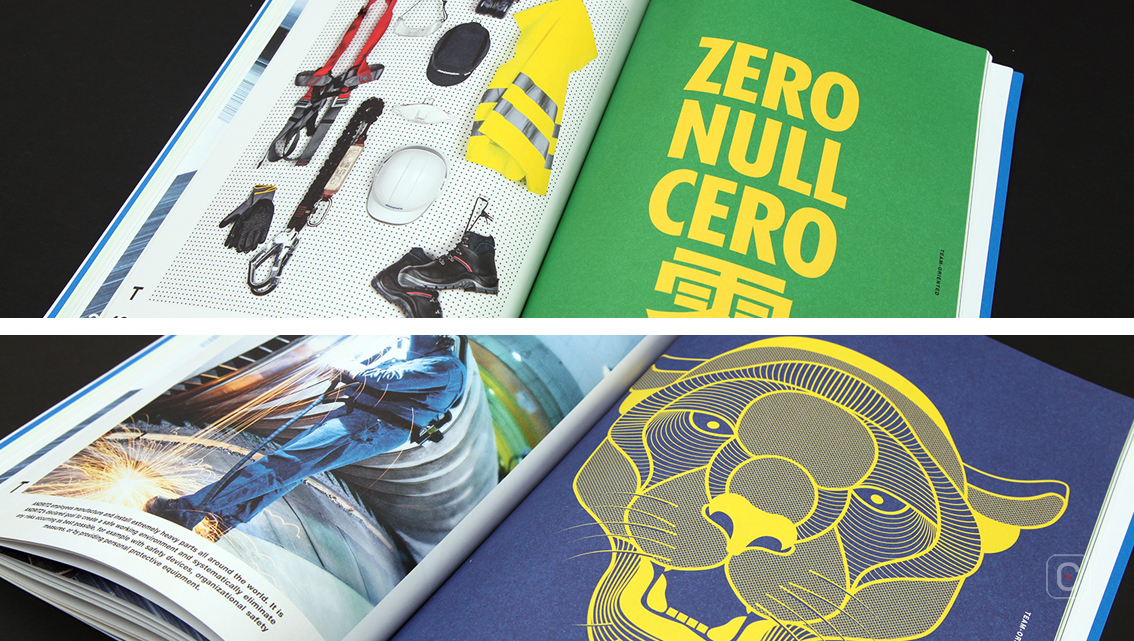
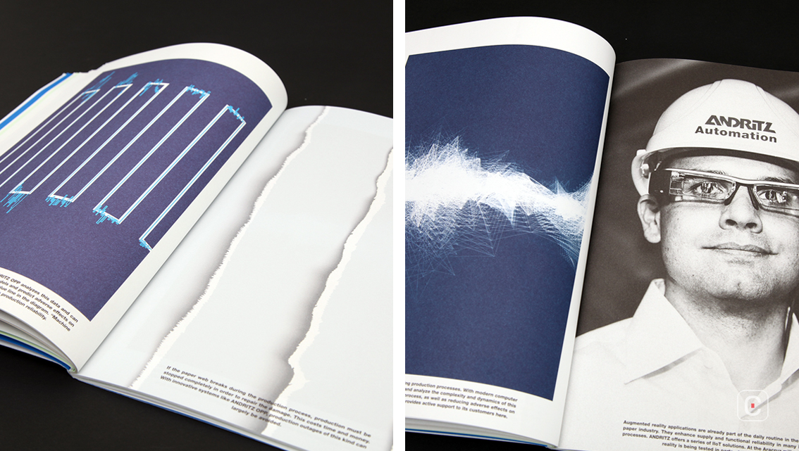
It’s not just proximity and viewpoint that change; there are crisp, colourful industrial shots as well as black and white ones, this applies to employee headshots too. Studio photography also gets a look in, for example, the banknotes denominating economic strength on page 13 and the safety equipment laid out on page 46. Studio photography is also used for some of the infographics as well as contemporary less-is-more icon styles ranging from filled to outline to intricately detailed such as the puma icon on page 43.
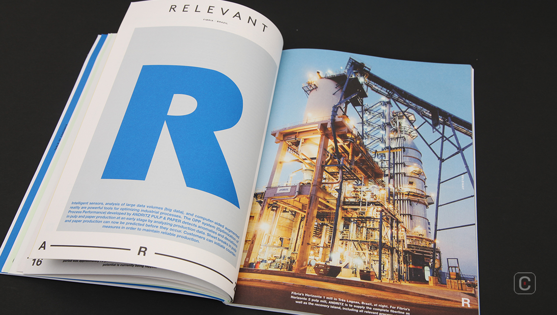
One might assume that a report filled which such varying images might result in an incohesive design, but this is not so, in this report it is the company name that binds and provides the cohesive glue. It starts in three formats on the front cover; as part of the report title, the display size initial ‘A’ which grabs the reader’s attention in its authoritative solid blue coat set against a dependable grey backdrop, and the company logo.
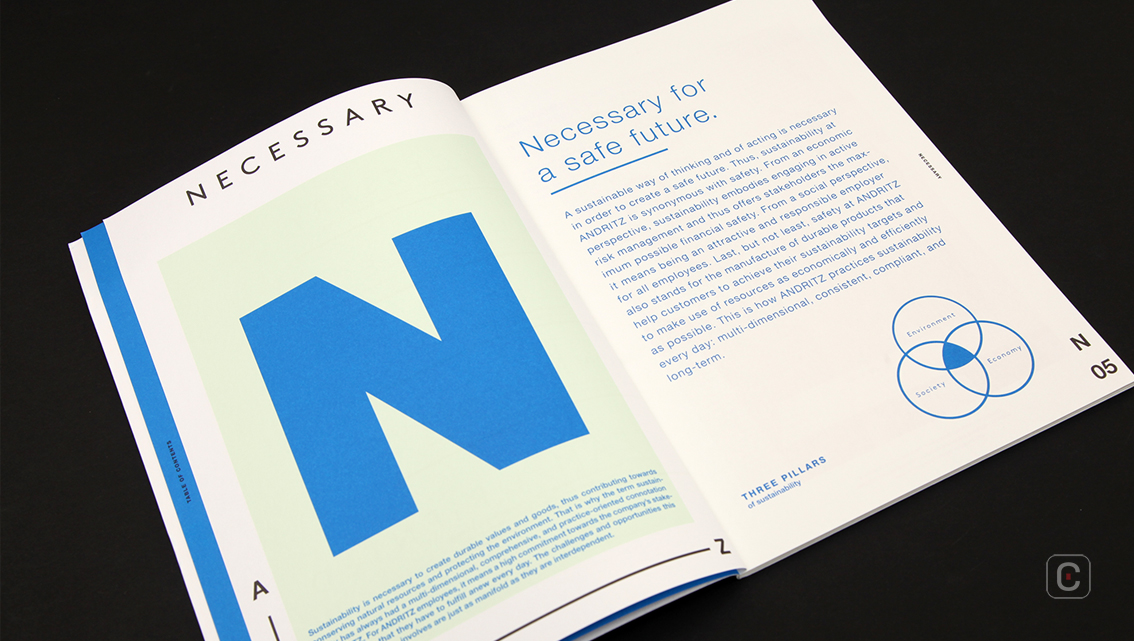
This is further supported with a mirroring letter of the relevant chapter heading strategically placed above each page number. The final ‘Z’ on the back cover ties the concept together neatly.
Another cohesive feature is the use of solid colours throughout the report. These blocks of colour mostly reflect the company’s corporate colours. Large swathes of Andritz blue threads through the report achieving a consistent look and feel.
Another design feature worthy of mention is the paper on which the report is printed. The uncoated paper, an unusual feature in an annual report, sets it part from its peers for maxim effect.
Back![]()
![]()


