Executive Risk Inc. was an insurance and risk assessment specialist based in America. Their 1996 annual report is unusual in its portrayal of what is traditionally thought of as a staid and sober industry.
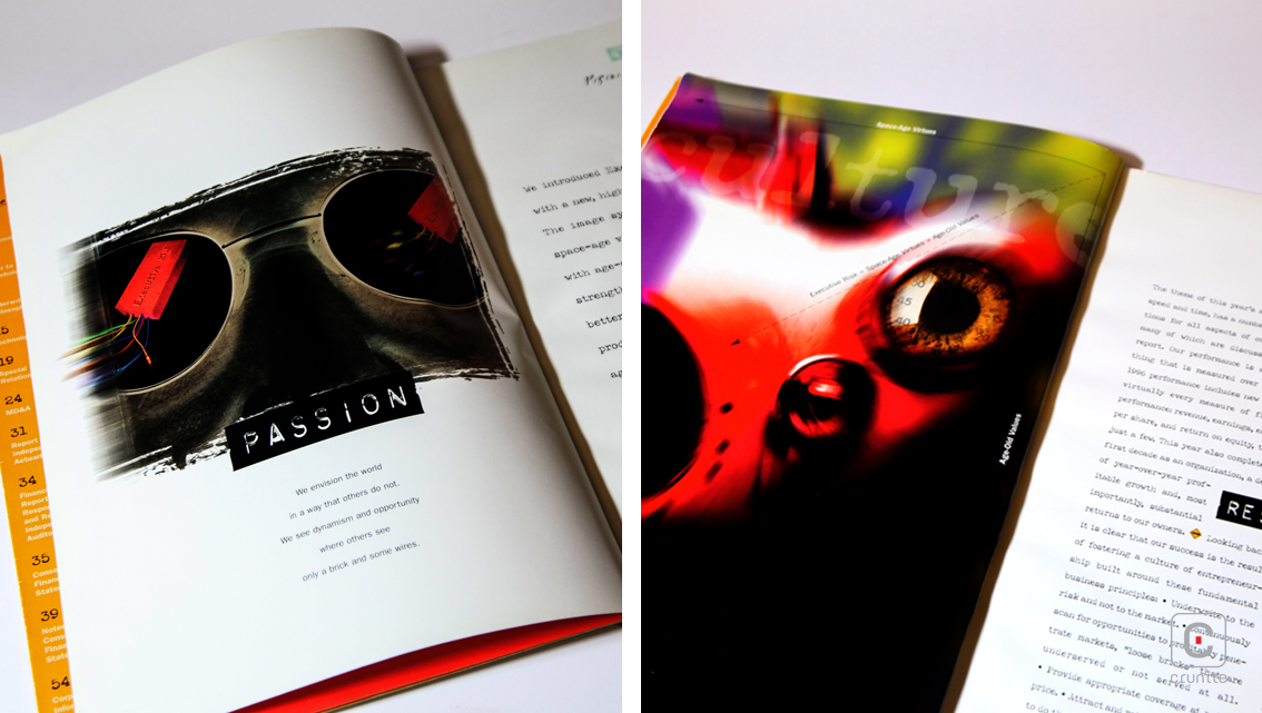
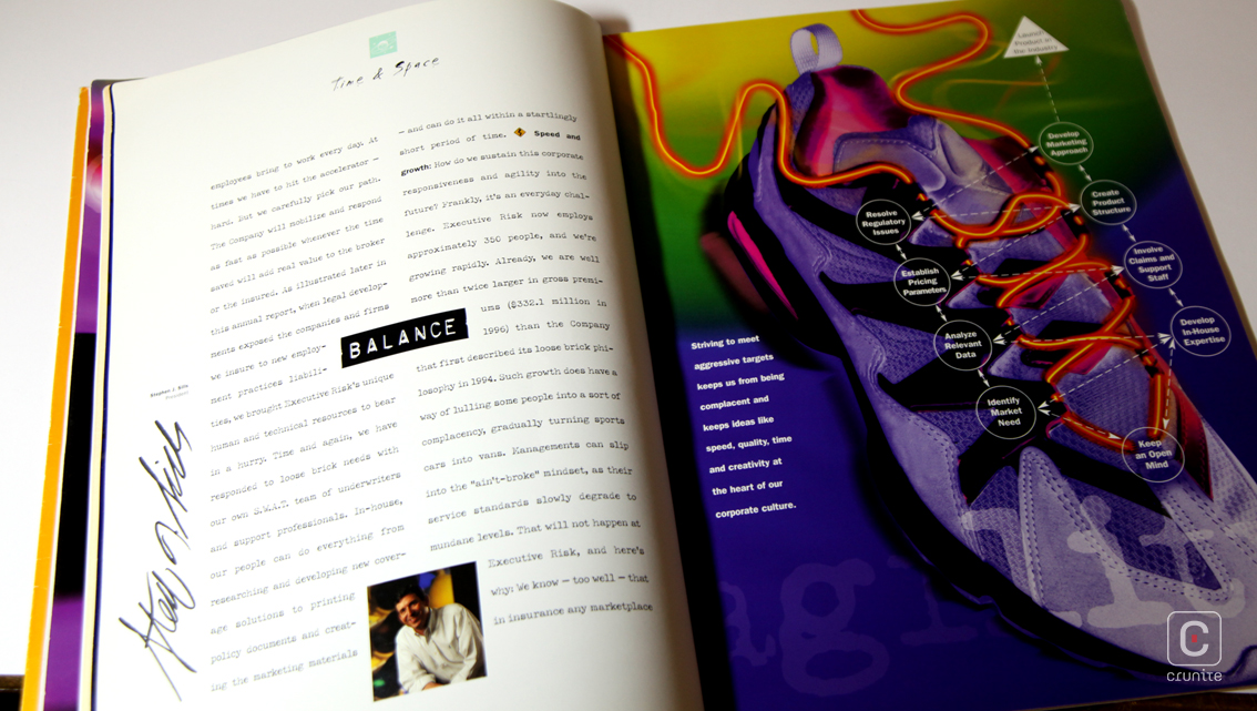
The text makes mention of a new, ‘high-tech’ website (which no longer exists) and ‘space-age virtues’. These ideas are brought to life using the two staples of 90s design – lurid colours and images blurred to suggest speed. The section opening pages are a treat for readers who are fans of a 90s esthetic. The visually busy images are annotated with arrows and dotted lines leading you around the picture, reinforcing the idea of speed.
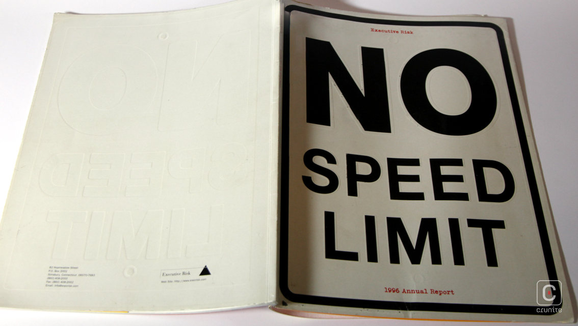
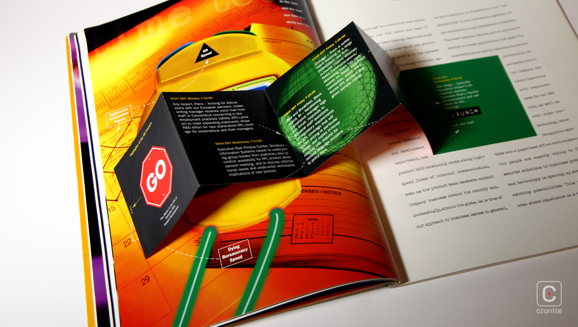
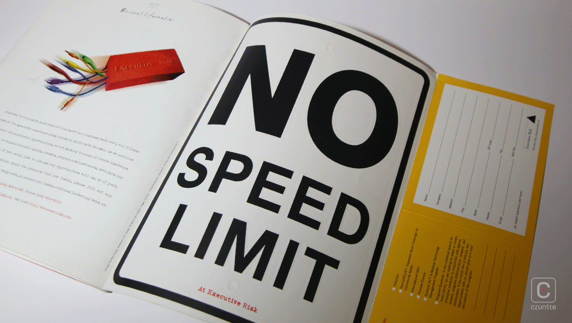
A single folded paste-in explaining the company’s process feels a little lost amidst what is otherwise a consistent design. Worth noting also is the design of the cover. Meant to mimic a speed limit road sign, the front cover features an embossing effect while the back cover uses a debossing effect – it’s the only subtle aspect of the whole report and it works well.
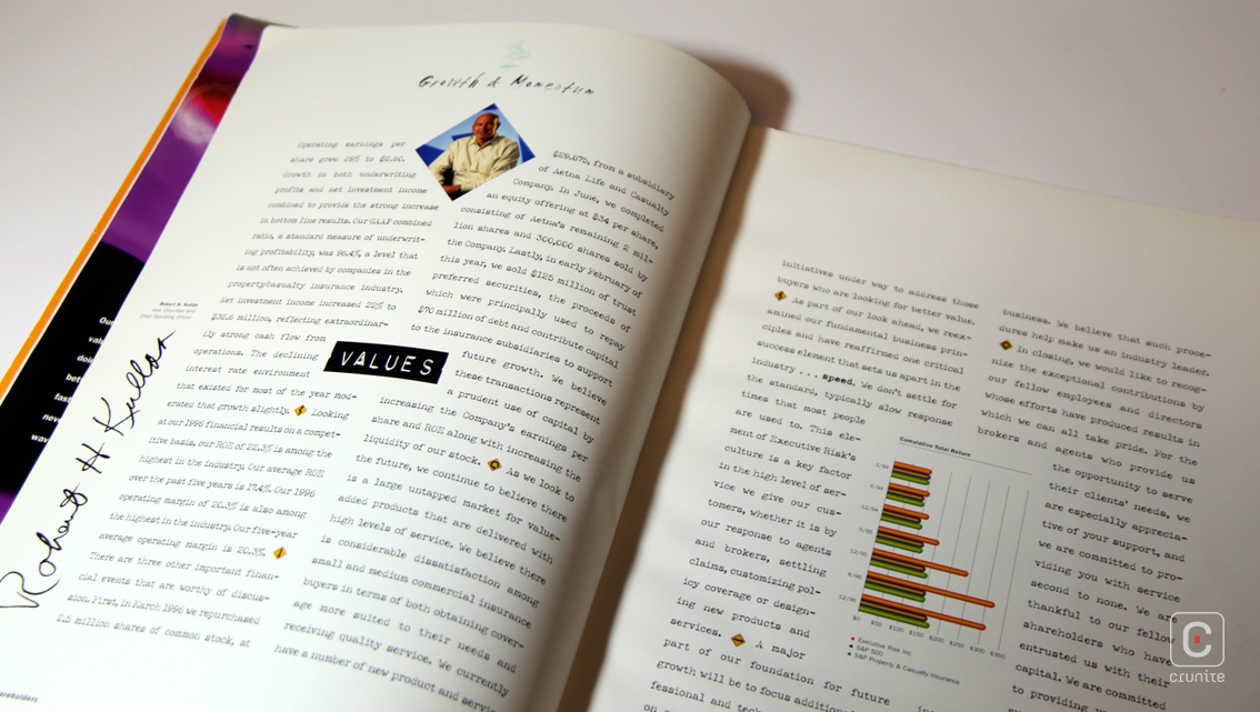
Print quality is excellent. Two paper types are used – an uncoated stock for the financials and a semi-matte stock for the thematic pages. Photographic and colour reproductions on the latter are crisp and saturated, making for a vibrant report.
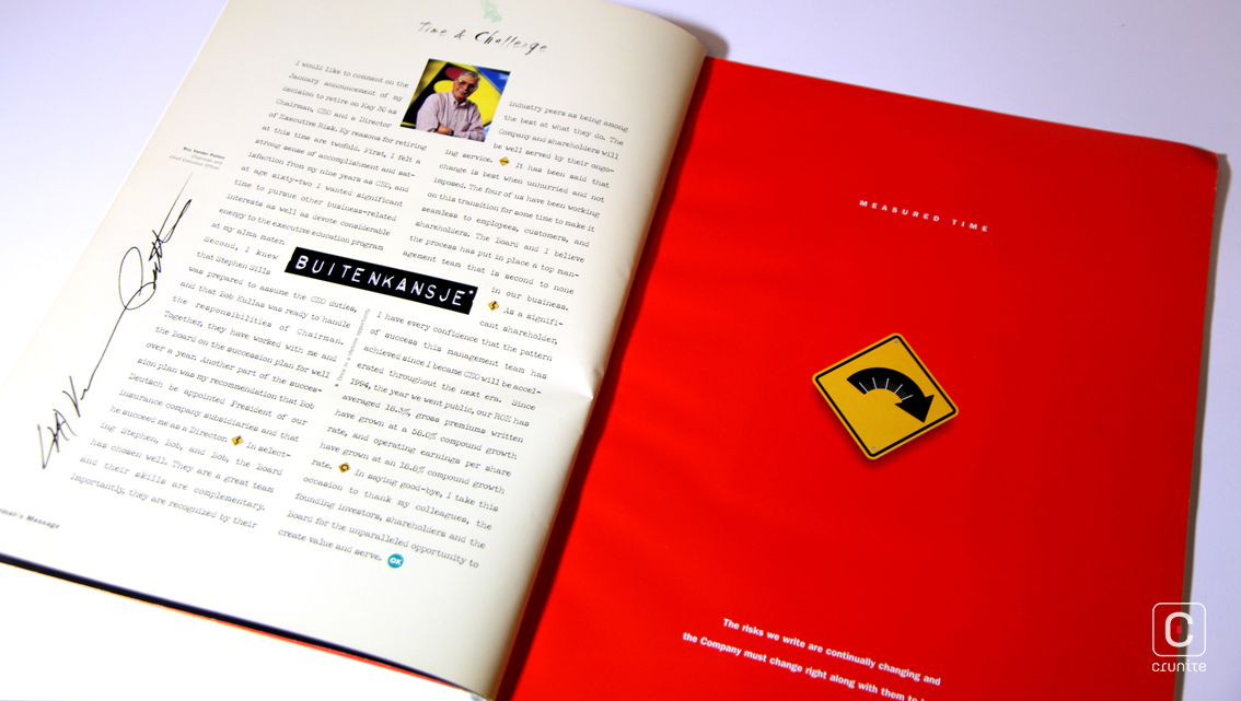
A plain, narrow sans serif competes with a typewriter inspired typeface which in turn competes with an ink-splatter effect, while section titles are set as strips of embossing tape. There is a sort of joyful madness to the design which is a refreshing change for a company dealing in insurance.
![]()
![]()