
Regeneron is a biotechnology company from New York. Their work is focused primarily on biomolecules affecting human nerve cells and their applications in medicine.

Given the complexity of the subject matter, the report does an excellent job of not overwhelming the reader. It does this using a number of tools – colour, infographics, and negative space (although nearly every aspect of the design strives to make the content easy to digest.)

The orange is key – it exhibits such contrast between the other two colours as well as the colour of the paper that it may be used in tiny quantities and still draw the eye. This allows for delicate, elegant type treatments. It also means directing the reader’s eye around the page is particularly easy.
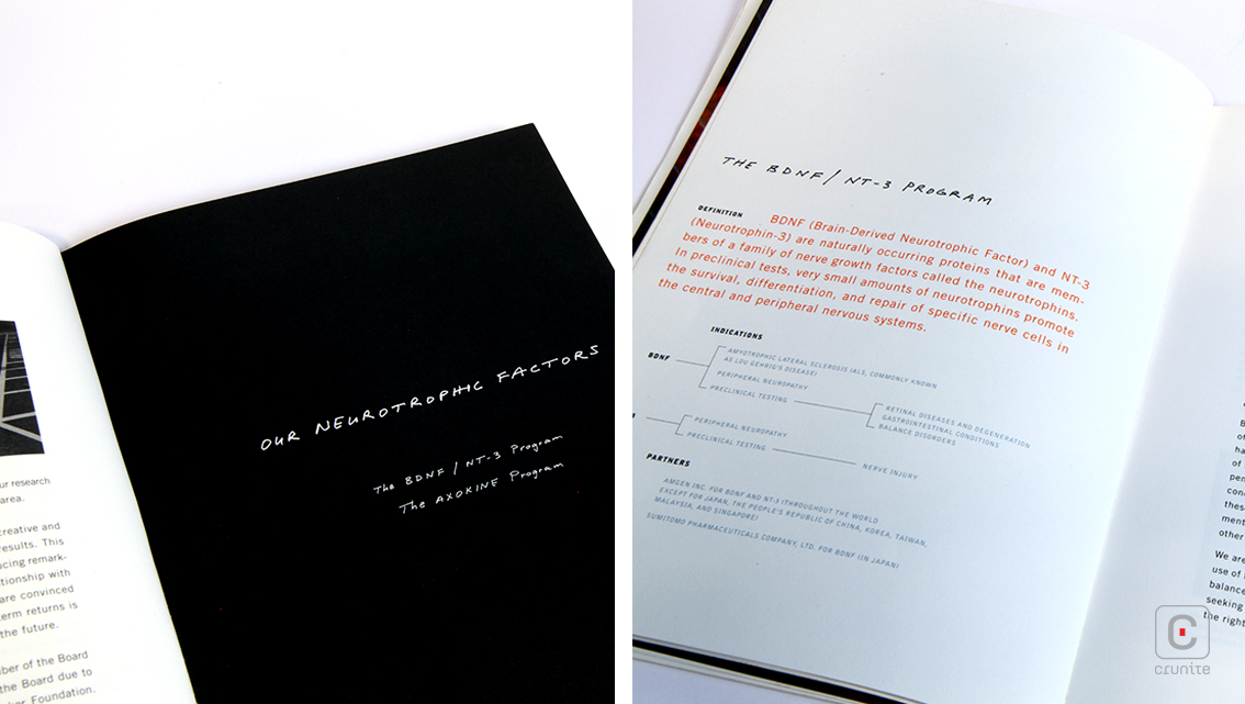
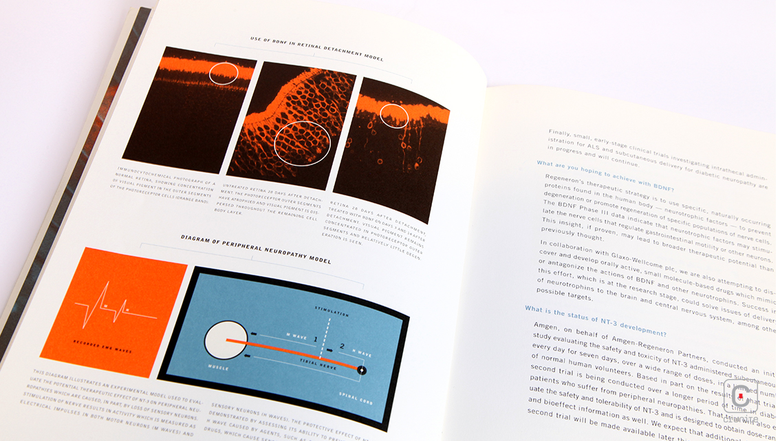
Infographics are used in a single way – to explain biochemistry. There isn’t a single pie chart or graph in the report about the company’s finances. It makes for a refreshing change. The report employs infographics in two visual styles to explain biochemistry. The first is annotated photographs that carry the weight of authority – something you might see in a medical textbook. The second is hand drawn diagrams – as if you’d met a biochemist for a coffee and she drew on napkins to explain how certain molecules act. In combination, these two styles do a remarkable job of keeping the subject matter understandable.

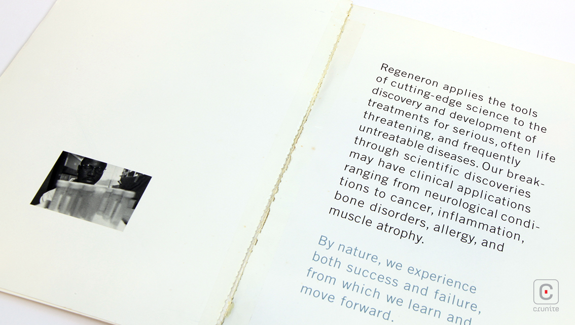
There seems to be a general consensus that a designer must put to work every square millimetre of space. The Regeneron report eschews this in favour of a calming, open design, giving design elements room to breathe. Coupled with soft, cream paper stock that does not strain the eye, the report is meditative.
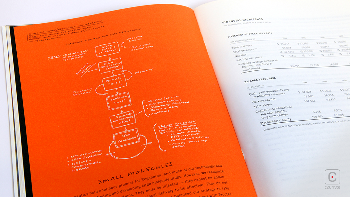
Portrait photography is used sparingly and mostly at the front. A few portraits of staff and one of the chairman and CEO round out the report. Again, restraint seems to be a watchword. Likewise, the typography – a narrow sans serif is paired with handwritten text, the latter perfectly complementing the ‘napkin sketch’ infographics. Clever use of leading and all caps on captions allows the report to impart complex information without bogging down the reader.
Back![]()
![]()


