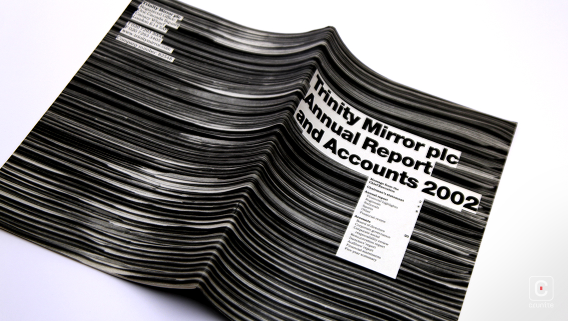
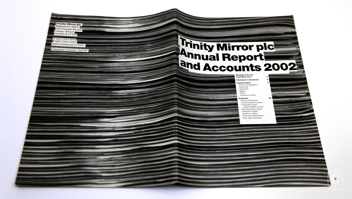
Trinity Mirror (now Reach Plc.) is a British newspaper publisher, most famous perhaps for being found guilty of phone hacking politicians and celebrities in 2011. Had they used the design of their 2002 report in 2011 it might have read very differently. The grainy black and white photography and colour palette would not have evoked a grim, journalistic cool, but instead, grime. That said, the design ethic works well for a newspaper publisher.
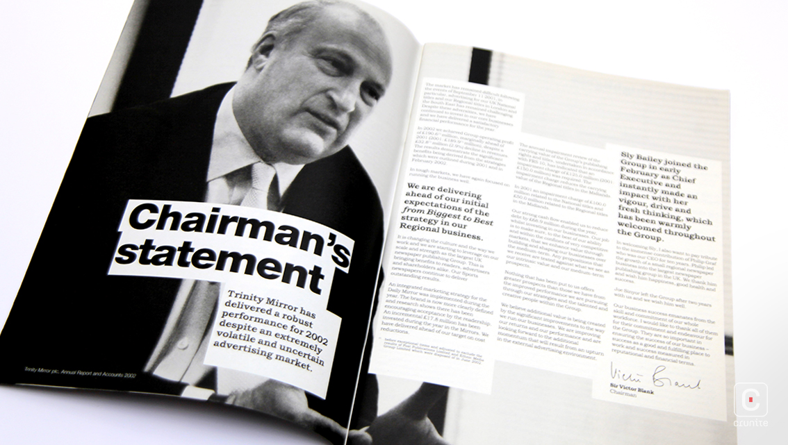
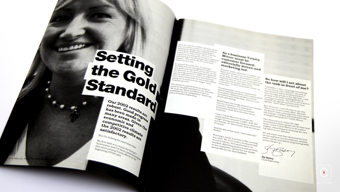
The grain in the corporate portraits evokes newspaper photographers working with film, working fast, trying to compose images through a gaggle of other photojournalists jostling for space. This approach to the portraits –swift, difficult reportage– does not extend to the board of directors, however. Here, while the images are still black and white, the portraits are carefully composed, lit in high-key and suggesting of thoughtful, capable leadership.
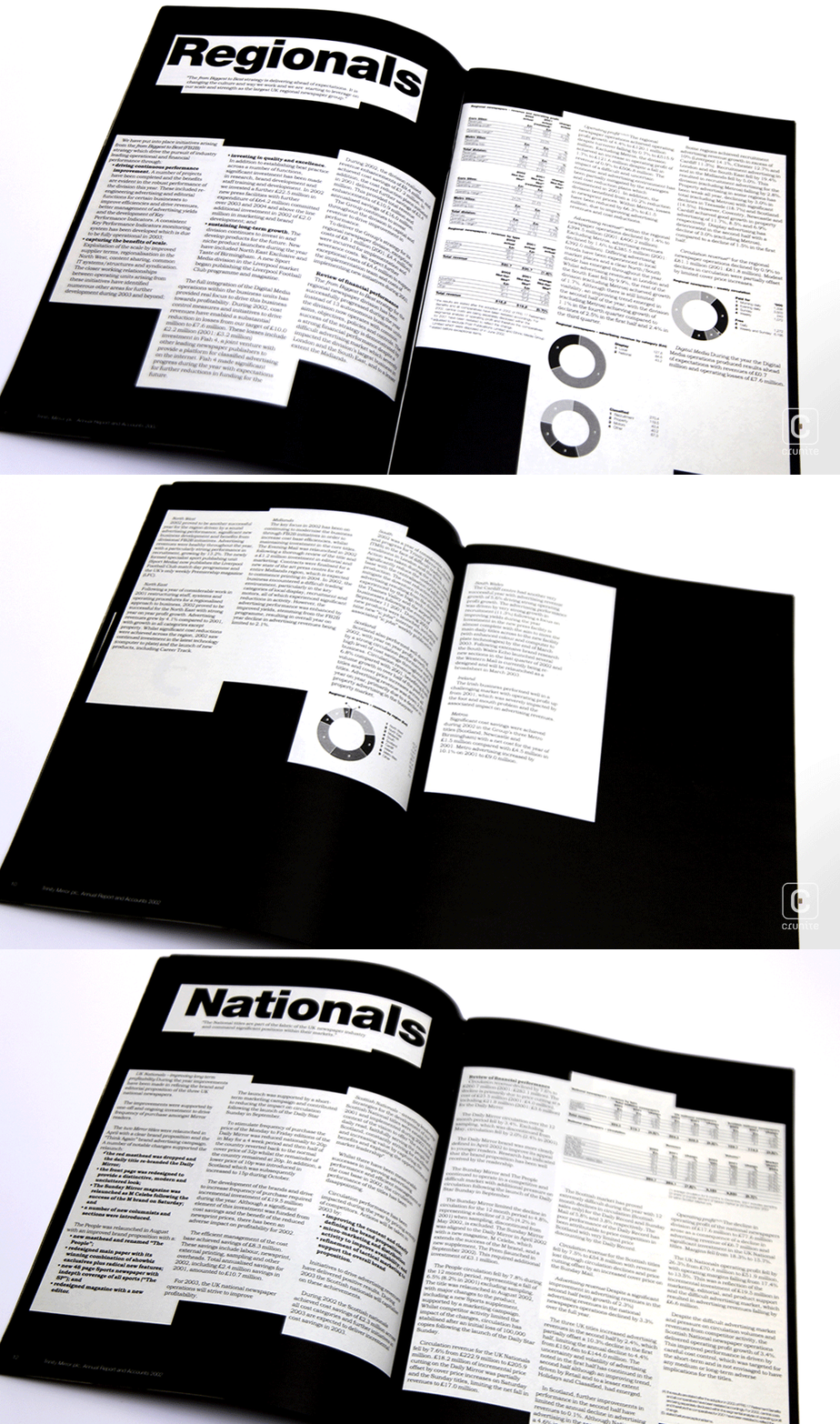
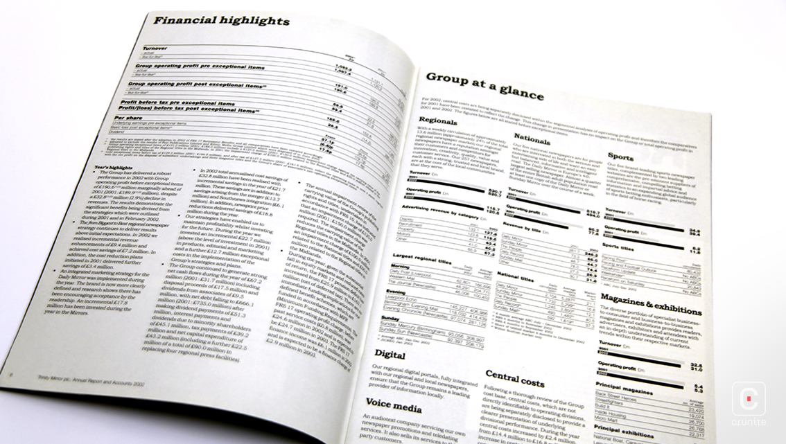
At the start of the report, type is set in a floating grid inside tight-fitting white columns on a black field, which the uncoated paper turns a deep, rich black. The black negative space is carefully balanced not to overwhelm the reader. Infographics, when they appear are set effectively in tones of black and seem not to suffer from it. The cover shows a tall stack of newspapers photographed end-on and is a surprisingly understated way of communicating their business interests.
