
Vlehan is a Dutch non-profit trade organization of manufacturers and importers of household electrical appliances. Their 2007 report is a good example of how to make an annual report easy to read, while having a sense of playfulness about it.
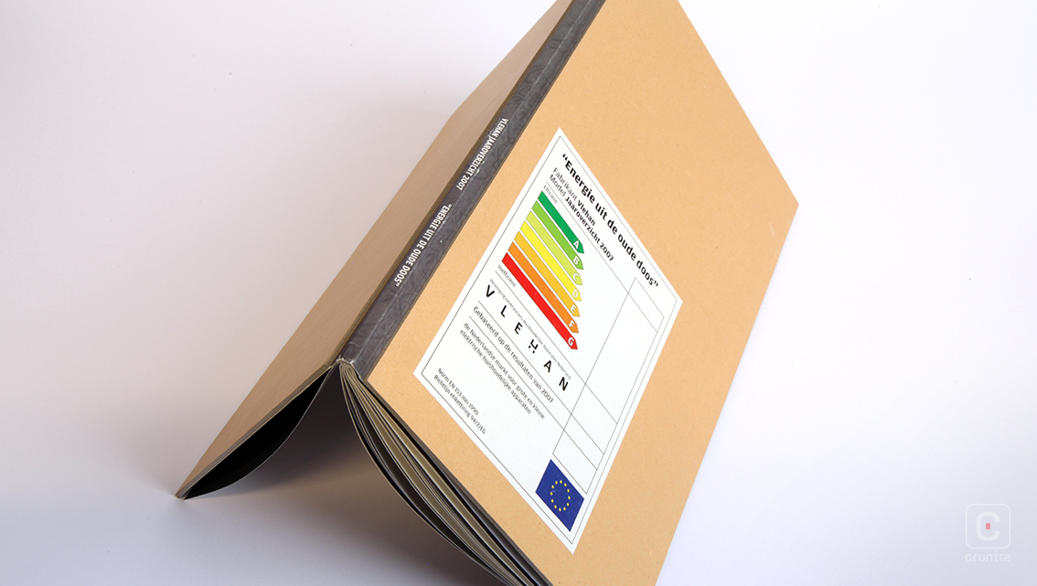
The report is a slim volume –both in terms of its physical dimensions and in terms of its page count. At 48 pages, the report is easy to digest in a single sitting. Its hard, board cover provides the added advantage of the report being comfortable to hold in one hand while reading.
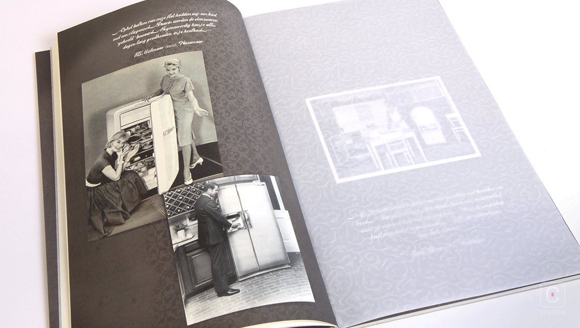
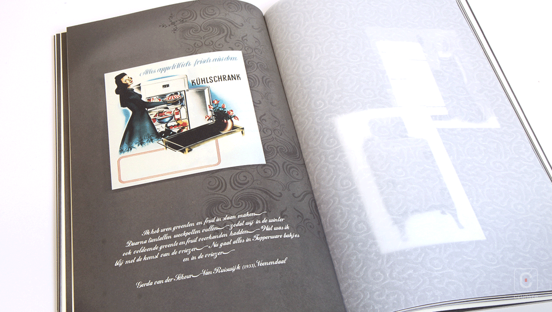
This approach to the design, coupled with the type treatment results in some surprising experiences. The type treatments are twofold – in the sections of the book that deal with the reporting, the type is a modern, narrow sans serif – while the parts of the report featuring photography use a gently slanting, serif that resembles handwriting. This has the unusual effect of suggesting each of these two sections were designed in different time frames.
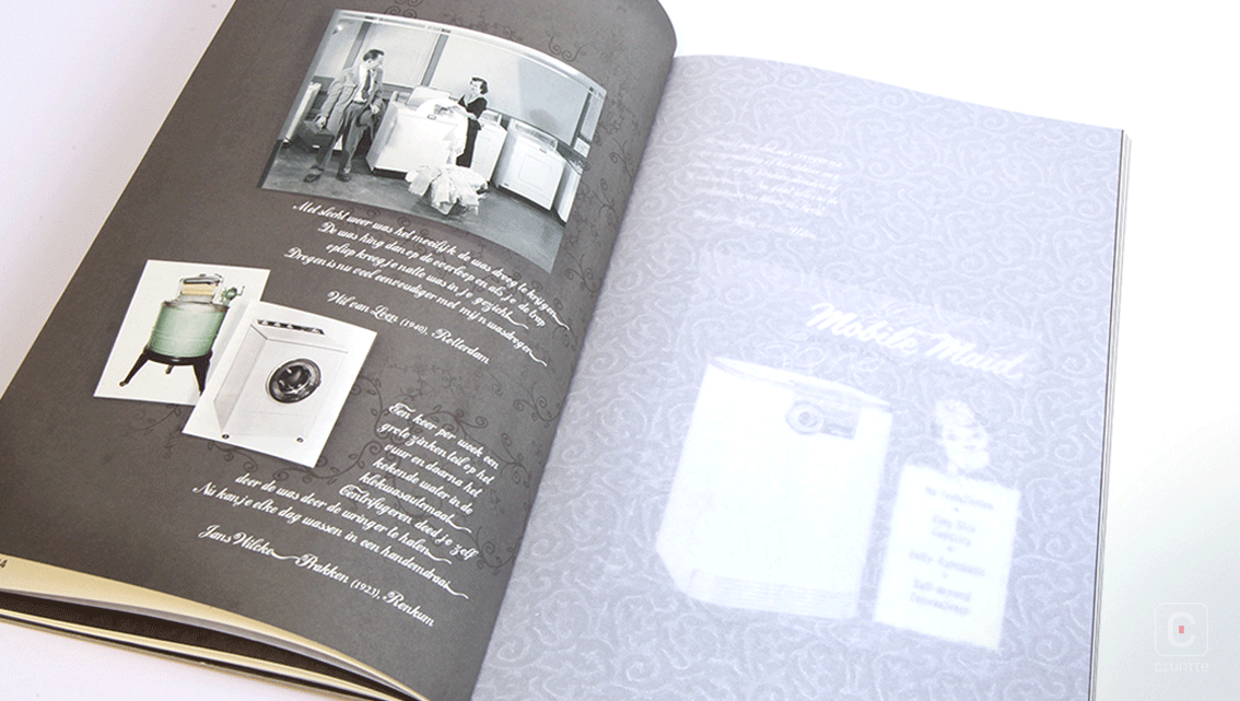
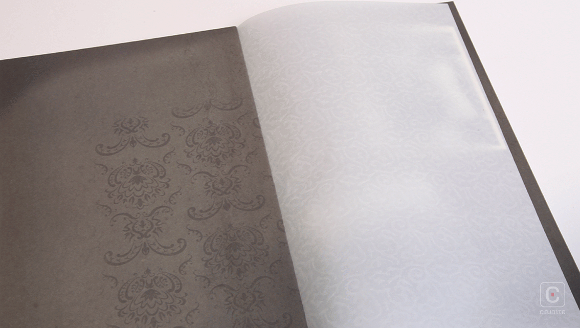
Each page of photographs is separated by a textured, sharp white sheet of ‘tissue’ paper and gives rise to a sensation not often associated with annual reports – the sound of a book other than the one you’re holding. Pleasing distractions like these sometimes make a report easier to enjoy and Vlehan use them to good effect.
![]()
![]()


