
Tilt Renewables is an Australian renewable energy generation company (predominantly wind) with operations in Australia and New Zealand. Their 2021 annual report might just make you tilt your head or the report – but it’s all in good fun for the creators and consumers of this report, as the reader will see as they turn the pages.
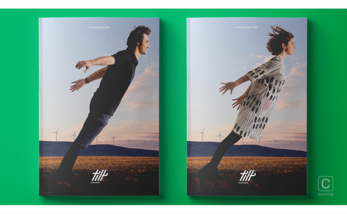
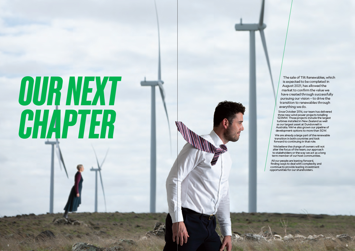
The cover image conveys a strong first impression: what came to mind was none other than Michael Jackson’s amazing anti-gravity lean! What’s special about this report is that most elements are slightly angled in their own way.
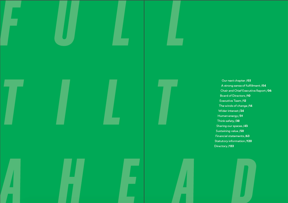
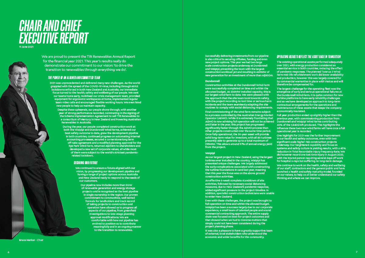
The type used for titles is set in italics, giving them a natural tilt, while the alignment of certain segments of text are also slanted, for example the contents page, and the chair and chief executive report on page 6.
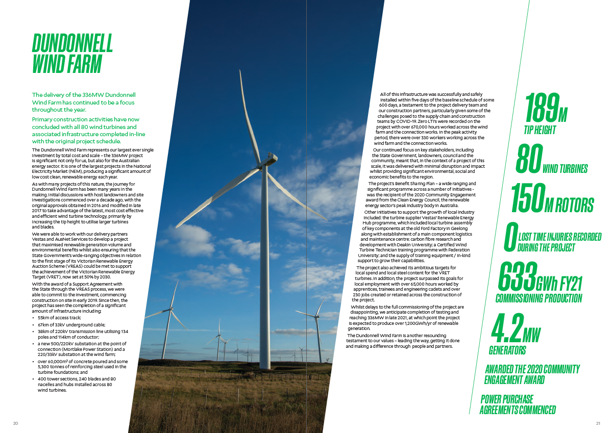
Even photography has been treated in a similar style, for example pages 20-21 and 22-23. This consistency, rather than appearing disconcerting or disruptive, is actually quite quirky.
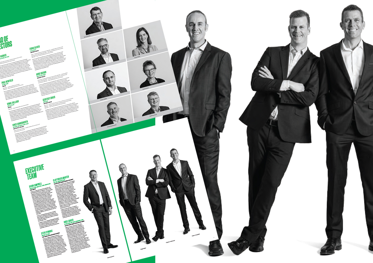
The black and white photography is a notable feature of the report. Page 11 has a collection of photos of the board of directors, once again presented in a slanted manner. Images of the executive team on pages 12-13 are also in black and white and have a playful vibe to them.
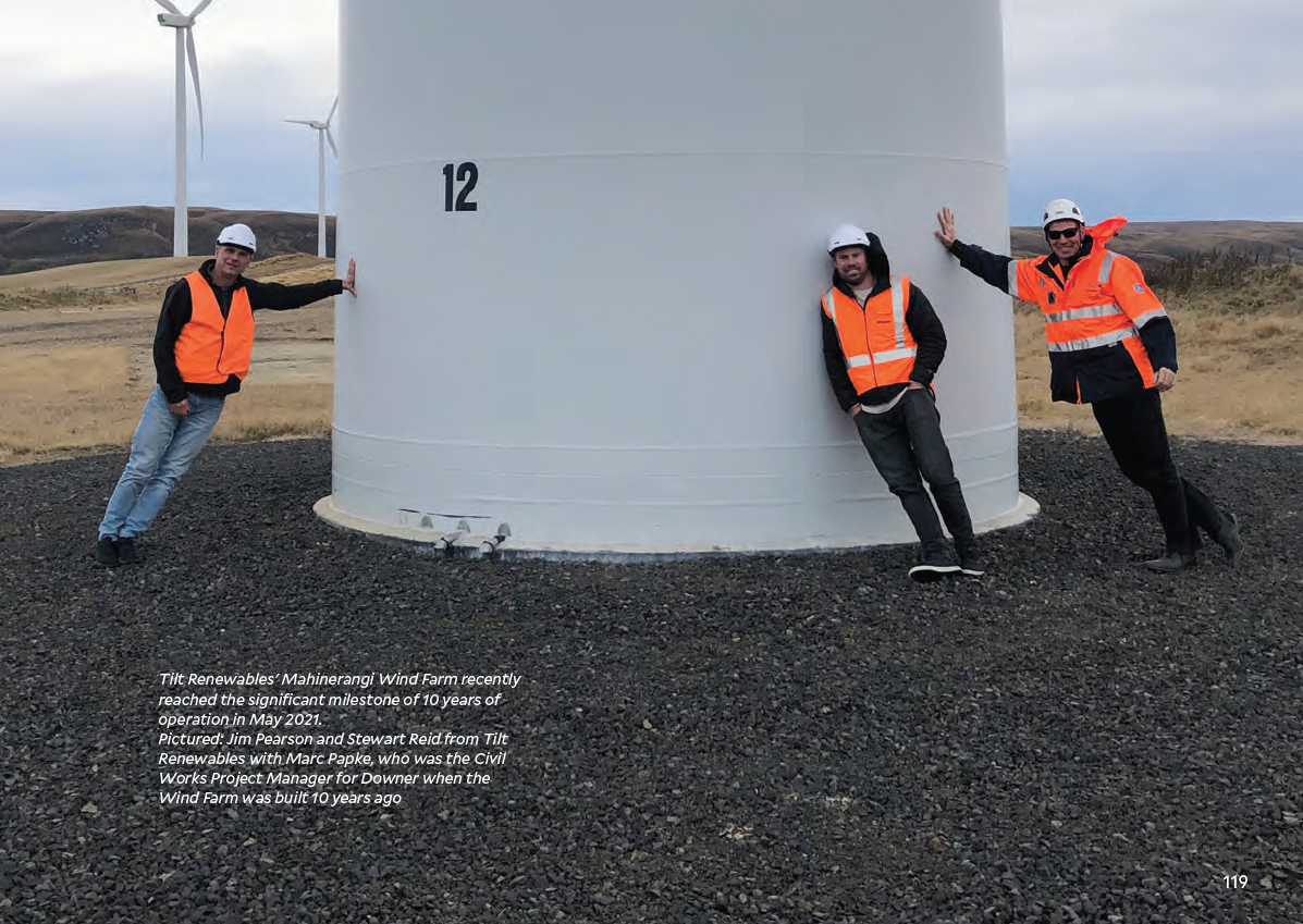
It is apparent that everyone who has been photographed for this report has enjoyed communicating the company name. The separator pages find various people within the company standing at an angle. There is even an image of employees at the Mahinerangi Wind Farm leaning against a windmill on page 119.
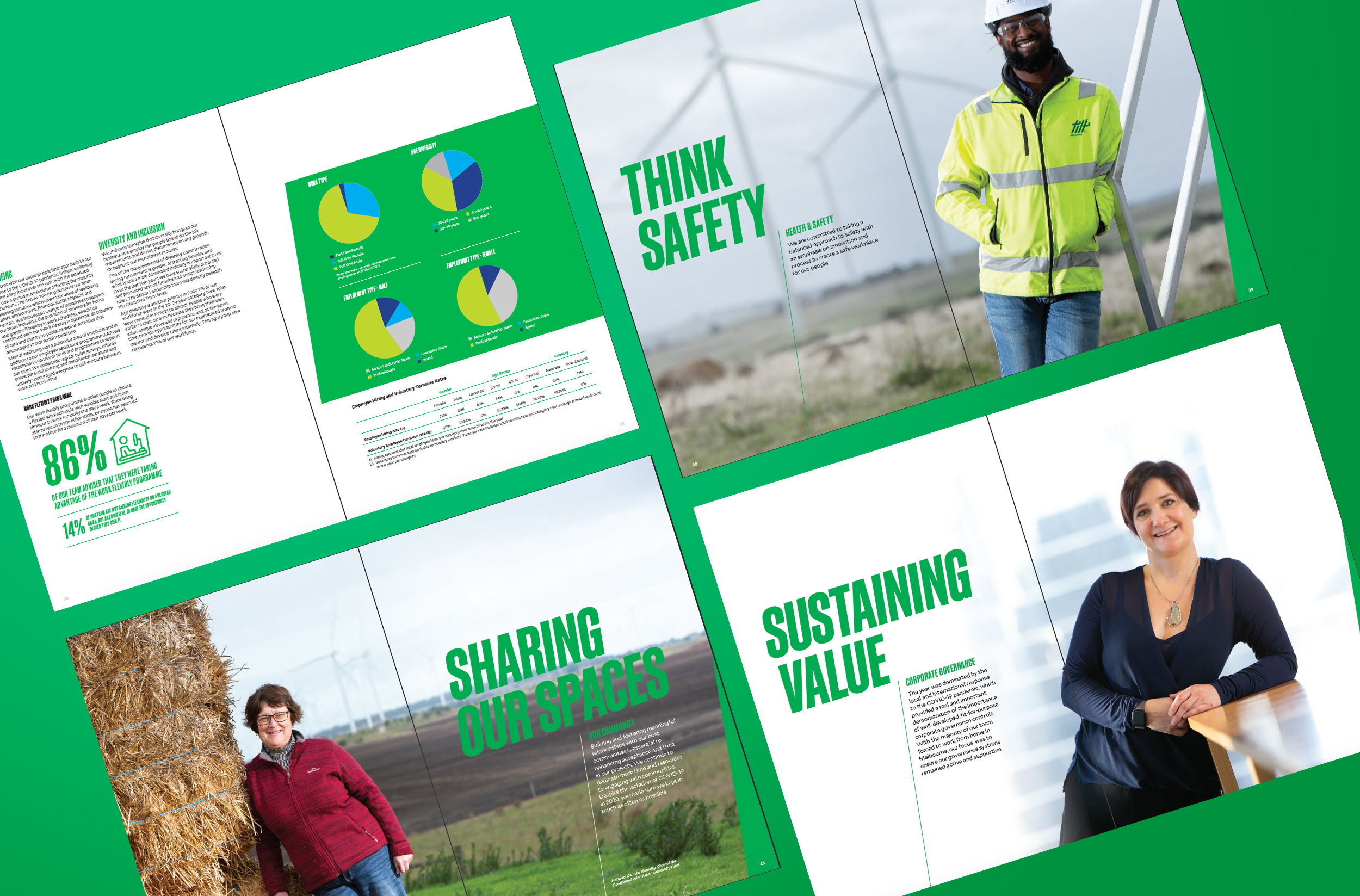
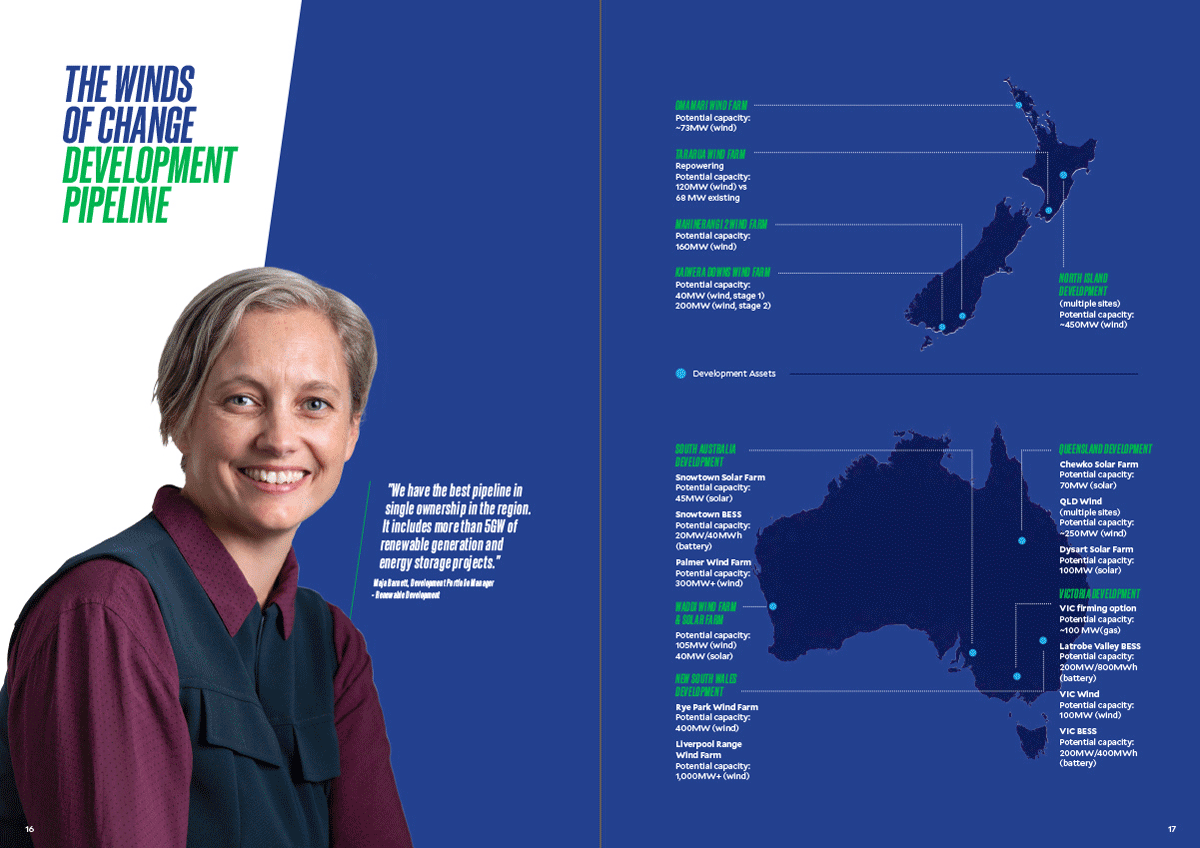
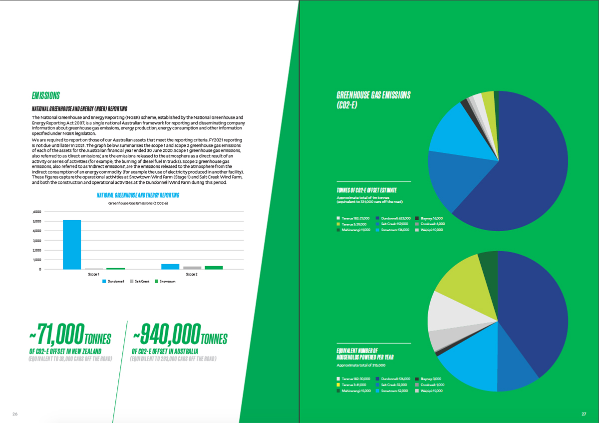
Colours used throughout the report are mostly shades of blue and green, that perfectly match the environment-focused approach of the company. Data representation and maps of Australia and New Zealand use the same colour palette and are vibrant and easy to understand.
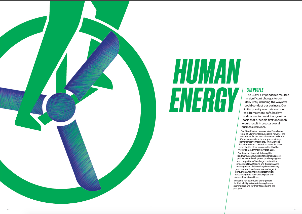
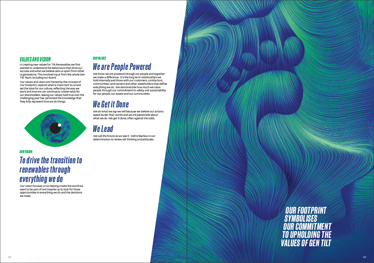
In addition to the creatively tilted (yes, this word is coming into play excessively!) features, there are some lovely illustrations to match the colour palette. Pages 30-31 showcase an apt illustration to match the title, while pages 32-33 display a similarly styled illustration. This report has certainly tilted (couldn’t resist) our opinion towards slightly lopsided content in annual report design.
![]()
![]()


