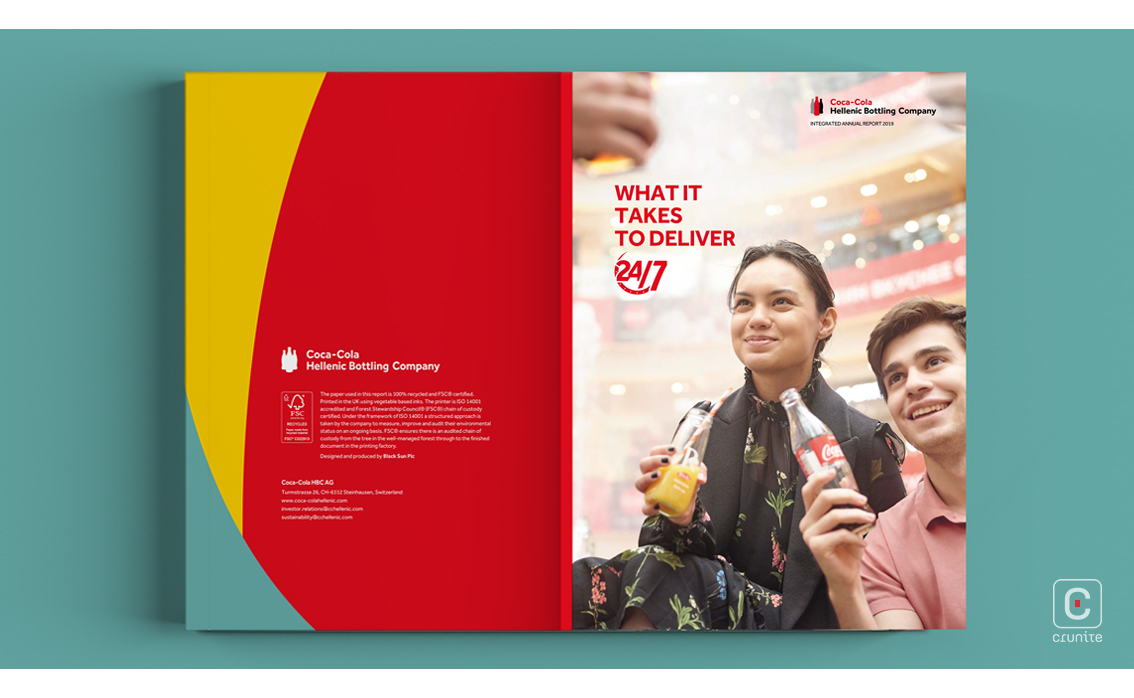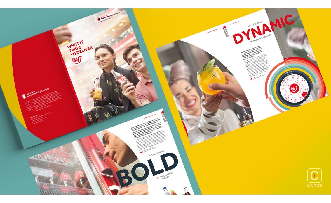
The cover page’s familiar red hue and smiling faces bring to mind many legendary campaigns and makes the Hellenic Bottling Company’s 2019 annual report stand out. The bottling partner of the Coca Cola Company uses the iconic Coca Cola red throughout this account in borders, images, headings and infographics, alongside a bold yellow and a muted aqua blue creating a colour palette associated with many beloved brands.


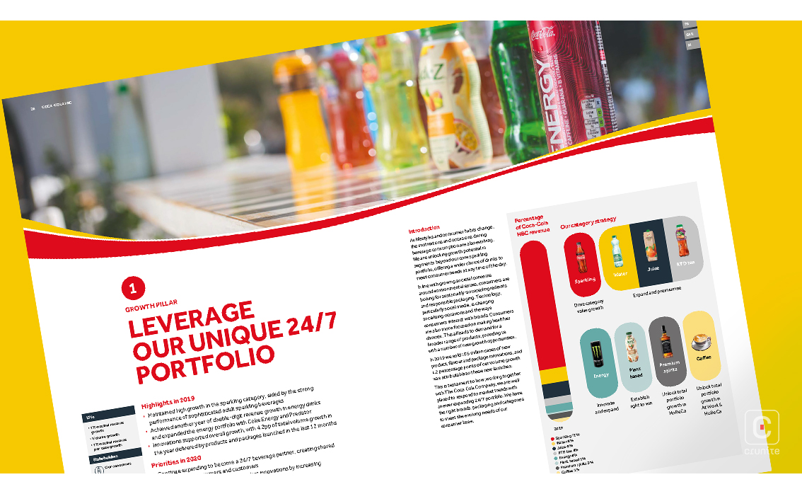
The report begins with a look at the company in a nutshell. The sans serif type in brief paragraphs sit alongside chunks of larger and weighted type with plenty of surrounding space in the introductory pages. Diving deeper however, the report becomes claustrophobic as content floods the page and margins are narrowed making it harder for the reader to stay interested. This claustrophobia hits its peak on reaching the financial section, which is not reader-friendly at all.


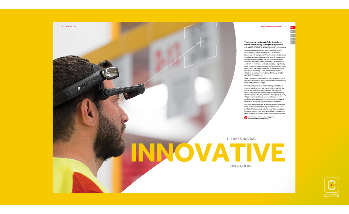
The lifestyle photography seen throughout the account does somewhat redeem this report. Initially covering three quarter of the introduction pages, the photographs are kept playful with a curved edge but are later switched for a double-page header above the Coca Cola swoosh. These images vary in size and shape causing the photography to lack consistency.

Even though the Hellenic Bottling Company may “bring the beverage brand to life”, their annual report piggybacks on the well-known Coca Cola identity and could easily be mistaken for the latter. For investors, shareholders, partners and the like, the report is an information goldmine. On the other hand, for a reader passing the time in an office lobby, this annual report is unlikely to hold their interest for long.


