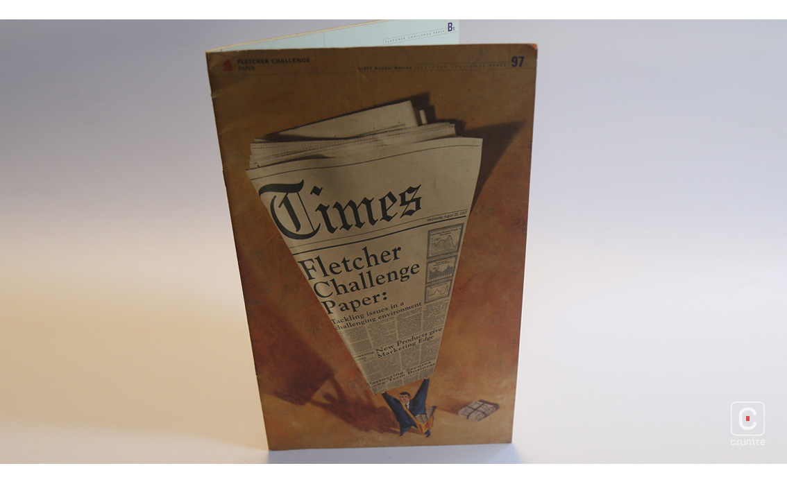
Fletcher Challenge Paper was part of a now-defunct New Zealand multinational involved in construction and forestry among other concerns. Their 1997 report hews close to the design ratios of a broadsheet and retains a particularly amiable Kiwi directness.
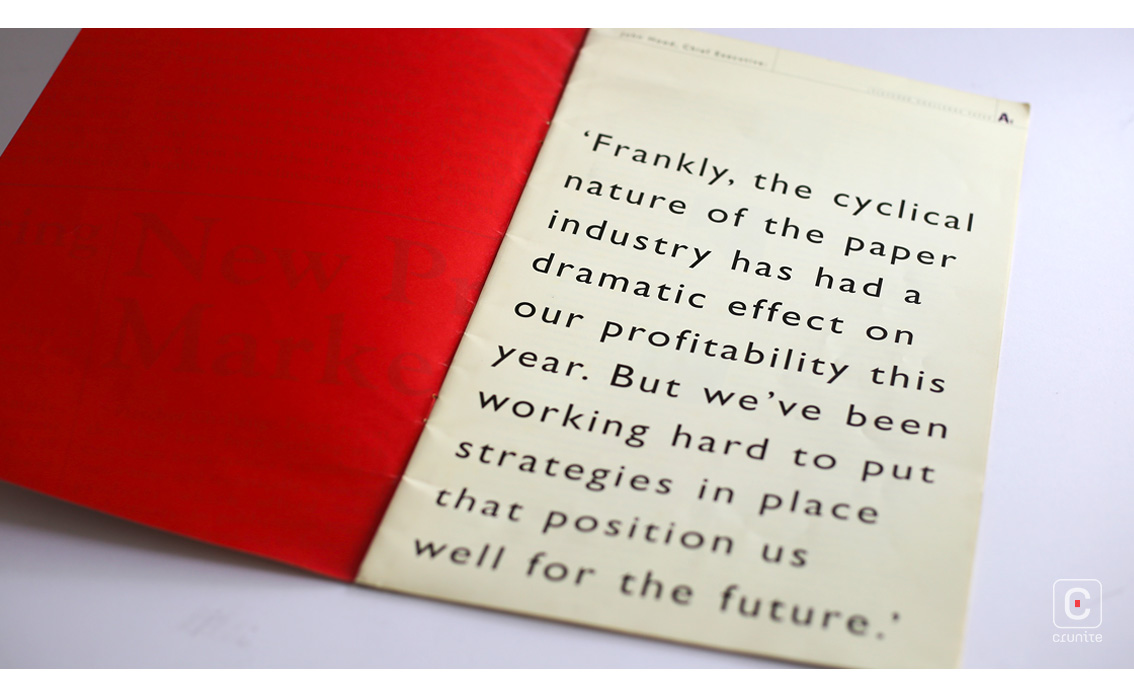
This directness is best demonstrated by the large text on page one, which in no uncertain terms tells the reader what kind of year the company had. In a single page the report goes a long way to building trust.
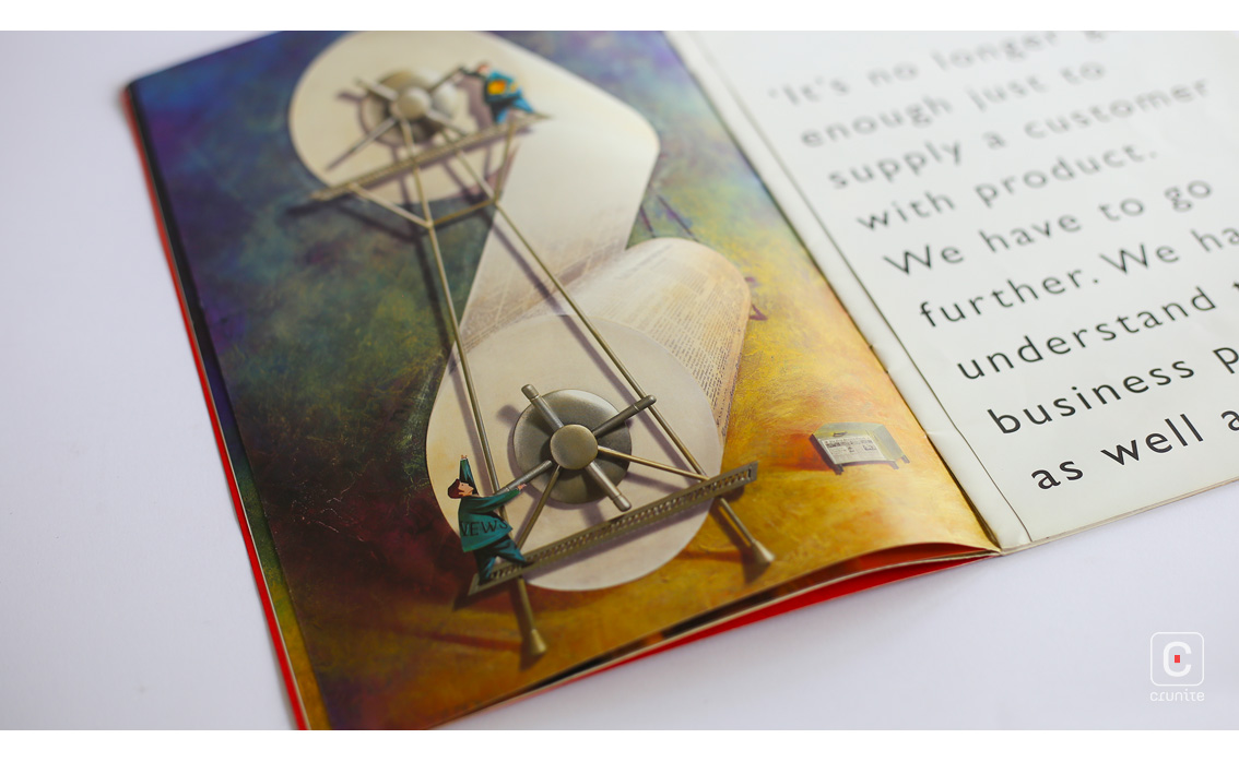
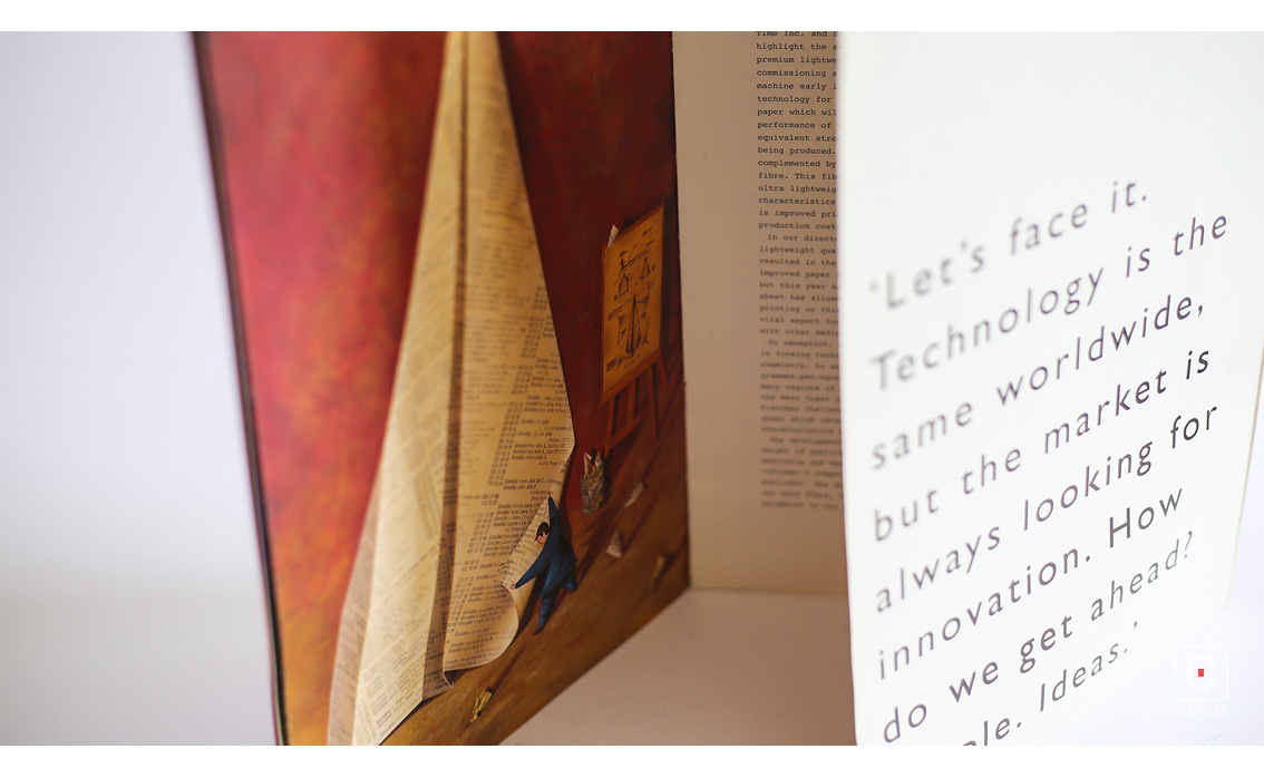
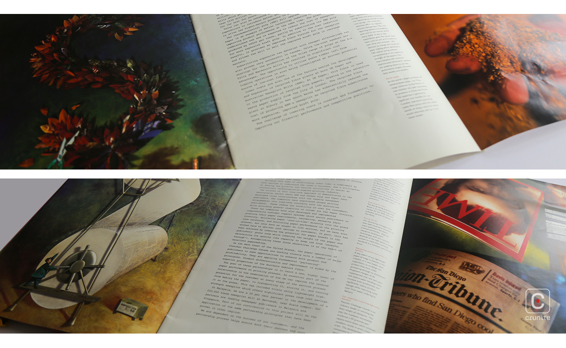
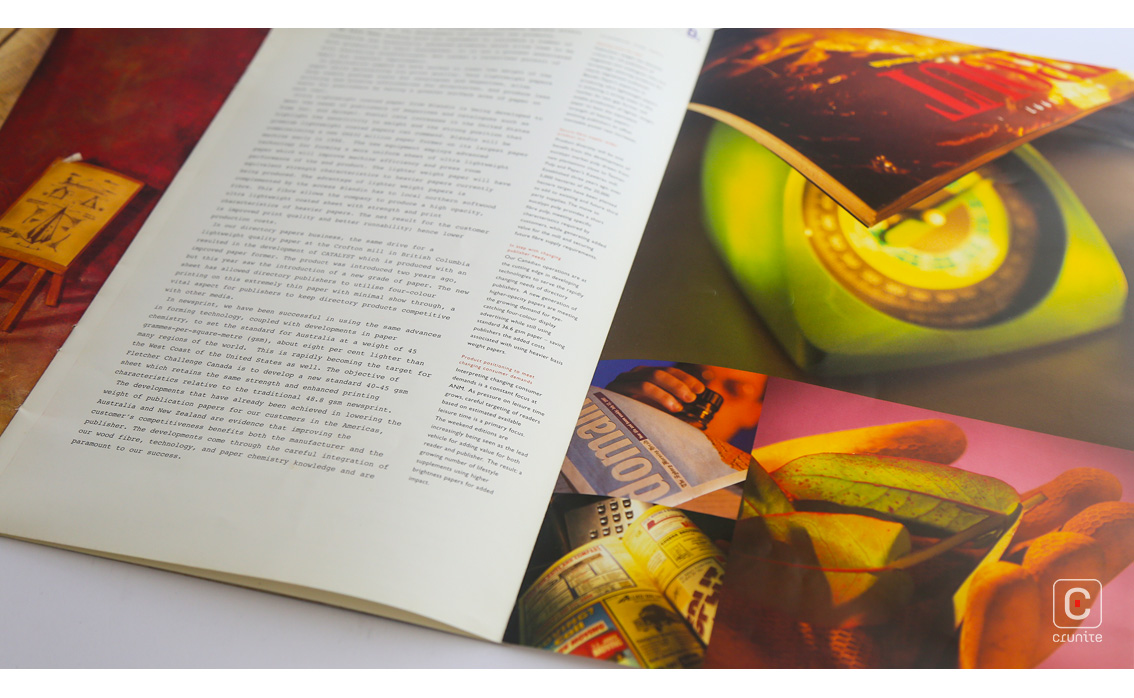
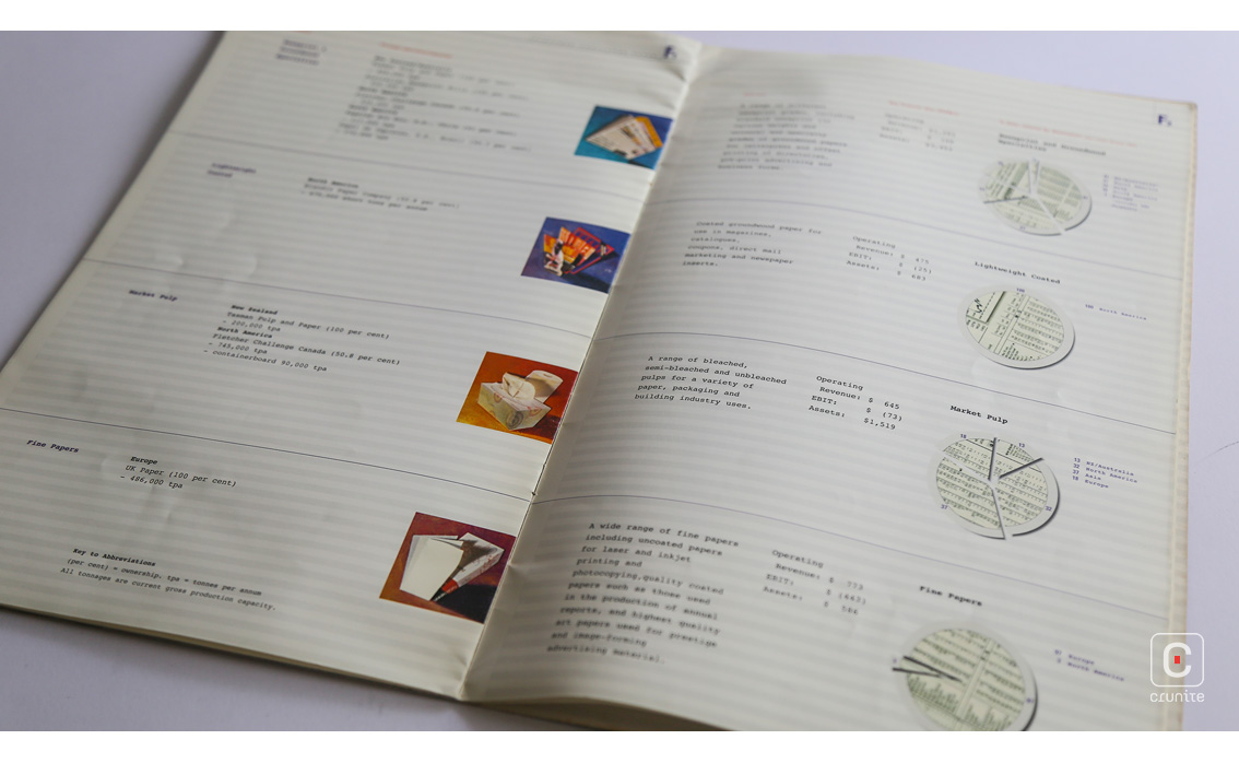
With the crux of the issue out of the way, the report covers the whole year (financials included) in a slim, 24-page report. Each section opens with a foldout containing lovely, hyper-saturated 90s photographic treatments and is accompanied by a gorgeous collage by Simon Shaw.
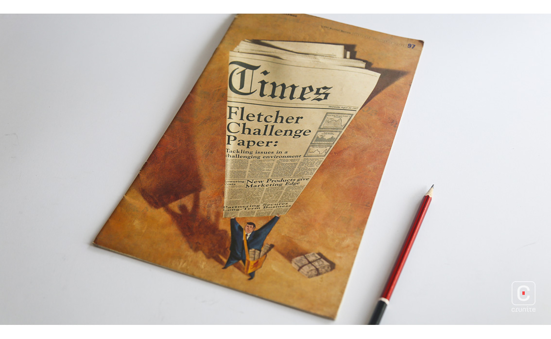
The collages are worth noting. Each features a tiny, attentive man in a business suit working with enormous devices. The man’s work always involves a small area of the enormous device but he never seems overwhelmed, hinting at how the company dealt with a difficult year.
Related to this are the corporate group portraits. Shot in black and white, the subjects are arranged close to one another as if in pleasant conversation, suggesting a close-knit team.
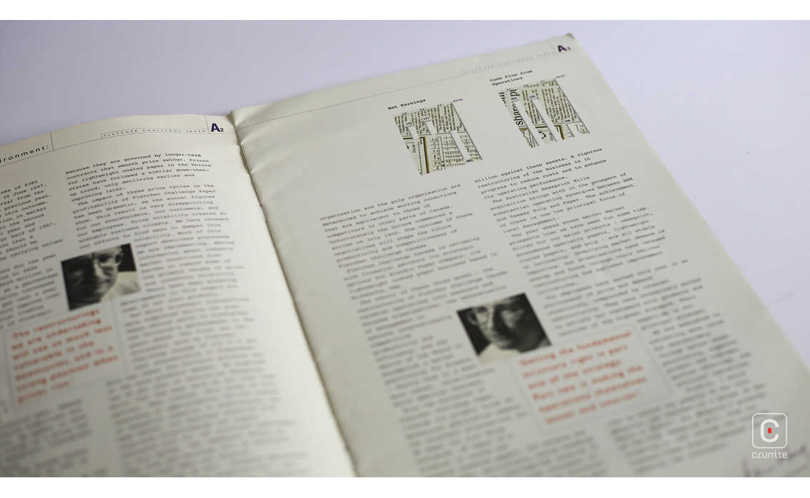
Type treatments include a lightweight ‘typewriter’ typeface. These can be tricky to work with for body text, but the typeface here is not mono-spaced and is leaded well. It is paired with a lightweight sans serif for captions and uses red ink well to direct the eye.
The only downside to this report is the treatment of infographics. These are hard to read on account of the cluttered backgrounds. The graphs in the financial section fare better for lacking patterned backgrounds. Poor infographics aside, this is a great report for studying use of type and illustration.
![]()
![]()