
AkzoNobel, the Dutch multinational delivers a unique and comprehensive annual report for 2019. The cover of this report exudes the company’s passion for the enamels and coatings they mix. 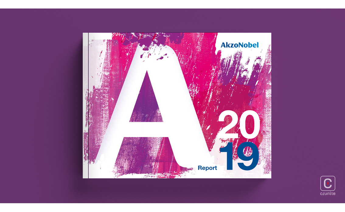
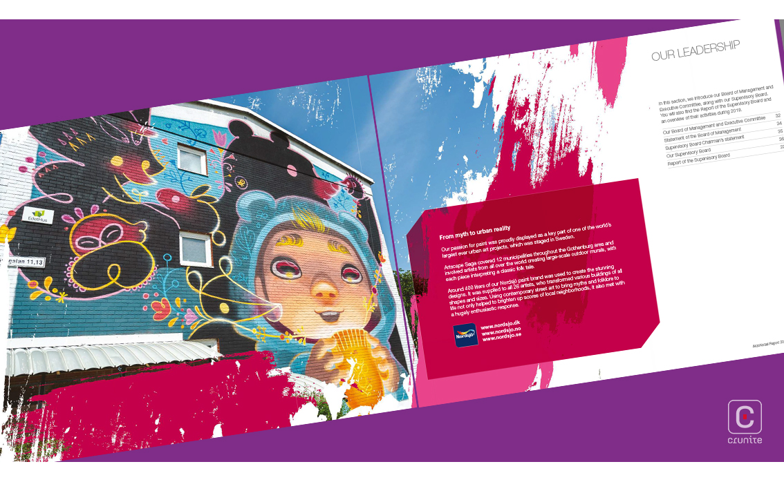
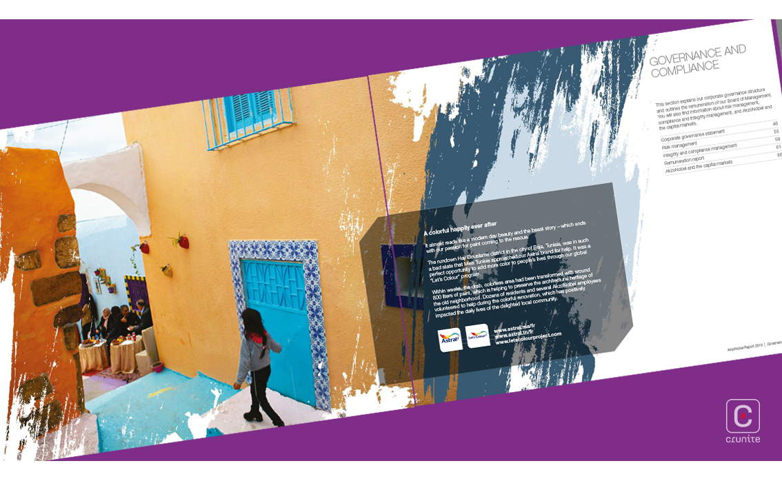
Rough brush strokes and paint splatters are featured throughout the report in various creative ways; from backgrounds to borders to maps. This colourful presentation marvelously fits the company’s profile.
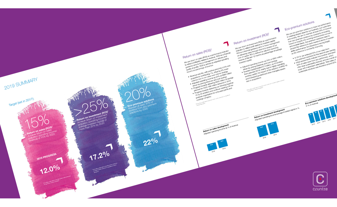
The dynamic typography complements the eccentricity of the account as well. Consistent use of a sans-serif in multiple weights keep the reader’s mind engaged. However, the narrow margins and extensive information divided into columns by thin lines on each page, coupled with the distribution of imagery and infographics clutter the account.
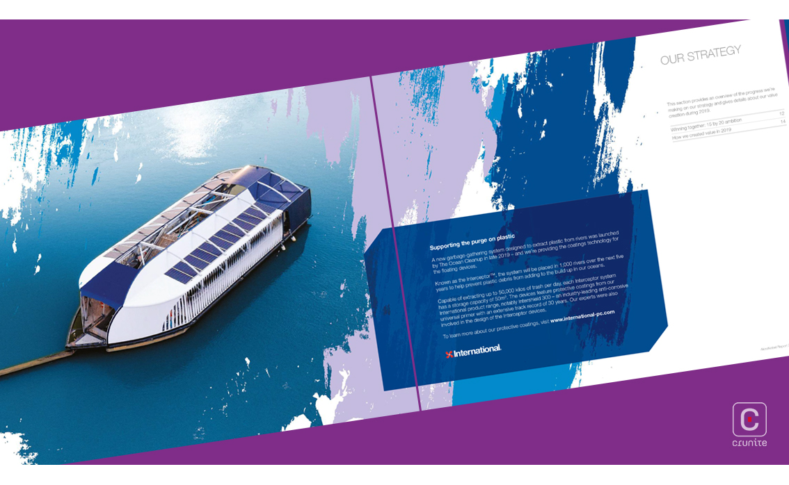
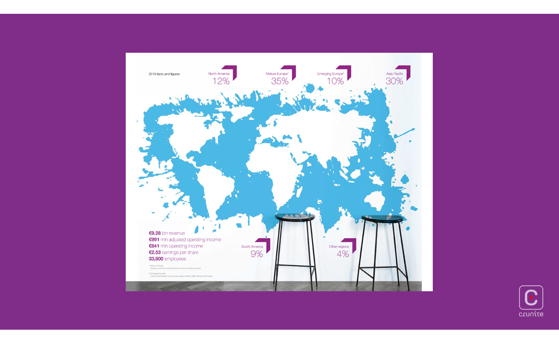
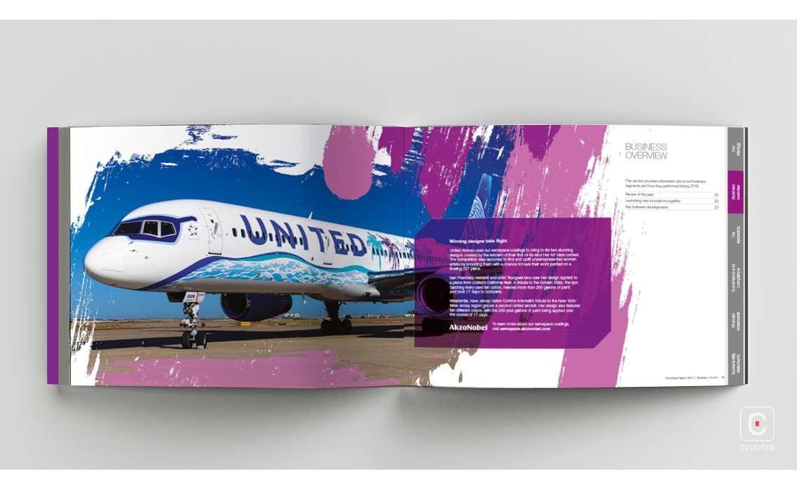
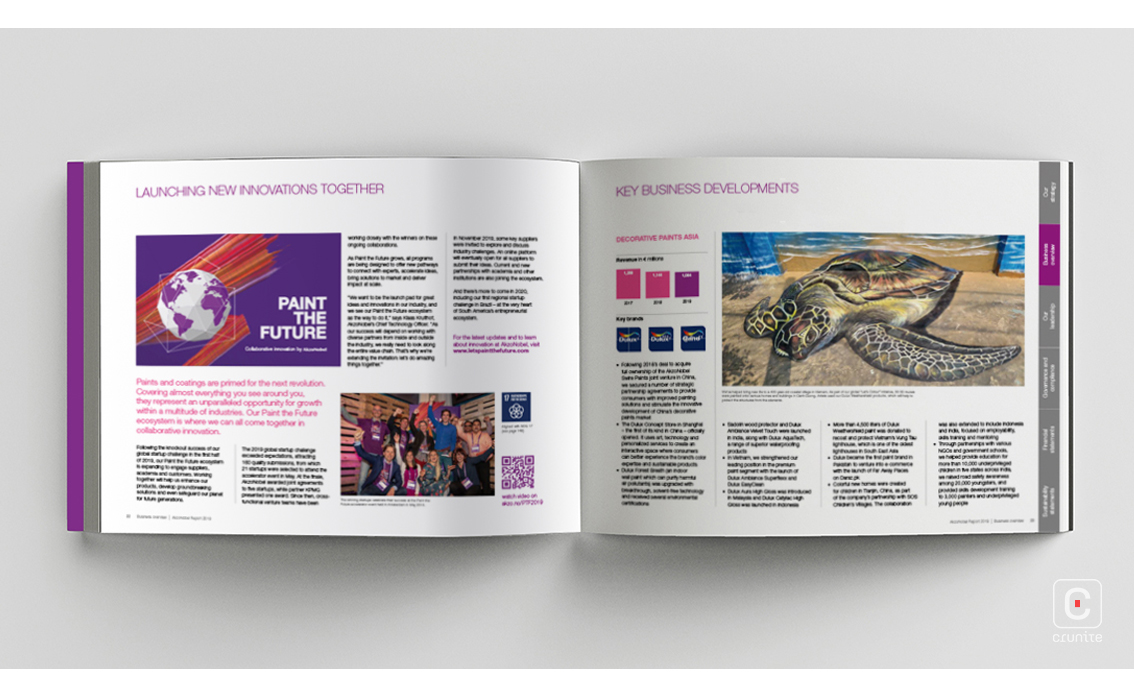
The photography follows a similar colour palette to the rest of the report. The varying sizes and 3D effects bring the images to life and showcase textures, art and moments. Unlike the usual text-image amalgamation we see, the AkzoNobel report features perfect transitions that blend text and image together seamlessly. This graphic, text and photography combination runs the course of the report.
One section takes on a variation from the usual format and uses a mood board layout with 3D elements such as paint drops, powders and wood panels. These stand out – much like the report itself.
Moreover, AkzoNobel shows off their futuristic outlook by introducing an interactive element into their annual report in the form of QR codes at the top right corners of certain pages making the experience even more immersive for readers. It is in these minute details that this annual report is truly brought to life.
![]()
![]()


