
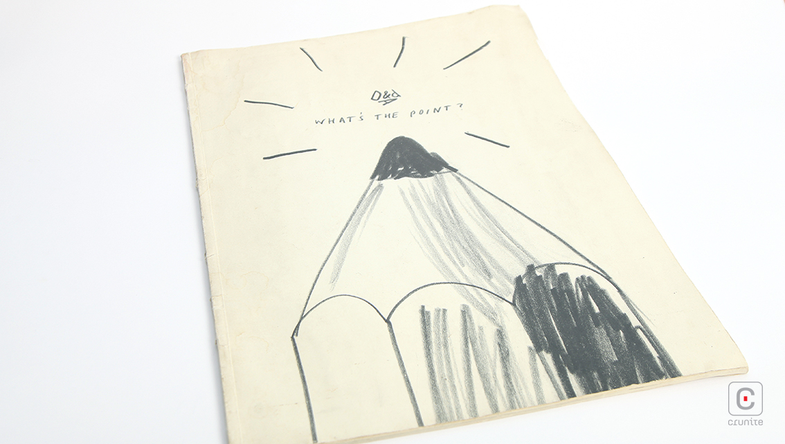
D&AD hardly needs an introduction – the British educational charity has been celebrating the best of design and advertising via their highly respected (and very difficult to win) D&AD Pencil awards program since the early sixties.
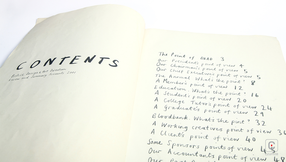
Their 2001 report and accounts summary is, unsurprisingly, a beautiful piece of design. It is presented as a large format, softcover, perfect-bound booklet. In your hands it feels like a small newspaper made of thick, light cream paper.
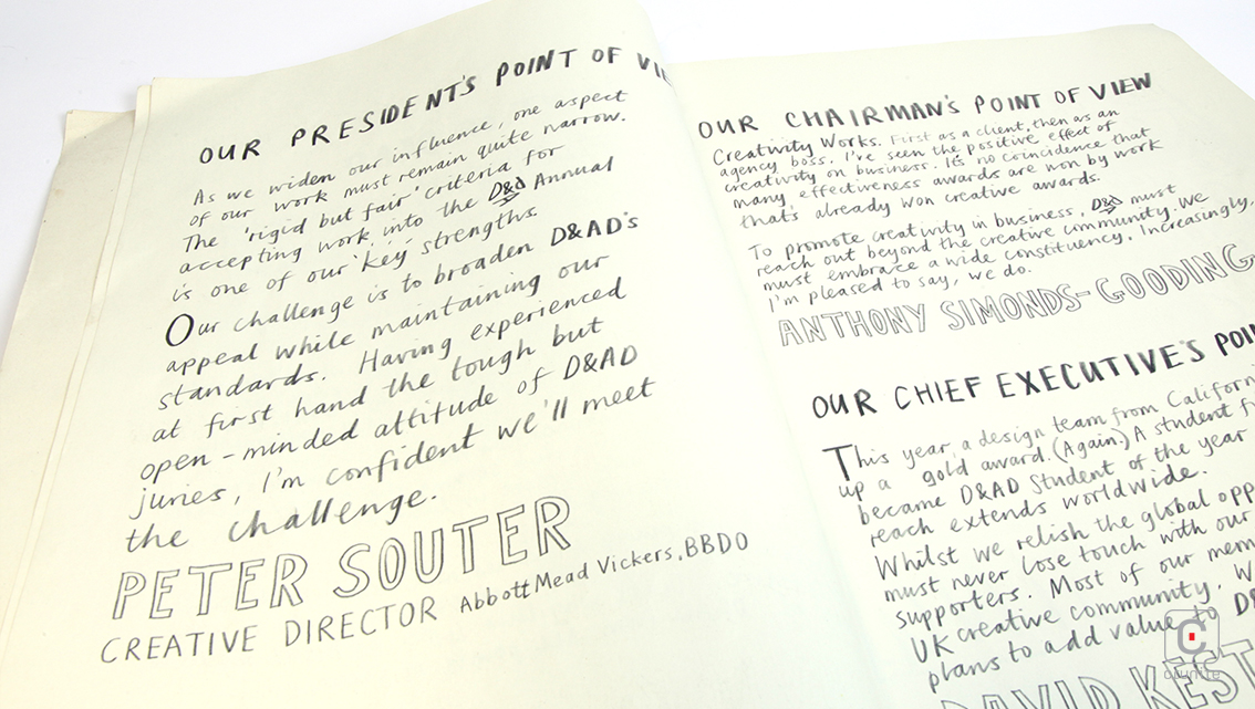
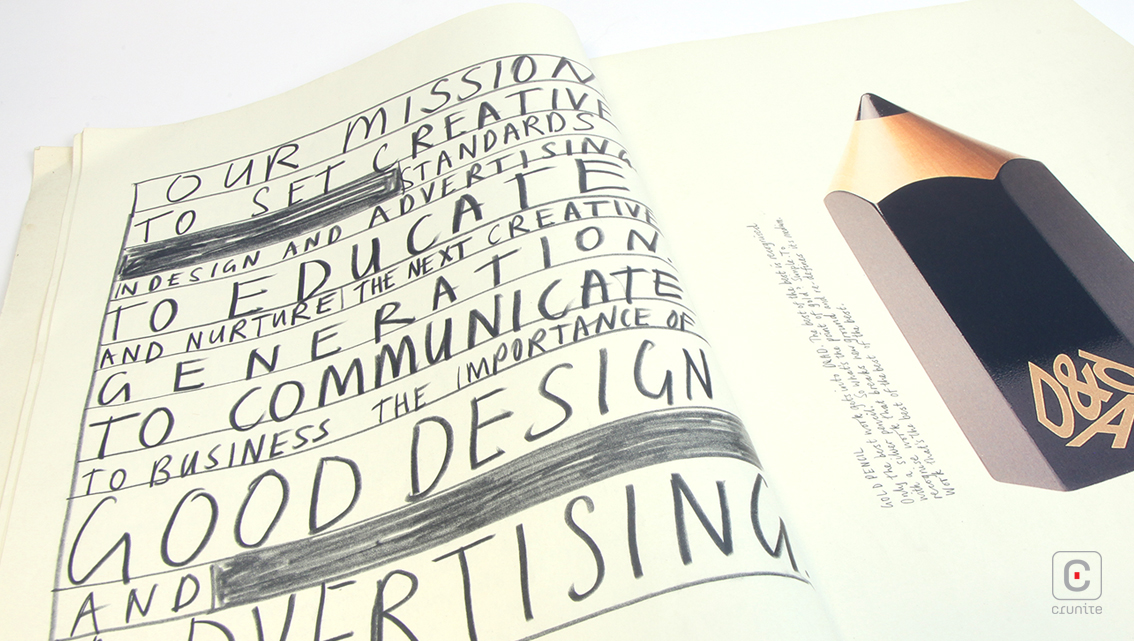
These are important attributes for any report to have but more so here because of how type is treated.
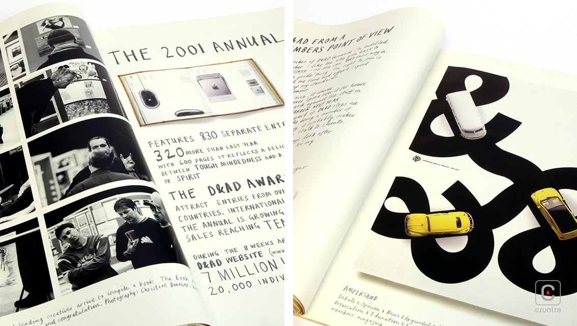
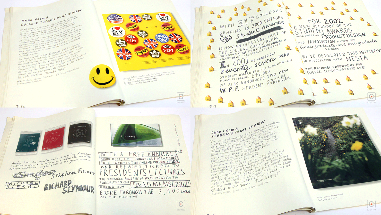
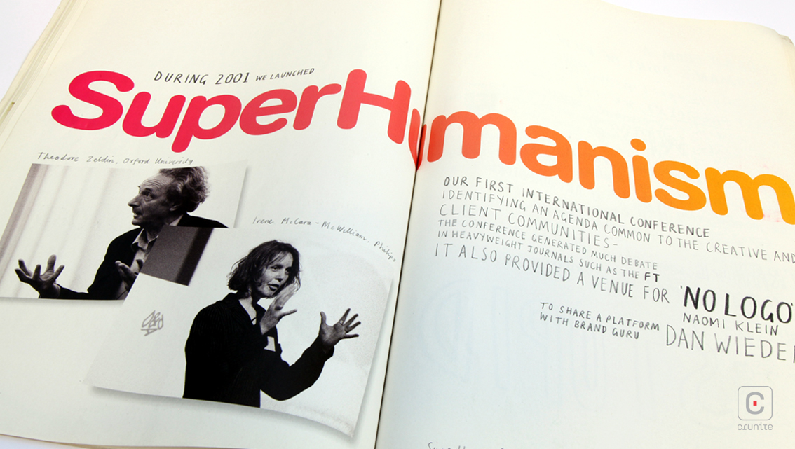
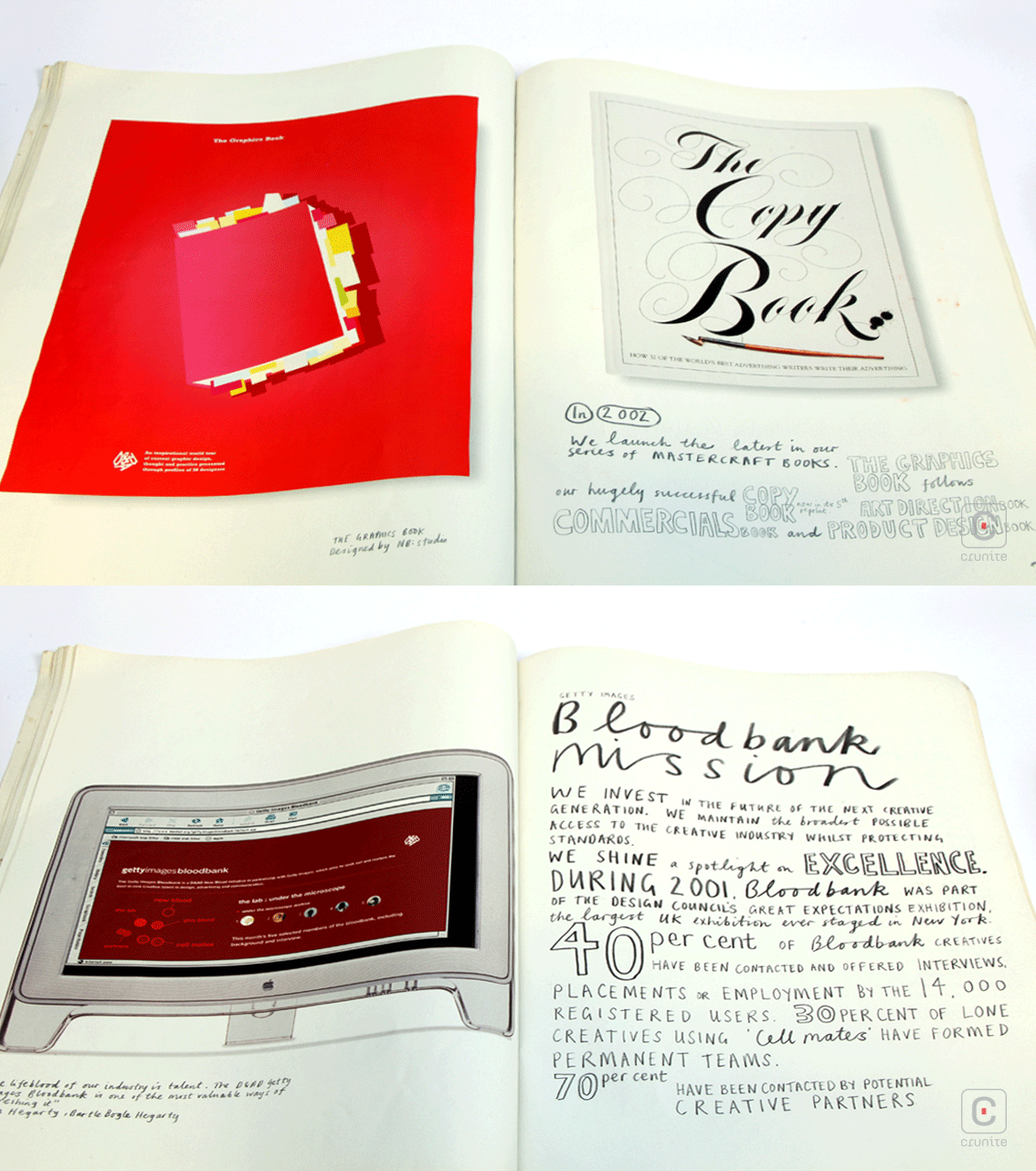
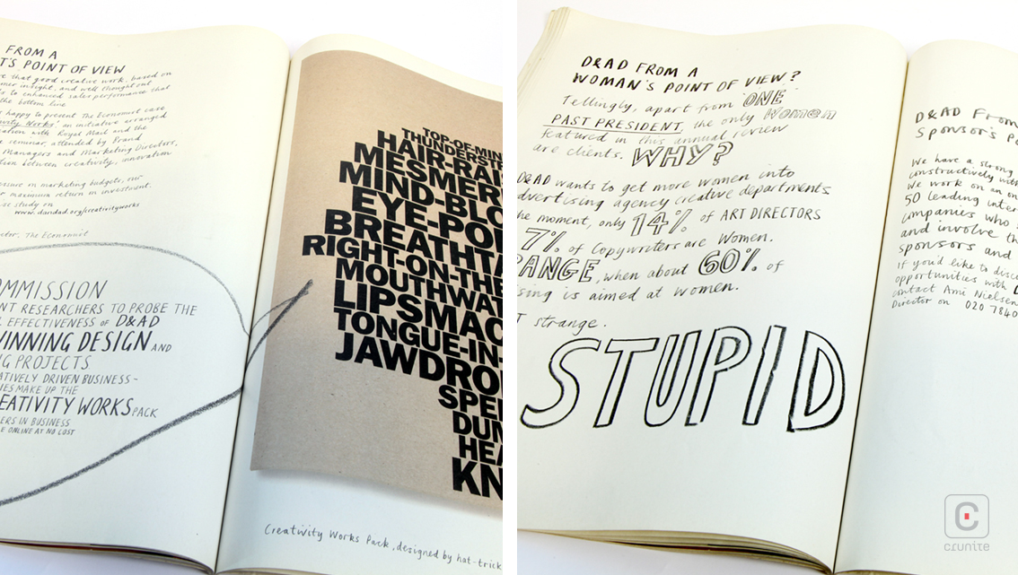
The type is entirely handwritten in pencil (which was then presumably scanned in carefully to allow the texture of the pencil strokes to show). The result feels as if you could rub out the type with an eraser – the reproduction quality is stunning.
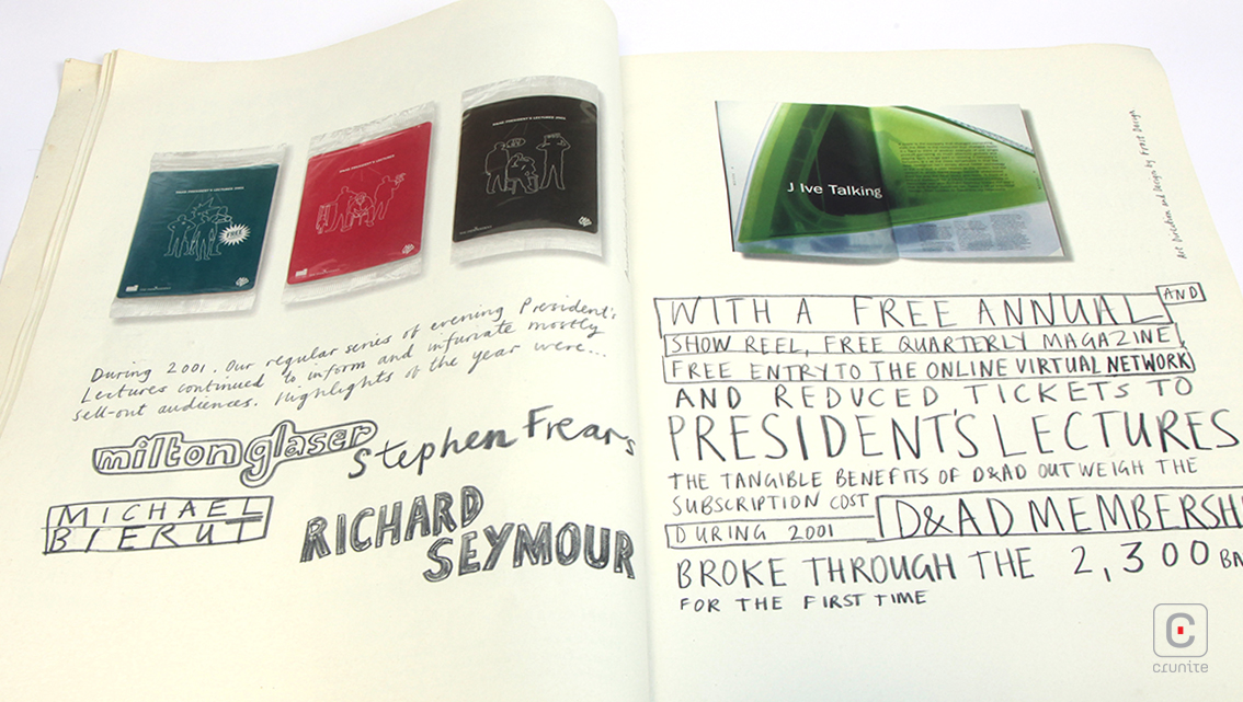
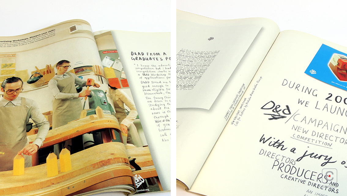
Photography is the only element that reminds you this booklet is a mass produced, commercially printed document.
Of note are the portraits of past D&AD presidents – it looks as if each subject submitted their own portrait but the page layout makes them work like a photography exhibition showcasing the work of multiple, skilled photographers instead of a jumble of styles.
The content of the report is nicely shared between stakeholders, beneficiaries and officials to provide a well-rounded view of D&AD, its charitable work, education programs and financial accounts (these, again are carefully drawn in pencil).
That none of these visuals feels rushed or messy is a testament to the designer’s skill and makes for an enjoyable read.


