For designers working with printed matter, Heidelberg hardly needs an introduction. It is the largest manufacturer of offset printing presses in the world and may be the most famous name in modern printing. Their 2013/14 annual report is an excellent study in how to take a seemingly obvious idea and create something fresh from it.
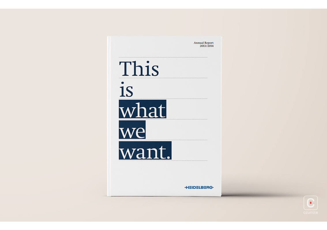
The central design idea is to treat printers marks and processes as pieces of art. This may seem an obvious solution to a design brief from a printing company, but the designers of the report take the idea and run with it, into bright, clever places.
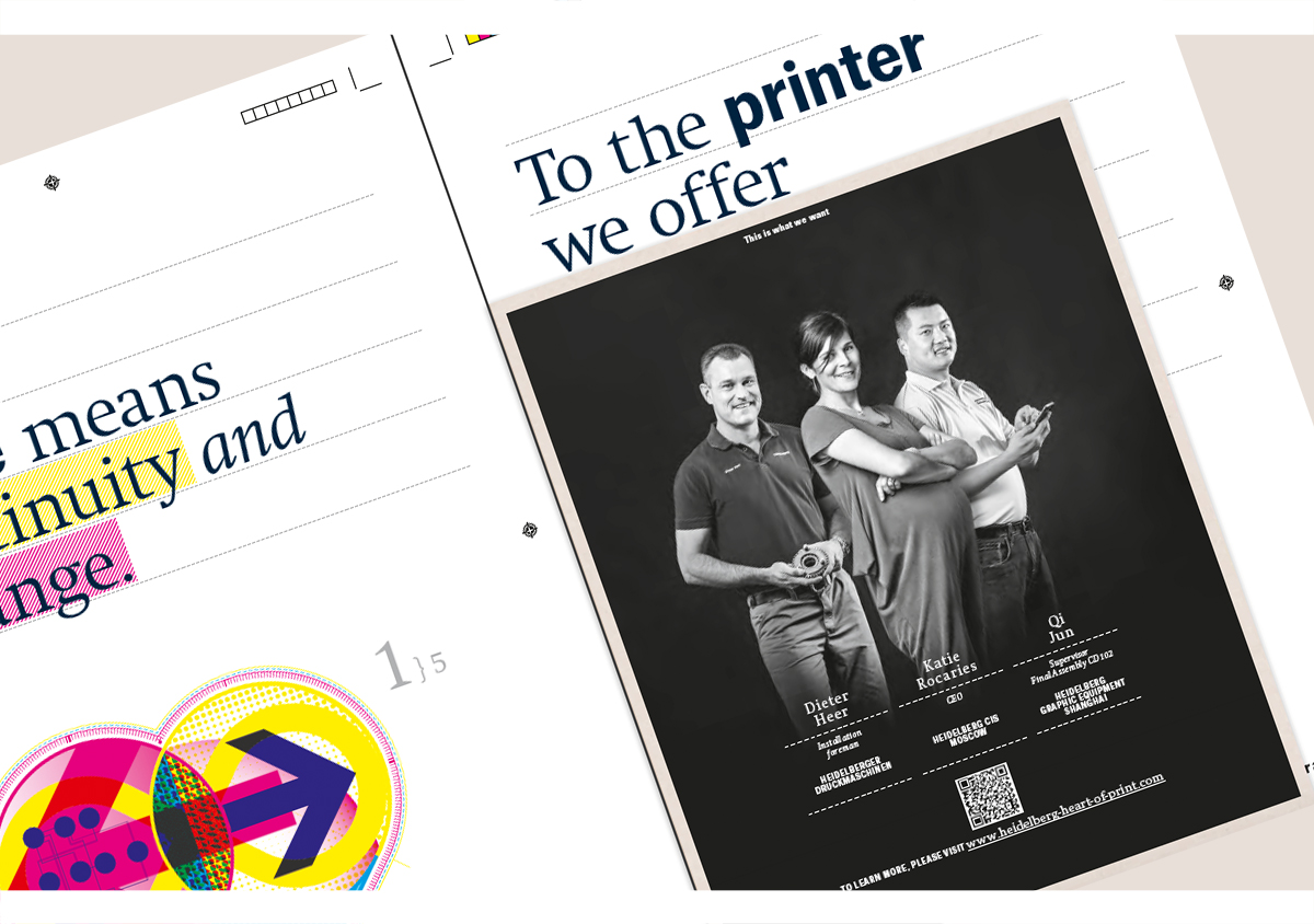
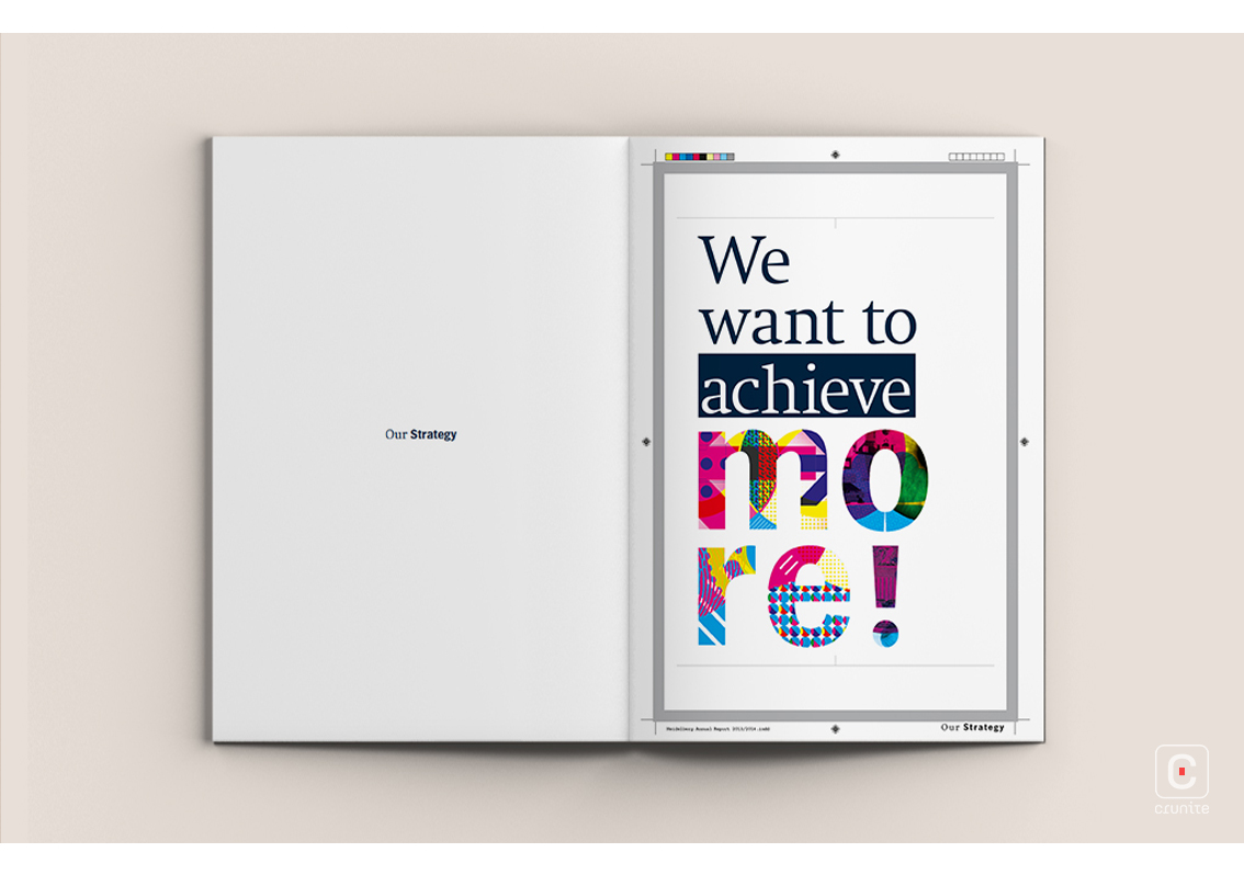
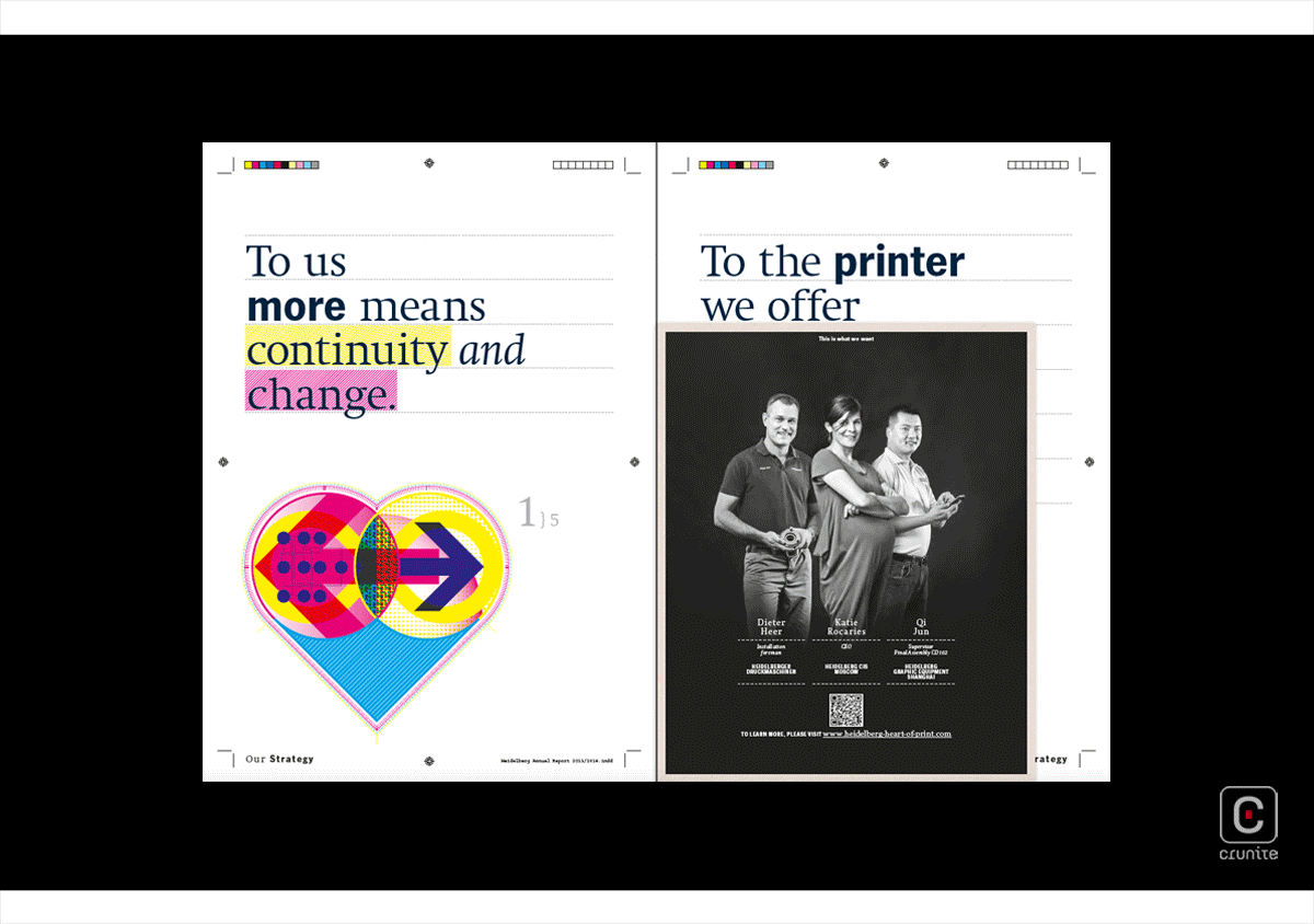
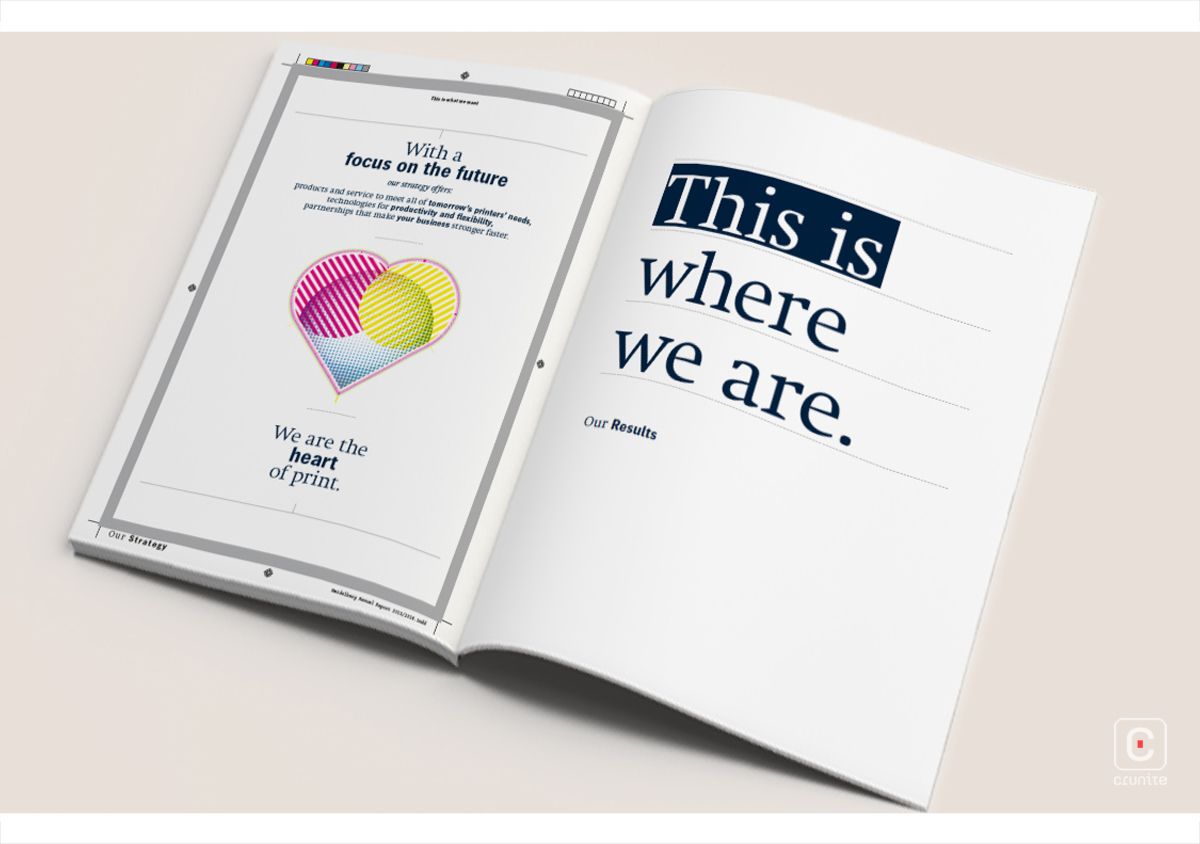
First, the report is designed to look as if the reader were looking at a printer’s forme, rather than a finished book. All the requisite printer’s marks are present around the ‘page’ – everything from crop marks to trim lines; registration marks to colour bars. The reader is seeing a book in the process of being ‘printed’.
What also makes this interesting is how the designers play with context. By including marks and processes in the design, readers are taken behind the scenes of the print process.
Second, the reader/designer is made aware of the inherent beauty of something we don’t often appreciate when designers are busy with a print job.
The report makes clever use also of the offset CMYK colour palette. All four colours appear, most often on their own and unmixed. Again, this makes the reader appreciate the simple building blocks of nearly every print they’ve seen.
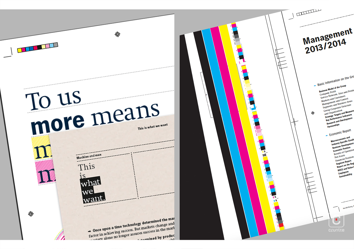
The colours of the CMYK palette do appear in a combined form, most notably in infographics and illustrations – where a collage effect is used to create vibrant patches of rich colour and pattern on the page. The full-page diagonal marks in a single colour are particularly striking.
Smaller touches round out the design philosophy. The report references contemporary design practices by mimicking the way commercial design software highlights text, or sets it to a baseline.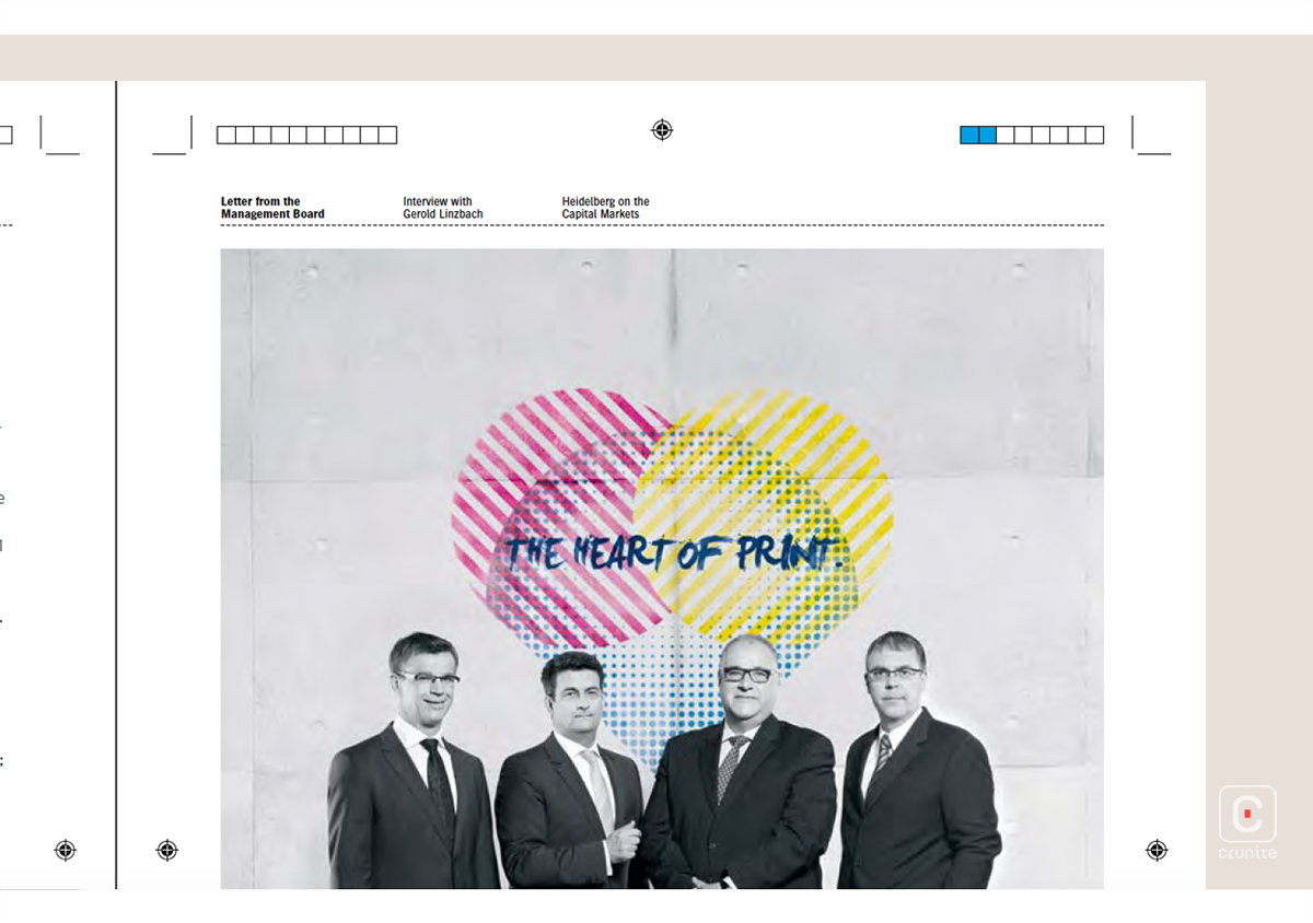
This report is a good reminder to us all – just because an idea seems obvious doesn’t mean it has to be boring.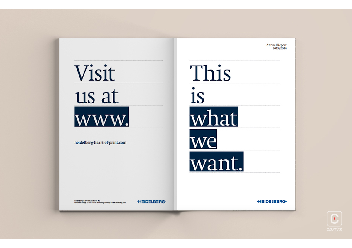
![]()
![]()