
Siegfried is a pharmaceutical and chemical company based in Switzerland which develops and produces active ingredients for medicines. Their 2018 annual report is a tabloid-sized treat, dominantly blue on white and easy on the eyes.
The layout of the report is well-composed; everything fits into place nicely. There is ample white space as well, adding to the reader-friendliness.
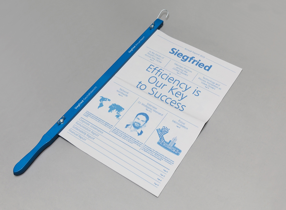
The front page is much like the layout of a normal newspaper: a sneak peek of each ‘story’ which draws the reader further into the paper. Headlines are printed loud and clear, along with corresponding page numbers on the cover page itself. The title of the report is well-positioned above the fold, like the masthead of a newspaper, to provide maximum visibility at first glance.
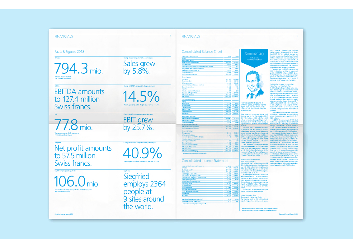
Oversized facts and figures for the financial overview span page 4 in two neat columns. For longer stories, the use of four columns to fit the width of each page makes for easy reading.
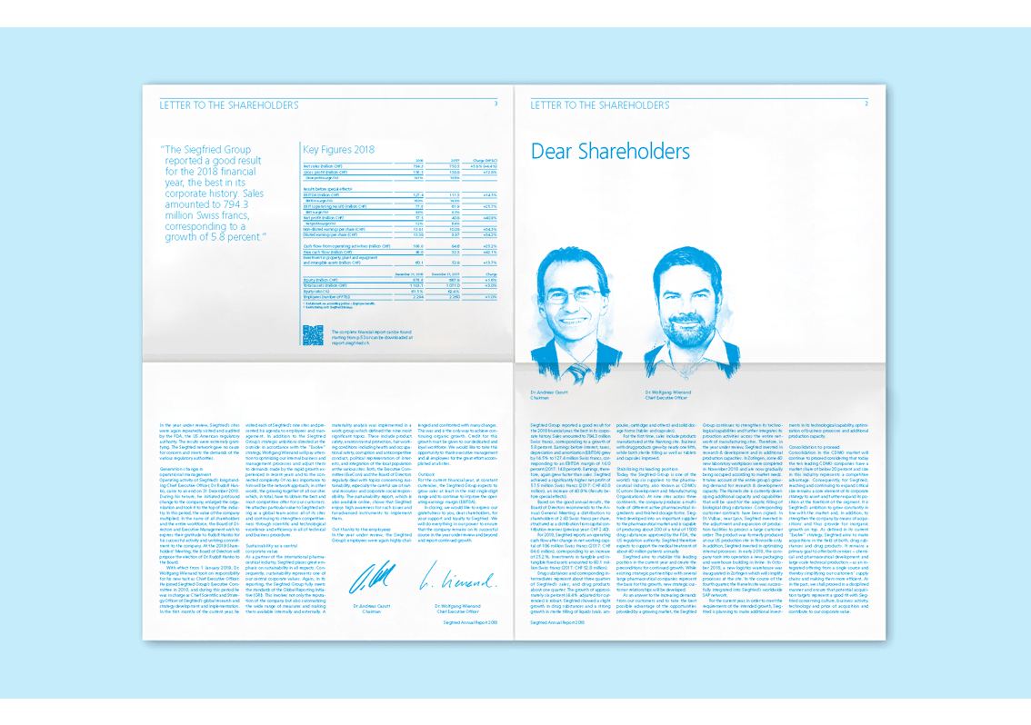
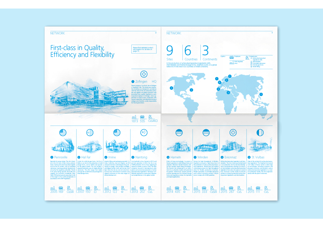
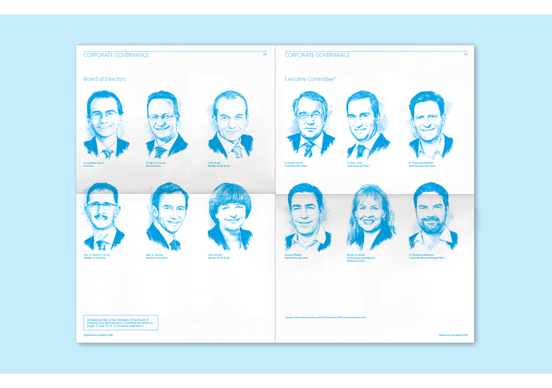
The most special feature of this report is the use of illustration for the headshots of the leaders of the company and the management team. Some stunningly detailed architectural perspective drawings can also be seen on pages 8 and 9. Information on this double spread is presented through the use of a key/legend, along with little circular icons to signify the flag of each of the countries Siegfried is based in.
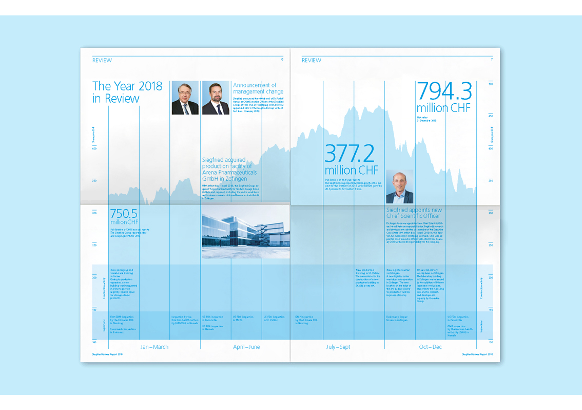
Pages 6 and 7 stand out because of the liberal use of blue, but there’s no doubt it grabs the attention. The pages that follow display the business model of the company, segmented in an orderly manner and even manage to give the illusion of less text on the page due to the composition of the text into well-spaced paragraphs.
Infographics and other forms of data representation are geometric and clear cut, allowing readers to comprehend their meanings without having to linger too long.
QR codes have been embedded throughout the report to take readers to the different sections of the digital edition.
The photos on page 73 and 74 seem to be filtered through shades of blue, and serve as a throwback to pages 8 and 9 thereby creating connections not only from the cover to interior but within the pages themselves. Siegfried certainly show their true colours when it comes to clever composition and use of colour.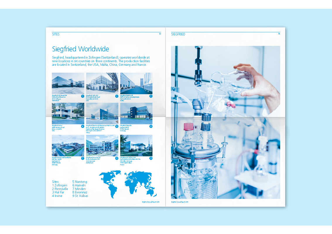
Back
![]()
![]()


