
Choices. Opportunities. Possibilities. From storytelling agent to dynamic interaction, the common thread of ‘choice’ binds together the 2017 annual report from Mercury, a renewable energy company based in New Zealand. The voluminous, detailed reporting, beautifully presented in a high-end magazine style is available online and in print. The online version’s design has a strong resemblance to its print counterpart and navigation functions in a similar fashion thanks to the animated page flip effect. It’s the printed version though, that has the X factor.
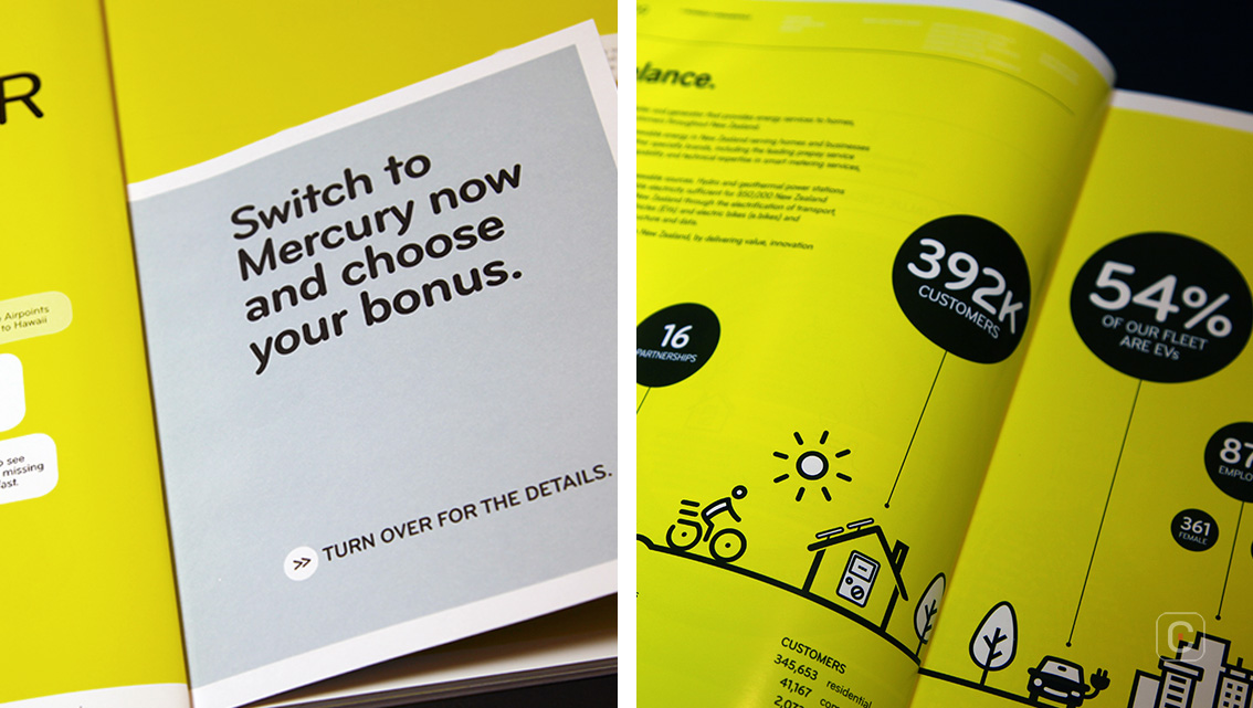
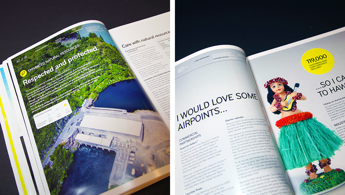
The effect is best seen when the publication is flattened so that both covers are visible. This report further engages with its audience by including a marketing insert encouraging potential customers to become clients. Digitally, readers can interact via the QR codes promoting crowd-funding donations, renewable energy information and solar energy quotes. This type of innovative design could help Mercury be seen as unique and world-leading in New Zealand’s small electricity market.
Finding a typeface that works well in a text and number-heavy report can be quite a challenge and Mercury’s choice of Gotham Rounded suits the task wonderfully. Its precise, unadorned, fresh geometric sans-serif design works well in print delivering a friendly yet high-tech personality and it works equally well on the web, maintaining its legibility at different point sizes.
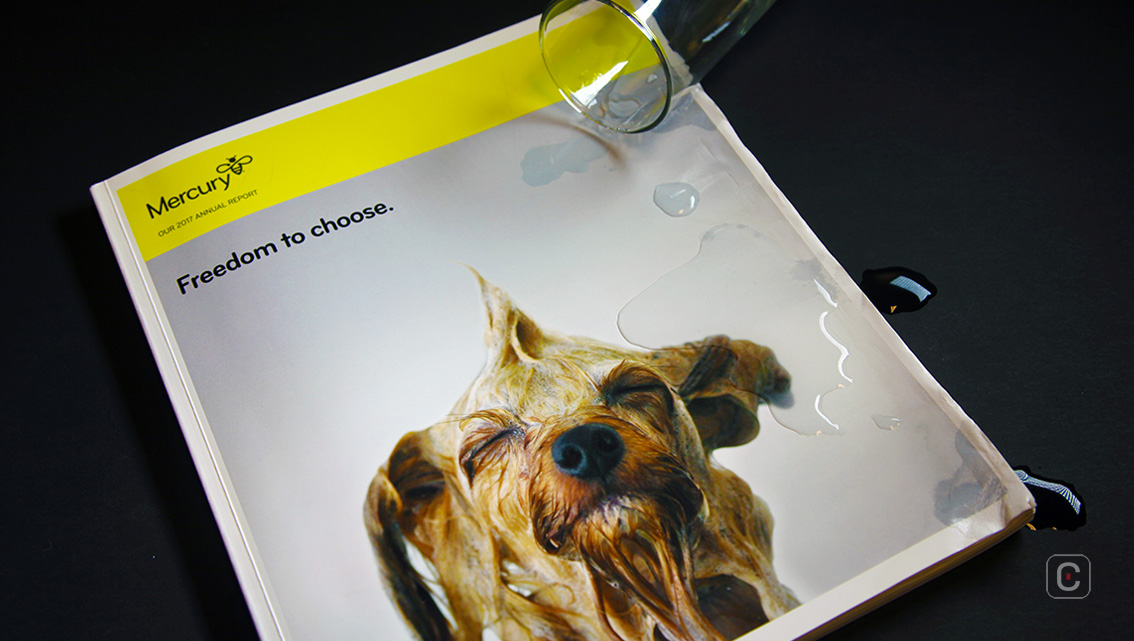
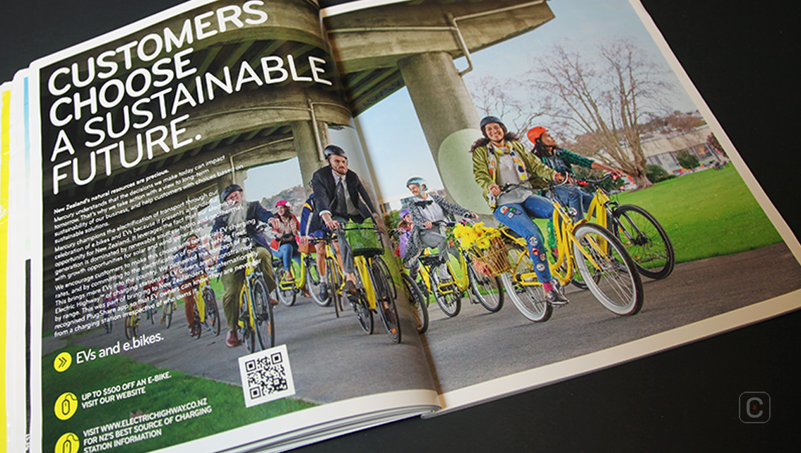
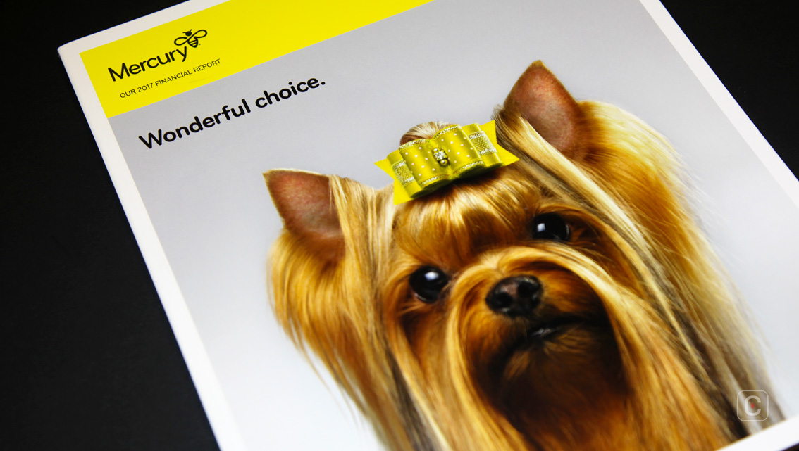
Colour divides the report, distinguishing each section from the next. A visually appealing thread of bright sunny yellow brings the report’s story to life showing what energy freedom means for customers and the company’s successes and highlights. This simple use of colour helps the report look more appealing.
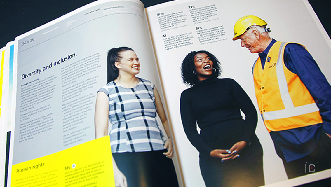
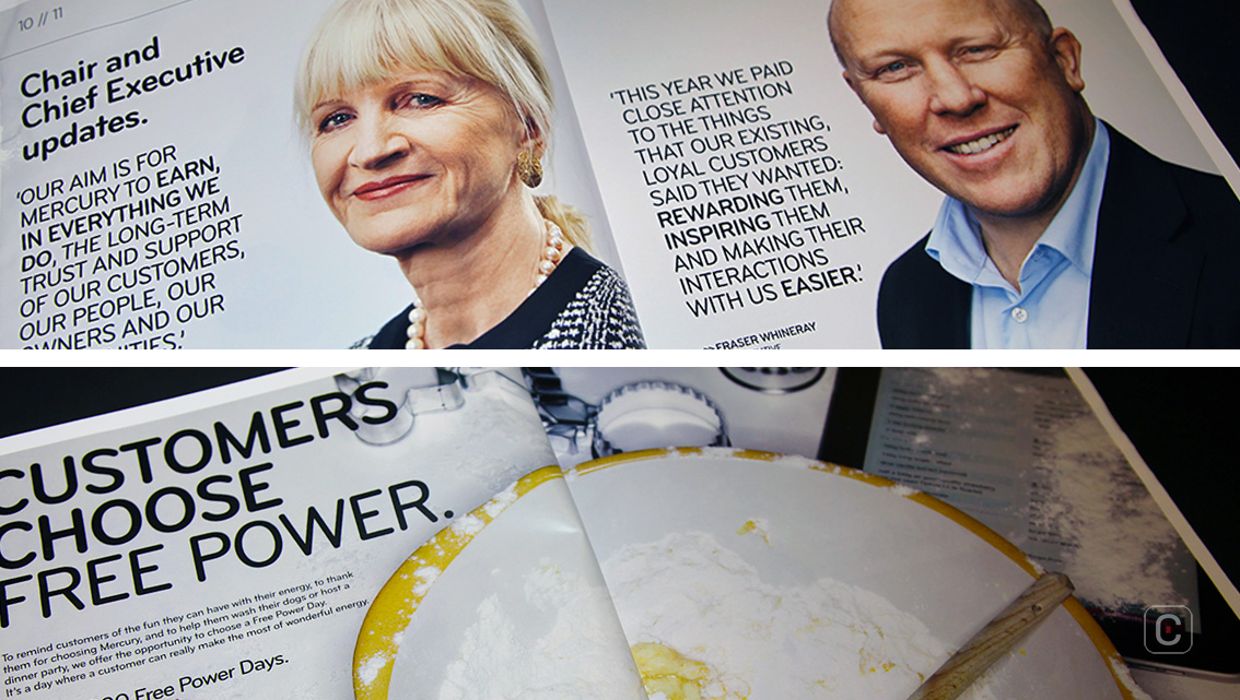
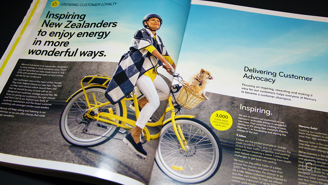
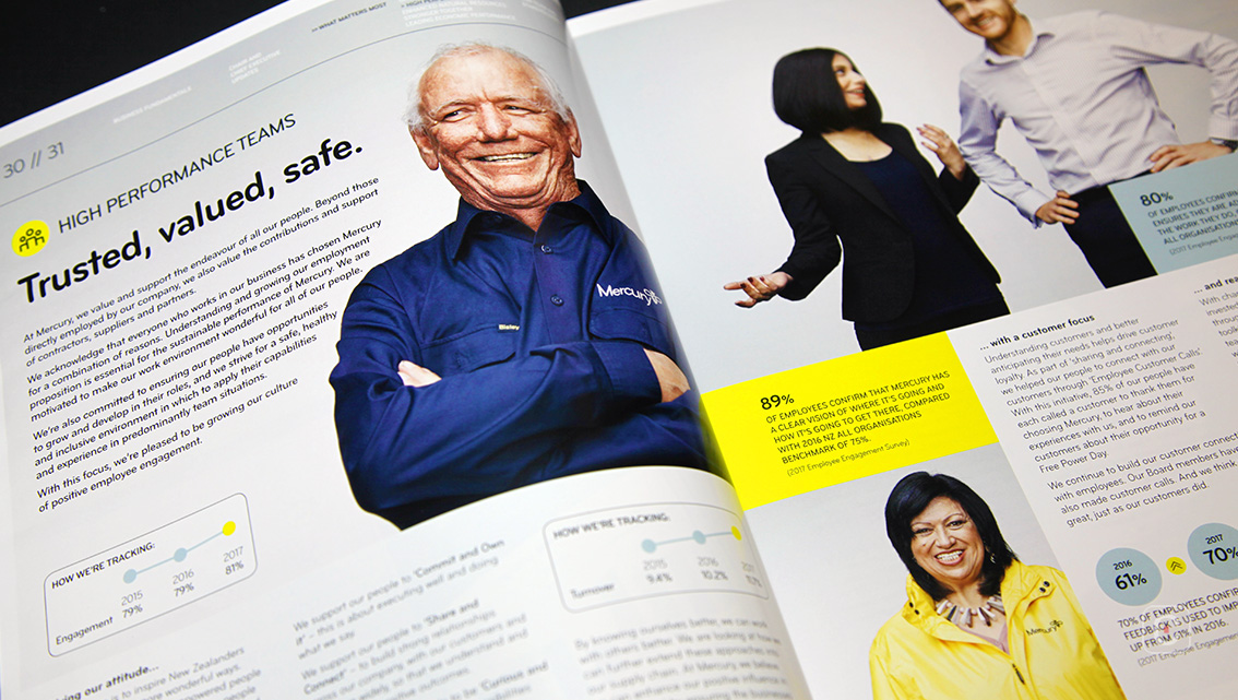
The report has a number of big feature spreads giving it the feeling of being connected, dynamic and real. The photographs are high-quality set against smooth clean backgrounds that lend them a mood of neatness and accuracy. The majority of photographs are human-centric, posed portraits set against a grey gradient background. This could have looked clinical but the shading warms the grey, softening the image without compromising impact. The gradient is tempered so that the eye is drawn to the people who really stand out on the page. Backgrounds tend to be dependent on current trends and for now gradients are cool again.
![]()
![]()


