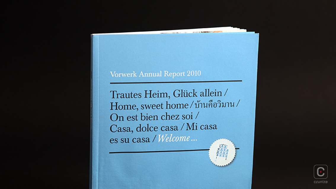
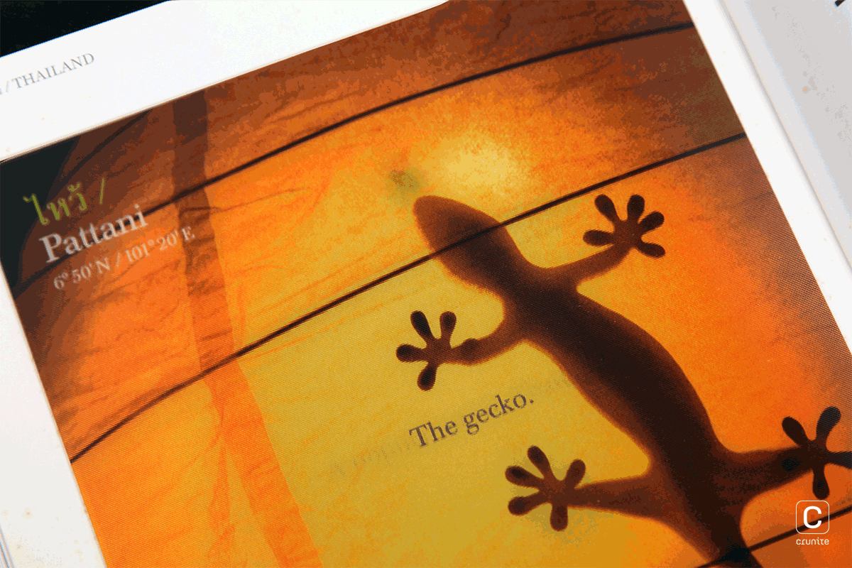
The unobtrusive type treatment, colour usage and uncoated stock in Vorwerk’s 2010 Annual Report perfectly complement the inventive use of materials and print techniques used in the opening pages of each section.
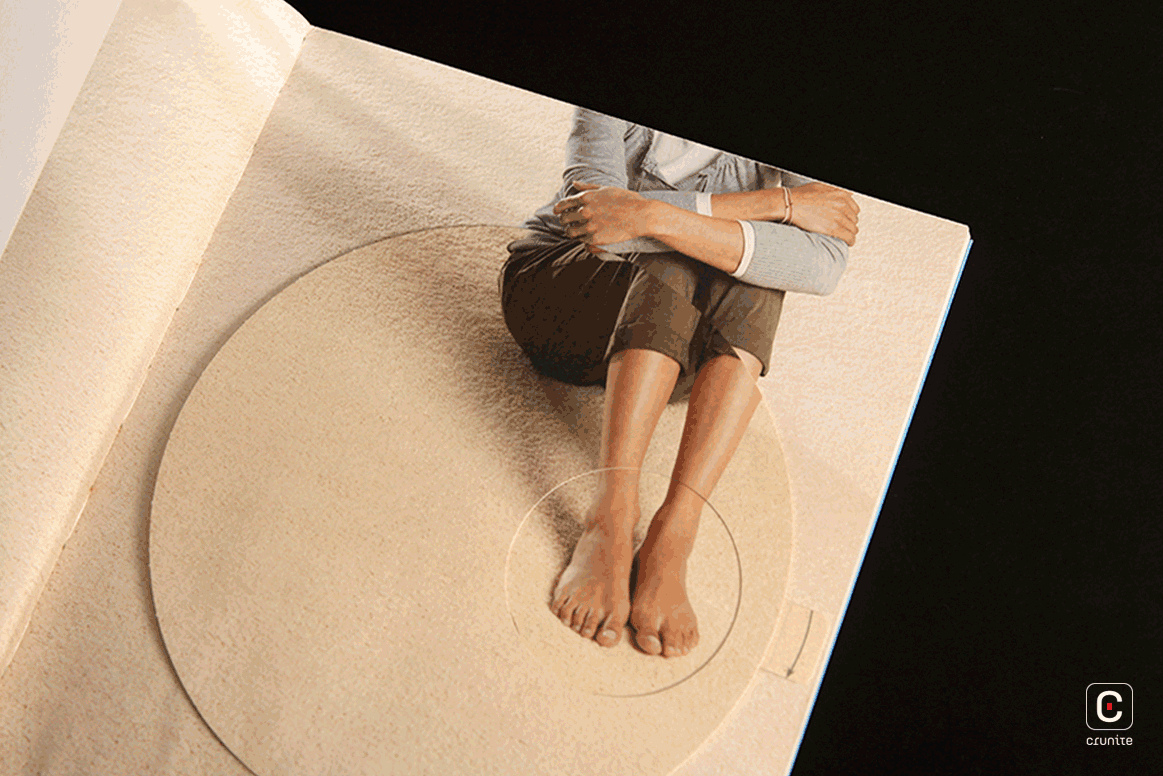
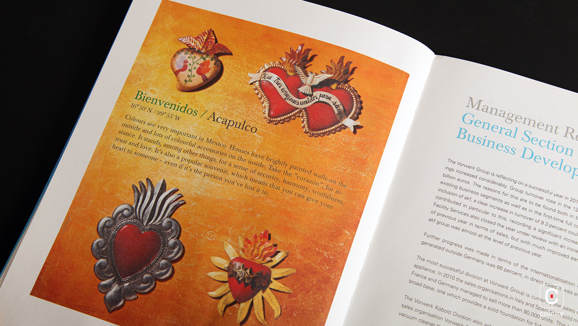
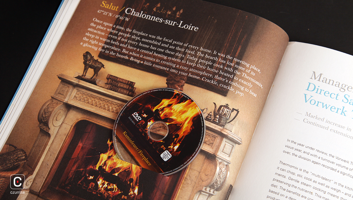
The treatment of the opening page is unique to each section. In one, a rotating card dial with a die cut allows you to choose different footwear for the model in the background. In another, a photograph of a fireplace features a small docket that carries a miniature CD. Fold-outs, paste-ins and lenticular prints all play a part in this report. While these make the report difficult to flip through, they do make for an engaging experience.
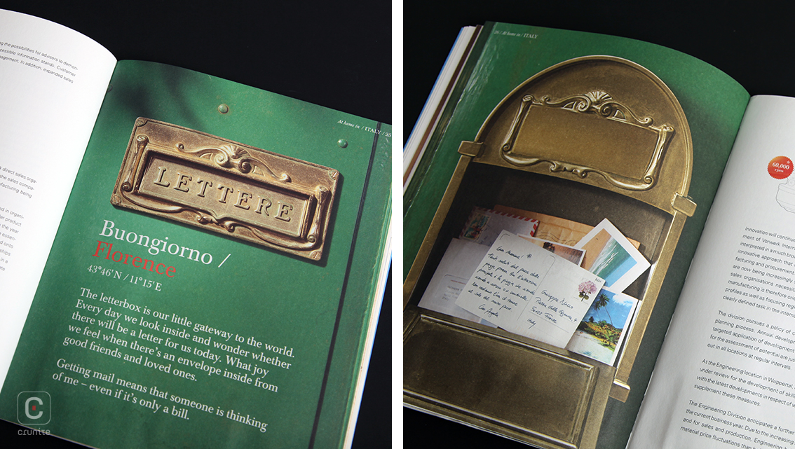
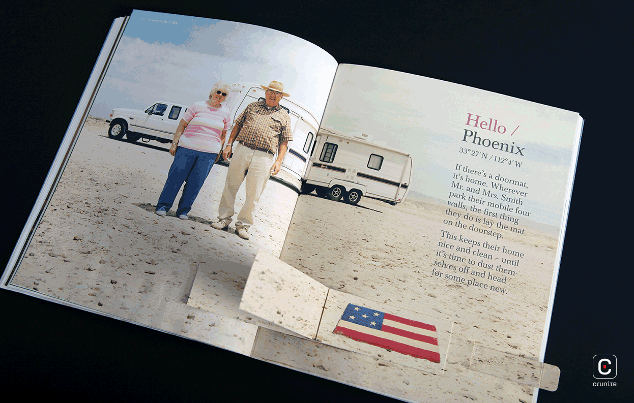
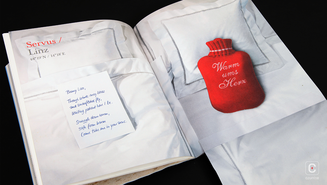
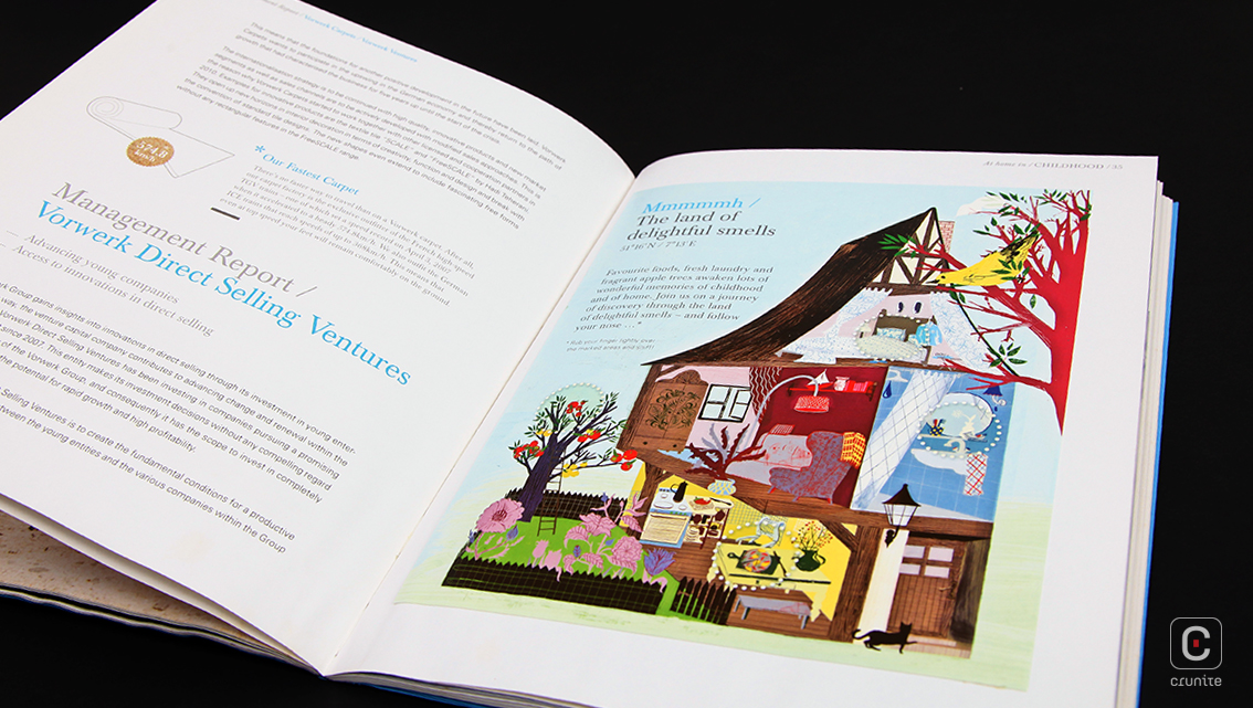
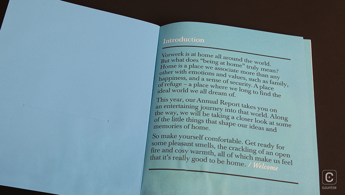
Coupled with a simple type treatment (serifs for titles, sans serifs for body text), the whole report seems geared to focus the reader’s attention on the section-opening pages. Infographics and icons, when they appear, are picked out in delicate black lines against the soft white paper, gracefully leaving room for the brighter elements of the report to shine.
![]()
![]()