Simply beautiful. The Volvo Car Group Annual Report 2017 uses great colour, typography and photographs as long as you don’t include the cover in that analysis.
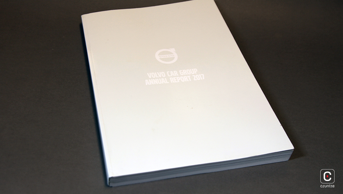
The cover is hard to read due to the choice of materials; gloss laminate with white lettering on a light grey background. Perhaps the company felt it gave the report a simple, elegant feel. May be Volvo thought the choice tied in with the company’s need to be authentic to its Scandinavian culture and this ensures every element of the report, from the cover to the copy, is anchored to the striking, sometimes bleak but always beautiful Scandinavian landscape. Or, perhaps it is an attempt to project the report’s theme of cool on the outside and warm on the inside. That said, for a company that prides itself on exuding soul in its vehicles the modern minimalist cover is somewhat lacking in this attribute.
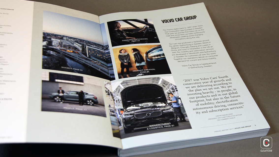
Inside the report things do warm up. The look of a classic report combined with that of a magazine glides the reader effortlessly through the report, carrying them from the magazine-style review section through to the financial reporting information. The start of the financial report section is heralded by its Contents page on page 116, which is produced in a dramatic contrast of white text on black background. Furthermore, there is an outstanding typographic scheme and an impressive two-column grid.
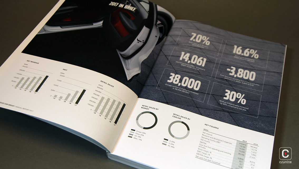
Volvo recognise that a typeface makes a big difference in how easy something is to read so they created their own: ‘Volvo’, a sort of Helvetica meets Univers mash-up where the crisp, clean, cold of Helvetica merges with the subtle sophistication of Univers. One could say it is a harmonious blend of warmth and humanity with cool and trendy. There are chunky, eye-catching headlines and numbers in Volvo Broad Pro, which are easy to read over the light grey graphics. This font, a forceful uppercase typeface, is both extremely impactful and easy to recognise. Titles and headings are also displayed in Volvo Broad Pro for a bold, strong effect while the body text is in Volvo Sans Pro for a clean, unfussy, easy-to-read style. Testimonials, quotes and individual stories are lifted off the page through the use of contrasting colours and white space which draws the eye to the font ‘Volvo Serif Pro’, generally used in longer body text, captions and quotes and particularly against white backgrounds.
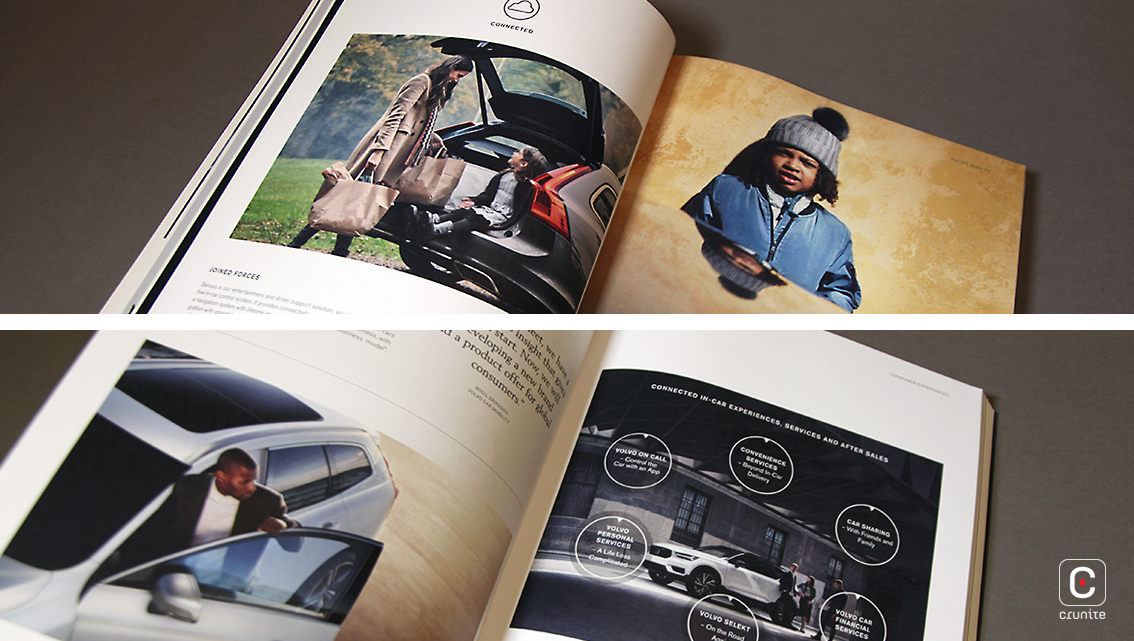
The style is sleek and sophisticated with precise lines and lots of functionality. Full-colour pages generate additional impact. The brand voice that sings the human-to-human connection ‘we put people at the heart of everything we do’ is delivered through the report’s photographs of its employees and consumers.
The report is available digitally online and as a 188-page pdf.
![]()
![]()