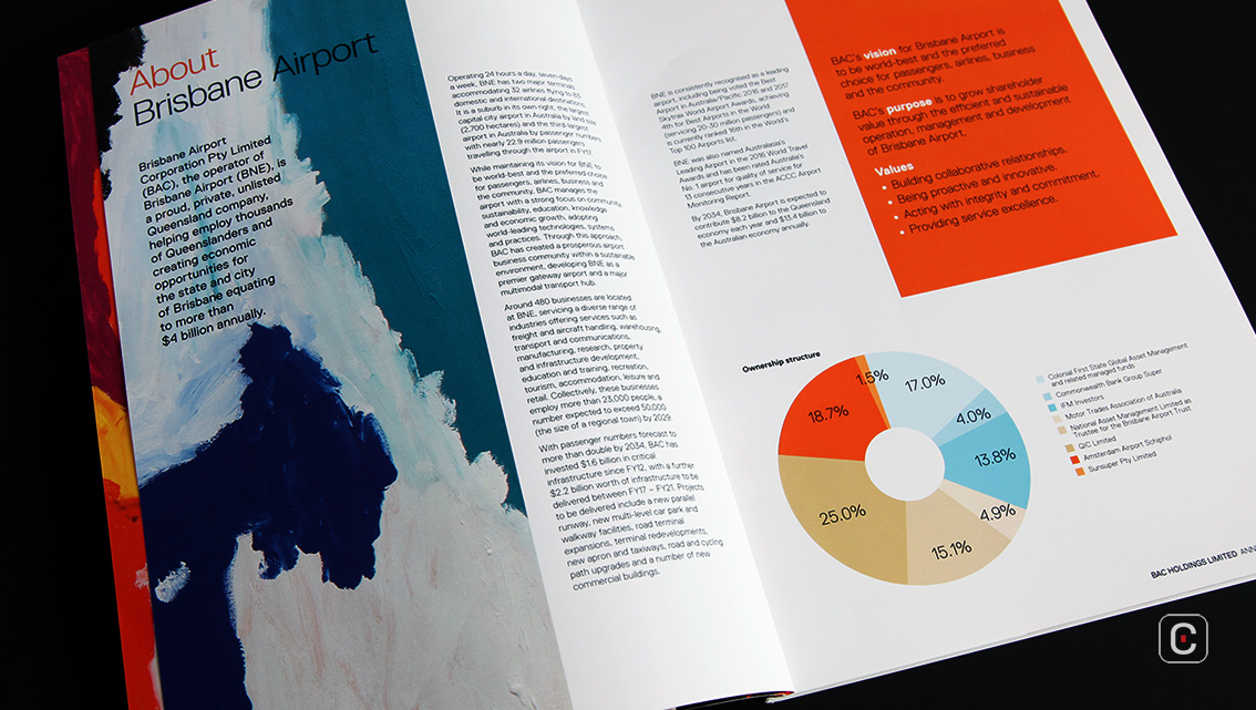
Brisbane Airport Corporations 2017 annual report could be described as lush, vibrant and potentially beautiful. It follows a traditional split of two sections; the first half of the report, designed in a magazine-style, is a review of the business and the second half is the financial breakdown. The overall design is basic and the use of one typeface in various weights and sizes gives a clean, no-fuss, practical feeling. The addition of the artwork and photography greatly improve the publication and turn what would otherwise be unassuming black and white pages into something that has the potential to be beautiful.
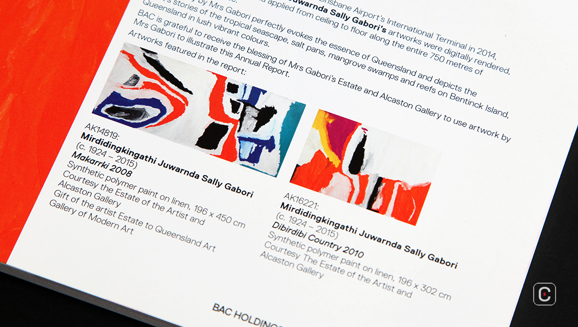
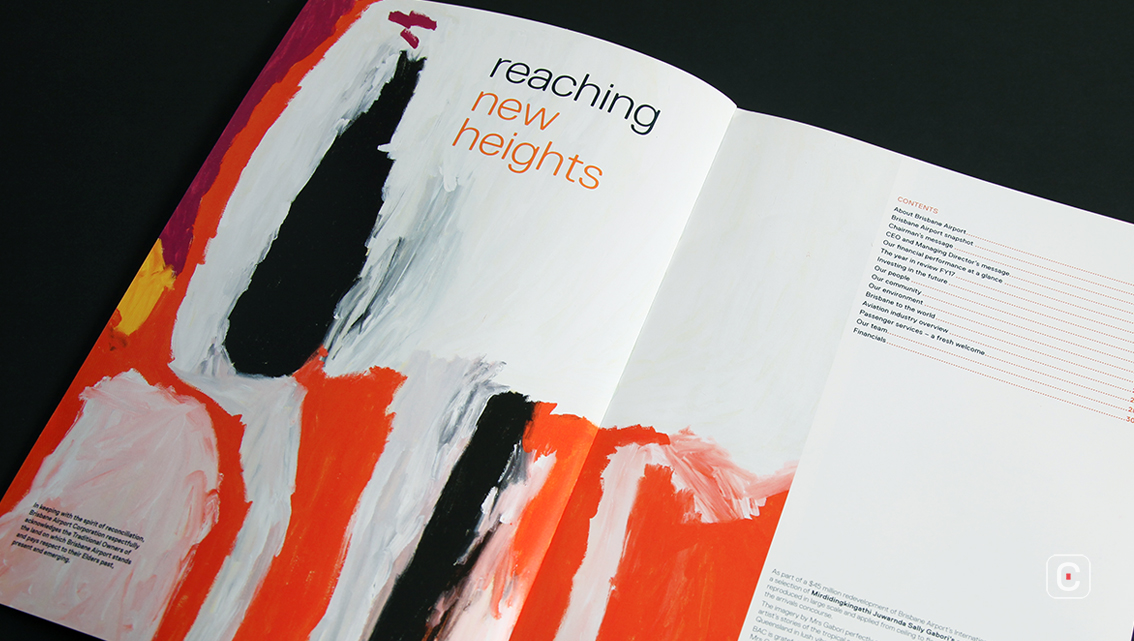
As well as using elements from two of her paintings, to varying degrees of success in the report, her work was reproduced on a scale large enough to cover the walls of the Brisbane Airport arrivals concourse in 2014. Of note on the title page ‘reaching new heights’ is a homage to the ‘Traditional Owners’ of the land on which Brisbane Airport stands in Queensland, Australia.
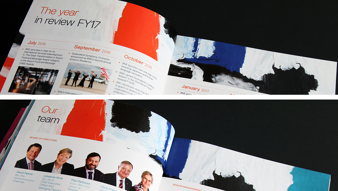
Alas, this is only partly true. Some pages look stunning while a few of the others could have benefited from a little more thought perhaps. Take for example the ‘Investing in the future’ section, which has a lovely feel to it. The harmonious balance of colours on the page work charmingly. This goes somewhat pear shaped when the reader comes in to land at ‘Our community’. The harmonious balance starts to unravel as the text fights to be seen against the bold brush work while ‘The year in review FY17’ and ‘Our team’ sections have a rushed feel about them. ‘Our environment’ and ‘Aviation industry overview’ regain some composure but by the time the reader arrives at ‘Passenger services – a fresh welcome’ the overall effect is not one that could really be thought of as fresh or welcome sadly. Balance is restored again to some degree in the ‘Financial statements’ pages section.
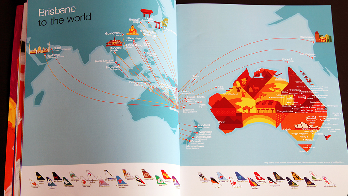
On pages 22 and 23 of the report, Brisbane Airport have used simple, but artful, vector illustrations to communicate how well connected the airport is to the world. A map stretches across a double page spread. On it illustrations of a semi-cartoon nature depict cultural traditions associated with specific countries that planes operating from the airport travel to. Planetails arranged alphabetically clearly show which airlines operate at the airport. There is a lot of value in such visual representation of content and Brisbane Airport has achieved this quite effectively plus it’s a great practical resource for the traveller in us all.
![]()
![]()