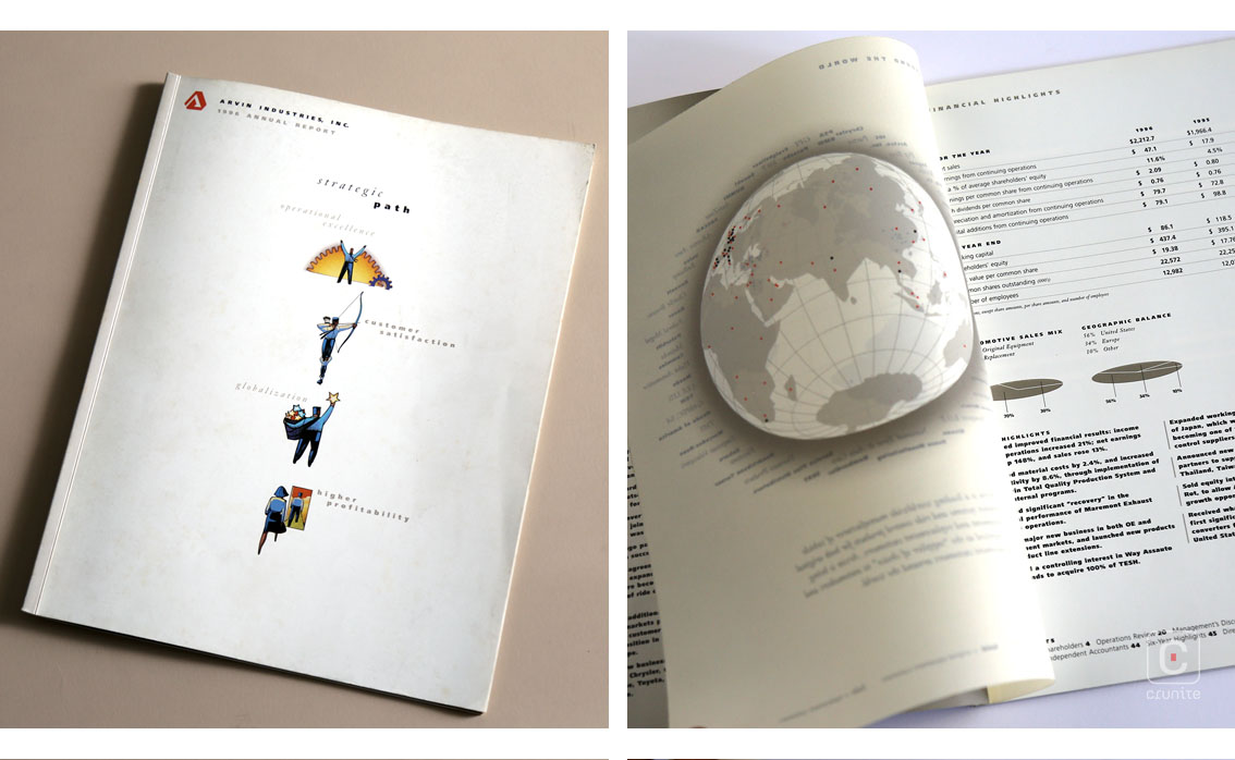
The American firm Arvin Industries produces vehicle exhaust systems and ride control products to various big names in the automotive industry. Their use of silver ink in the 1996 report makes immediate sense but it is the way they incorporate this ink that makes the report special.
Metallic inks can be difficult for a designer to master and for a printer to execute. This report shows clearly that both designer and printer were at the top of their game in making this book.
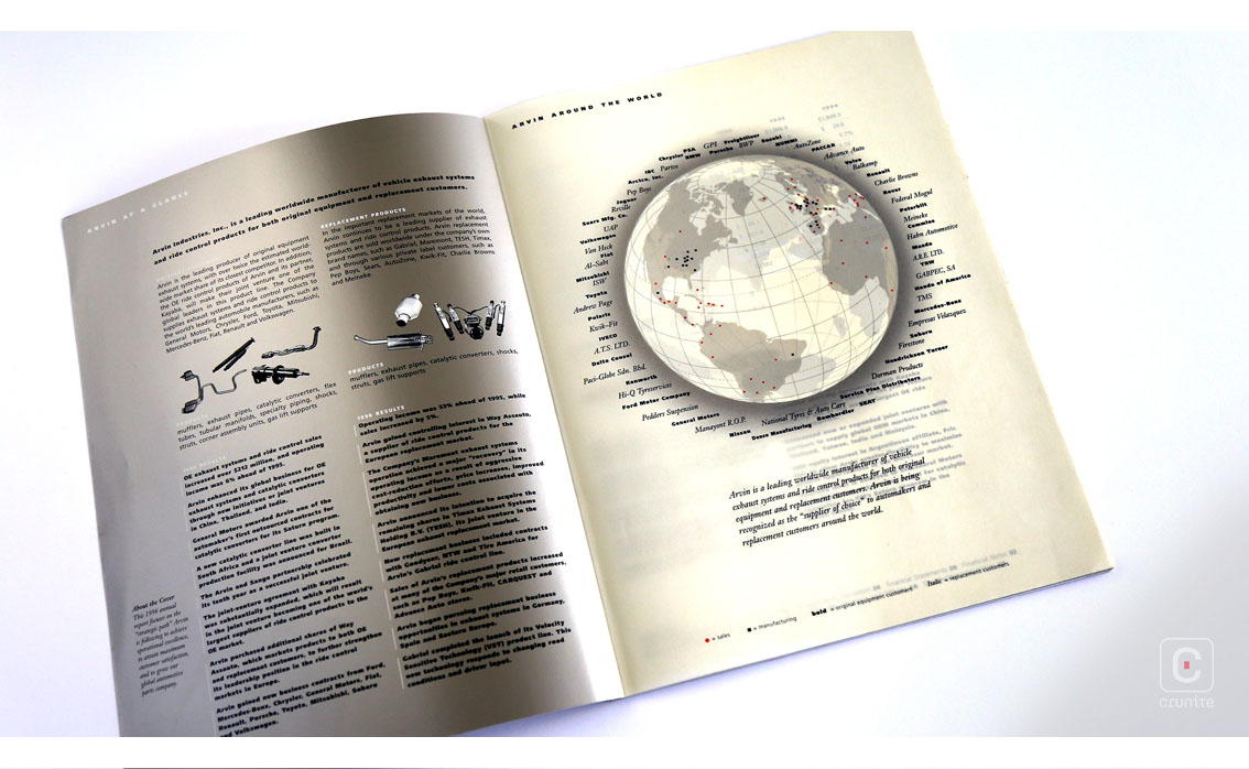
There is a simple use of silver – as a fill colour or as a base for a photograph to be superimposed. The sheen of the ink is a constant reminder of the materials Arvin uses in its business. There are less simple uses of the ink – to delicately pick out the spine of this perfect-bound book, the ink running precisely up to the cover crease.
It is also used for text and this is where the mastery of designer/printer starts to shine. In some cases it is used on quite thin serif typefaces reminiscent of a Garamond italic and to make it easily readable is remarkable.
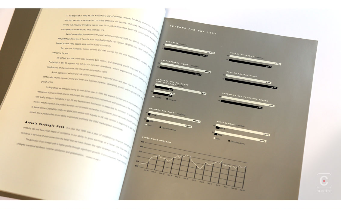
More remarkable still is the use of silver ink for infographics and for underlining parts of the financial section. This latter use is noteworthy because often the financial section is left as brutally simple as possible by most designers. Here, the addition of silver ink as a highlighting element is clever and brave and it works well, bringing an understated sparkle to an often overlooked section in annual reports.
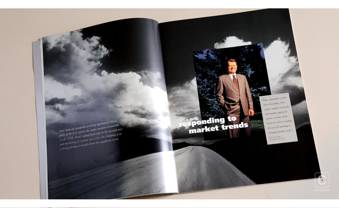
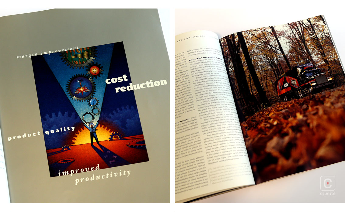
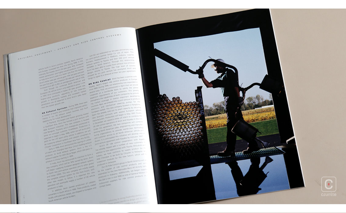
The report also features some classic 90s high saturation photographs coupled with grainy black and whites as well as some beautifully coloured illustrations, seen on the cover and sometimes as larger images to mark the start of new sections. These are nice touches but what makes this report one worth studying is the superb use of a difficult metallic ink.
![]()
![]()