
Baden-Württemberg Stiftung is a state-level foundation in Germany that provides for and supports community projects and charities with a focus on education, society and culture. (You can find our review of the 2016 report in this section, too)
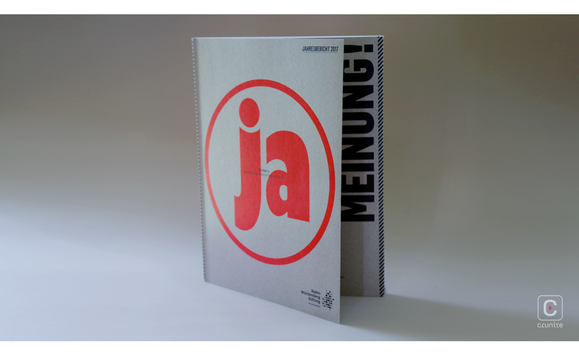
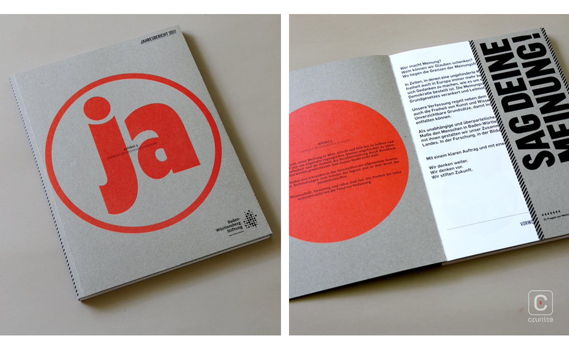
The construction of the cover is simple – uncoated, brown card stock with a large, bold orange type treatment. It is also deceptive – inside, the report is a chaotic burst of colour, shape and design.
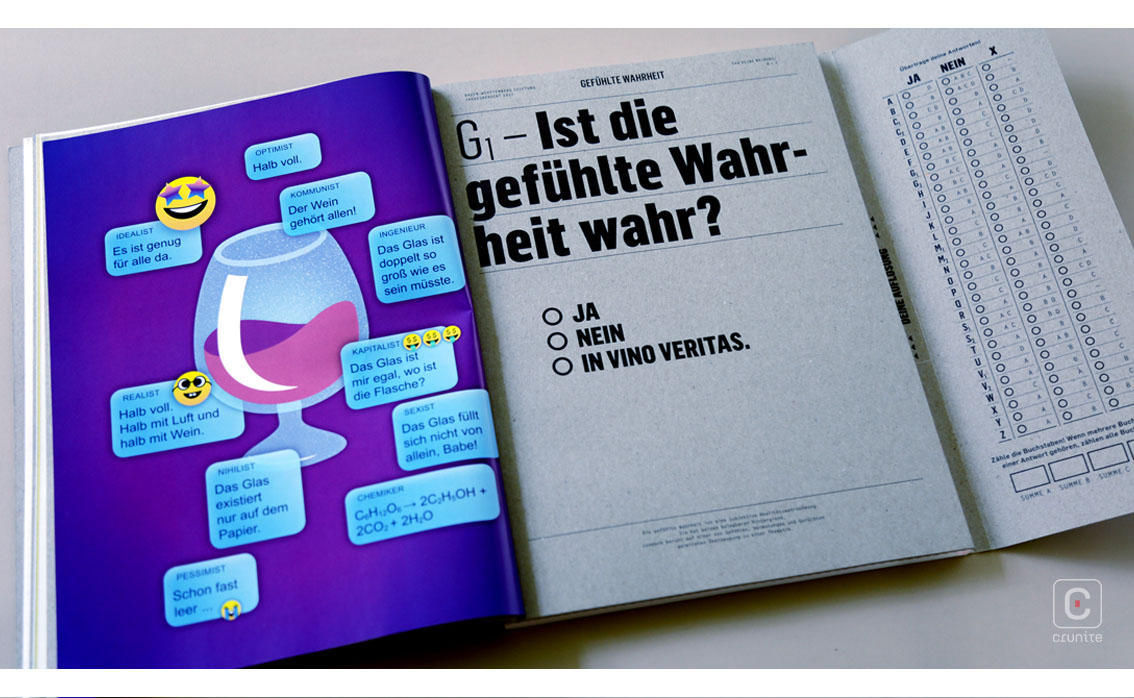
The first third of the book alternates between the cover esthetic and high-gloss pages requiring a great deal of care in production to manually tip-in the gloss pages. The latter two-thirds of the book use a stark, uncoated white paper stock that turns the orange of the cover into a eye-searing fluorescent orange.
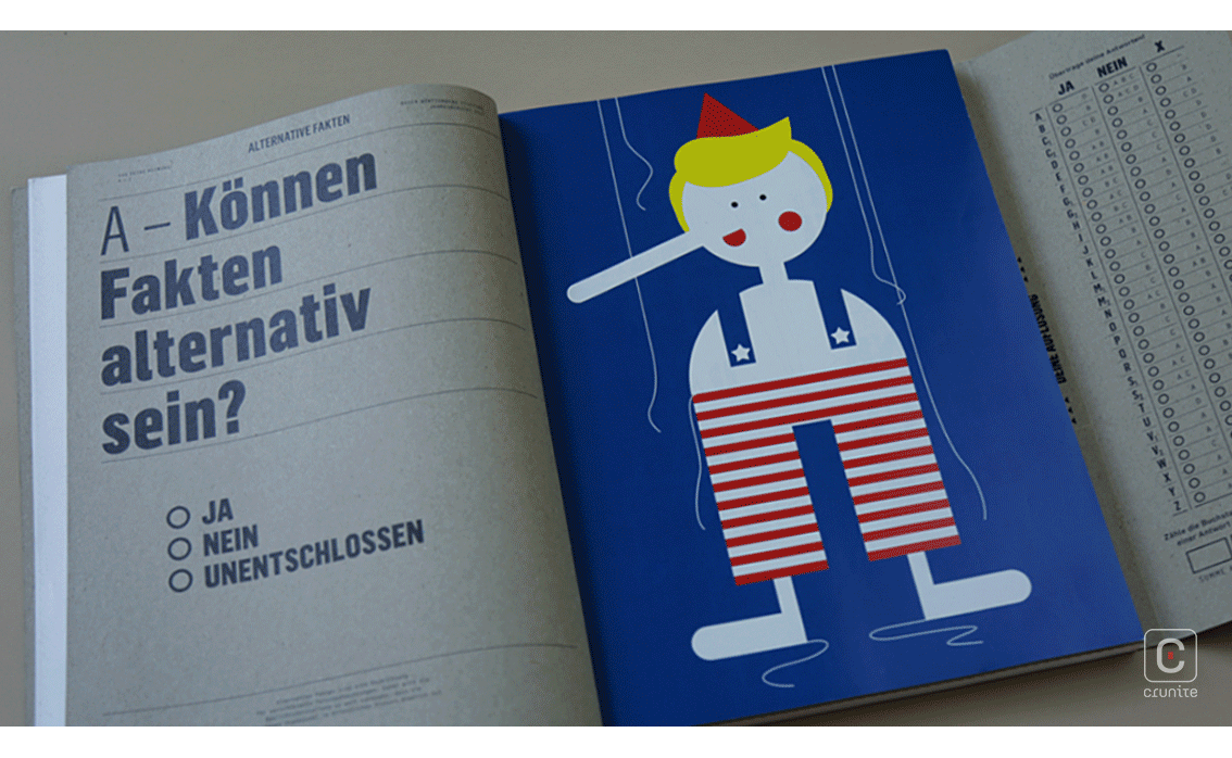
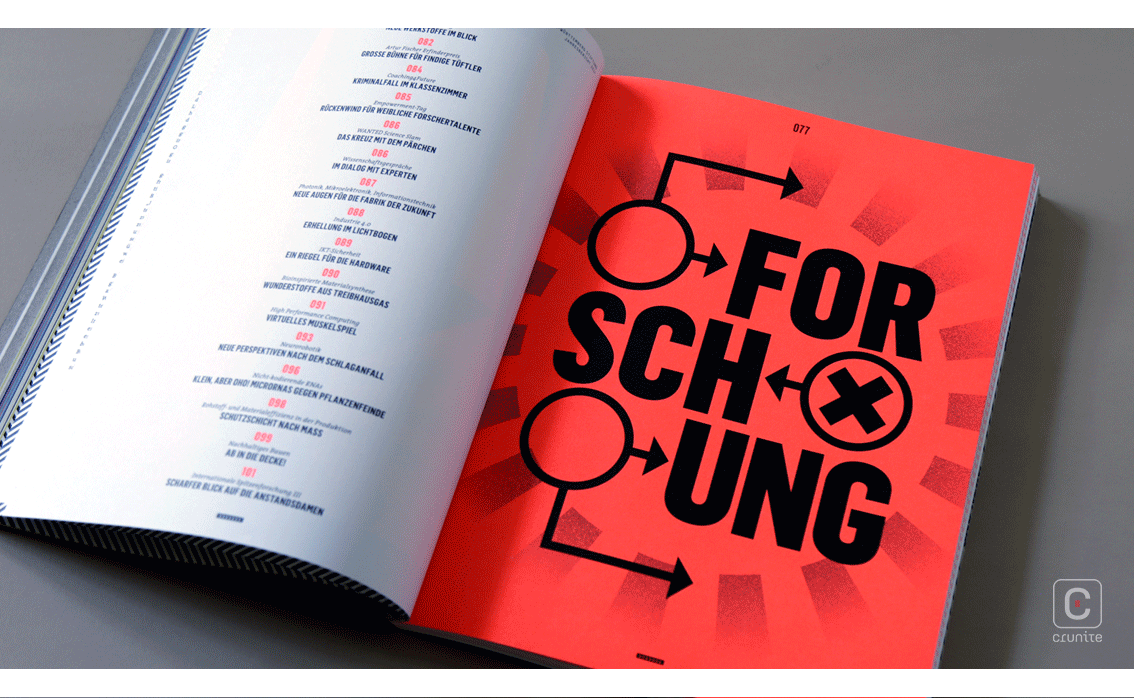
This use of fluorescent colour feels brave and experimental – the orange appears as a section marker, navigational aid, highlighting tool and for spot illustrations. It does a lot fo heavy lifting, that orange.
Type treatments echo the chaotic design logic of the internal pages – multiple typefaces are employed and most surprisingly, the report makes use of a slim monospaced typeface – quite rare these days in annual reports design.
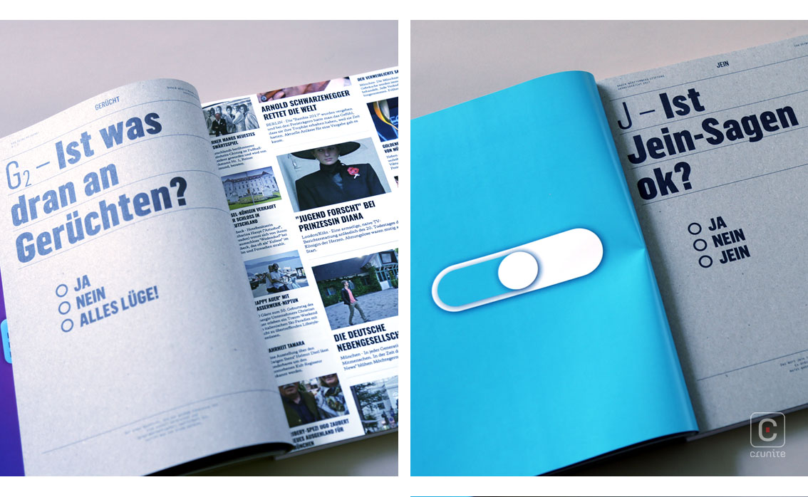
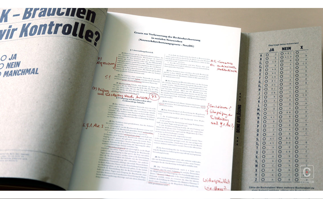
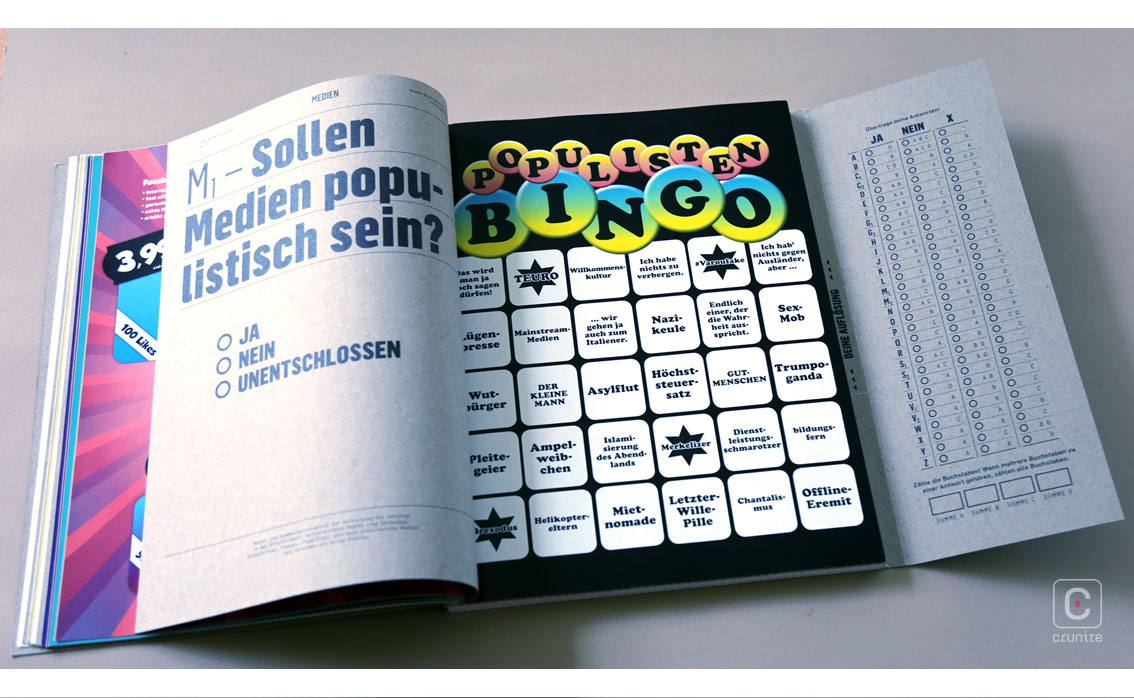
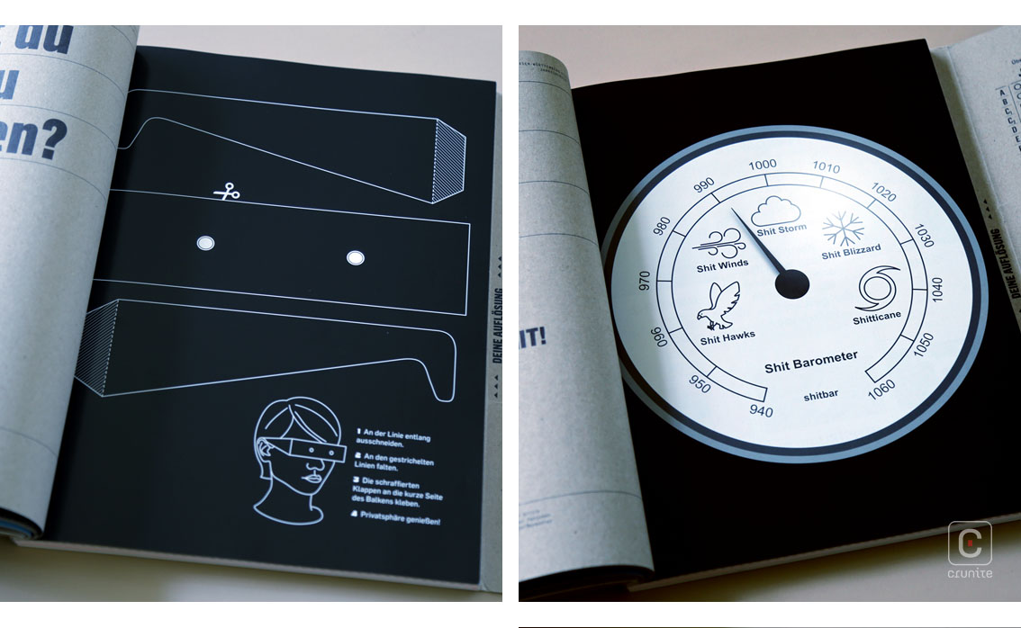
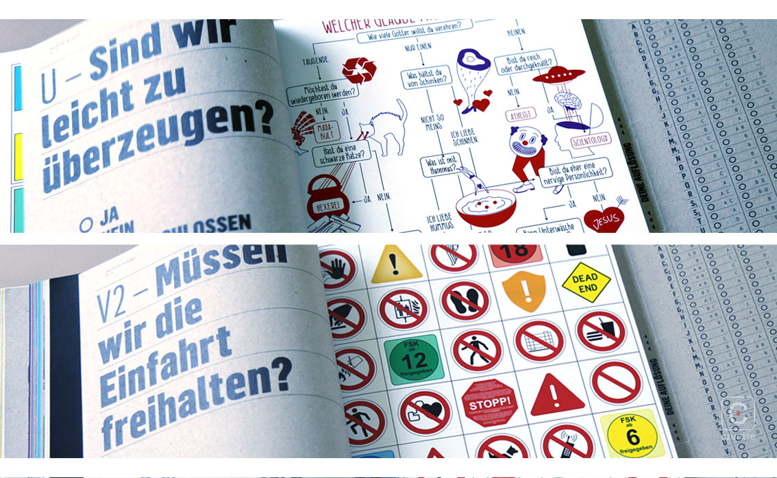
It is a surprise that these disparate elements – newspaper scans, infographics, stickers, puzzles, comics, quizzes – work together and most of the credit must go to the very clear type treatment of titles and subtitles. The use of a single, solid sans serif ties the whole book together.
While this book is not an easy read, it is certainly an energizing experience.
Back
![]()
![]()


