Black and white link together within the pages of the BEOS AG 2020 annual report to produce a document that makes clear the journey and ambitions of one of Germany’s corporate real estate giants.
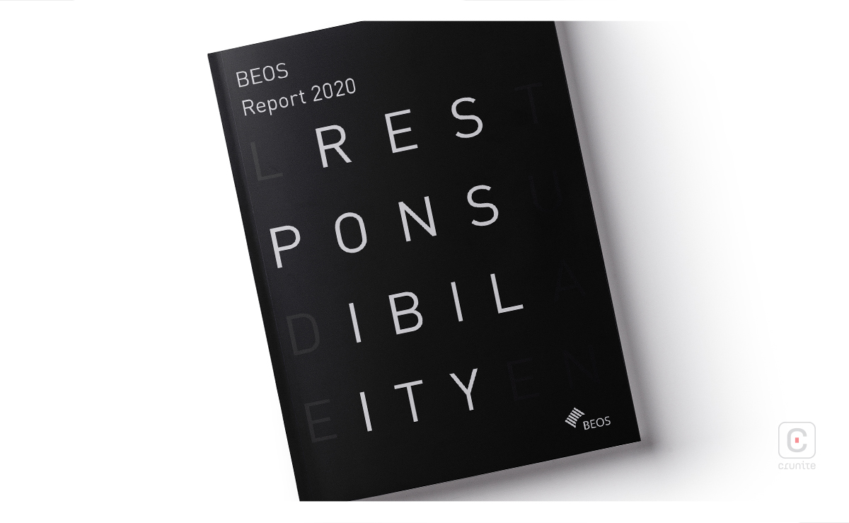
Typography is one of the notable features of the report, with the use of extra-large sans serif type, particularly in the section separating double spreads and title pages, and the additional use of serif typefaces on other pages. Descriptive text is well-composed so as not to appear overbearing.

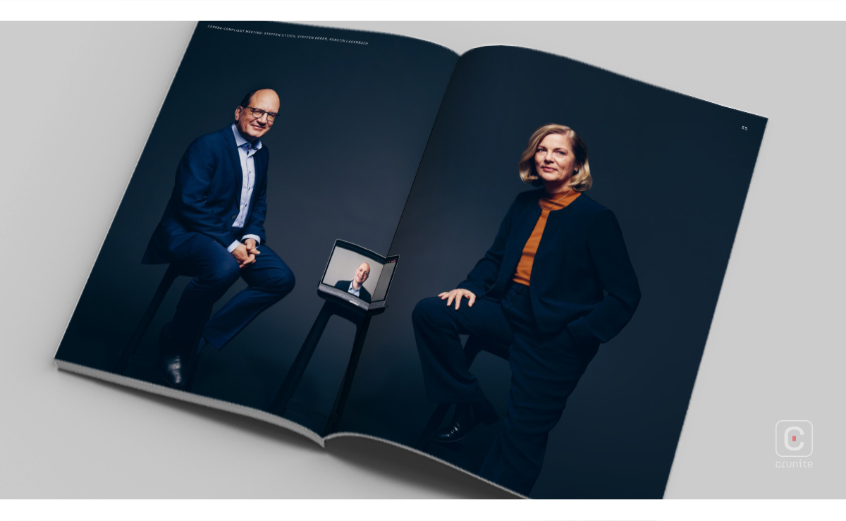
A few pages into the report, the reader is treated to a collection of remarkable portraits of the heads of the organization. Other photographs of activity within the company bring in a lot of the white as well, with a bokeh aesthetic in nearly all of them. The excessive white is a fit contrast to the full black pages. Interestingly, there is an element of blue across the photography; even some of the portraiture on closer examination reveals a very subtle tinge of blue.
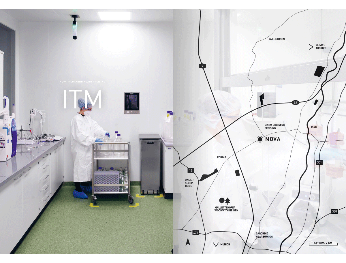
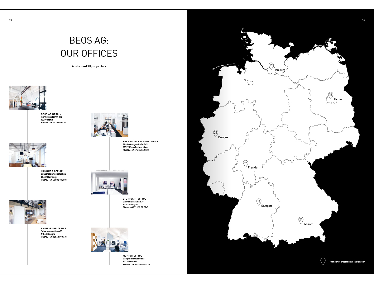
Maps are scaled and presented in black on white, but on closer examination, a faint photograph is visible on the background of each map.
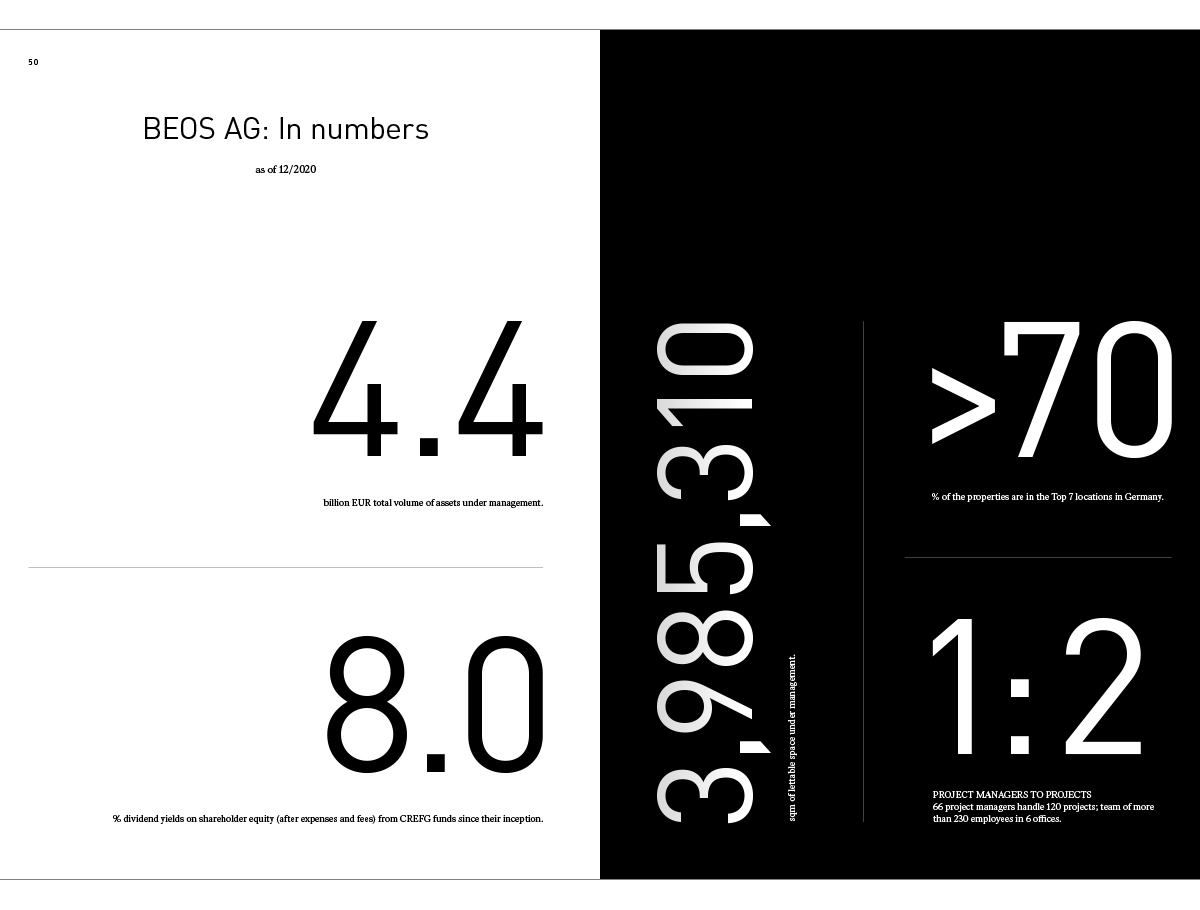
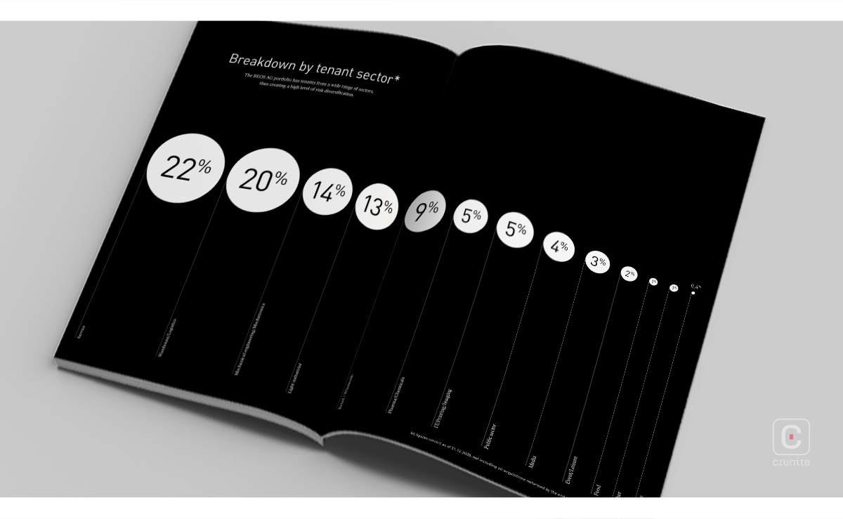
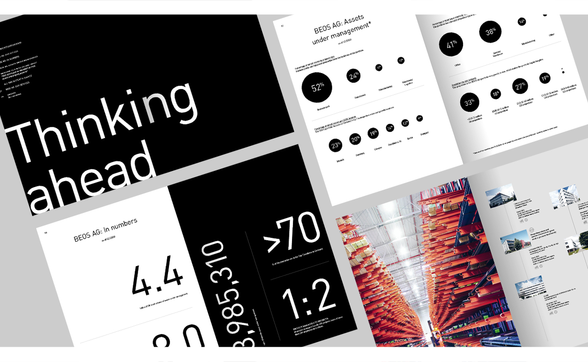
Data representation is minimal. Figures on pages 50-51, with a fold-out page, are extra-large and in the pages that follow, numbers represented within circles to match their respective proportions.
A collection of icons has been used in the services section, as well as later on, to represent the four corporate real estate categories. The latter icons are scattered throughout the very detailed projects section and help the reader understand the scope of the company’s work.
The projects section consists of an assortment of smaller images to showcase an impressive and diverse number of properties.
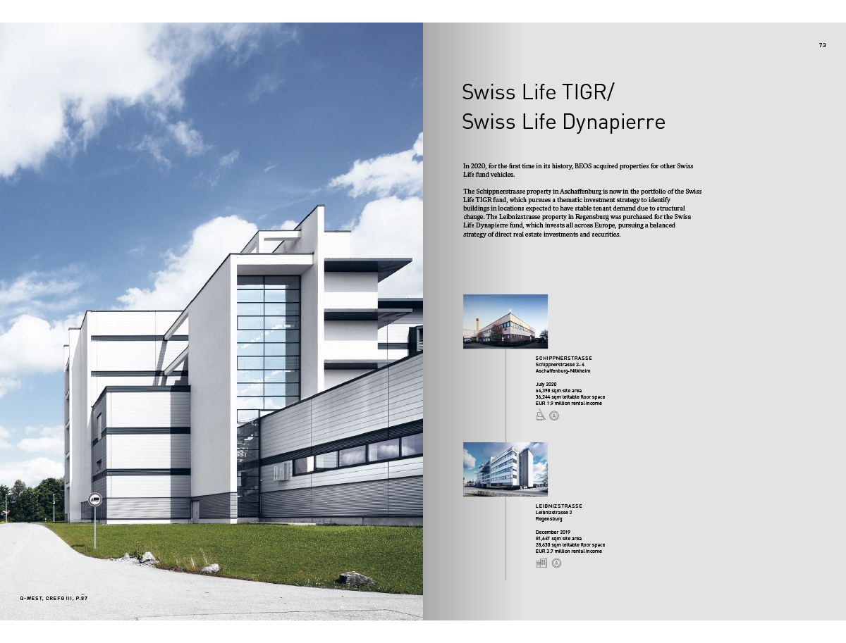
Interspersed within these pages are also a few full bleed photos of the different locations.
Overall, this report possesses a clean, almost sanitized look, owing to the generous use of black and white across nearly all design elements.
![]()
![]()