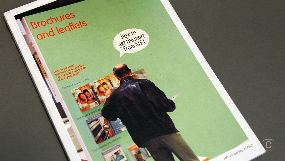
The United Kingdom’s largest furniture and fittings retailer gets right to the point on “how to get the most out of MFI” in their 2002 Annual Report. The cover page, which doesn’t scream out a title like most reports would, uses a full-page candid photograph with subtle inclusions of its content, that’ll be sure to attract the more meticulous readers.
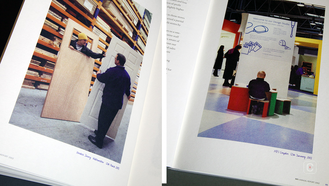
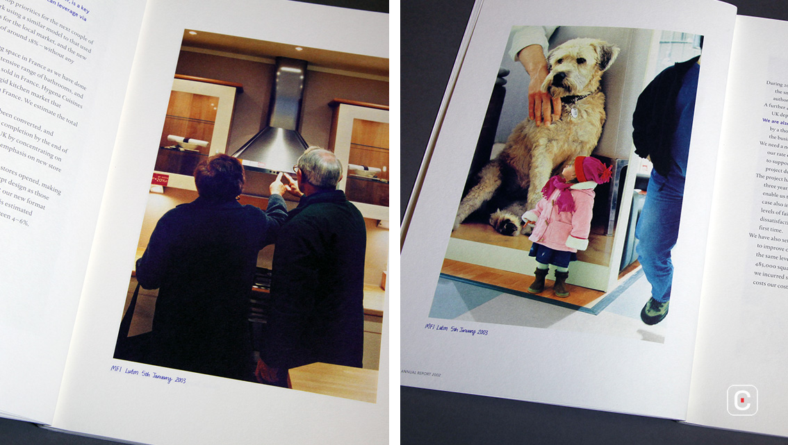
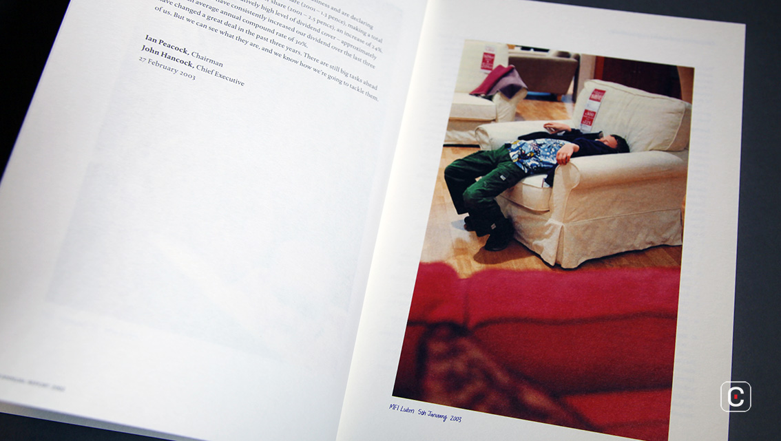
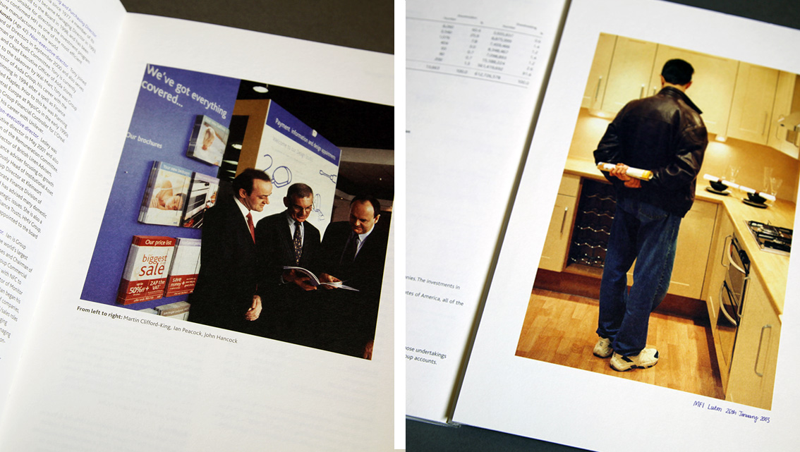
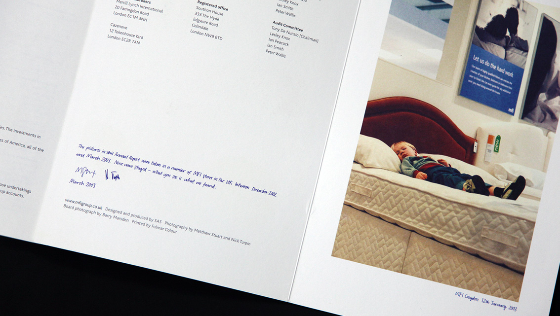
The photography featured within the report captured by Matthew Stuart and Nick Turpin, two renowned British street photographers, incorporates various iconic moments from different MFI showrooms around the country. The use of this informal style of photography helps depict a broader image of the company’s many attributes and gives this report a fun, lively aspect to it as well.
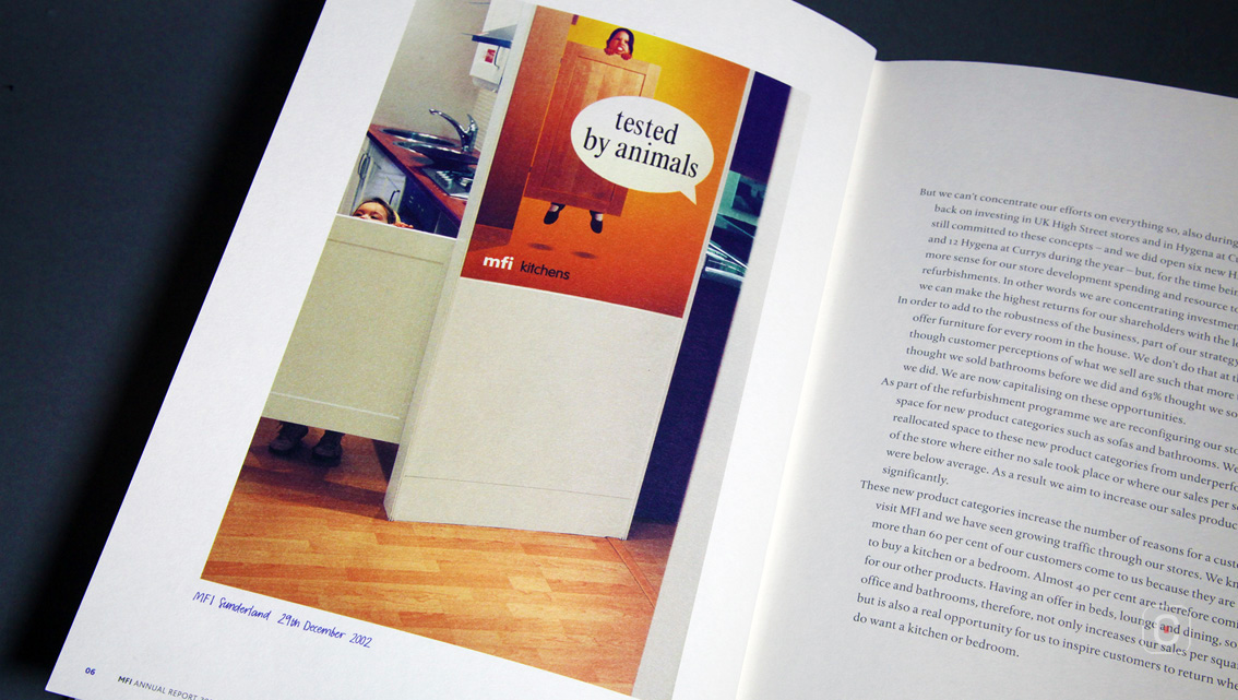
Starring the customers of MFI, the photographers have managed to catch momentous images of their experience. A majority of the photography centres around children in the store suggesting a very family-oriented and family-conscious business that integrates family life into their furniture and fittings to give you the ideal setting.
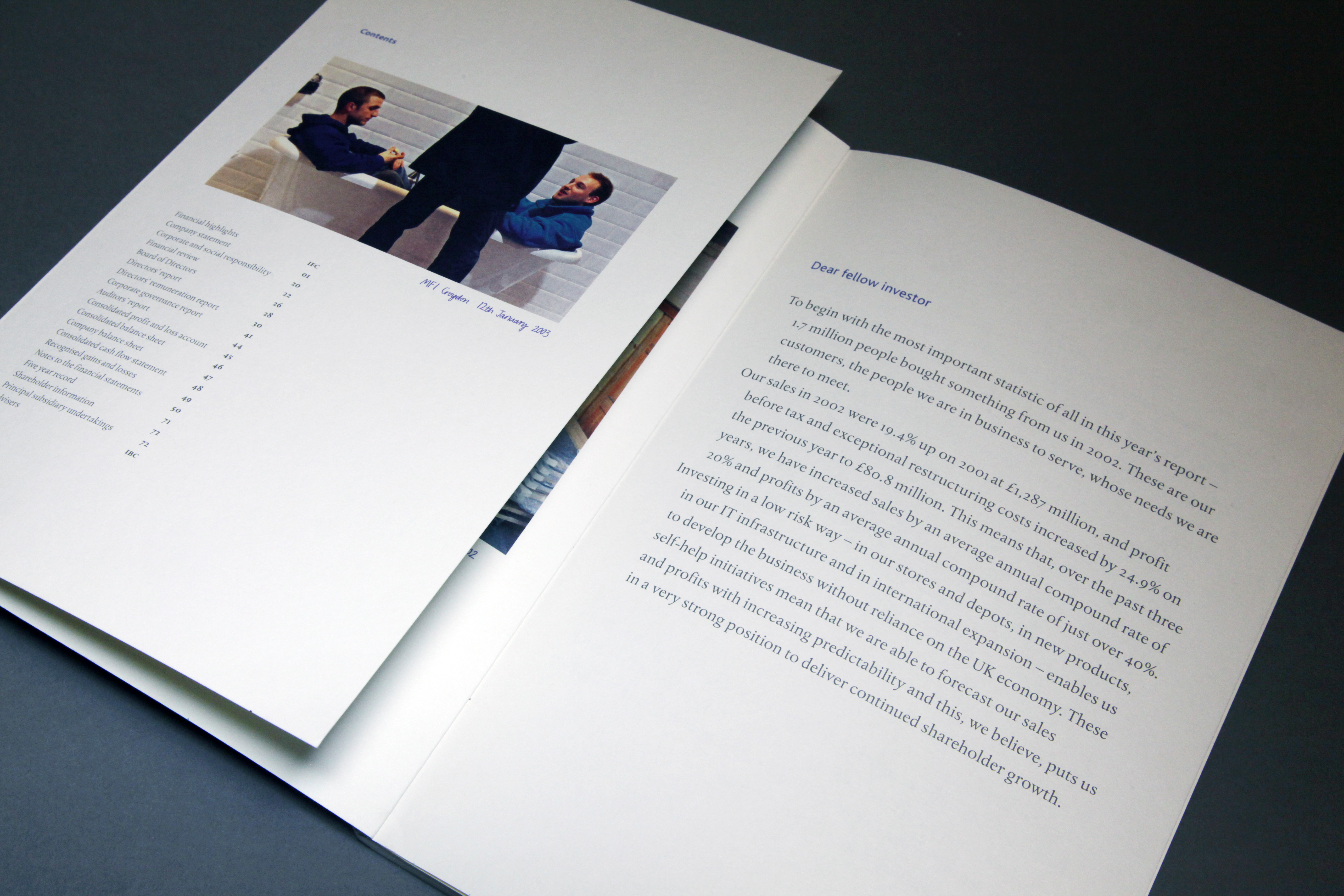
Even the heads of the Board of Directors are presented through a candid snap of the three gentlemen casually browsing through a company brochure rather than formal individual portraits. Not only does this show off the fun-loving, easy side of MFI but also the energetic and enthusiastic teamwork that the company upholds.
The 27cm x 18.5cm booklet deserts the typical gloss paper for a more homely white matte finish with front and back cover flaps that reveal more pictures and clever bar charts represented through wooden planks. The report itself includes no unnecessary information and uses simple and easy language.
The simple Serif font and big type makes the report attractive to any reader. The neatly structured paragraphs under subtle blue headings, with big white space around large chunks of information reflect the business’ neat, clean-cut organisation and management. Additionally, the absence of any sort of amalgamation between pictures and text bring out the dual nature of the company; financial yet flamboyant.
Overall MFI’s 2002 Annual Report sports a very informal design with great vivid photography, simple typography and extra space as a breather to make it easier for MFI-interested clients to read and enjoy as well.
Back![]()
![]()