
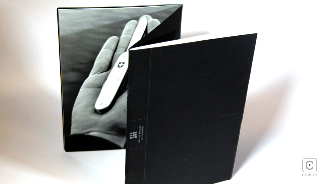
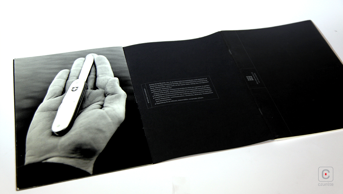
Sleek and compact, this report outrageously manoeuvers from the norm of an annual report design. The 1997 Annual Report of Swiss Army (presently Victorinox) uses a dos-a-dos binding to divide the report into two sections – one for the text and the other for pictures.
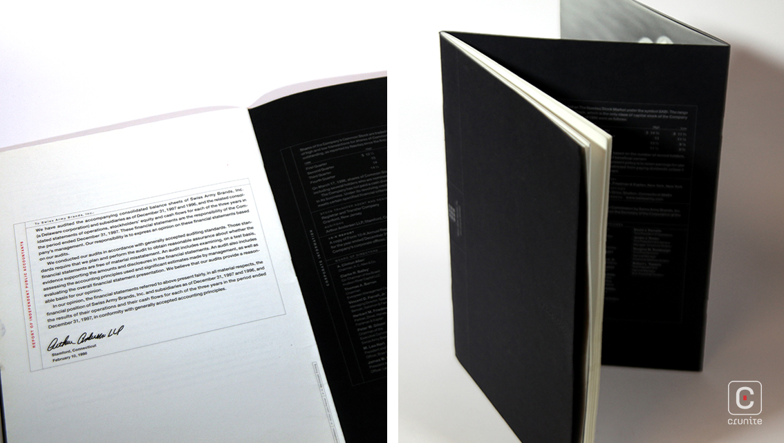
The inner cover displays financial highlights for the year in silver text, a form which is repeated throughout the report to draw attention to significant numbers and information. A colour synonymous with sophistication and grace, the silver infuses the financial report with a sense of optimism, too.
The president’s letter to shareholders is again a deviation from the usual – the tone is casual, almost conversational. It begins with statistics to provide a summary. The use of phrases such as “These numbers hurt,” build an emotional connection with the reader, authentic and vulnerable. This is a trust-building exercise, explaining failure in a motivational style. Subsequently, the report continues to break down the causes of its losses and thereon how the company aims to rectify the situation.
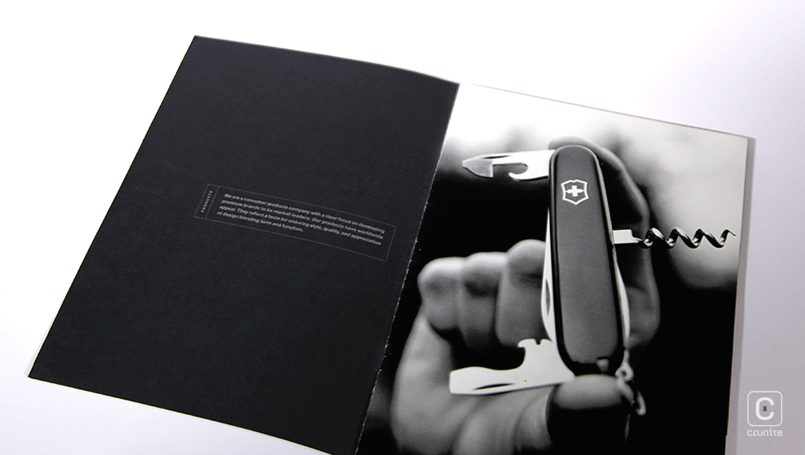
The latter is utilised only for the words ‘Innovations’ and ‘Icons’, hinting at the dual themes that make up this report. Pages 6-7 takes this story forward, smartly demonstrating the product profile of the timeless and classic Swiss Army brand.
Back![]()
![]()


