
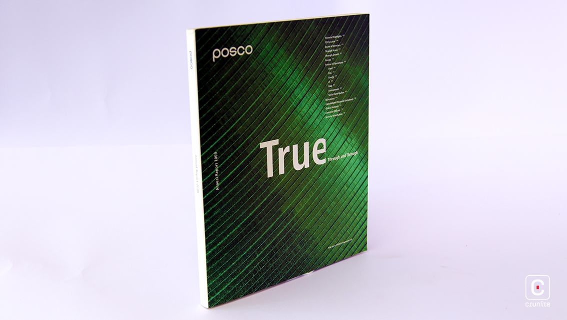
South Korean steel-making company Posco dishes out yet another strong annual report in 2009 with its creatively expressive title and bold photography. Breaking the norm, the contents page appears as the cover.
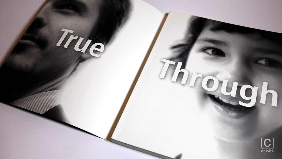
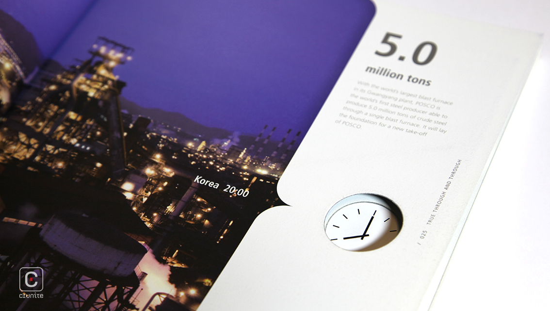
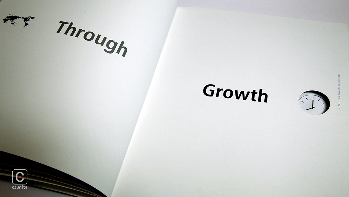
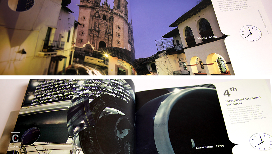
Large text with a subtle drop shadow over black and white portraits transition into full, double page images of scenery. The consistent colour scheme of these picturesque landscapes make these images the perfect canvas for overlaid narratives and graphics. Additionally, the parenthesis edge and die-cut clock and map that run through a few pages give the report that little touch of quirk.
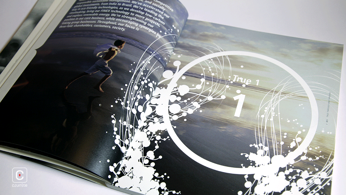
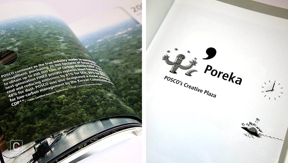
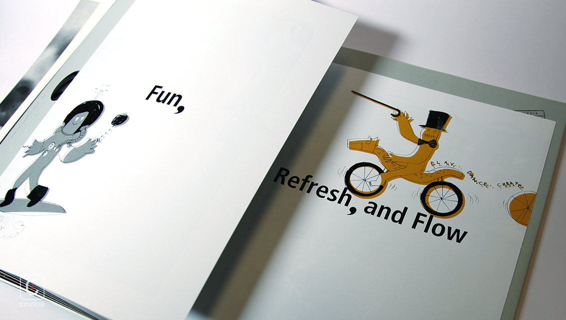
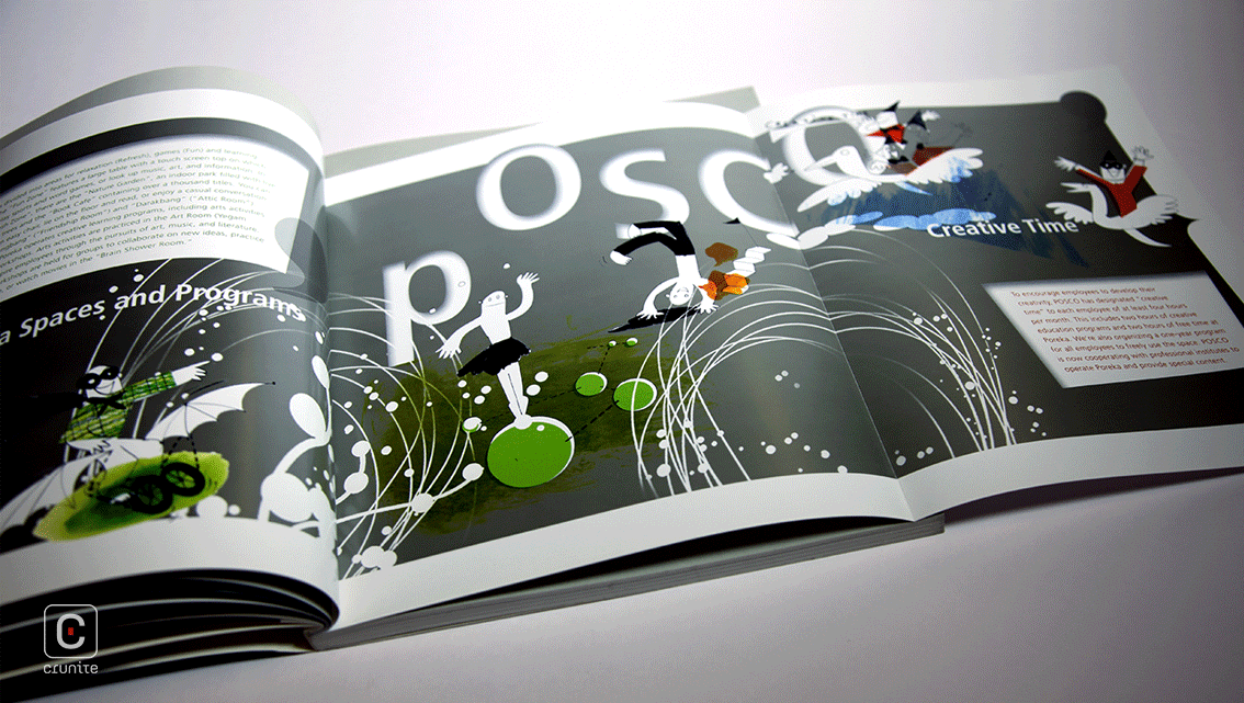
As readers venture into the centre, a double spread booklet opens up revealing Posco’s novel personality that shines as bright as the steel they produce through the funny little doodle creatures who bring life to this report. These simple, imperfect, monocoloured, two dimensional sketches along with white bubbly graphics are scattered through the report and mingle with text as well as imagery.
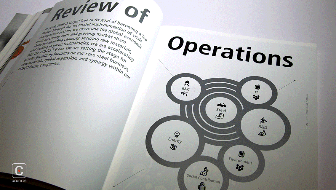
The left-aligned square paragraphs give the report a neat put-together feel much like Posco themselves. Emphasized numbers, bolded headings, rhetorical questions and vertical page numbers and headers on thick glossy paper (150gsm) complete this unorthodox corporate style. Overall, the subtle mix of horizontal and vertical text, photography interwoven with graphics, text image amalgamation and even the eccentric doodle characters perfectly bring out the true nature of this gentle giant in the steel manufacturing industry.
![]()
![]()


