
The Progressive Corporation’s 2016 Annual Report has transitioned into its 2017 Shareholder’s Report, a quarterly review. The reports are identical except for the additional data on the Shareholders’ Financial Highlights page. These, and a letter to the shareholders are available online, and as downloadable pdfs. The Annual Report is also available in print on acid-free, environmentally-friendly, Forest Stewardship Council certified paper.
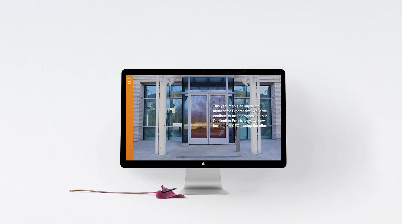
The theme of the Annual Report is ‘transition’. It is a hot topic following the leadership change in July 2016 when a new CEO took up the helm at the auto insurance company. But there is no departure from the company’s regular use of art in its financial publications. The Progress Corporation regularly invests in contemporary art and uses contemporary artists to illustrate their annual reports.
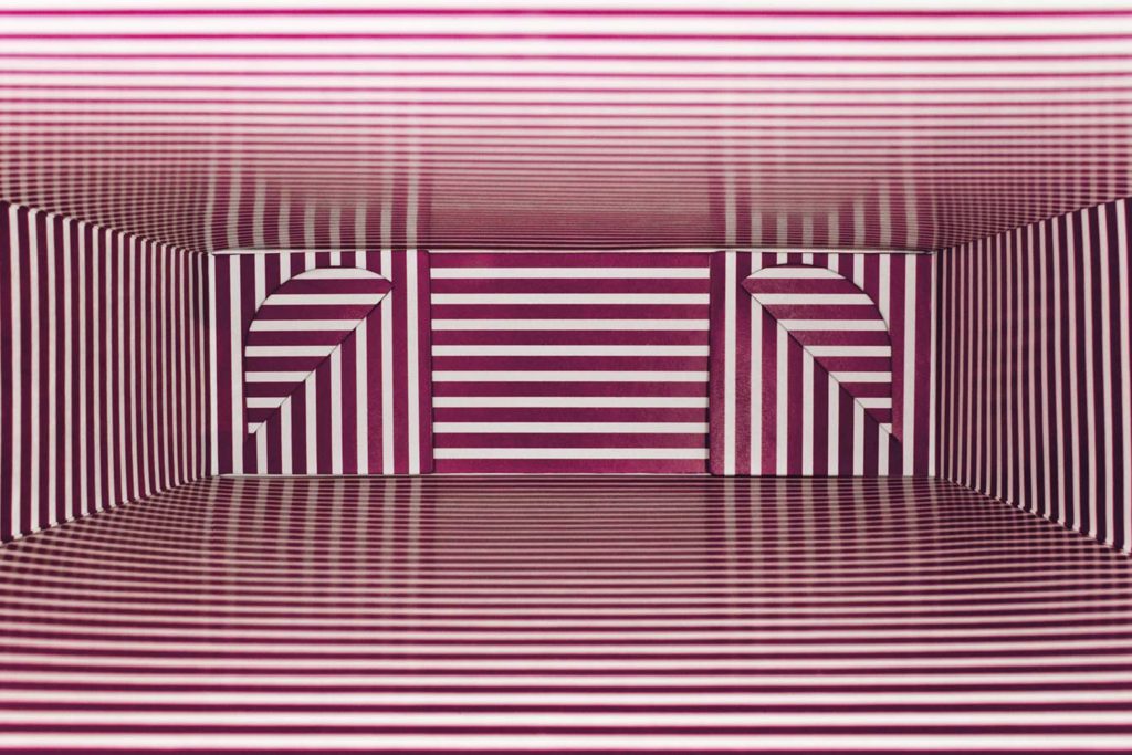
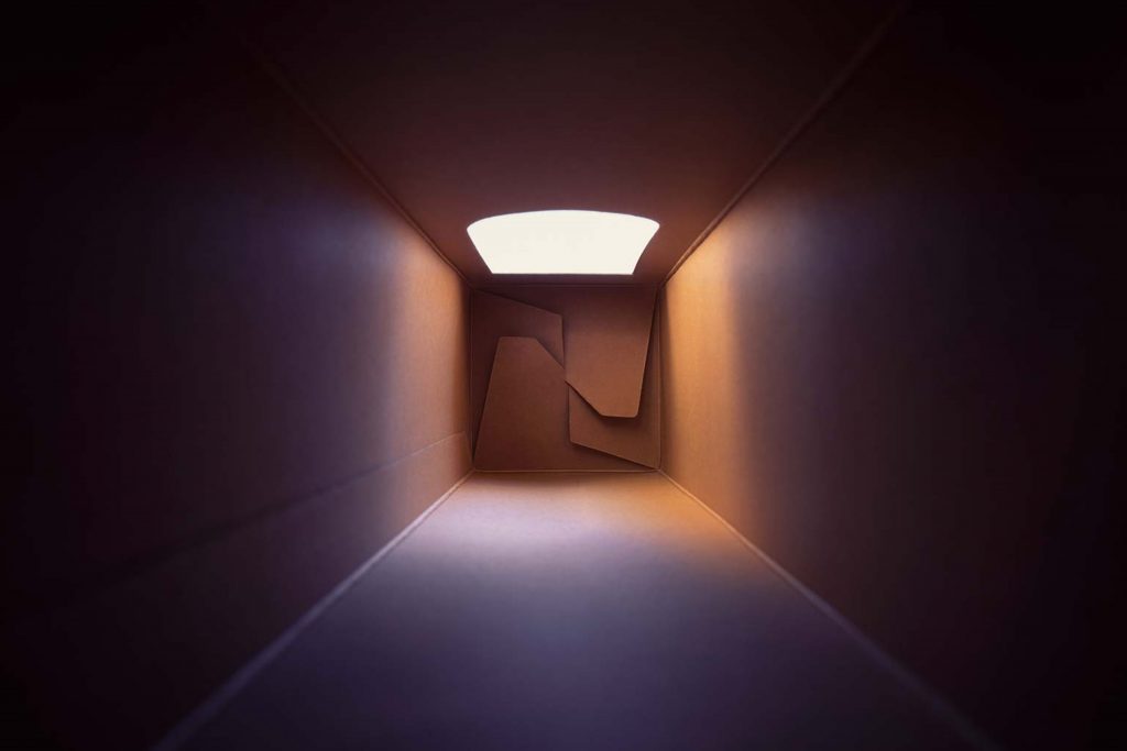
Here, contemporary Brazilian artist Lucia Koch’s imaginative, thought-provoking photographs and installations are used to great effect in the annual report; inspiring confidence and telling shareholders that their company is doing well – a welcome message to anyone interested in the company.
Colours used in the photographs are integrated into the pages through clever use of colour gradation, imparting a feeling of transition in both offline and online versions.
In terms of typography, the clean, crisp typeface enables headings to remain clear as they move and overlap in various degrees of opaqueness, reflecting the main colours of the photographs on the page.
The Financial Highlights is a straightforward no-frills review. It’s clean, it’s crisp; there is nothing out of the ordinary about it. The layout follows a traditional financial spreadsheet style. There is no interaction except for the greying out of each line of data as the cursor passes over it, a nice touch that makes the page easier to read.
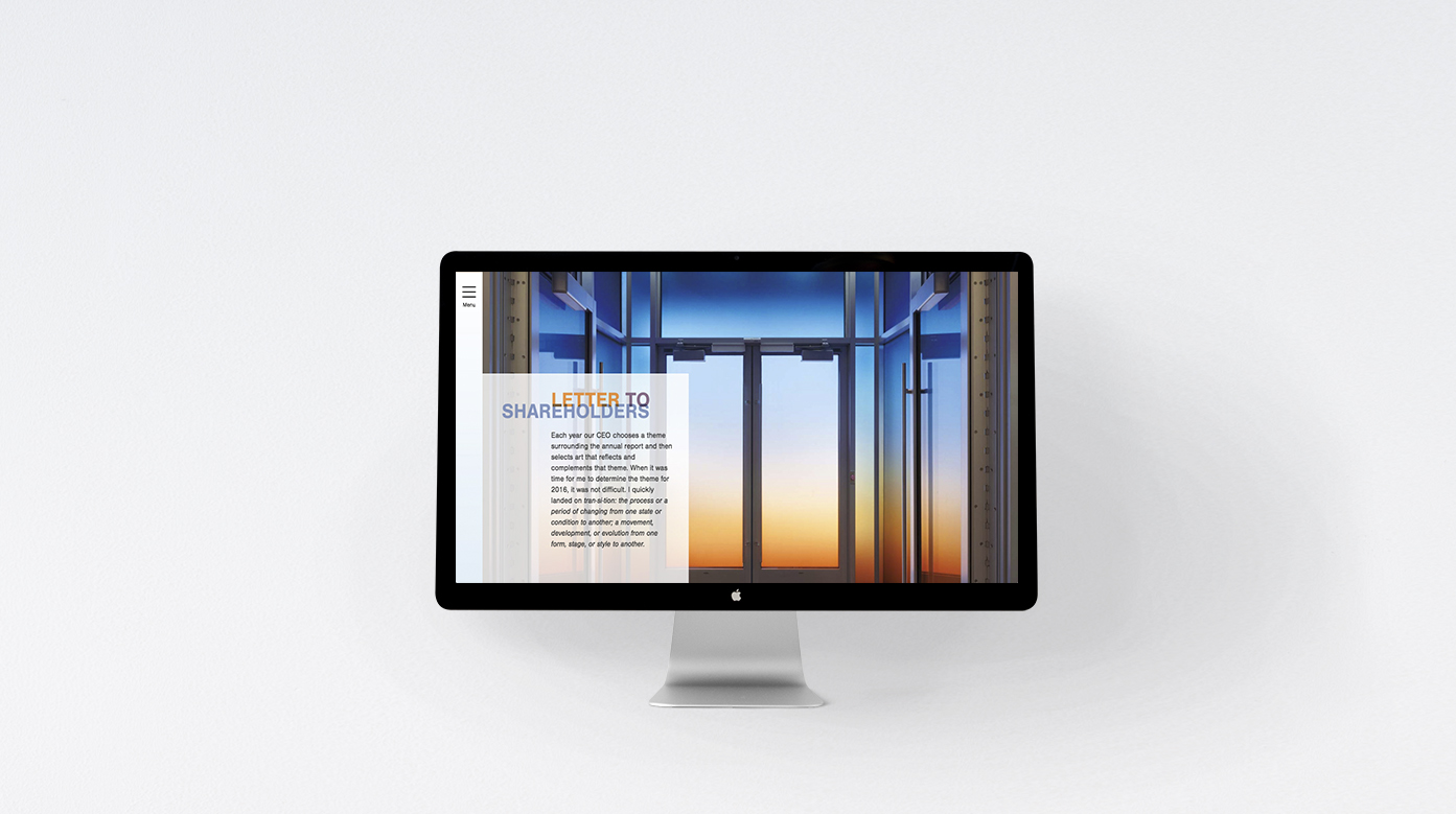
The 2016 Annual Report won awards for its interactive design, and it’s plain to see why. The digital report contains a significant amount of motion playing a critical role in the company’s philosophy of customer interaction. The interactive design also adapts to a user-friendly version depending on the device being used, including mobile phones. The Progressive Corporation is among those who realise that a significant number of shareholders are likely to be reading their report online and possibly on the go. Speaking of on the go, when you enter the report and scroll down the words ‘transition’ appear moving from right to left. Instantly, but subtly, you have witnessed the report’s themed ‘Transition’ message. Further scrolling takes you literally to the doors of the corporation’s headquarters which open invitingly and you’re transported into the Visitor Centre. From here you can take a 360º degree tour of the virtual space that you find yourself in. To experience the full motion of the pages, have the report open full screen. On the ‘Operations Summary’, for example, page segments move in opposing directions; forwards, backwards, horizontally. The feeling of motion really has been achieved.
Back
![]()
![]()


