Next Fifteen Communications Group is a marketing agency based in England and operating globally. Their client list includes heavyweight companies like Google, Apply, Microsoft and Cisco.
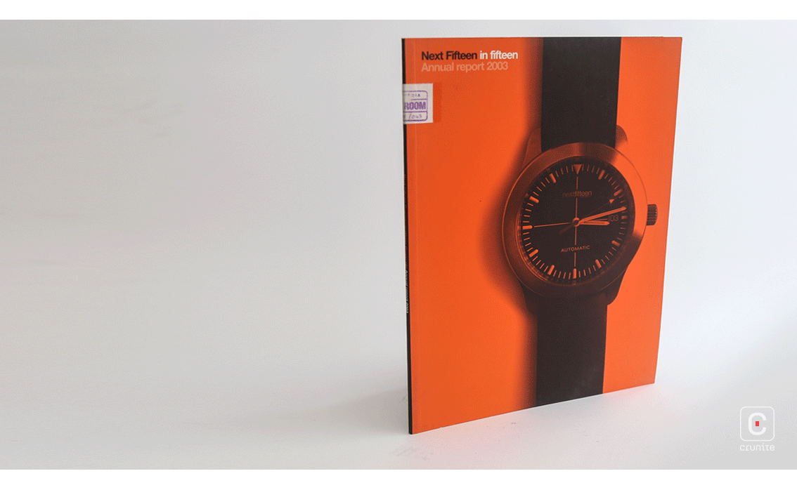
Their 2003 annual report is a good study in using a cover to conceal a design surprise. The cover image –a wristwatch set to nearly 15 minutes past the hour– suggests calm. A bright orange photographic overlay is the only clue that the inside of the book contains something more energetic.
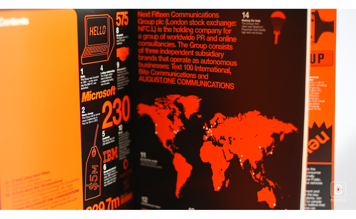
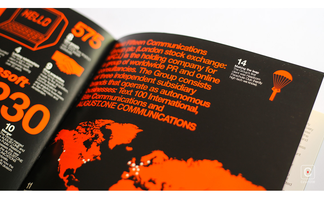
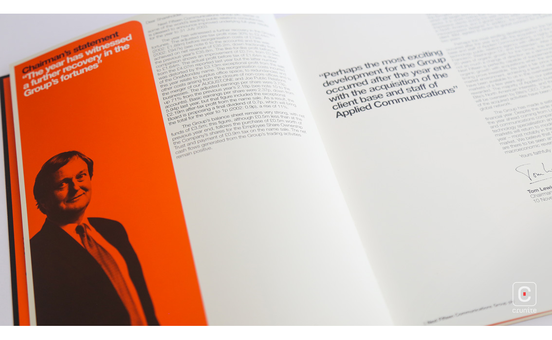
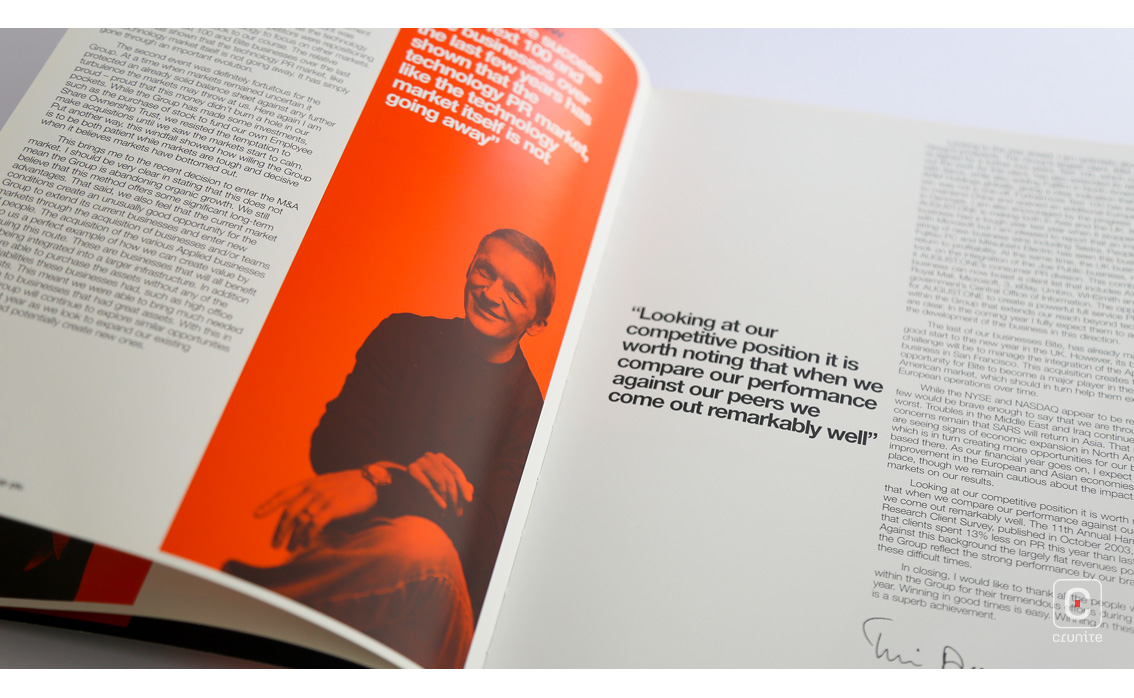
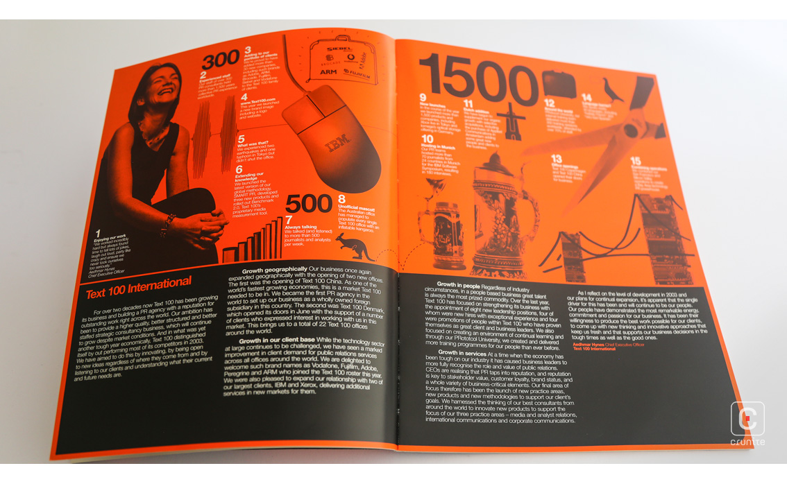
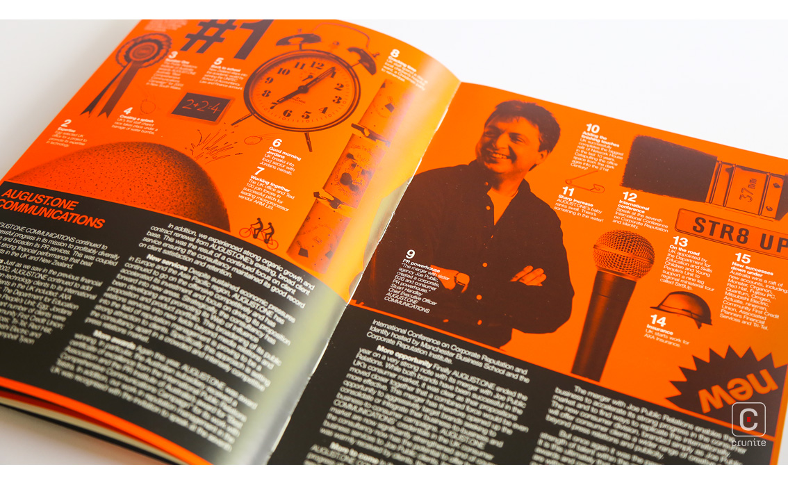
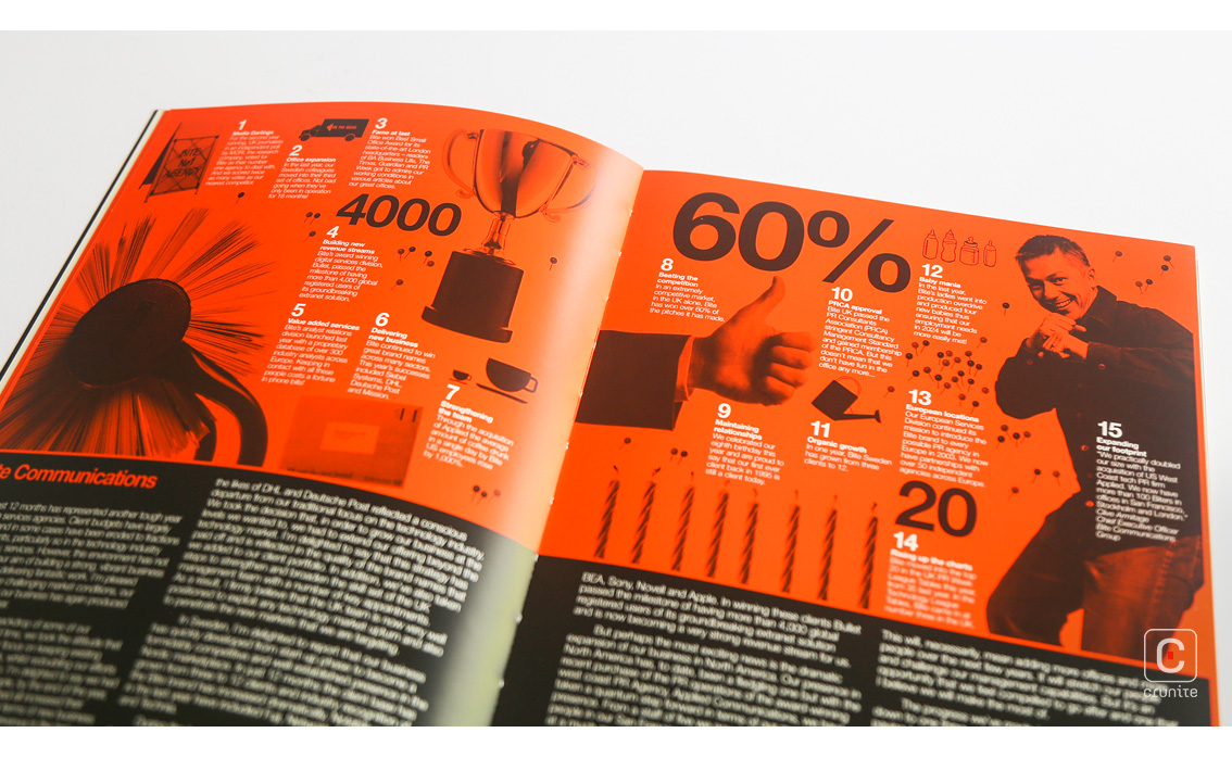
Opening the book to its first page leads to a blizzard of text and illustration, combining the contents page, infographics, a map of operations and some handy statistics about the company into a single spread. This approach of combining dense imagery into a unified whole is used also for corporate portraiture and suggests a dynamic workplace. The people in the portraits are often jolly, in turn suggesting a friendly work environment.
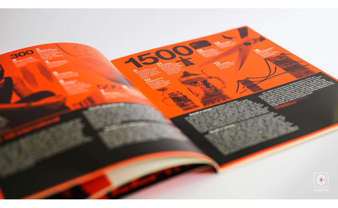
All of this is set in a 2-colour palette – the orange of the cover, a solid black that reproduces well on the matte paper stock (and of course the white of the underlying paper). The paper choice is excellent and shows off the sharp contrast of orange and black inks. It also enables the orange to be used effectively for navigational text at quite small type sizes.
Type treatments are simple – a single sans serif in multiple weights is used throughout. On white pages, the body text veers toward being too tightly leaded but this effect is less pronounced on black pages with white type.
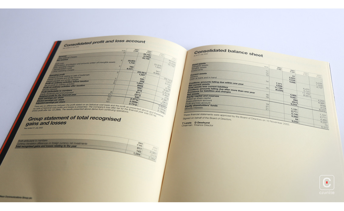
The financial section uses a cream, heavy uncoated paper stock and makes for a calming change after 16 pages of intense colour and densely packed graphics. The report is a good size for holding and comes in at a sensible 40-pages, making for a swift reading experience.
Back
![]()
![]()