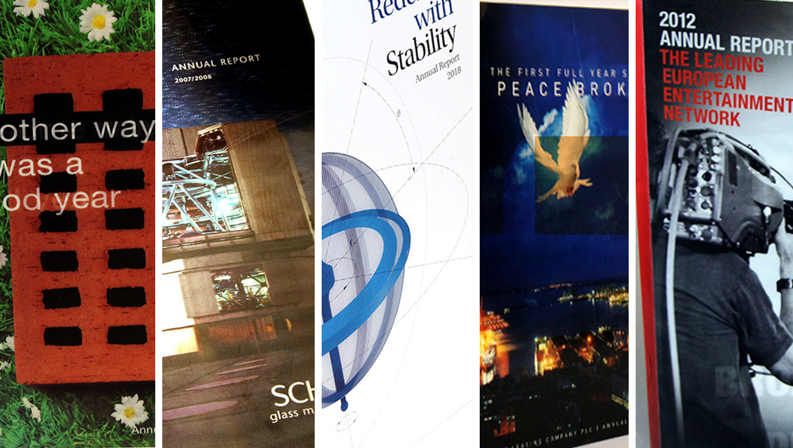
Exuding a sense of magic, lenticular printing is a technique that uses two or more images to give an impression of depth and movement. This week, we explore a few annual reports that use this method on their covers. For us, it brought back memories of our childhoods and renewed our fascination with lenticular printing.
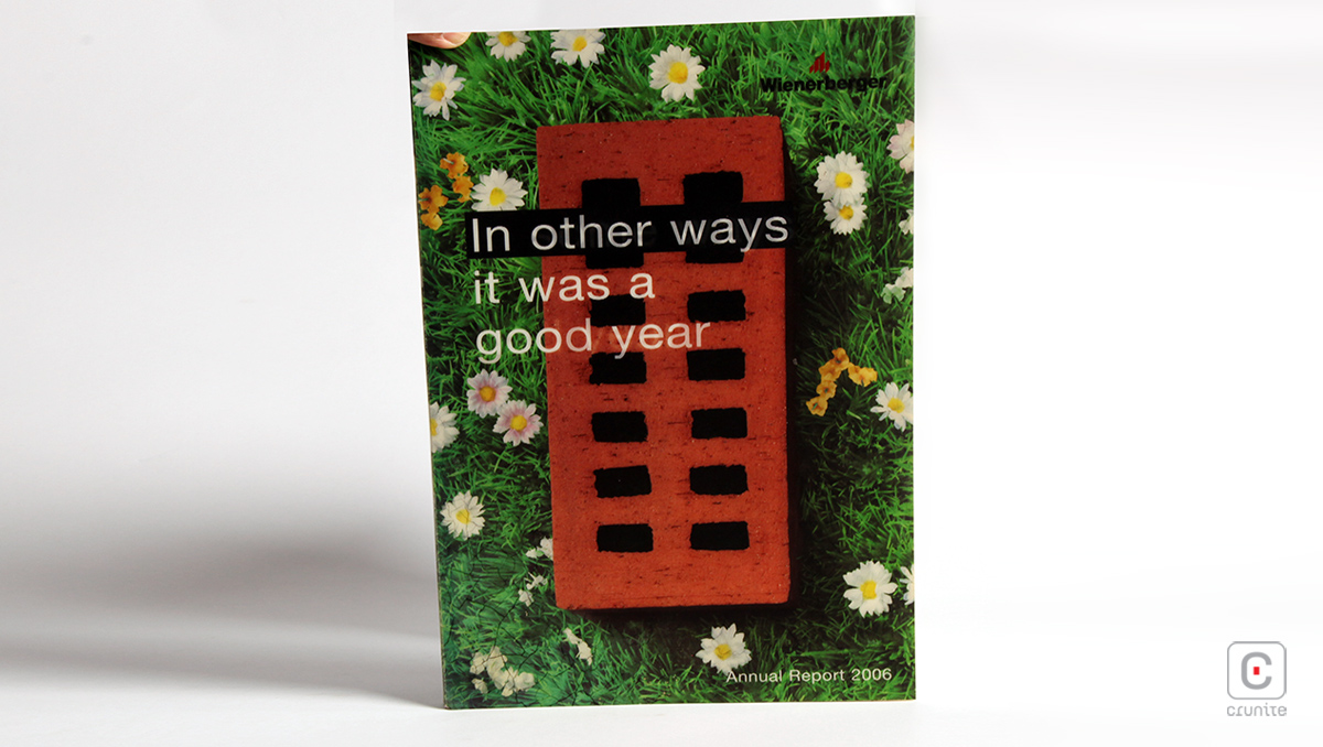
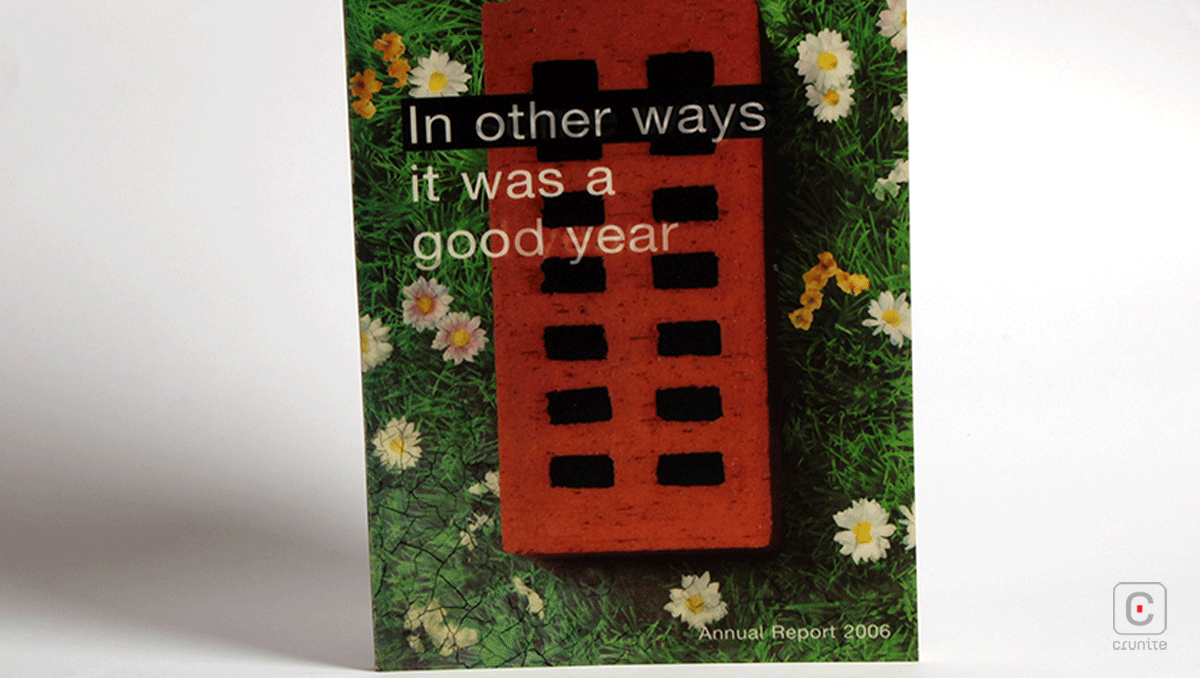
WIENERBERGER (2006) The cover of this report cleverly uses two contrasting images to signify the ups and downs of the company. It is straightforwardly honest in capturing both the company’s struggles and its triumphs.
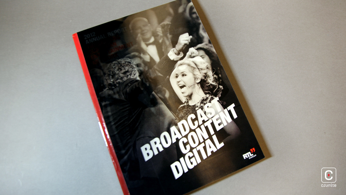
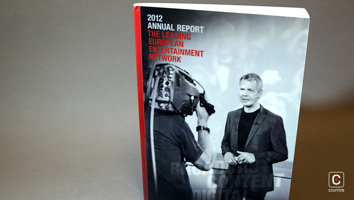
RTL GROUP (2012) Using two black and white images, this cover portrays the dynamism of the broadcasting industry. It gives the reader a glimpse of what goes on behind-the-scenes. (Read more)
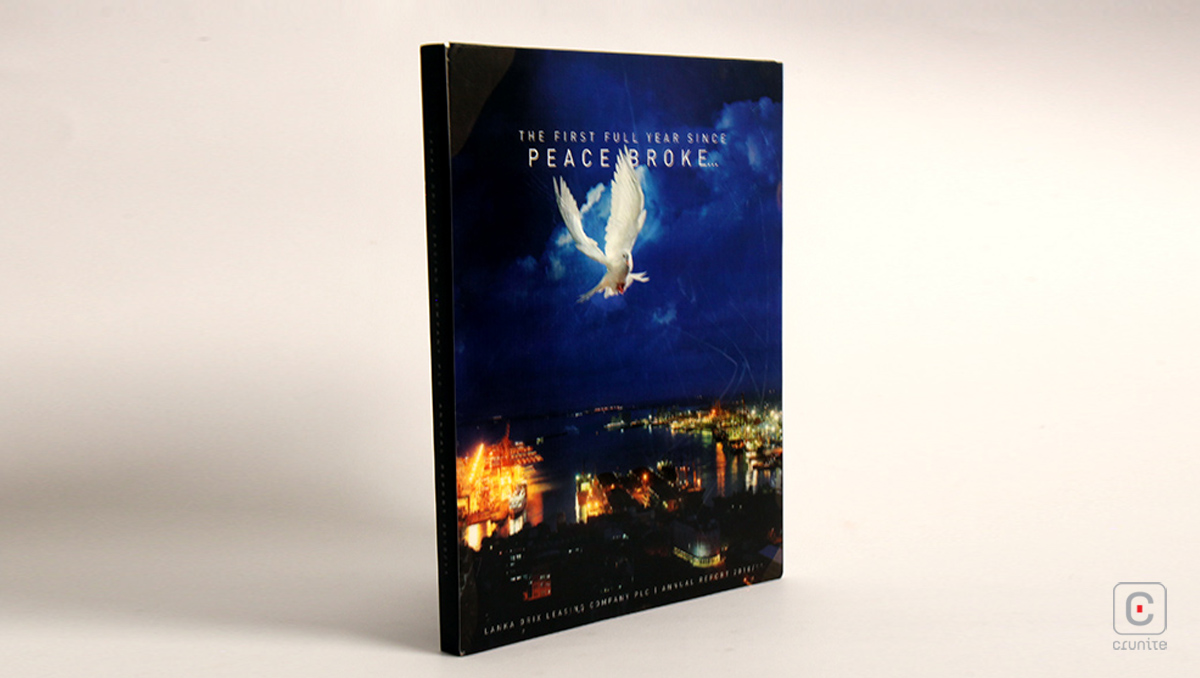
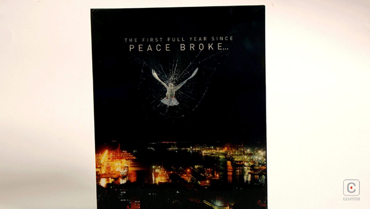
LOLC (2010/11) This cover is thought-provoking. It uses symbolism that is universally understood but also conveys hidden depth that would be revealed when the report is perused.
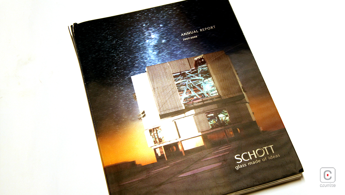
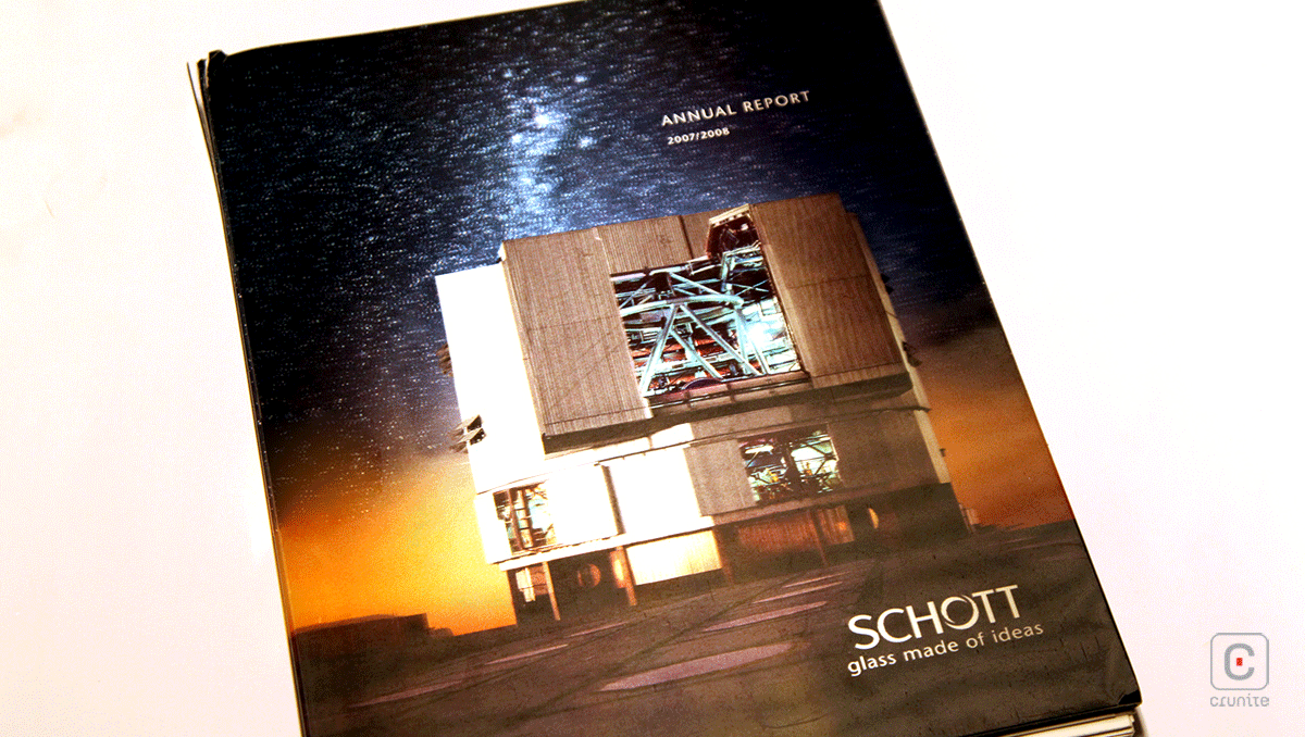
SCHOTT (2007/08) Giving an aura of futurism, this cover has an extendable flap that reveals a limitless world to the reader. The 3D effect further contributes towards creating wonder and mystery.
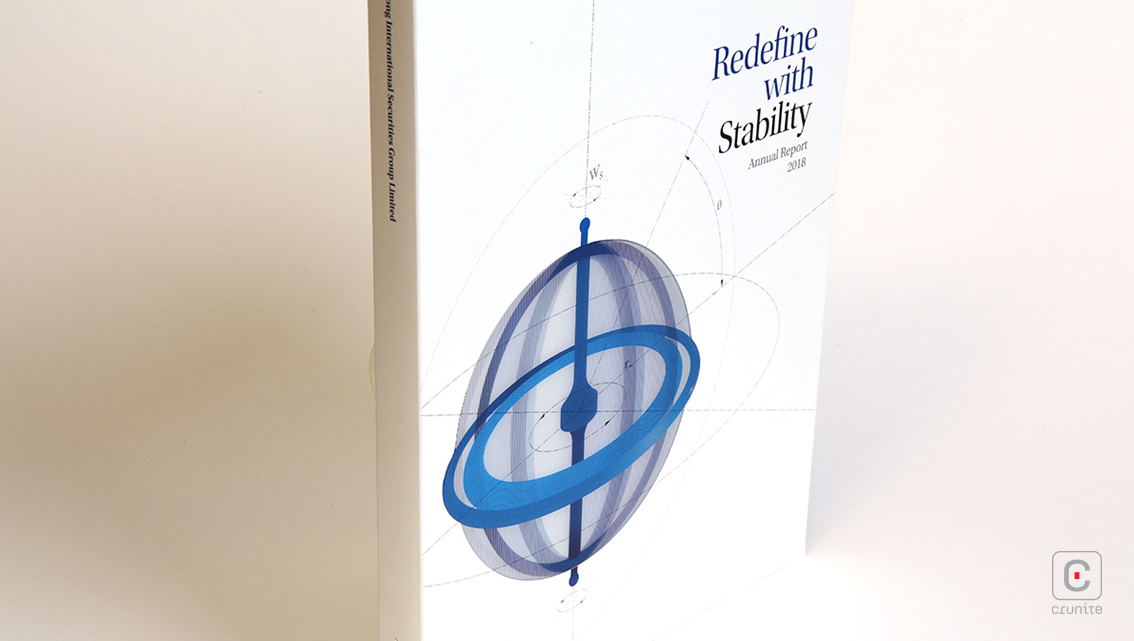
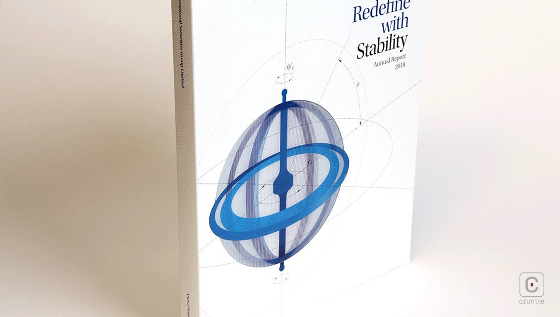
HAITONG INTERNATIONAL (2018) This cover is simple yet immersive. It portrays a moving globe in abstract style, which grabs the attention of the reader and signifies global reach as well as stability in an ever-changing world.
![]()
![]()