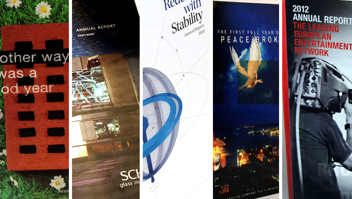
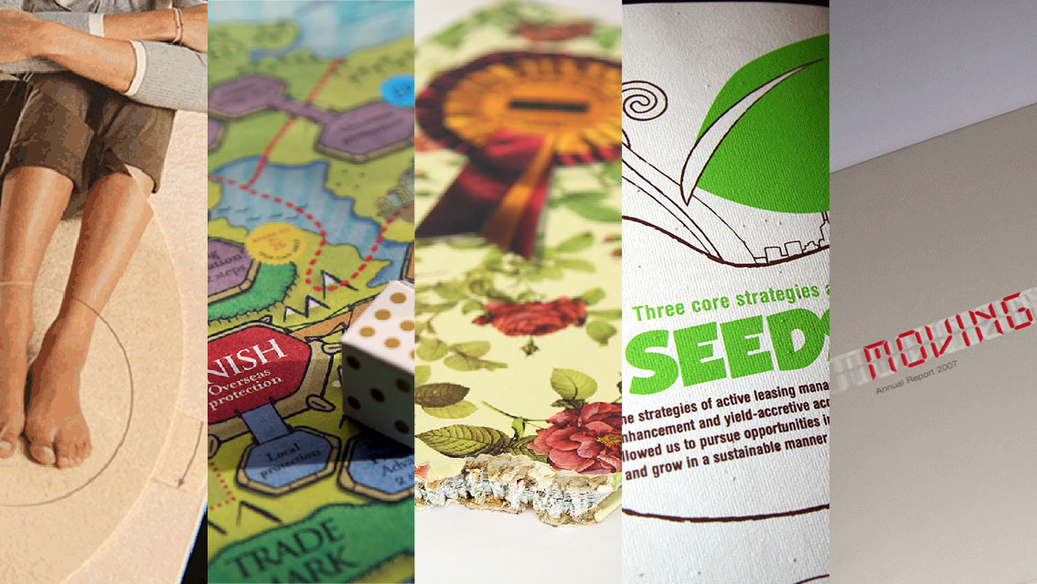
Quick Read is an article format where we consider a collection of reports that share a design ethic. This week’s Quick Read looks at annual reports that reference magazine design.
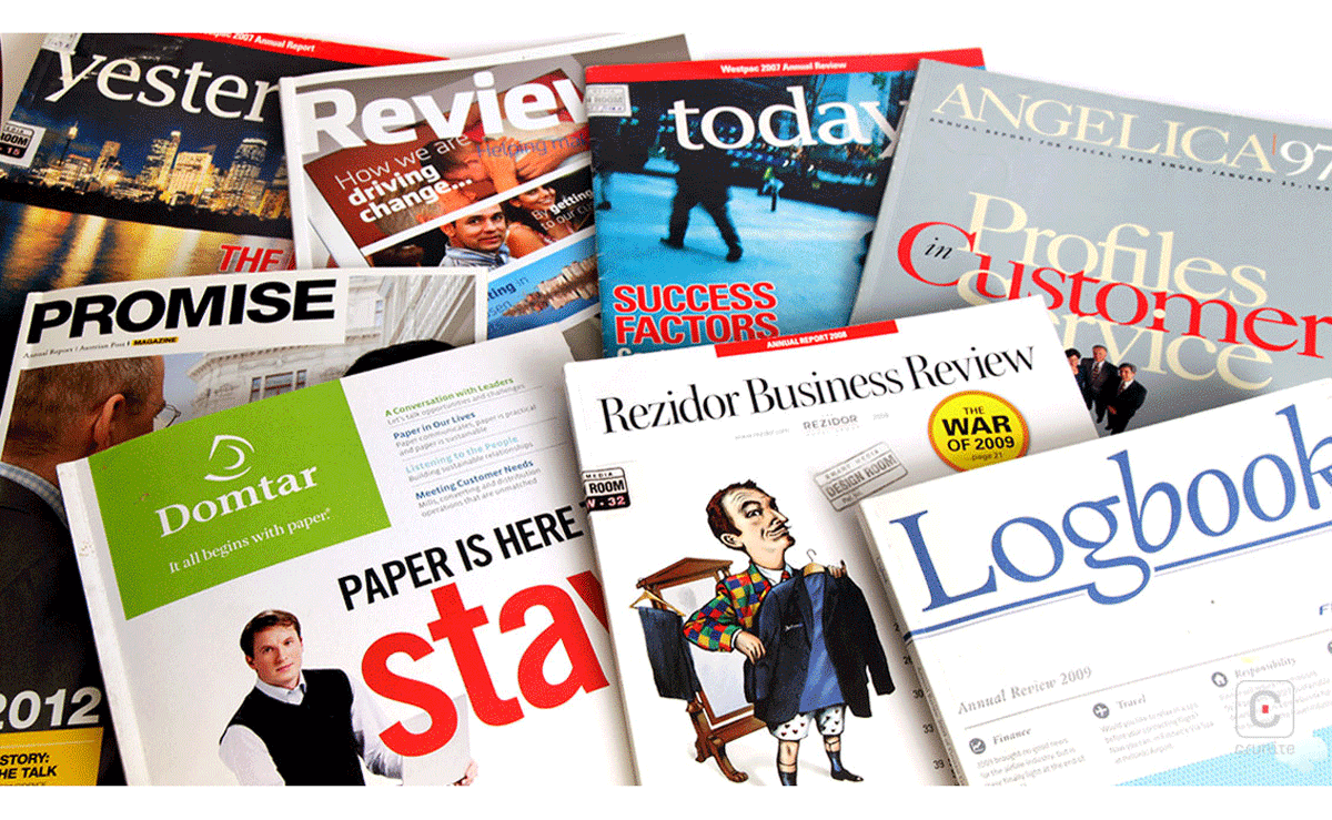
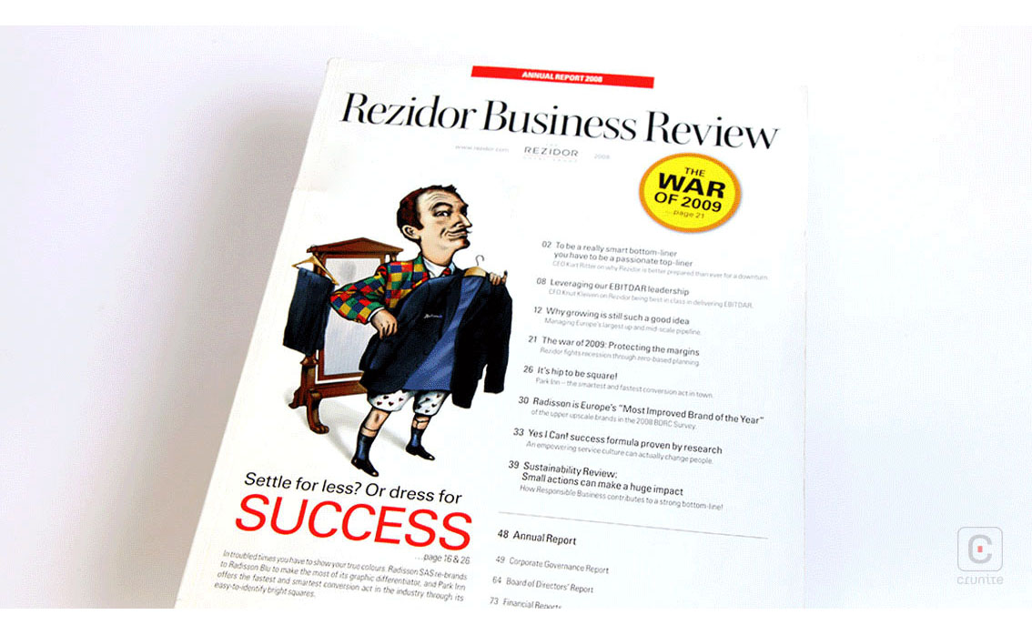
REZIDOR (2008) The most direct and convincing of the bunch at using magazine format – article titles, summaries and page numbers on the cover, striking illustration, great use of colour – effective and enticing.
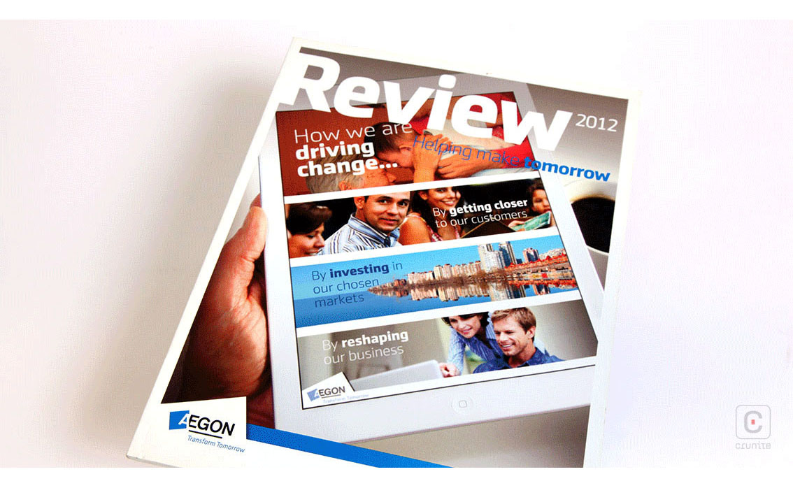
AEGON (2012) A report in the form of a physical magazine that uses an image of a digital magazine on its cover, with some clever type treatments that encompass both ‘magazines’. Does a good job subverting the magazine format’s tendency to list article titles on the cover.
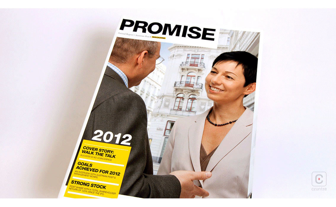
AUSTRIAN POST (2012) A bold masthead, glossy cover and nice use of the magazine format’s list of article titles on the cover. Maybe it doesn’t need to use and highlight the word ‘magazine’ to drive home the design ethos.
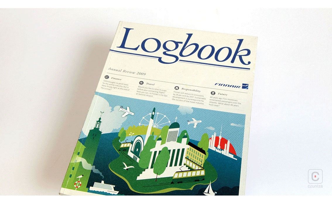
FINNAIR (2009) Strong masthead design and good use of magazine-style section titles and summaries to draw in the reader. The illustration effectively conveys the scale of Finnair’s operations.
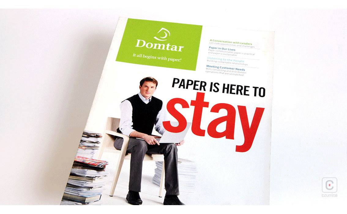
DOMTAR (2008) The masthead doesn’t suggest ‘magazine’ but the design is clean and they make effective use of article titles and summaries by locating them at the top of the cover.
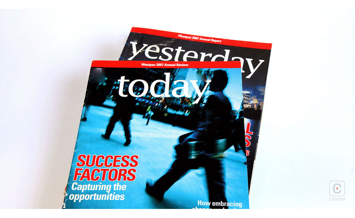
WESTPAC (2007) A lovey riff on Time and Newsweek in its choice of page size, colour and layout. The photographic treatments on the covers suggest urgency and wealth and the ‘barcode’ is a clever touch.
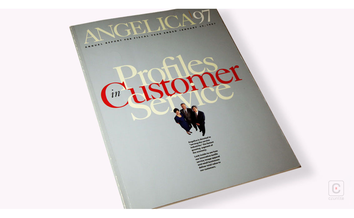
ANGELICA (1997) The least direct use of magazine format because it avoids standard elements of the magazine format – article title, summary and large illustration. The design may be a risky approach when seen on its own, but when placed in this collection, it is an intriguing cover.
Back
![]()
![]()