My thought process doesn’t change all that much from one client to the next, with each job I’m essentially trying to please myself from within the constraints of any given brief. I guess the key phrase here is ‘the constraints of any given brief’.
I think it’s important for me to be happy with the work I’m producing but that can’t be a completely inward-looking process, I have to be also be aware of the client’s needs and the requirements of the brief. These are both constraints that fine artists wouldn’t have to tackle but it’s this kind of problem solving that I love about illustration. It’s like having to find your voice or opinion from within a framework that is larger than just yourself. I’ve always found the combined communication of words and images a pretty potent mix and even after ten years in the job I still feel immense pleasure and am very privileged to play my part in this role.
Most of my work is based on the communication of a story/article or some other kind of pre-existing text or text-based communication. So my first job is to read that text, and then read it again, and again and again and so on. It’s only after numerous reads and re-reads that I can start to grasp the real fundamentals of an article.
One thing I always try to avoid during this process is bringing any baggage to the table at the reading stage, I try to stay as open as I can and allow the text to direct me towards what I might want to say about the subject. It can be easy to see ‘truths’ that aren’t necessarily ‘fundamental’, and therefore might not communicate to the widest possible audience. I suppose I’m trying to tap into some kind of collective unconscious (if there is such a thing) in a search for something that gets as close to ‘right’ as possible.
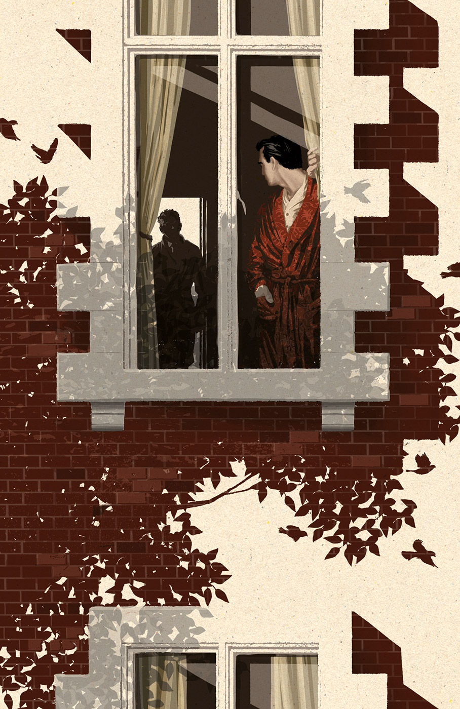
It’s difficult to pinpoint any particular source for this but I think there might be a few reasons why my work ended up with this look. Firstly, I’m from a working-class background and there’s something in the intrinsic ‘weight’ of the print style that I find attractive, almost like you can feel the heavy machinery behind the creation of the image. Before I took the leap into illustration I was employed in plenty of factory jobs where I was on the other end of this machinery and I can tell you it’s much nicer on this side! Also I think the print style is very suited to limited palette work.
This relates back to my earlier comments on looking for fundamentals, I like to tell a story in it’s most simple form and I try to apply this to the application of colour as well as the creation of a concept. I was probably also influenced heavily by mid to late 80s skateboard graphics, a golden age for skateboarding. I spent years knocking around the streets on these and after a while the screen-printed graphics would get scratched up/distressed in a way that isn’t dissimilar to the way that I work now.
One thing that was drilled into me on my illustration degree is that although aesthetic trends come and go, ideas are always in demand. I’ve tried to make sure my work is always ideas driven so that the style is less important and hopefully less susceptible to the vagaries of design trends. My style has evolved over the years but always with the intent of improving the communication of my concepts, aesthetic-driven styles have always looked a bit empty to me.
That’s very kind of you to say! I’m not sure I think that art should ‘always’ be radical, there are probably plenty of uses for art that isn’t but it’s the unique stuff that has always excited me. There’s no feeling better than being able to take a well worn cliché and somehow come up with a new way of realising it. These kind of ideas are the real prizes in illustration. I’ve been lucky enough to win several awards for my images but, as grateful as I am for these, they’re nothing compared to being able to find that unique way of saying something that might shed some fresh light on a subject. This is what illustrators live for.
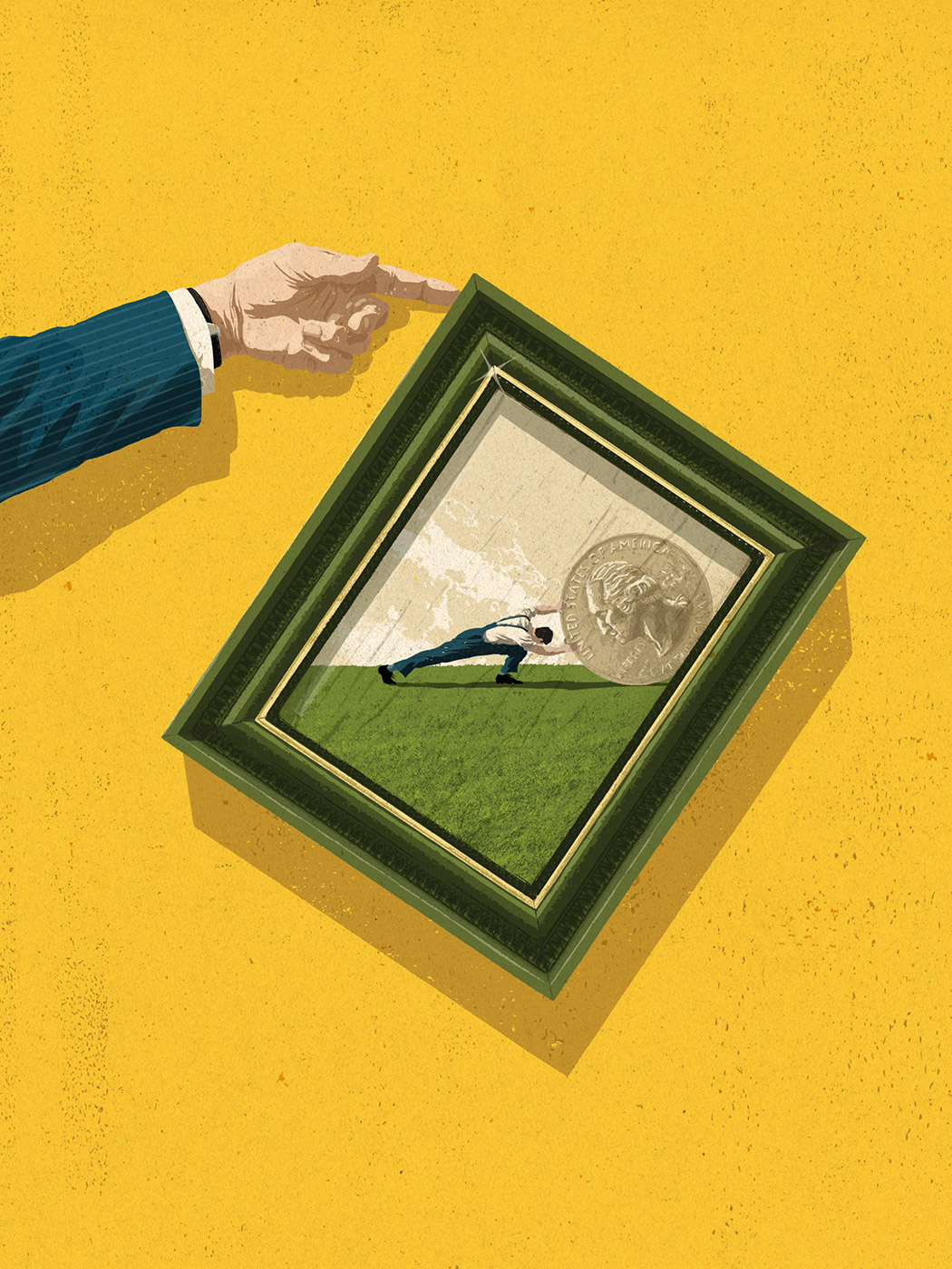
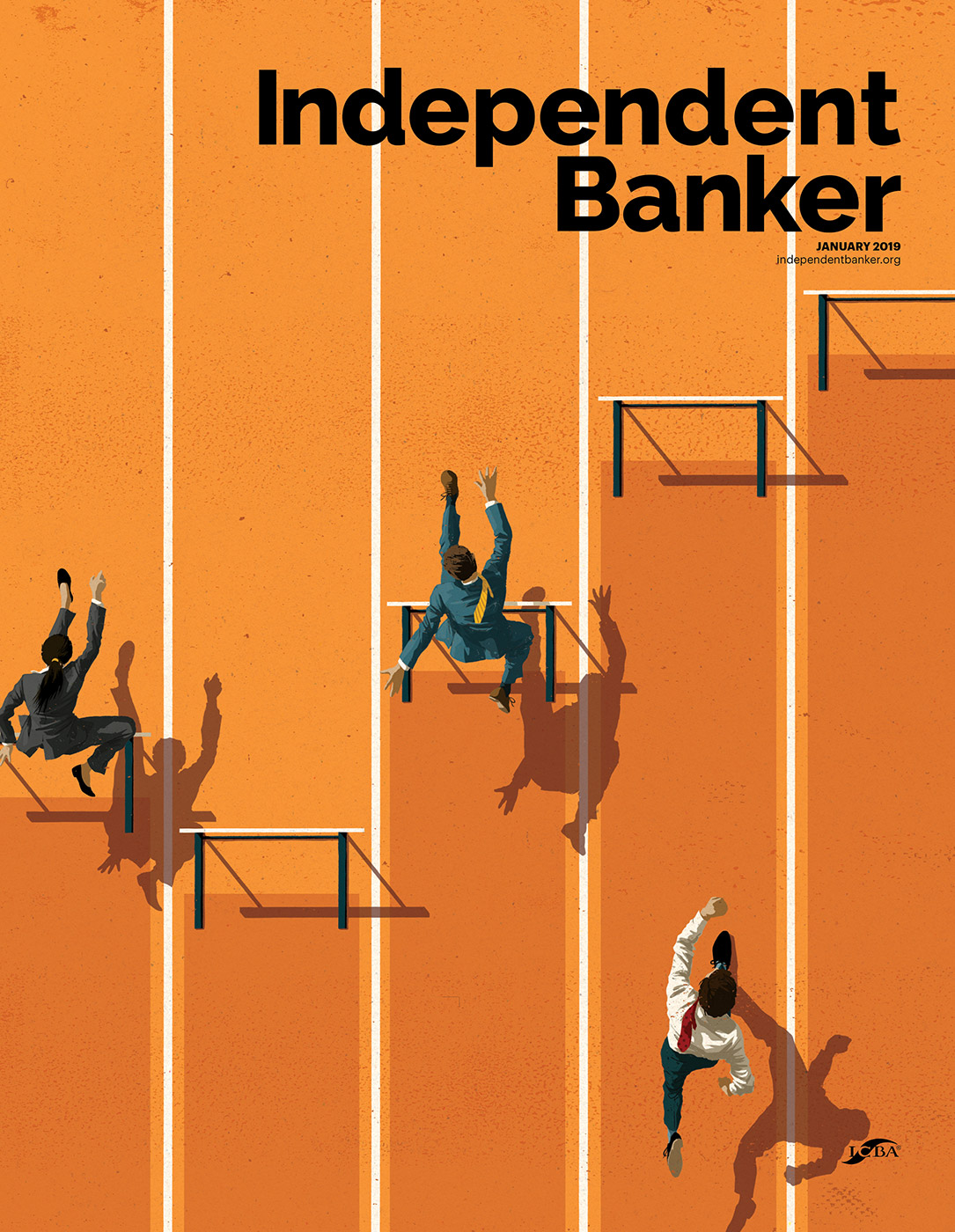
The most stimulating jobs are always the ones that give me the opportunity to find that ‘unique’ idea we were just talking about. A recent job I did for the Time magazine was a good example of this. The client isn’t particularly ‘corporate’ but the subject matter was, it was about trying to level the economic playing field. I used some cliché’s in the image but I think I used them in a way that would qualify as something new. The Sisyphus reference has been used many times before to show the working class struggle but by putting this reference within the picture frame I was able to show that struggle, relate it to economic wellbeing, show how easy it would be for the rich to ease that struggle, and also literally show the ‘playing field’ being made level.
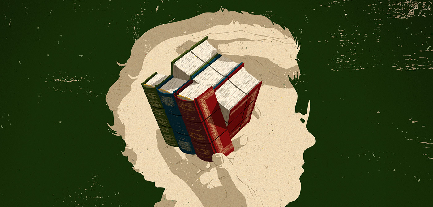
Another one that stands out for me was an image I did for the Harvard Business Review, this one was about re-training older people in the workforce. The key parts of this article were age, knowledge and some kind of adjustment to that knowledge. The silhouetted form of the lady’s head shows age but I backed that up by depicting some old style, leather bound books, which also represent the knowledge aspect of the article, and by drawing these books in the style of a Rubik’s Cube I was also able to show the adjustment to that knowledge.
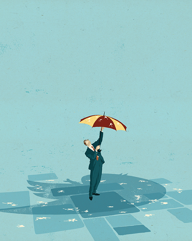
A slightly more playful image, and one that I’m still quite proud of, won me the Best in Show Award from 3X3 Magazine’s annual awards. It depicts how bosses can protect themselves from social media abuse. Using a shadow from the Twitter bird and a boss with an umbrella for protection from the bird’s droppings seemed to fit the bill perfectly.
Yes. Very much so. The main obstacle is the fact that I’m working in a language without any hard and fast rules and no firm framework that is readily understood by anyone that reads it. This is both the beauty and the potential problem of communicating with images. It allows for a huge amount of creativity but there’s always the pitfall of subjectivity that can lead to miscommunication if it isn’t handled correctly.
For example, in the Harvard Business Review image above I had to be careful not to make this look like it was an overly forced or invasive change to the person’s knowledge, if the hands were grabbing the book/cube any more tightly it could start to look like an uncomfortable transition for the lady. I also wanted to make the books look like they were old, but without being out of date or too worn out. They’re old-style books, but it was important to show that they’re still fresh looking, still have plenty of use, or value, left in them, and that it just takes it bit of adjustment to come up with something that translates as re-training. They can be small details to be concerned with but they can have a huge impact on the overall communication of the image.
Meeting and hopefully exceeding the needs of the client is the source of my creativity so if I didn’t do that I would consider the job a failure. In the case of Rembrandt’s ‘The Night Watch’, the fact that it is now considered such a masterpiece shows that in this case the client was very wrong, and I certainly don’t mean to suggest that Rembrandt was any kind of failure!
If you liken a piece of work such as ‘The Night Watch’ to (just for example) Tolstoy’s ‘War and Peace’, what I’m providing for clients is a mere sentence (if that!), hopefully a pithy or profound one but still just a sentence. So I’m able to come up with several different options for a client to choose from, and this ‘searching’ part of the process is all part of the creative process for an illustrator and is there to be enjoyed as a creative outlet in itself. If I had to spend the amount of time it takes to create a painting like ‘The Night Watch’ on every job, I’m not sure I’d be so keen on providing various options mind you! I’d be going very hungry if I did.
If by radical, you mean fresh, creative, unique, left-field and progressive I think these can only ever be good things, particularly when applied to communication, even more so when applied to corporate communication.
This is certainly the case for me, and I’ve worked on countless articles over the years that suggest the same can be said for the business environment as well. Being exposed to the kind of left-field solutions that are the bread and butter of conceptual illustrators can foster the kind of creative thought in a workforce that can overcome a wide variety of challenges that a business might face.
Any industry that’s having an issue condensing large amounts of information into single images or fundamental meanings. I haven’t really got a preference as far as the topic goes, I just love the process of chipping away at that block of marble, so if that’s your business I’d love to hear from you.
![]()
![]()