When I was trying to decide my future in college, I knew I wanted to pursue a career in something related to the arts, however journalism also created little sparks in my mind. I didn’t know anything about infographics at the time, I thought it was one thing or the other, so I decided to bet on the arts, design in particular.
Before graduating, I was already working very closely with journalists, and little by little I discovered that it was possible to merge these disciplines and more with infographics. From that moment on I felt like it would never feel like work again because I found something that I enjoyed so much.
If you work in infographics, you will have to be open to a very wide range of possibilities and things to learn, or at least be aware of the elementary knowledge like coding, 3d modelling, illustration, cartography, etc. But in short, this is about storytelling, so I will say that journalistic instinct and a tireless curiosity to understand all the details are the essentials.
If you found someone having those key characteristics, that’s the one to pay attention to, simply because they will show you something from an original angle and it will not only be pretty, but it will also be revealing.
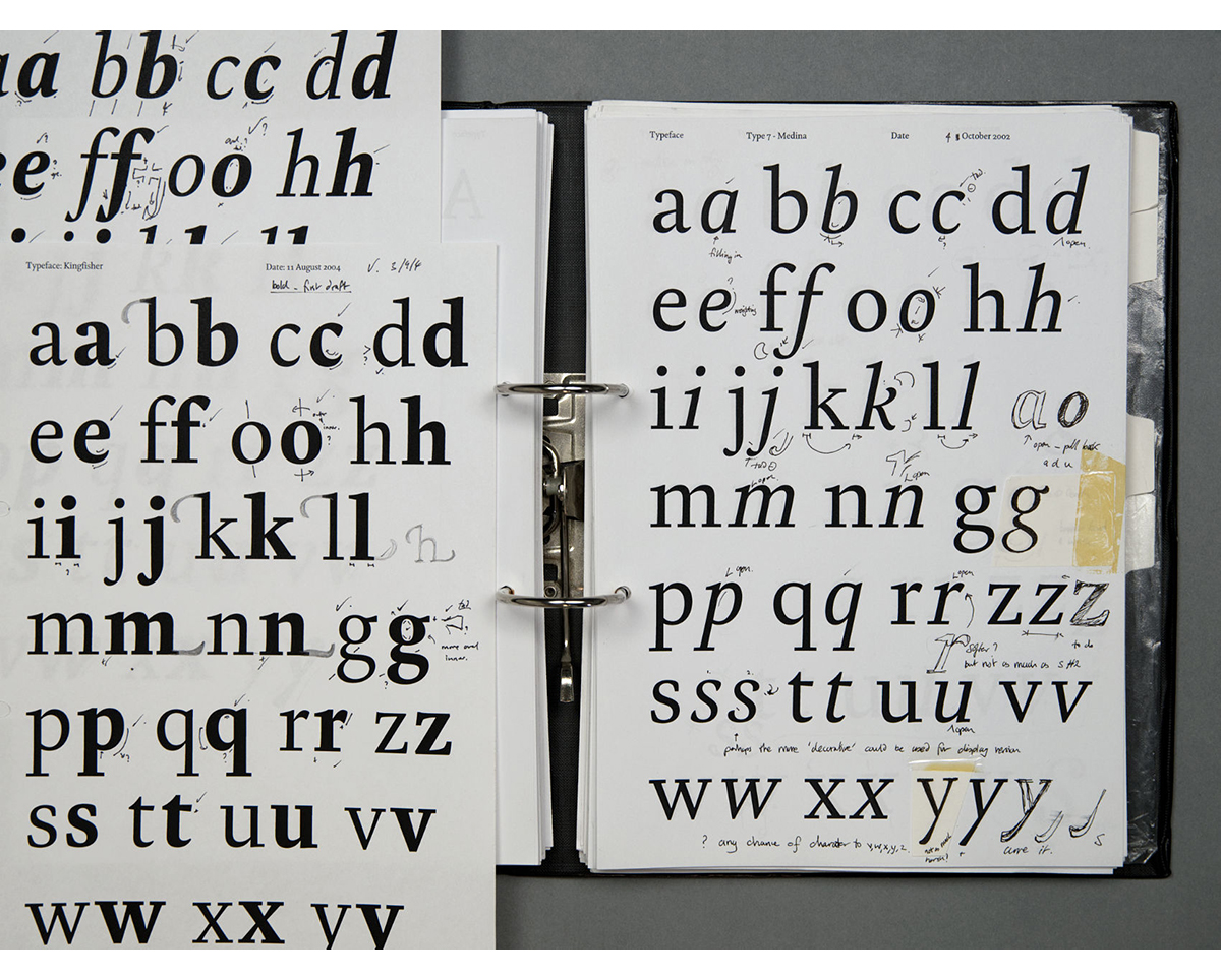
What I want to highlight with that statement is that illustrated graphics sometimes also known as “classic infographics” aren’t just about having a seat and going crazy with a pencil to create. I have been in situations that demand a lot of documentation just to do a single illustrated graphic, you can spend days just doing research, talking to people and gathering evidence to recreate an accurate illustration, just as you do to create a visualization or a text-driven story.
The hard part of those classic graphics is that as soon as the reader reaches them, they will take it literally, even knowing that they aren’t photos they will assume you did that, in that way, because in real life it is that way! In infographics, there are none or very little chances to use artistic licence.
If we put side by side, a classic graphic and a data-vis graphic, we can tell that in essence, the data-vis is an abstraction. It takes off all complementary information and provides a single point of view, while in a classic graphic you do the opposite by adding details.
Let’s say you have a graphic of an unknown ancient sport, you will use the illustration to show how people use an instrument to play, but at the same time, it will also show the outfit they used, the players’ builds, their gender, cultural references… many things to keep in mind.
I love data-vis graphics, sometimes they are just the right thing to do, and yeah, you need to know what to take off. But the readers would not get “hard feelings” on its details because it’s abstract. On the other hand, the classic graphic may create that if you don’t take precautions. Classic graphics are meant to evoke reactions whether you like it or not as a producer.
Looking at the graphics I was doing 10 years ago, I can notice the evolution to create a better experience in devices and a reduced trend to focus on print formats or desktop screens. There’s also a more refined product displayed in an extended scrolly format rather than a single dashboard full of buttons.
I think innovating in media is focusing on creating premium infographic experiences, polishing storytelling in multidisciplinary teams.
Technologies evolve quite fast, and the access of the readers slowly improves. One of the frustrations isn’t the technology available but the internet connection of the readers. Luckily that has changed a lot in the last decade.
I hope we will be able to use immersive experiences in a more efficient way and other exiting technologies in the coming years.
I hope we don’t need to move to a more complex structure. I like the possibilities that infographics have to take a reader by the hand an introduce him/her to the most tangled topic in a straightforward way and success with the message.
There are specialized magazines where the readers touch very specific topics, but for general media I think we should aim to serve all, not elevating things but telling a good story. I believe good stories doesn’t need to be complex. As creators we need to understand it well, then break our heads to explain it nice and clean for everyone.
Quoting Einstein “If you can’t explain it simply, you don’t understand it well enough.” That’s the work of an infographic designer in essence.
We work with small samples on big projects to conceptualize. Many times the concepts are just drawn on a white board or a piece of paper.
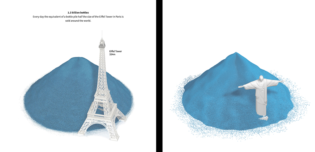
For that project [Drowning in plastic], I did a lot of single frame renders to test the static graphics, to test textures, others to check camera positions for the top animation… then when all was as we wanted I did the final process, crashing my small laptop a few times but I found the way before melting it.
My process sometimes is long since I create a lot of things that may never use in the final project. But I really think it’s necessary to have other perspectives. I only take things out of the process that make me doubt if that could be better or in seen in another way.
If that happens, I quickly create an alternate sample, most of the time it is just a small change and I try not to go too far with a finished product of every single version.
I think it gives a better final product as alternatives have been tested.
This pandemic was a turning point for me as for many other people. I have changed many aspects of my life to add things that I never paid attention to before. I guess you start thinking about life balance only if you find yourself caught in a terrible situation. However, I always like to see the good things, and I’m still here loving graphics so all good.
Oh there are so many, it’s difficult to do a short list. I have a bunch of folders with bookmarks on my browser to check cool stories/graphics daily. But here you go a few just to mention some:
I suggest to pay attention graphics teams doing nice things like the NYT, the Washington Post, the SCMP and Reuters Graphics, of course. Then, I like to check what’s new at The Pudding and Flowingdata.
On people’s blogs Andy Kirk’s Visualizingdata, Eleonor Lutz’s Tabletop Whale and Nicolas Felton Tumblr are good places to see diverse and cool stuff.
Books are another world too so many good ones, but there are some good starters like “The Functional Art” and “How charts lie” by Alberto Cairo. “Design for Information” by Isabell Meirelles, and the nice minimalistic classic “Visual grammar” by Christian Leborg.
I like the fact that doing graphics, you rarely will see the same thing twice, there’s always a new story to tell and you need to get into it like an enthusiastic fan to understand it. So, the influences and inspiration also come in some sort of waves, flowing with the projects and their requirements. You just need to keep sources sorted by topic and places or websites to look for.
A good example are old books with diagrams and technical illustration–thinking of this people doing infographics so long ago and in a such nice way. Sometimes I look those “vintage” graphics and you can notice smart ways to solve problems and handle information and design. The British Library has a nice collection on Flickr with many great examples.
Random things also refresh my mind and sometimes trigger ideas for future projects. I bookmark the things that create sparks to revisit later. Colossal and ArtStation are good for those ideas.
I usually have two or three big projects in progress at a time. I have to juggle production well to meet timeframes. However, since I work on news, if a breaking news event comes in, I must make a pause and jump into something different for a while.
I can’t give too many details of the projects, but right now I have a special project about the Olympics using “classic graphics” style. I hope it will be released this month, then in the bucket there are some 3D things for later this year, good simulations and one more with a scientific approach on environment and ice with a mix of different disciplines. So exciting months are coming, you can get it fresh on our graphics home page and related stuff on my twitter account.
You can learn more about Marco and his work, including an instructive look at his process at https://mhinfographics.com/
@TmarcoH https://twitter.com/TmarcoH
Image credits: Marco Hernandez, South China Morning Post, Reuters, Plastics plus
![]()
![]()